2023 | Professional
SHUN PIN LANG 480 (BLUE)
Entrant
Chengdu Mind-and-Hand Positioning Co., Ltd
Category
Packaging Design - Wine, Beer & Liquor
Client's Name
Wang Bowei, Yu Jun, Wang Chaojun, Huang Chen, Qiu Lina
Country / Region
China
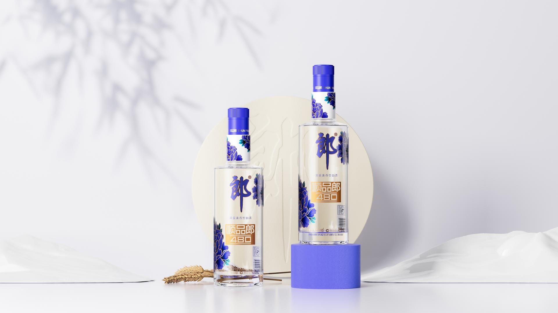
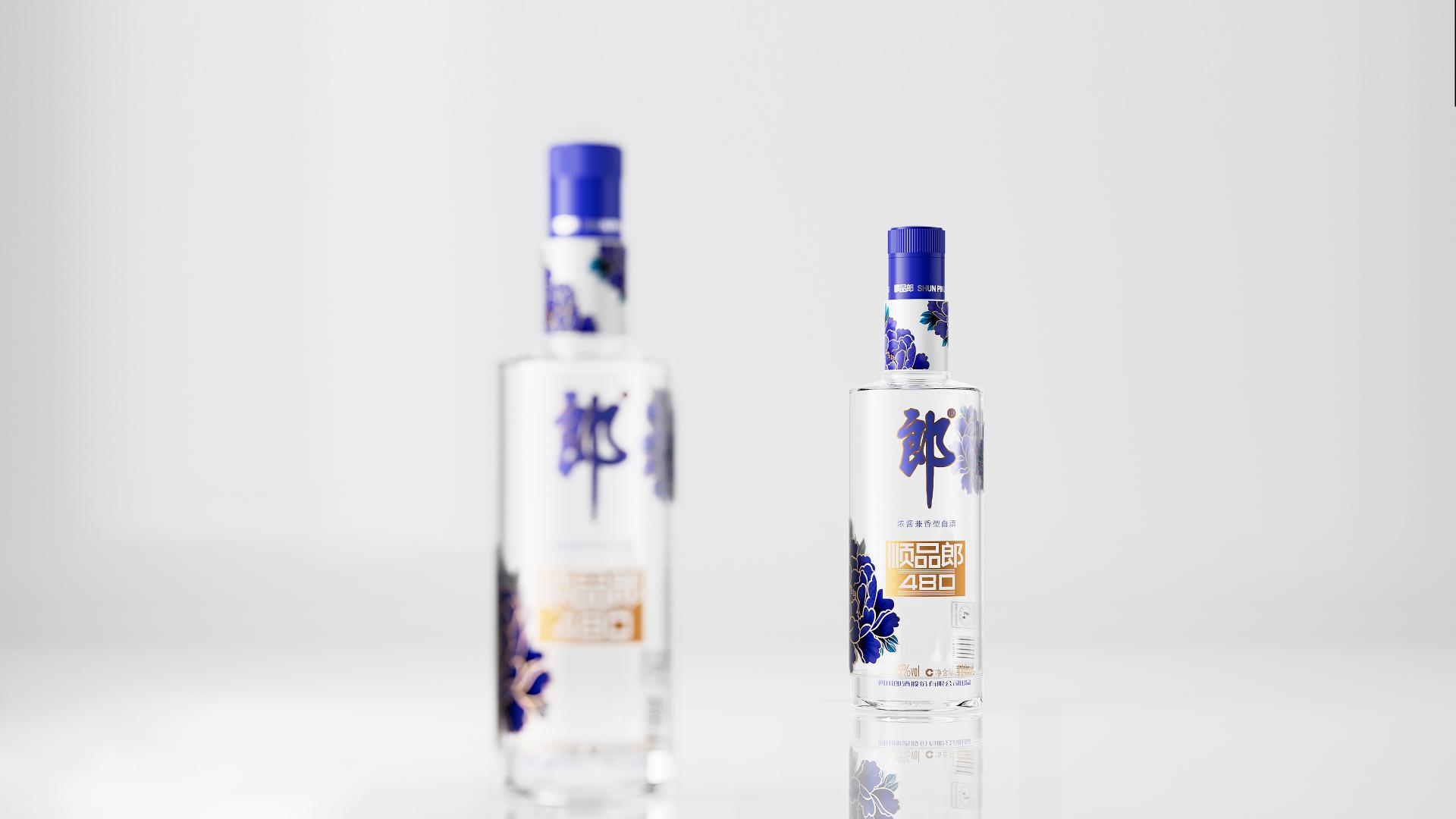
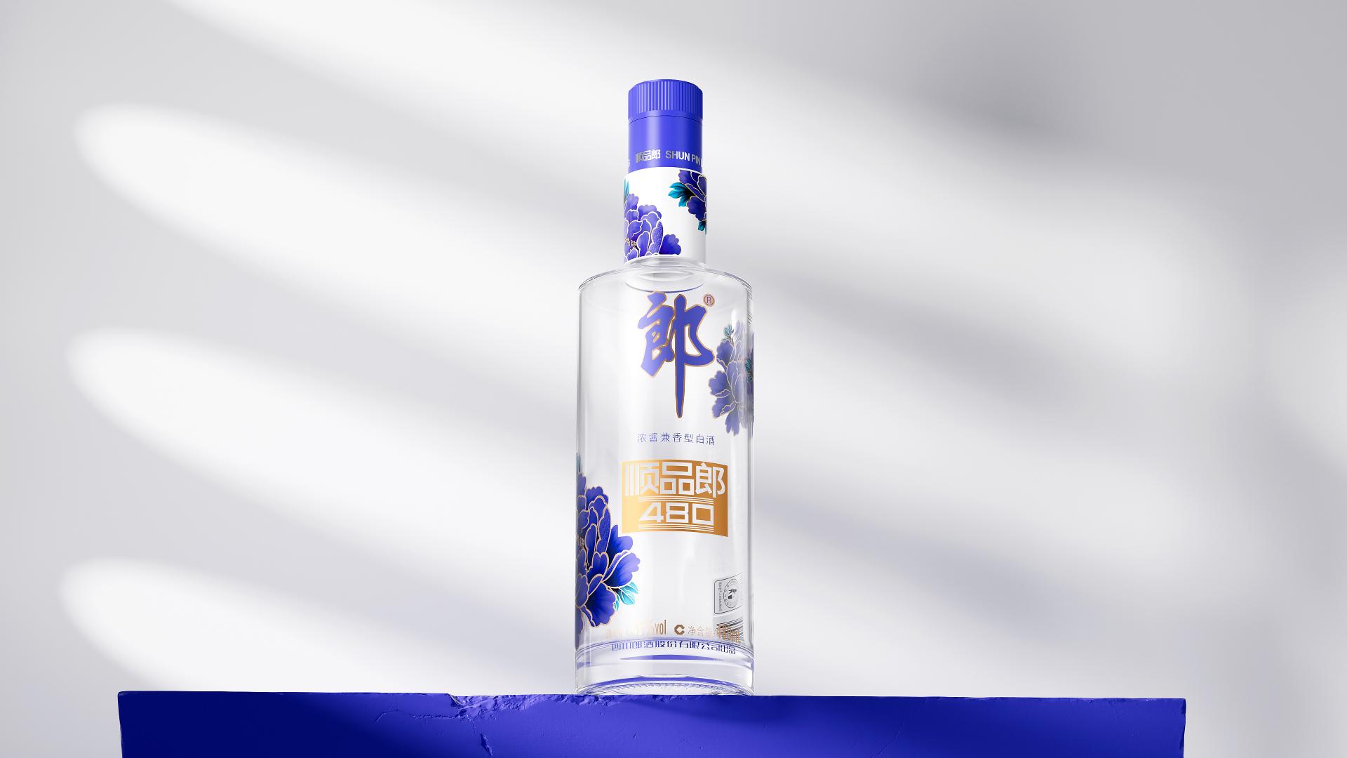
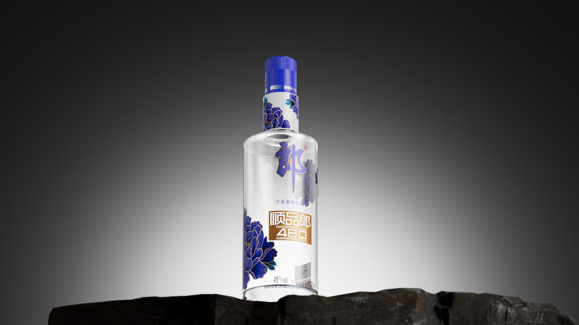
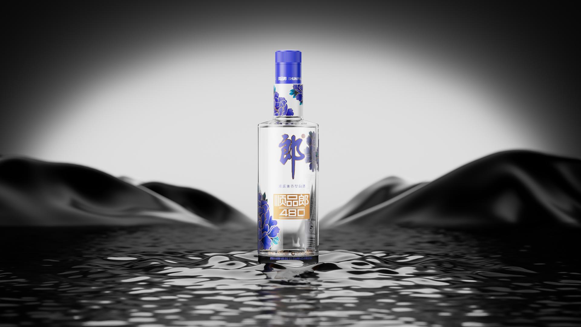
SHUN PIN LANG, with its exquisite packaging and delicate design, showcases the brand's unique charm and value. The fully transparent bottle is adorned with a mysterious and enchanting blue peony, symbolizing prosperity and abundance, carrying sincere auspicious wishes. Its meticulously crafted appearance, profound auspicious symbolism, and the noble and elegant temperament conveyed through brand design make SHUN PIN LANG an unforgettable treasure with significant collectible value.
SHUN PIN LANG series packaging features intricate patterns on the bottle neck through hot stamping, making it even more eye-catching and prominently displaying the brand's core. Additionally, the bottle caps have undergone gold foil adjustments, clearly indicating "Blue, Red, Gold Cap" variations. This fresh visual upgrade enhances the product's visibility in the market, highlighting the brand's focus and uniqueness, and achieving a harmonious balance between functionality and aesthetics in the packaging.
The unique design carries a beautiful blessing: the peony, as a traditional auspicious flower in China, symbolizes prosperity, good fortune, and auspiciousness. The peony swirls on the bottle, which enhances the brand impression and facilitates consumer recognition. It conveys wishes of prosperity, abundance, and happiness to consumers, bringing joy and harmony to their hearts.
The overall design exudes simplicity and elegance, showcasing a sense of refinement and nobility. The combination of the blue peony on the bottle body and the golden pattern on the neck creates a harmonious and visually pleasing aesthetic, adding a touch of sophistication and texture. Every detail reflects the brand's values and quality, while also demonstrating a deep respect for and inheritance of traditional culture. The visual presentation further enhances the cultural taste, elevating the packaging to a higher level and embodying the essence of Chinese traditional harmonious and lucky culture.
This packaging design fully embraces the characteristics of minimalist aesthetics, showcasing the brand's sophisticated and elegant visual appeal. The cylindrical bottle shape, designed with geometric precision, is easy to grip and features smooth lines that symbolize smoothness and harmony. The exquisite use of hot stamping technique, with intricate patterns adorning the bottle neck, adds a touch of refined simplicity and sophistication that complements the peony motifs.


Credits
Entrant
Spark Branding
Category
Packaging Design - Non-Alcoholic Beverages
Entrant
Shangda Design
Category
Interior Design - Residential
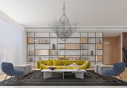
Entrant
Yu Space Design Firm
Category
Interior Design - Residential
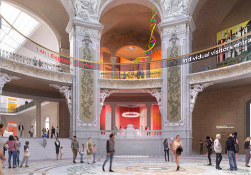
Entrant
Ateliers Adeline Rispal
Category
Conceptual Design - Exhibition & Events