2023 | Professional
Vagesty - Feminine Hygiene Products
Entrant
Digiwits
Category
Packaging Design - Beauty & Personal Care
Client's Name
Vagesty
Country / Region
Lebanon
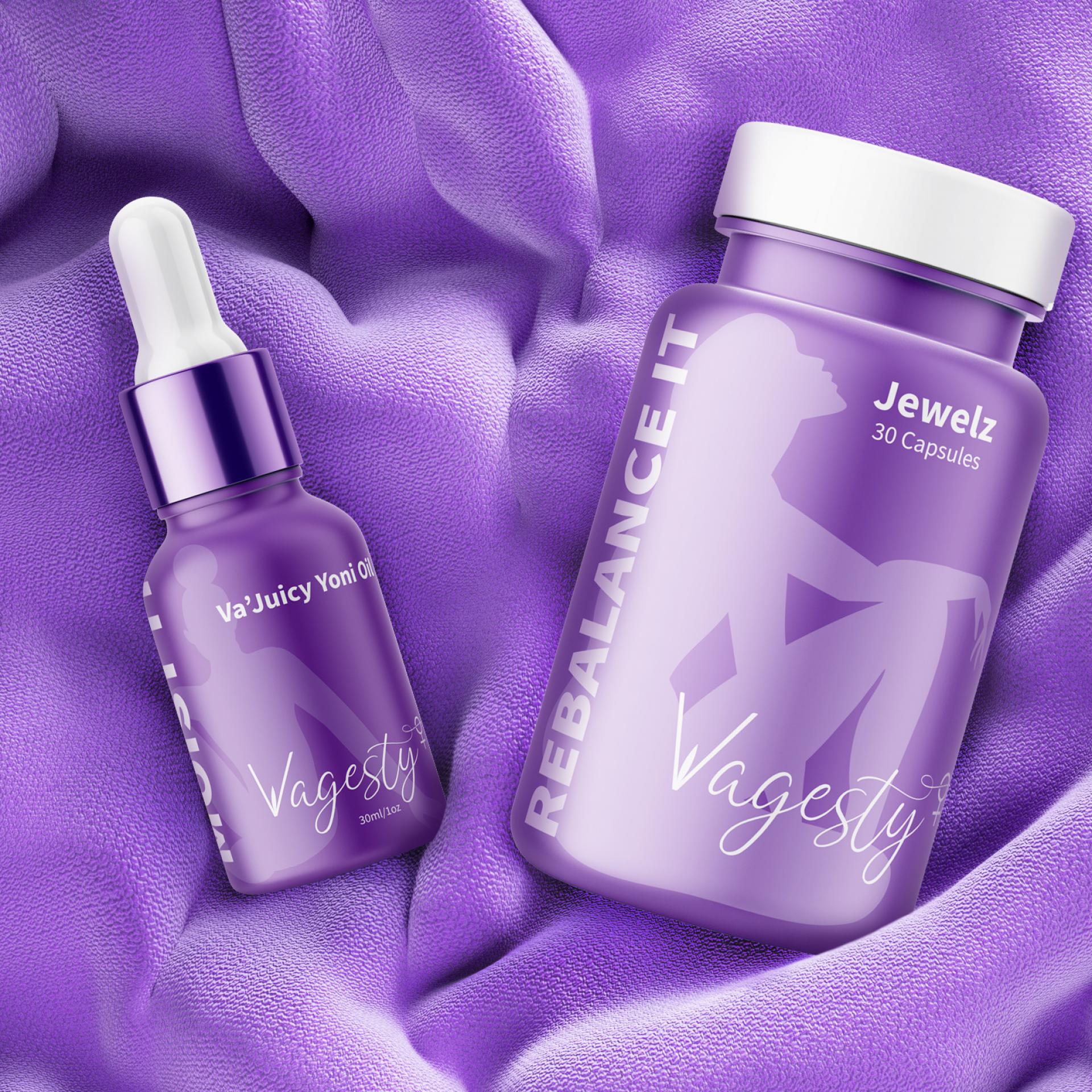
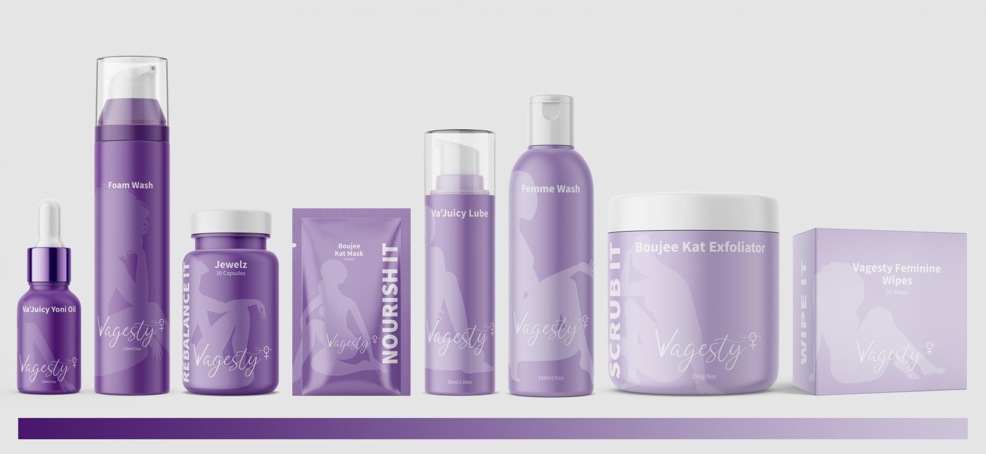
Vagesty crafted logo strongly promotes feminism. The "V" in Vagesty takes the shape of a female's vulva. The female symbol at the end of the word is elevated to show that this product caters for all women.
Purple signifies royalty, encouragement, and power. The presence of a gradient color throughout the products expresses the brand's support for sisters of all skin colors.
To include every female style, each label has a woman silhouette of a different body type. The "V" of the logo intentionally falls exactly on the vulva of every lady's silhouette.
Last but not least, the catchwords "Cleanse it", "Wipe it", etc., are there to categorize the product's usage and purpose.


Credits
Entrant
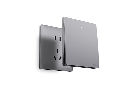
Guangdong Futina Electrical Co., Ltd.
Category
Product Design - Switches, Temperature Control Systems

Entrant
Shuei Design
Category
Interior Design - Office

Entrant
Pinze Design
Category
Interior Design - Restaurants & Bars

Entrant
Y SPACE DESIGN & CONSULTING FIRM
Category
Interior Design - Restaurants & Bars