2023 | Professional
1st & Essence
Entrant Company
Creative Workshop(Beijing)Cultural Technology Co.,Ltd
Category
Packaging Design - Wine, Beer & Liquor
Client's Name
Xie Qing
Country / Region
China
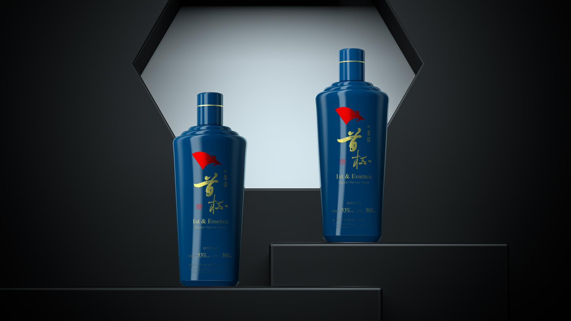
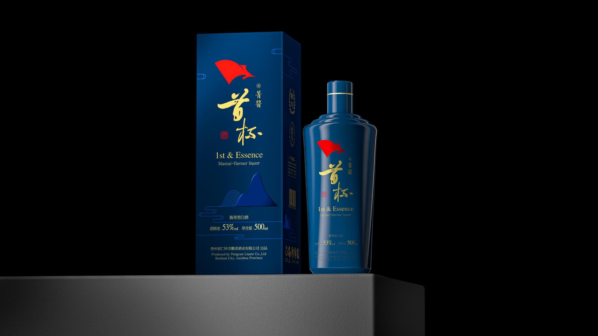
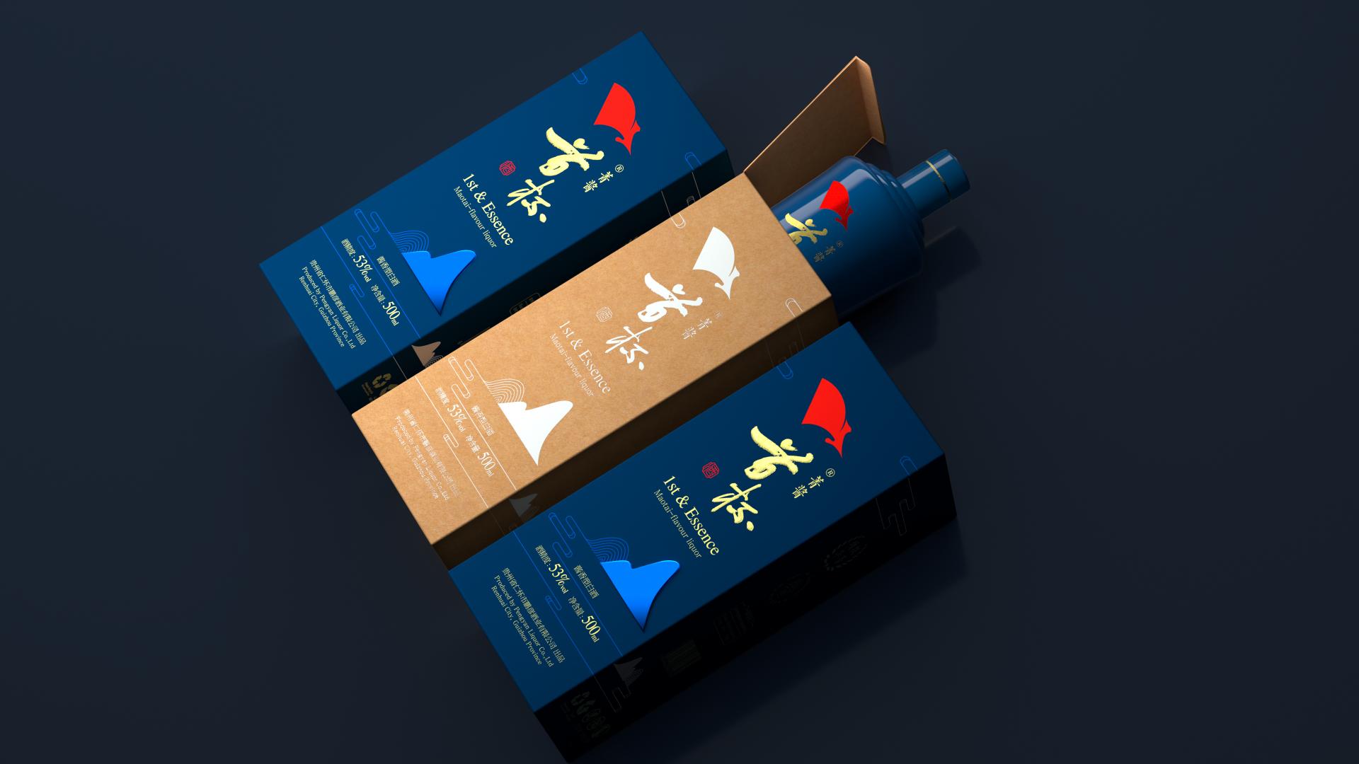
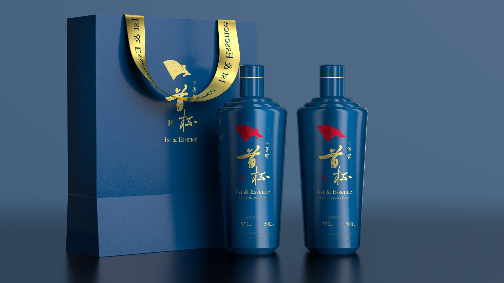
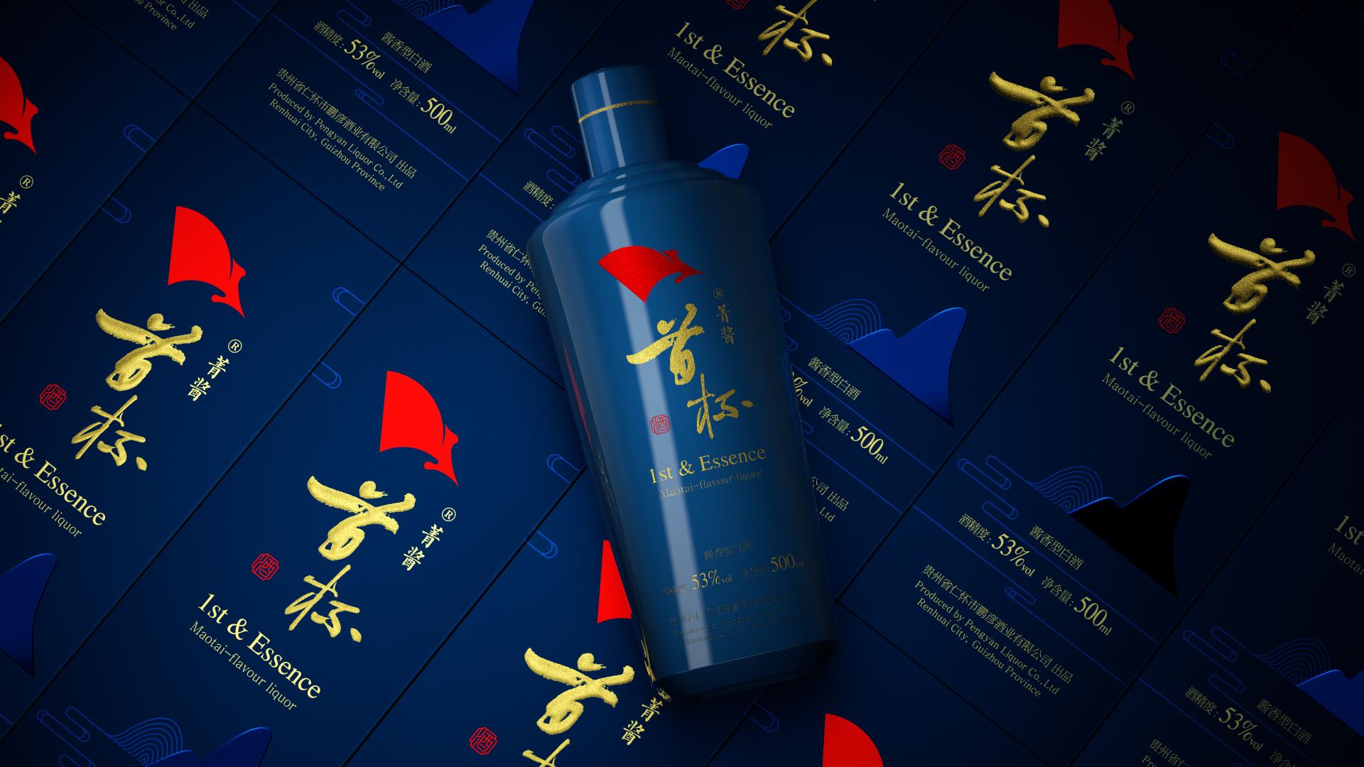
In the spirit of "Tian Yuan Di Fang" (the dome-like heaven embraces the vast earth, Symbolizing Harmony) and the age-old adage "Food is the paramount necessity of the people", the red flag emblem represents the brand's enduring commitment to its revolutionary roots, carrying forward the essence of the Red culture. This emblem embodies the aspiration to become the benchmark of private enterprises and a shining flag in the aromatic liquor industry. The complementary graphic elements of "Mountains, Waters, and Cloud Patterns" reflect the natural features of the region, known for its "Eight Mountains with Water and Field", expressing the development philosophy of "Green Waters and Lush Mountains Create a Happy and Healthy Life".
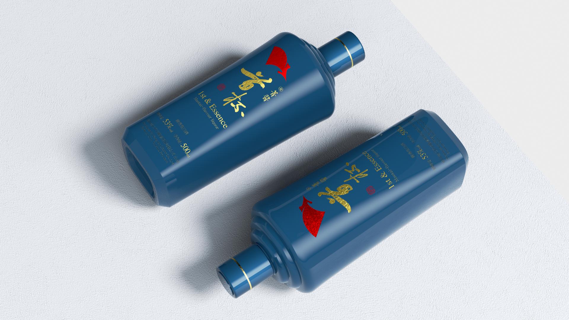
Embracing the iconic silhouette of the Maotai bottle while innovatively integrating the "the dome-like heaven embraces the vast earth" concept, our design showcases strong visual recognition, evoking a sense of familiarity yet residing somewhere "between likeness and difference". In traditional Chinese dining culture, the "first cup of wine" is often the opening toast, setting the tone for the banquet, uplifting the atmosphere, and fostering camaraderie. The term "Jing" symbolizes elite and essence, with "Jingmao" (a type of plant) historically used to filter liquor, removing impurities. Hence, "1st & Essence" signifies forever indulging in the essence of our fine Maotai aroma liquor, embodying auspiciousness and fulfillment.
"1st & Essence" has been officially authorized, marking the commitment to excellence and quality. While preserving the iconic Maotai bottle shape, it is the most fitting design for the Maotai region. With an ergonomic grip and the compelling symbolism of the red flag emblem, the packaging exudes a magnetic allure.
It advocates minimalism, striving to reduce the use of printing, adhesives, laminations, and films to conserve production resources while upholding and passing on the rich heritage of Chinese culture. The packaging employs conventional eco-friendly paper materials, adopting a simple and efficient production process with minimal printing and pollution, thereby offering an economical solution.
This liquor packaging stands at the crossroads of tradition and innovation, celebrating the spirit of harmony and the essence of Maotai, an emblem of good fortune and cultural heritage.
Credits

Entrant Company
Wangda Apparel Corp
Category
Fashion Design - Haute Couture
Entrant Company
Weihai Lizai Composite Materials Products Co., Ltd.
Category
Product Design - Home Appliances
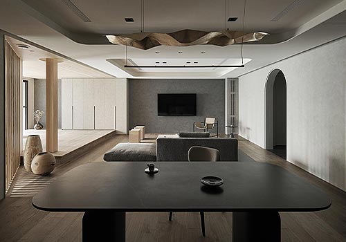
Entrant Company
MoreIn Design
Category
Interior Design - Residential
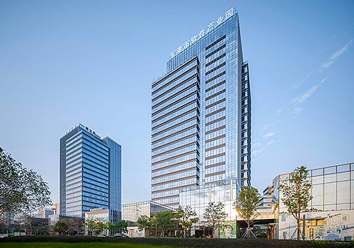
Entrant Company
Zhubo Design Co., Ltd.
Category
Architectural Design - Office Building