2023 | Professional

Analgesic spray packaging design
Entrant Company
柠乐电商
Category
Packaging Design - Medical
Client's Name
Ma Yi ran
Country / Region
China
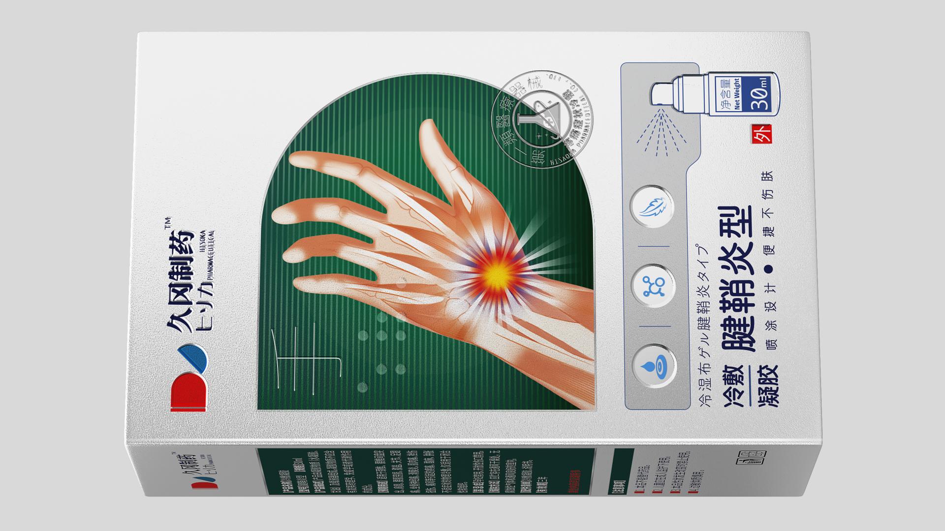
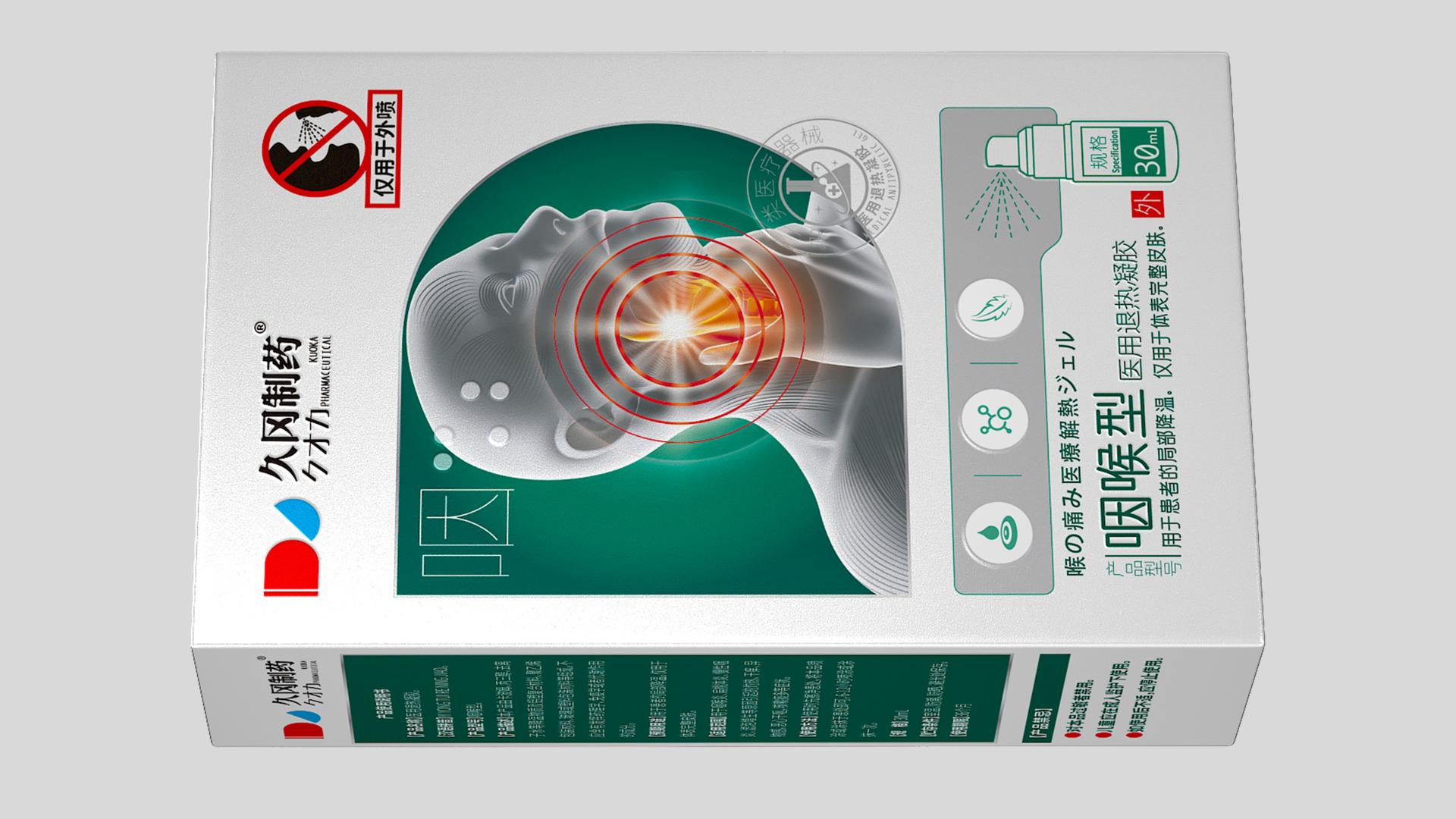
The core of packaging design is not only to reflect the functionality of the product, to help consumers make quick decisions, to find their own products is the key, in rational design with humanistic care.
This series of spray products from Kuoka Pharmaceutical, through the integrated design of color, shape, and body part marking, show the characteristics of the product, and also help consumers to make quick choices, saving the time of reading lengthy product instructions. At the same time, unlike other products, we have taken into account the needs of a minority group that is easily overlooked - the visually impaired, and specially printed Braille, so that they can also buy products according to their own needs. It's a rethinking of the spread of humanistic care in modern design.
We have insight that" suit the remedy to the case, find specific ways (to solve problems) "has become the purchasing habit of consumers to buy medical device products. We have divided the products according to the pain parts of the human body - neck, waist, pharynx, knee and hand, so that consumers can choose products according to their own symptoms.
The background shape of our illustration echoes the brand logo; According to the red color in the logo, we highlight pain points on body parts.
In order to convey the strong efficacy of the product to customers, the picture of the body part treated by the product is placed in a prominent position in the package, whether shopping online or offline in the pharmacy, consumers can quickly access product information and choose the product they need.
The spray chart is placed on the net content so that the user can intuitively know the contents. The illustration occupying 1/2 of the front and the setting of prominent pain points allow consumers to intuitively know where to treat pain symptoms, and relate to the experience of physical discomfort, so that they can make an informed choice.
The packaging design of this series allows the general public to quickly and accurately select the required products, and shows the goodwill of the visually impaired community with the design details. We hope to bring the best products to the most needy consumers through both rational and emotional packaging design.


Credits
Entrant Company
Xie TIanyu
Category
Interior Design - Restaurants & Bars
Entrant Company
Mas Studio Ltd.
Category
Interior Design - Restaurants & Bars
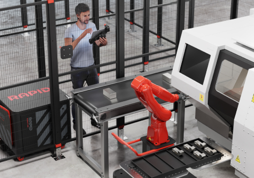
Entrant Company
Card79
Category
Product Design - Robotics

Entrant Company
Pulina Exclusive Interiors
Category
Interior Design - Residential