2023 | Professional

VEOK Luxe Skin Renewal Series
Entrant Company
SONGREEN INTERNATIONAL HOLDING CO. LIMITED
Category
Packaging Design - Beauty & Personal Care
Client's Name
Country / Region
China
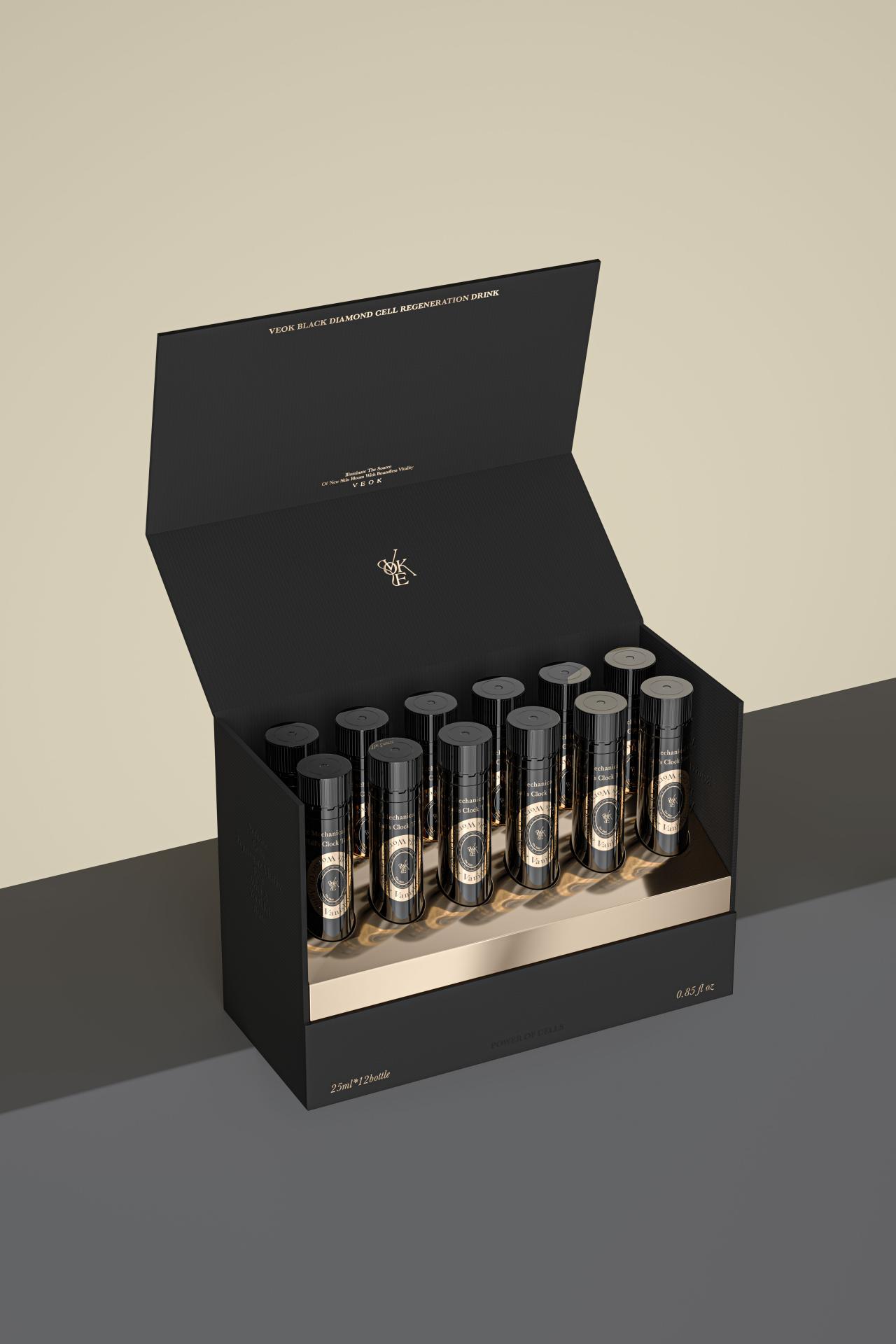
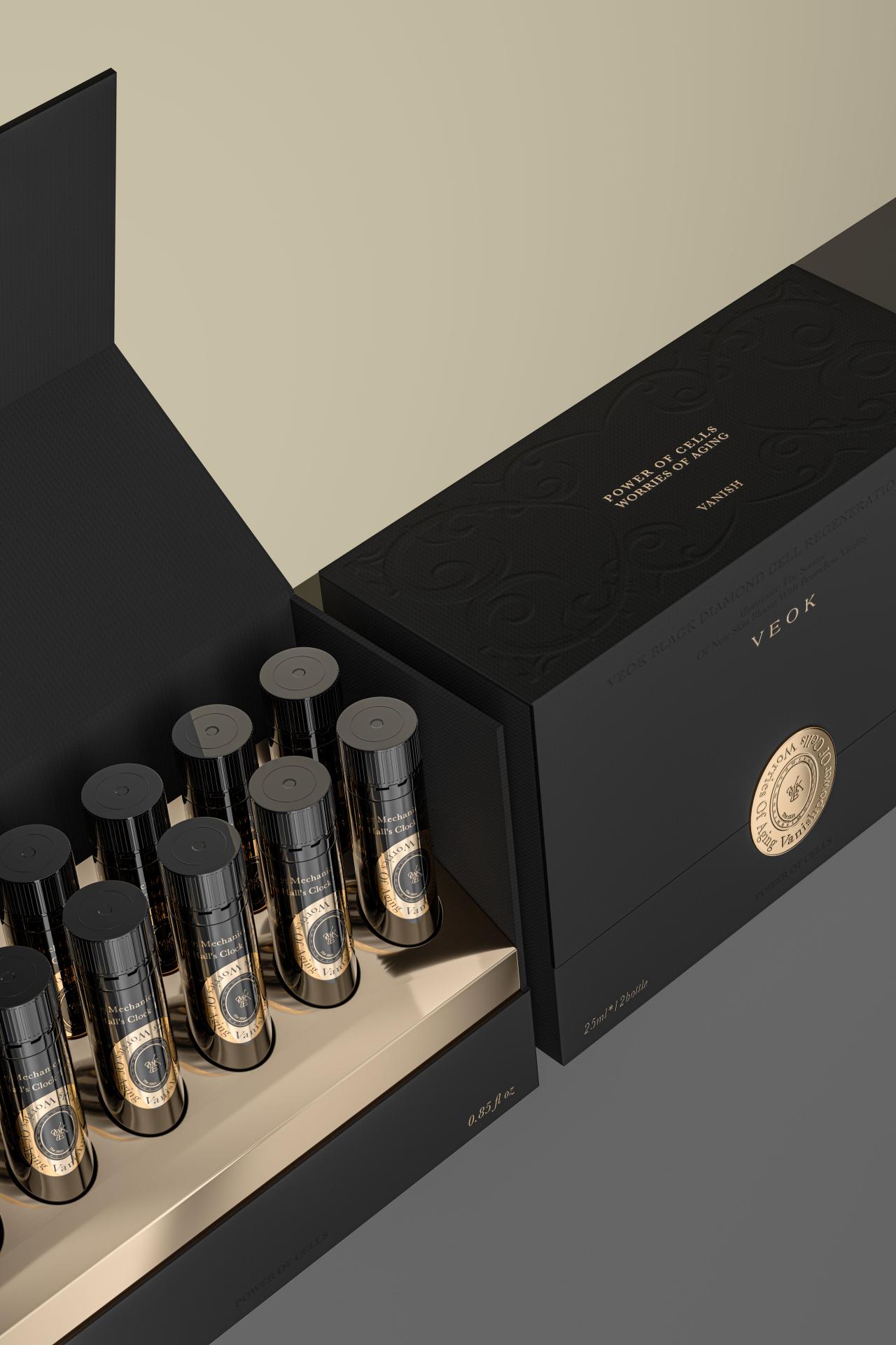
This packaging is specially design for the high-end anti-aging beauty supplement launched by Veok, the exclusive brand used by the German Royal Family. Anchoring on the brand's concept of "defying the passage of time", this packaging design further incorporates the element of Germany's prominent clock to vividly express the efficacy of this product in effectively delaying skin aging, truly embodying the idea of "redefining time".
Drawing inspiration from Germany's famous Glockenspiel — a large clock featuring a daily performance of automated figures, this packaging design positions the Veok logo at the axis of the classical golden clock pattern, which is set against a black background for a sense of added depth. The combo of the Veok logo and the clock pattern serves as a representation of the brand's proficiency in anti-aging. Meanwhile, the color scheme of gold and black exudes the brand's elegant and understated royal essence, while evoking a profound historical ambiance.
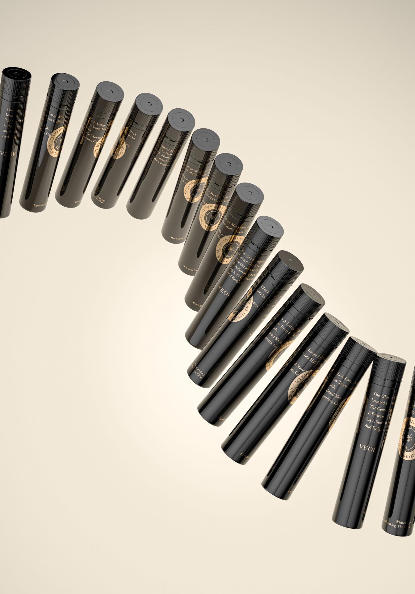
The uncapping design of the bottle also takes inspiration from the classic clock. The cap, graced with a clock outline, securely joins the bottle mouth in a design mimicking the meshing gears of a mechanical clock. Twisting it open can make a sound reminiscent of the clockwork in motion, adding auditory delight to the overall experience. This design transforms the simple act of opening the bottle into a magical moment akin to setting back time.
As for the box design, its opening is graced with a gold-embossed clock pattern, styled after a traditional European wax seal. This not only transforms the product into a timeless gift that transcends time and space but also offers users an intriguing interactive experience. Inspired by the crown once owned by the Grand Countess of Baden in Germany, the box top is exquisitely embossed with laurel branch patterns in the same color of the black background, whose sleek lines and refine texture further provide tactile pleasure for users. This pattern design in a modest aesthetic style effectively reflects the brand's understated royal temperament.


Entrant Company
QRANGE Smart IoT (Hubei) Co., Ltd
Category
Product Design - Baby, Kids & Children Products
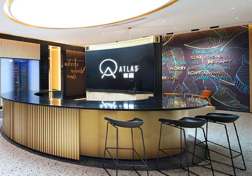
Entrant Company
Maverick Interiors
Category
Interior Design - Office
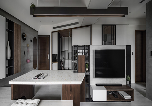
Entrant Company
Mupo Interior Design
Category
Interior Design - Living Spaces
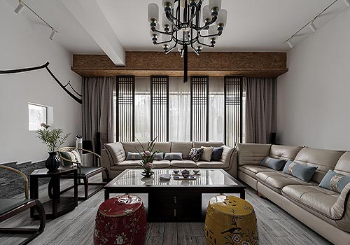
Entrant Company
Suzhou Xinglai Architectural Decoration Design Engineering Co., Ltd.
Category
Interior Design - Living Spaces