2024 | Professional
Suoyirun natural mineral water
Entrant Company
Shenzhen Tigerpan Design Co., Ltd.
Category
Packaging Design - Non-Alcoholic Beverages
Client's Name
Charoen Pokphand Group Co.,Ltd.
Country / Region
China
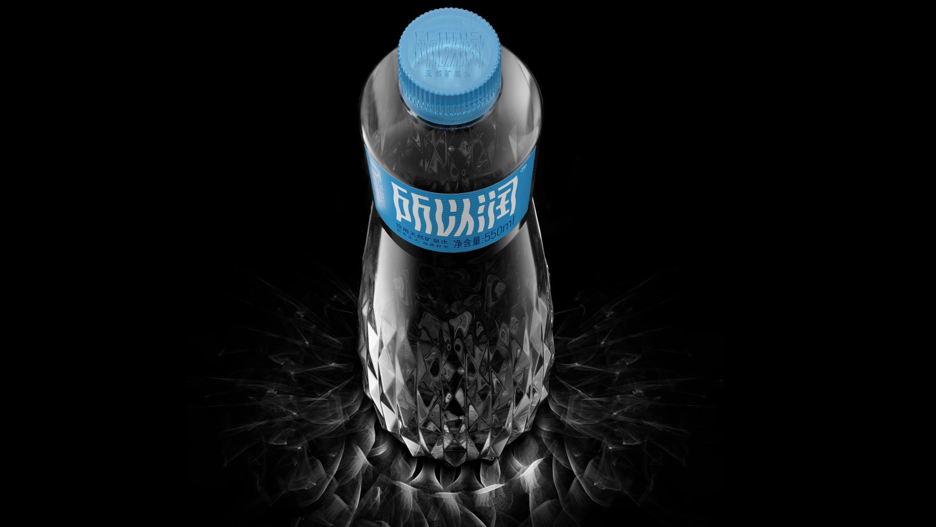
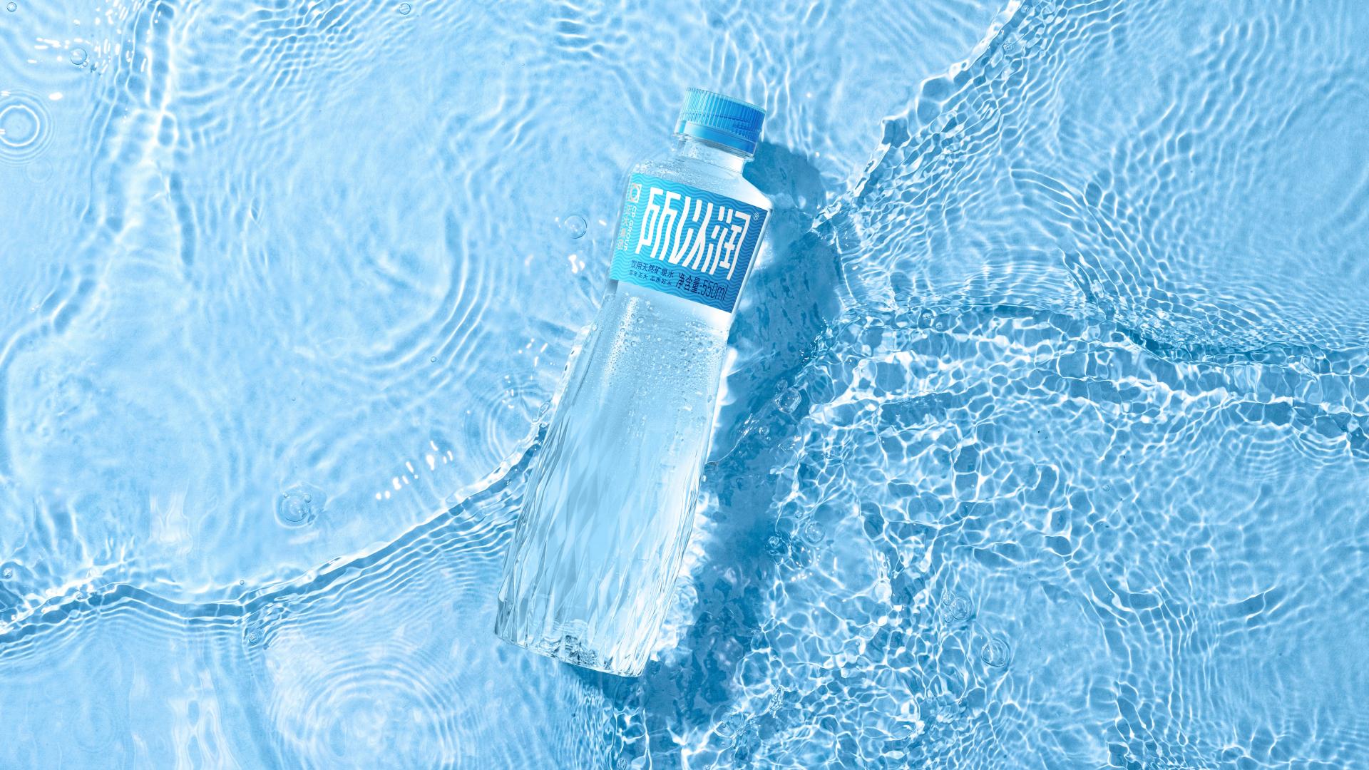
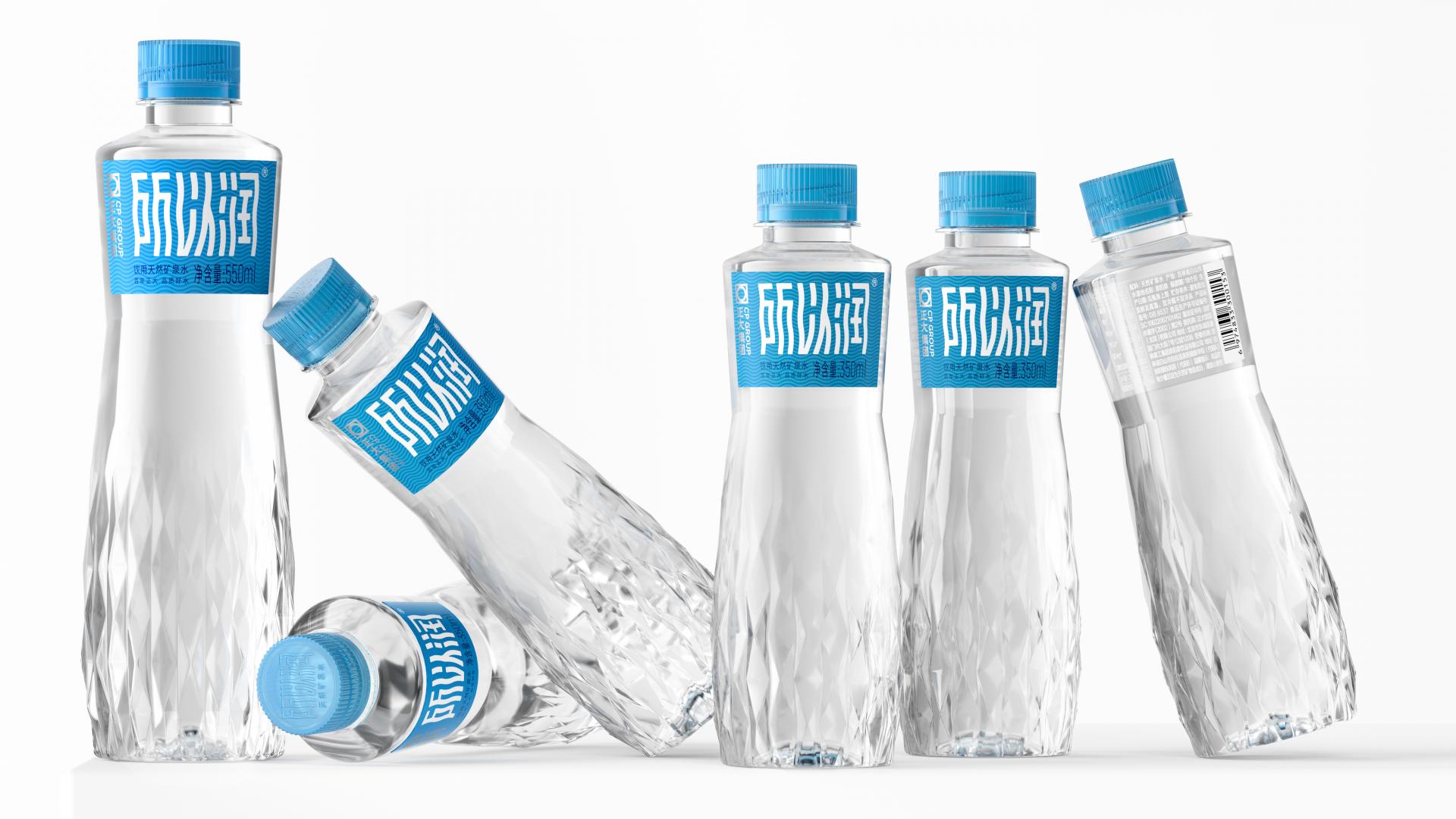
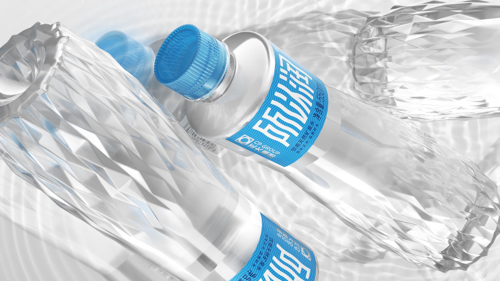
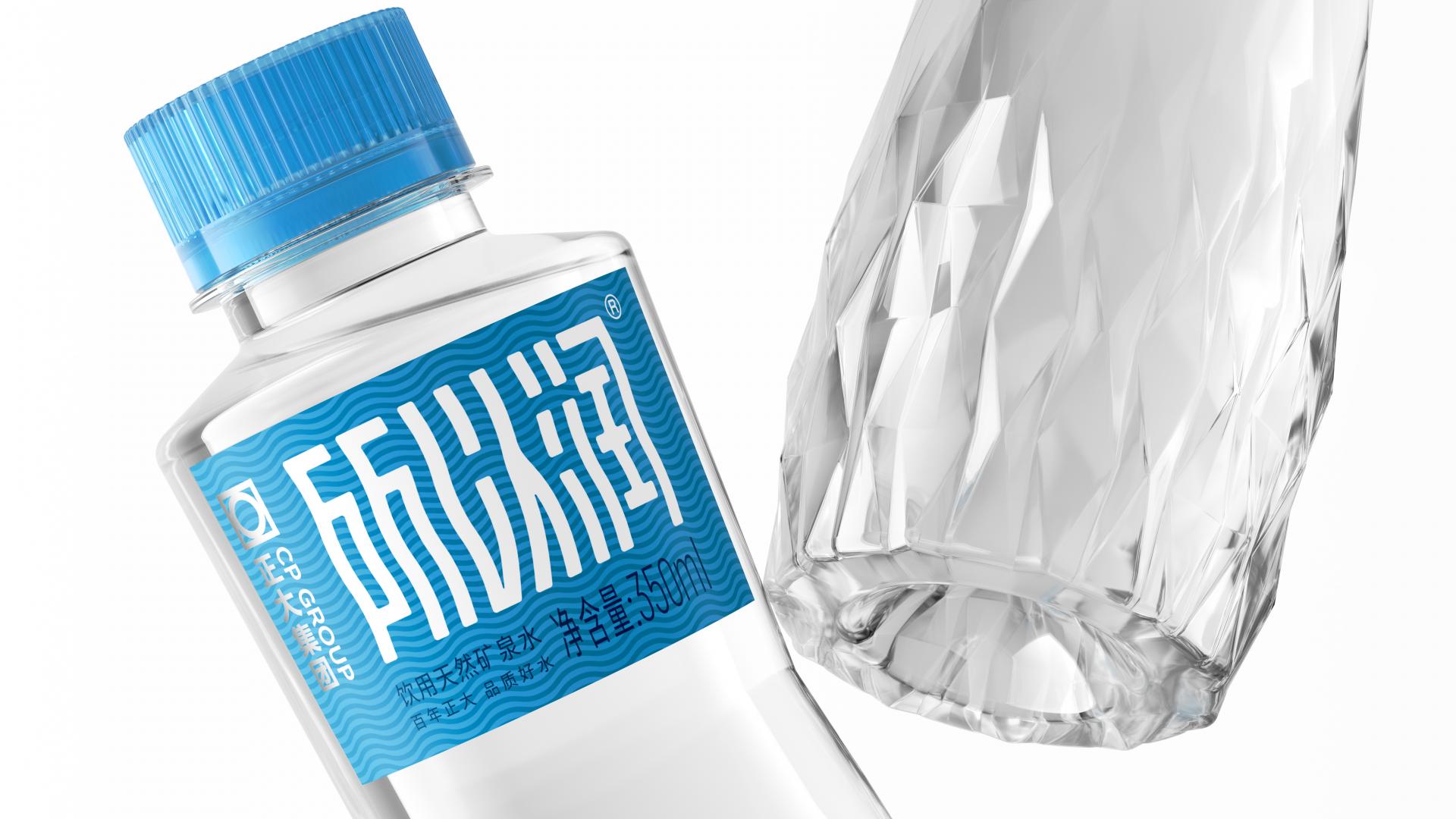
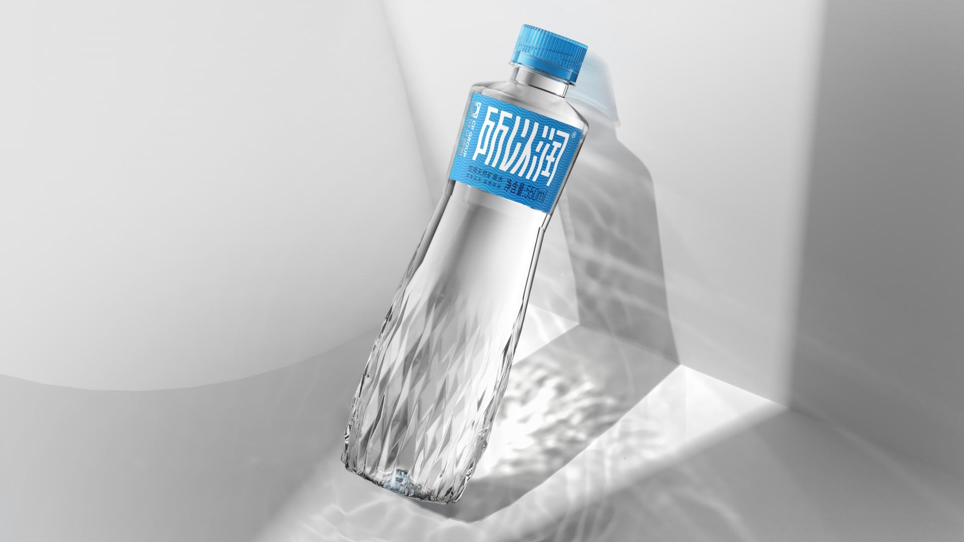
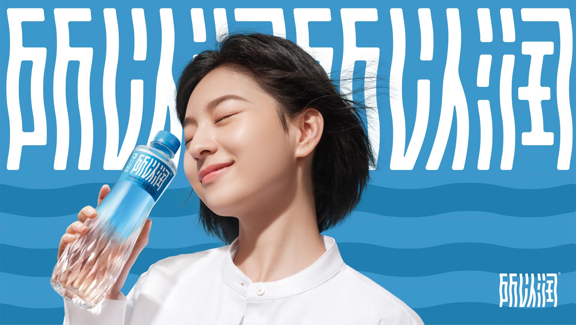
Suoyirun is a natural mineral water brand under the CP GROUP. It comes from Changbai Mountain,a world-class gold water source at 36°-46° north latitude. It is rich in a variety of natural miner als and trace elements. Because the total hardness of water is only 90-120mg/L(the national standard total hardness is less than 150mg/L for soft water). So the water is lubricated. In the face of competition from various existing brands in the market, how to shape differentiation and strengthen the brand's own advantages and communication through branding and packaging is the focus of our project.The bottle design takes inspiration from acoustic flow, the vibrations and ripples that music causes in water. By naturally transitioning from shallow to deep frequencies, we transform the intangible into tangible, creating a new visual experience through refraction between the surfaces of the broken bottle structure. This design showcases a shimmering wave-like form when illuminated by sunlight.The original logo of Suoyirun brand had a font design resembling water ripples, which was visually distinctive and characteristic. However, there were still issues such as the emphasis on form over recognizability and the lack of stability in the letter structure.By retaining the original brand attributes and further enhancing the perception of water ripples, it becomes a unique symbol of the brand. The uniform thickness of the horizontal and vertical strokes of the font, as well as the rounded corners, provide a more balanced structure for the Suoyirun font. This maintains visual familiarity while visually reinforcing the core selling point of the brand's "moisturizing" sensation.The shape of the small waist is more in line with ergonomics.According to the British horticulturalist/architect William Kent,"nature hates straight lines."A natural vitality,forming a structure similar to a"small waist",brings a sense of grace and centripetal to people,gentle but yet powerful.Whether it is a large bottle of 550ml or a small bottle of 350ml boys and girls can hold it more closely.
Credits
Entrant Company
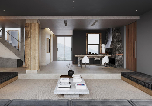
SANS
Category
Interior Design - Residential
Entrant Company
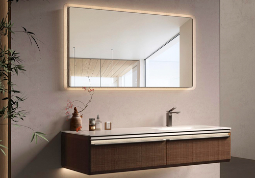
Guangzhou Oppein Sanitary Ware Co., Ltd
Category
Furniture Design - Other Furniture Design

Entrant Company
GUANGDONG VANWARD NEW ELECTRIC Co., Ltd.
Category
Product Design - Other Product Design

Entrant Company
James Hou
Category
Interior Design - Exhibits, Pavilions & Exhibitions