2024 | Professional
Me Magic Elemental Cube
Entrant
S'YOUNG INTERNATIONAL
Category
Packaging Design - Beauty & Personal Care
Client's Name
mesoestetic
Country / Region
China
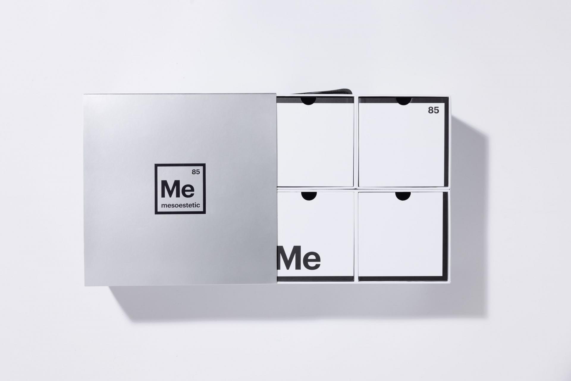
This skin whitening solution gift box integrates ever-changing magic cubes, a symbol of exploratory spirit and strong operability, into packaging design, not only embodying the brand MESOESTETIC’s professionalism and its dedication to unveiling the secrets of beauty, but also suggesting the brand’s ability to offer flexible solutions in the aesthetic medicine sector.
The gift box adopts the brand’s exclusive visual factor — “Me”, an abbreviation of the brand name, and ingeniously places it into one of the four equally sized grids that are delimited based on the proportional division principle of magic cubes, directly and clearly showing the brand information. Besides, the “Me”, presented in a form resembling the periodic table of elements, symbolizes the one and the only element of “beauty”, externalizing the brand’s scientific and rigorous attitude. The number “85” represents the brand’s founding year of 1985. A color scheme of black and white (1:9) highlights the visual focus, guiding consumers’ eyes to the crucial content. The periodic table hidden in the gift box suggests the product’s position as a secret weapon for skin whitening, which can go deep into the skin to realize a powerful and lasting whitening effect.
The square gift box comprising four smaller boxes of equal size, just like a 2×2 magic cube, to ensure visual balance and stability.
As the brand recommends one box per month over a three-month cycle, the gift box includes three boxes of the product and one box of the flavouring, which makes the packaging design perfectly correspond to the product usage, thus striking a balance between functionality and aesthetic pleasure. Moreover, the size of each box is designed according to the content inside to optimize space utilization to the maximum extent.
In terms of material selection, the gift box utilizes a silver sleeve with the stamped black pattern, as well as the matte white mounted paper. The unique white color conveys the brand’s profound understanding of whitening products, while the contrast in color and texture leads to a more layered sense visually.


Credits
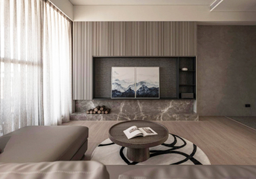
Entrant
WeiDing Design & Juàn Living
Category
Interior Design - Residential
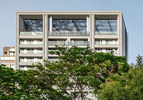
Entrant
Ya-Yuan Design / CT Design / PU Architecture Association
Category
Architectural Design - Residential
Entrant
Shenzhen Yichuang International Design Co., Ltd(深圳壹创国际设计股份有限公司)
Category
Architectural Design - Educational (NEW)

Entrant
OCEAN EURO LIMITED
Category
Interior Design - Service Centers