2024 | Professional
HIGHFLEX Packaging Design
Entrant Company
BYHEALTH Co., Ltd.
Category
Packaging Design - Health & Wellness
Client's Name
BYHEALTH Co., Ltd.
Country / Region
China
HIGHFLEX is a dietary nutritional supplement brand dedicated to the bone and joint health of middle-aged and elderly people.
As the population structure evolves, the new expectations of users have sparked our brand upgrade journey. We are committed to the rejuvenation of the brand, keeping pace with the aesthetics of the times, while maintaining the heritage of the brand tone and deepening the resonance with user experience.
After a decade of accumulation, the blue of the HIGHFLEX brand has become a classic memory. We have retained this deeply rooted blue, choosing a fresher and purer blue as the brand's new color, extending it to the bottle design, which not only strengthens the brand assets but also stands out among the white bottles commonly used by competitors in the market.
The new packaging design has abandoned complexity, showing the product's youthful vitality and professional demeanor with a simple hierarchy, giving the brand a sense of pioneering.
In terms of pattern design, we focus on the technological aesthetics of bones and joints, outlining their form with lines, and combining exquisite illustrations with special processes, which not only enhances the sense of technology and value but also highlights the core functions of the product.
The concept of environmental protection runs through everything. Bottles made of HDPE material, environmentally friendly paper labels treated without film, and printing with environmentally friendly ink, every detail demonstrates our commitment to the sustainable development of the Earth, and has passed the SGS testing certification, ensuring the environmental standards of the materials.
The design of the bottle cap is ingenious, with the industry-leading tri-color cap technology, ensuring excellent sealing performance. The 13mm wide tear ring has been carefully tested 500 times to ensure that women and the elderly can easily tear it open. The crescent-shaped cap edge design fits the natural curve of the thumb, which can be easily pushed open with one hand. The clever connection between the bottle cap and the body avoids the trouble of losing the cap, taking into account both product quality and user experience.


Credits
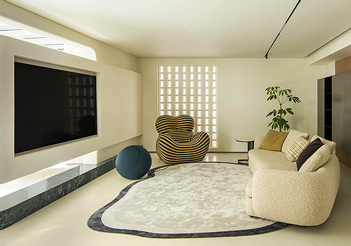
Entrant Company
Qi Space Design Studio
Category
Interior Design - Residential

Entrant Company
Zhaoming
Category
Architectural Design - Other Architectural Design
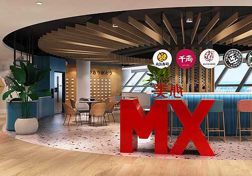
Entrant Company
CHO Associates Pte Ltd
Category
Interior Design - Office
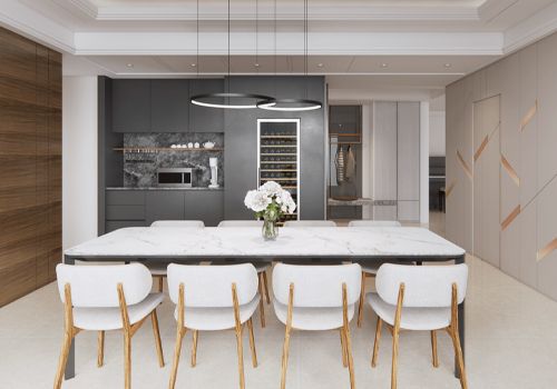
Entrant Company
Iris Lin Space Design
Category
Interior Design - Living Spaces