2024 | Professional

Fish-flavored chili sauce
Entrant Company
Sichuan Wangjiadu Food Co., Ltd.
Category
Packaging Design - Dairy, Spices, Oils, Sauces & Condiments
Client's Name
Country / Region
China
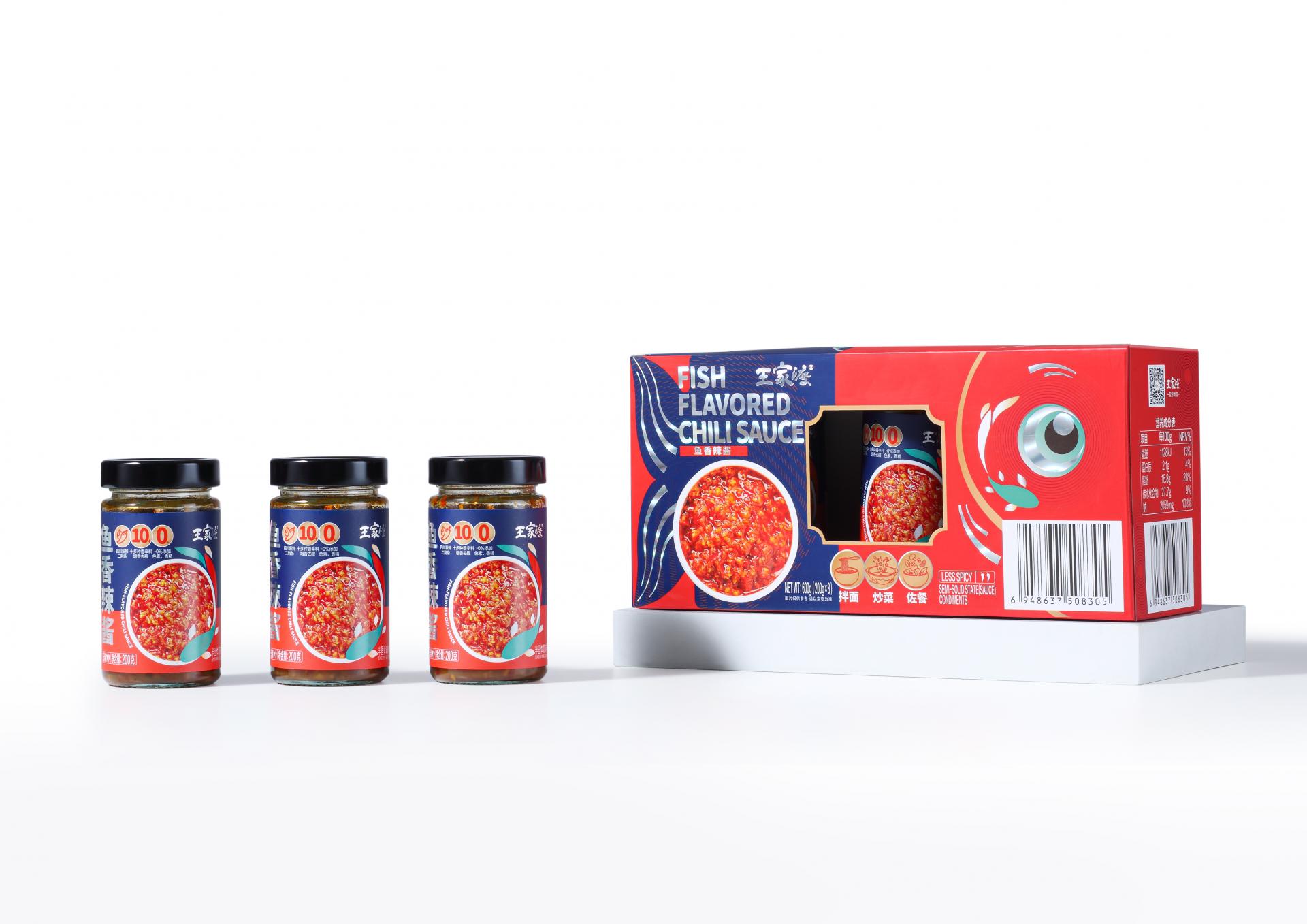
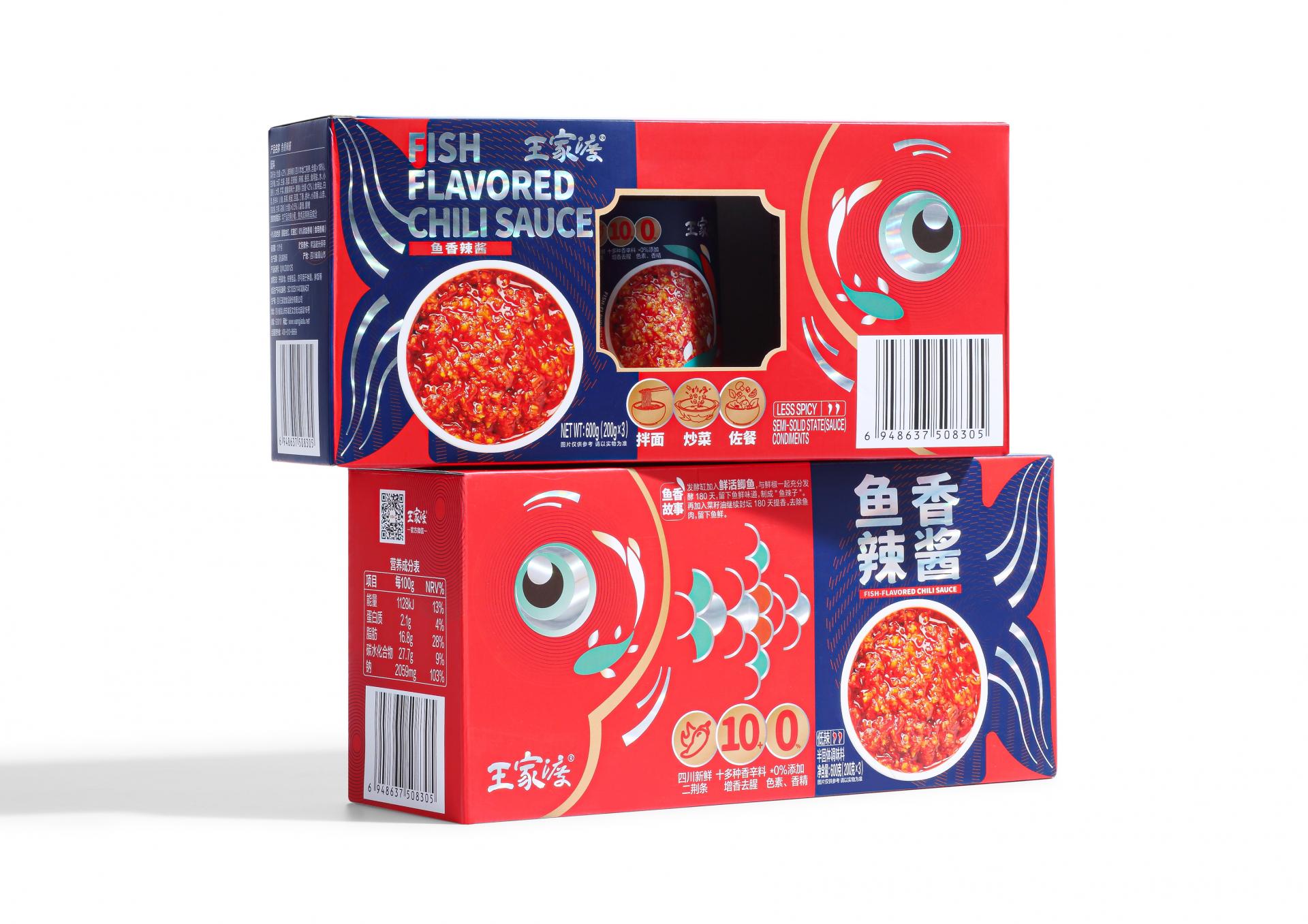
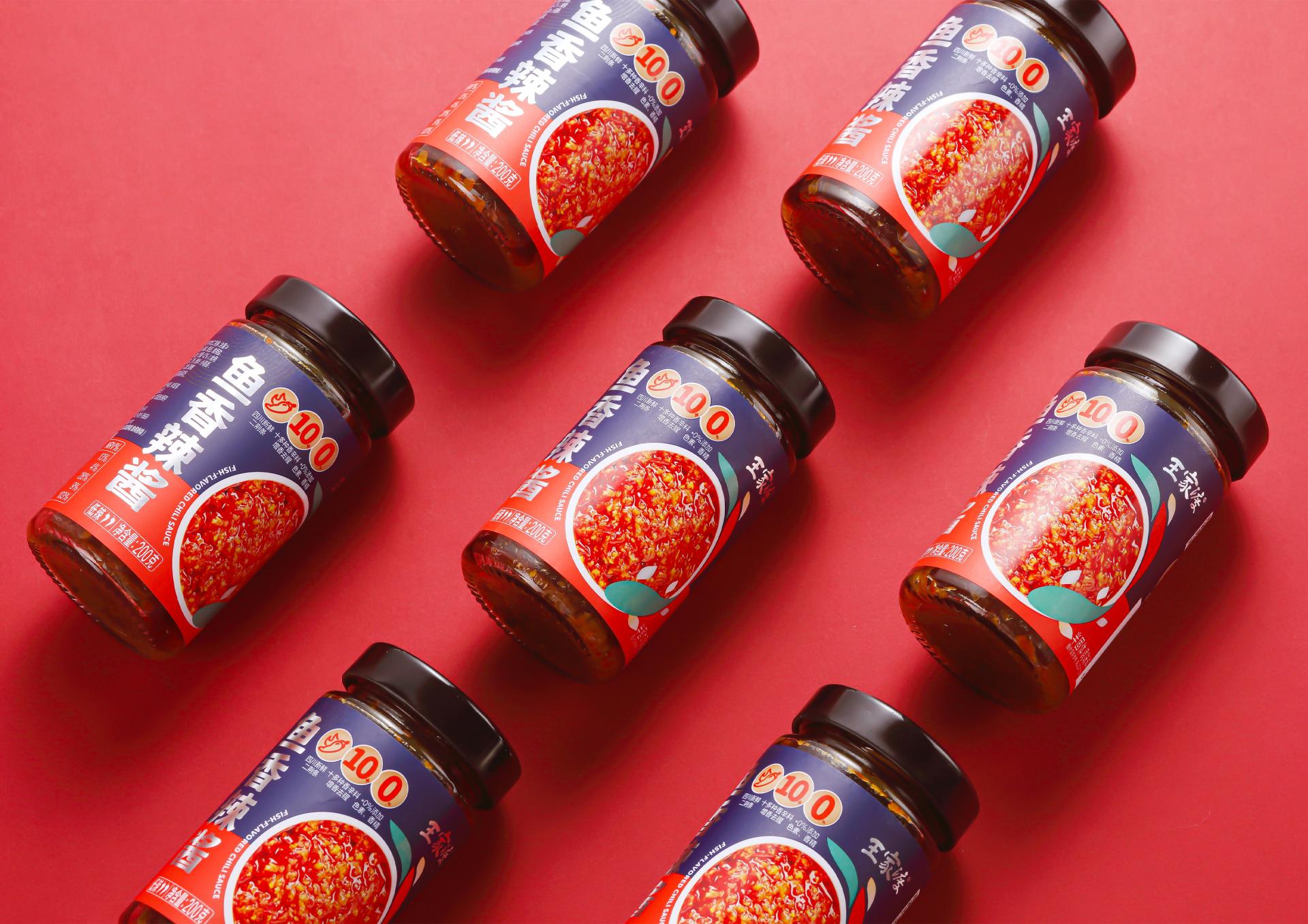
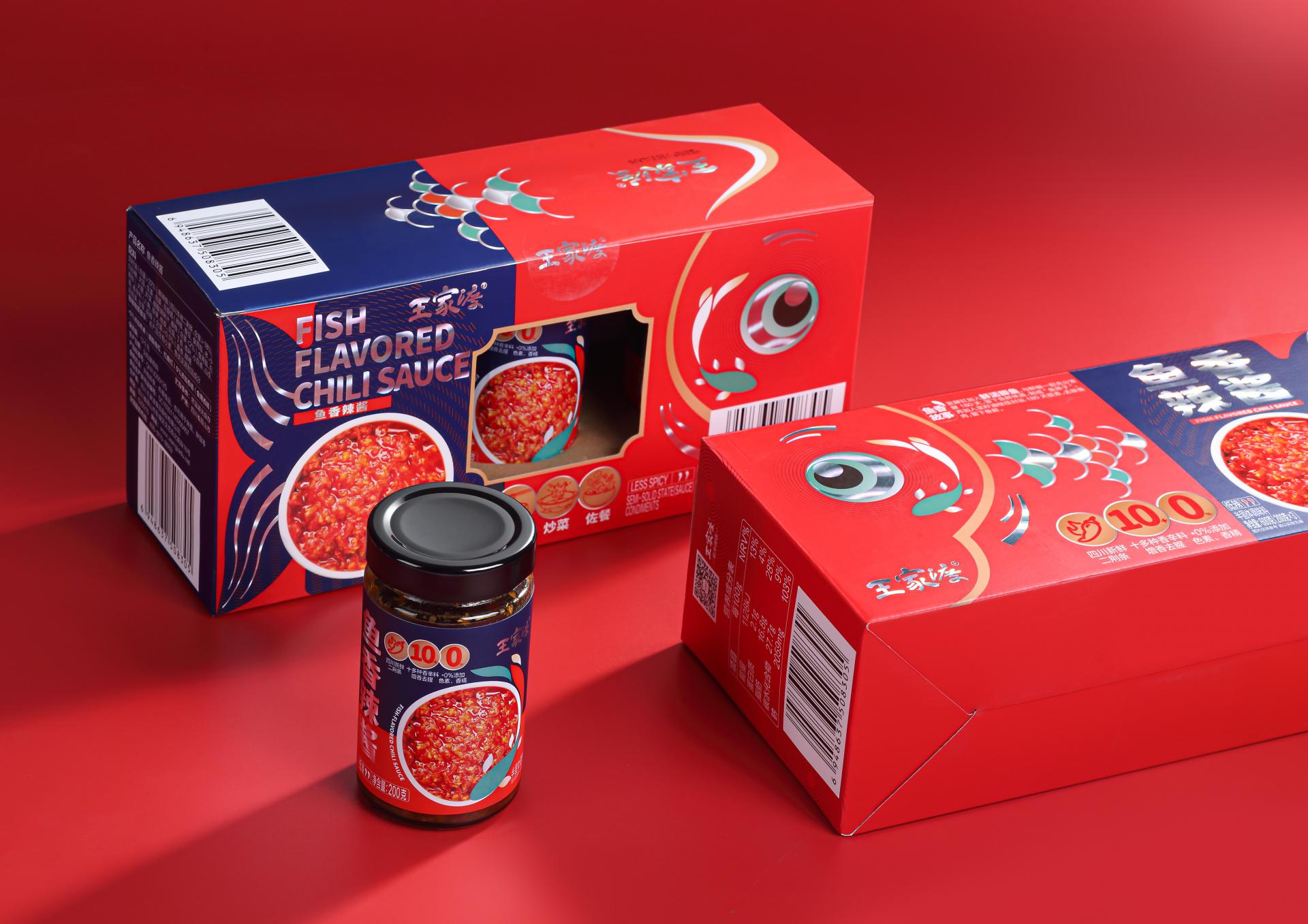
The packaging for this fish-flavored chili sauce takes “fish” as the theme, aiming to visually inform consumers of the product’s flavor. Breaking away from conventional design, it deconstructs and reorganizes the image of fish, creating a lively and creative visual symbol.
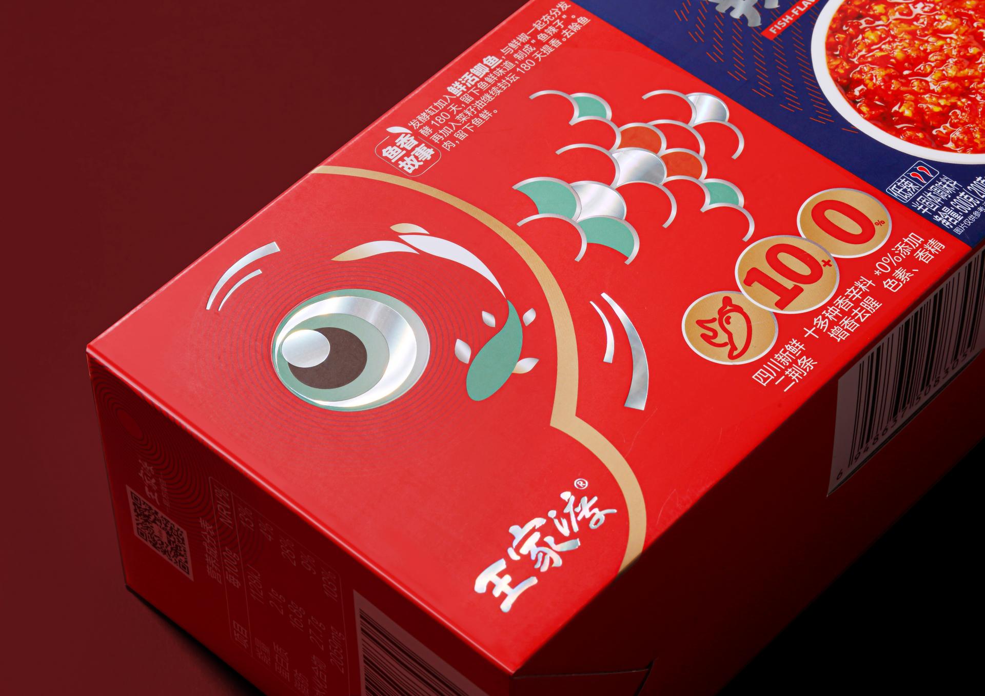
Benefiting from the laser process, the vivid fish eyes, coupled with the shiny fish scales reminiscent of sparkling water, inject the static packaging with a sense of liveliness and dynamism, seeming like the fish swimming freely on the packaging. The product name and the brand name, also using the process, will present dazzling colors under the light, whereby the product displayed on the shelf can effectively attract consumers’ attention.
The packaging incorporates the ripple element, which not only act as an aesthetically pleasing decoration, but also is directly related to the product’s source and production process. The element symbolizes the natural clear water environment where high-quality crucian carp (a raw material of the product) grow, as well as the special breeding pattern of 30-day growth in flowing water, suggesting no antibiotic use from the raw material to the finished product, and highlighting the natural nature and safety of the product.
Credits
Entrant Company
Dr.Tam Art Office Limited
Category
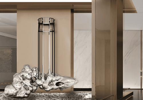
Architectural Design - Public Art & Public Art Installation

Entrant Company
Guangzhou S.P.I Design Co., Ltd.
Category
Landscape Design - Residential Landscape

Entrant Company
ANSAYA PHUKET & designbyPATA
Category
Interior Design - Residential
Entrant Company
GLAMROUS co.,ltd.
Category
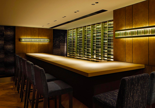
Interior Design - Restaurants & Bars