2024 | Professional
Light Meal Angel
Entrant Company
Beijing Yifeng Innovative Advertising Co., Ltd.
Category
Packaging Design - Other Packaging Design
Client's Name
Country / Region
China
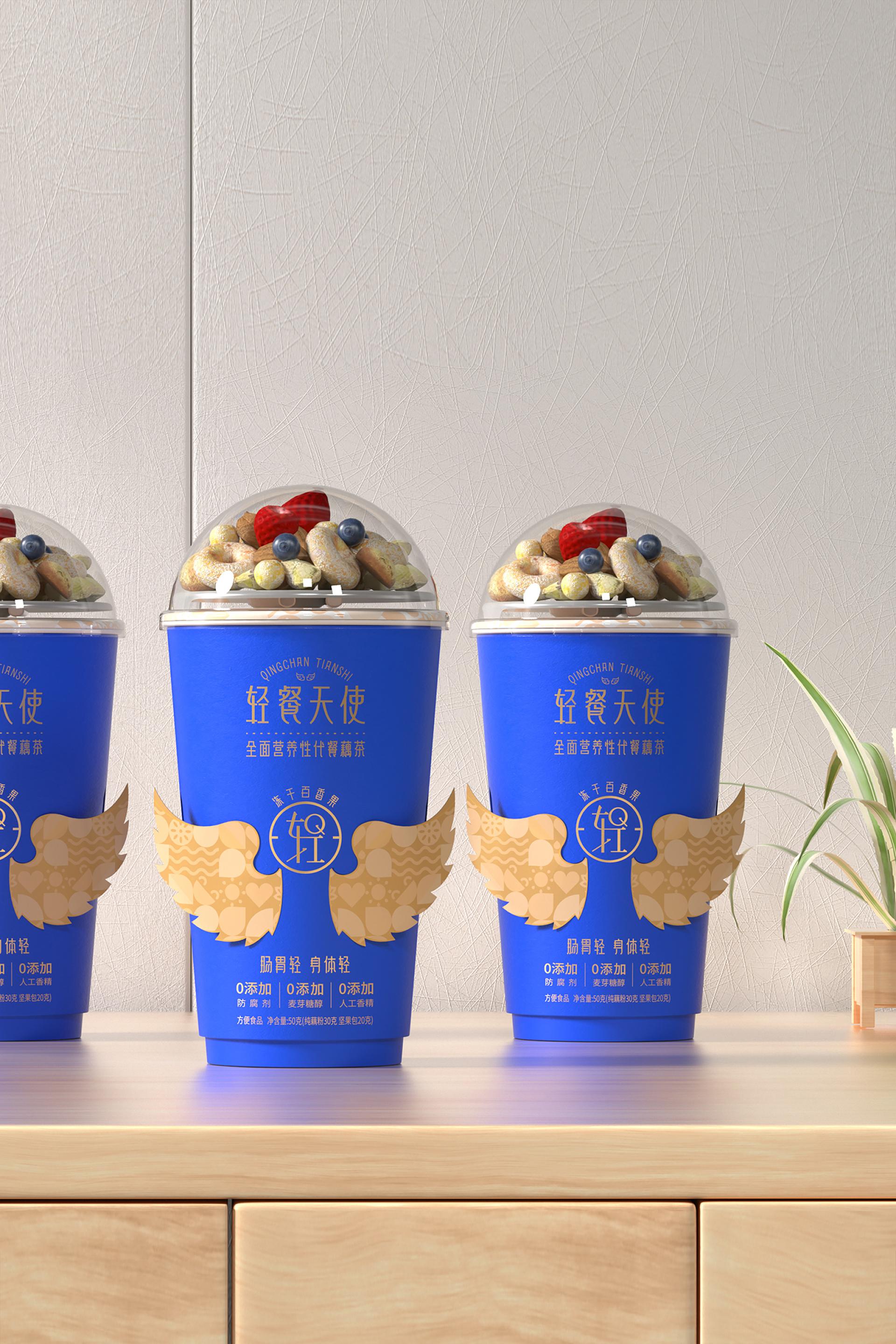
Lotus root powder is a traditional snack in Jiangsu, Zhejiang, and Shanghai regions of China, known for its unique flavor and rich nutrition. It is a nourishing dessert suitable for all ages. However, the usage scenarios of lotus root powder are quite limited; usually, it is marketed mainly as a breakfast or dessert item, and outside the Jiangsu, Zhejiang, and Shanghai areas, there is no habit of consuming lotus root powder, facing limitations in both consumer demographics and usage scenarios. To break away from these traditional constraints and seek new opportunities in a rapidly evolving era, based on the natural stomach-nourishing and lightweight properties of lotus root powder, we aim at the contemporary young people, who are self-styled as "crispy youth" and are already on the path to wellness. Based on the dual needs of young people for light wellness and stomach nourishment, we have found innovative points for the category, positioning the brand as a comprehensive nutritional light meal for stomach nourishment called lotus tea, creating a brand with strong traffic potential. In the minds of young people, angels represent purity and goodness, embodying positive energy on earth, which aligns with the brand tone of West Lake Lotus retail brands. Thus, Light Meal Angel was created. Our packaging inspiration comes from angels, aptly named Light Meal Angel, symbolizing lightness and health, wishing it to awaken the deep love and longing for life in young people. Starting with self-care, particularly gastrointestinal care, we advocate a positive, energetic lifestyle, enabling everyone to embrace every beautiful moment in their best state. The angelic form, akin to a heavenly figure, radiates a soft and dazzling light, with a halo above its head adding a sense of sanctity. We use die-cutting to allow the angel's wings on the packaging to gently unfold, making these wings the most striking symbol of our brand—a super signifier. The main body of the Light Meal Angel packaging is a paper cup, utilizing a die-cutting technique to present the wings in a soaring posture, symbolizing that Light Meal Angel will accompany and protect everyone.


Credits
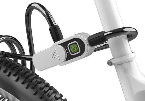
Entrant Company
Zhongshan Elink Smart Technology Co., Ltd.
Category
Product Design - Hardware, Power & Hand Tools
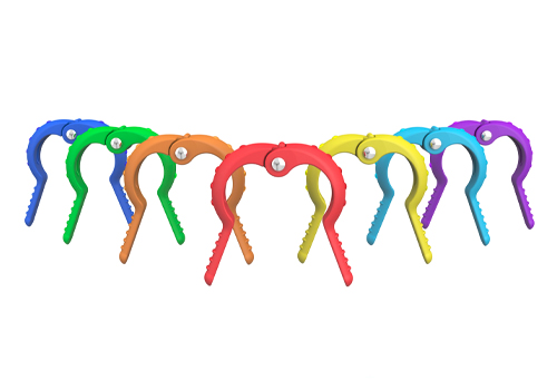
Entrant Company
Galileo (Xiamen) Science and Technology Co.,Ltd
Category
Product Design - Medical Devices
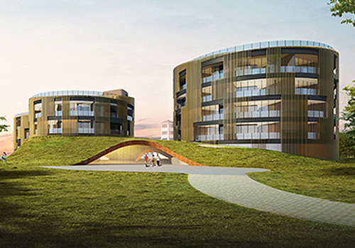
Entrant Company
Shilily Hotel Group
Category
Architectural Design - Conceptual
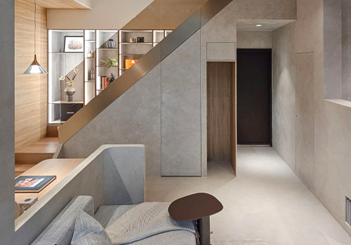
Entrant Company
More Natural & Land
Category
Interior Design - Residential