2020 | Professional
Magtoff Vodka Logo, Bottle and Case
Entrant Company
Phoenix Lifestyle Marketing Group
Category
Packaging Design - Wine, Beer & Liquor
Client's Name
Logan Distribution Company
Country / Region
United States
The Phoenix developed the Brand Essence, Identity, Visual Representation and Go-To-Market Strategy for Magtoff Vodka. This submission comprises the design of the Brand’s logo and packaging (bottle and case).
The Phoenix analyzed the competitive landscape for spirits, focusing on foreign and domestic premium vodkas. Magtoff’s logo, bottle and case designs do not intend to emulate market leaders but quite the opposite. The overall design is contemporary and reflects a cutting-edge brand - one that manufactures its product using the finest ingredients and latest production technologies. The Phoenix incorporated design elements that highlight and elevate the premium nature of the brand, while also providing a distinct look that differentiates Magtoff on and off premise.
The logo incorporates simple, yet refined geometrical shapes to create a brand mark that forms a uniquely-shaped “M” - representing the first initial of the Brand’s name. The logo also leverages the Brand’s rich color palette to convey a masculine, yet refined image. The logotype features custom-designed typography to further enhance Magtoff’s premium look and to reinforce differentiation versus other premium vodkas.
The bottle design takes on a traditional form in order to align with market preferences, while at the same time incorporating several cues that differentiate Magtoff at retail and at nightlife. The design integrates several tactile features, including a frosted top, embossed Magtoff brand mark and logotype as well as dimensionalized geometric facets in the base. The bottle features a high-end decanter stopper that further demonstrates the premium nature of the brand. A summary of Magtoff’s Brand Story is featured on the back of the bottle: rich in heritage, relentless pursuit of excellence and the desire to create the smoothest, highest-quality premium vodka.
The use of a full-color print on the case allows for the incorporation of the Brand logo and the rich, deep blues of the brand palette. The design includes spot UV treatment to add depth and contrast through varying levels of sheen and texture. This treatment contrasts the dimensionalized geometric logo pattern with the smooth white space and further demonstrates the Brand’s premium nature.


Credits
Entrant Company
PTang Studio Limited
Category
Interior Design - Showroom / Exhibit
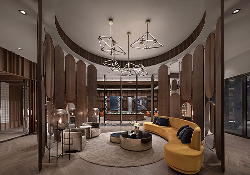
Entrant Company
Shenzhen Fanst Design Co.,Ltd
Category
Interior Design - Commercial
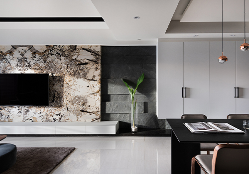
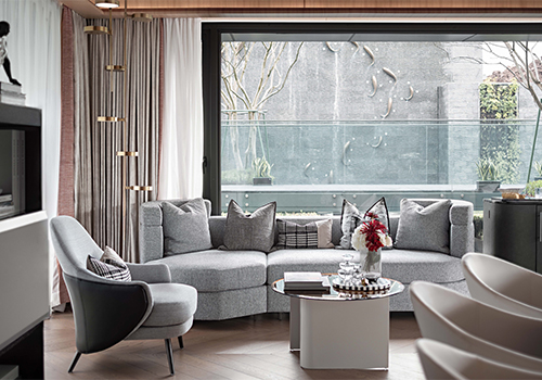
Entrant Company
AEXB INTERIOR DESIGN
Category
Interior Design - Residential
Entrant Company
SLA designers
Category
Lighting Design - Art (Interior & Exterior Lighting)