2025 | Professional
HUG’S GIFT- Pet Nutrition Supplement Series
Entrant Company
Shandong Baobao Biotechnology Co., Ltd.
Category
Packaging Design - Retail
Client's Name
Shandong Baobao Biotechnology Co., Ltd.
Country / Region
China
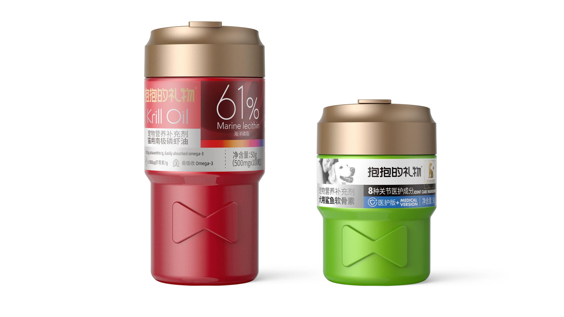
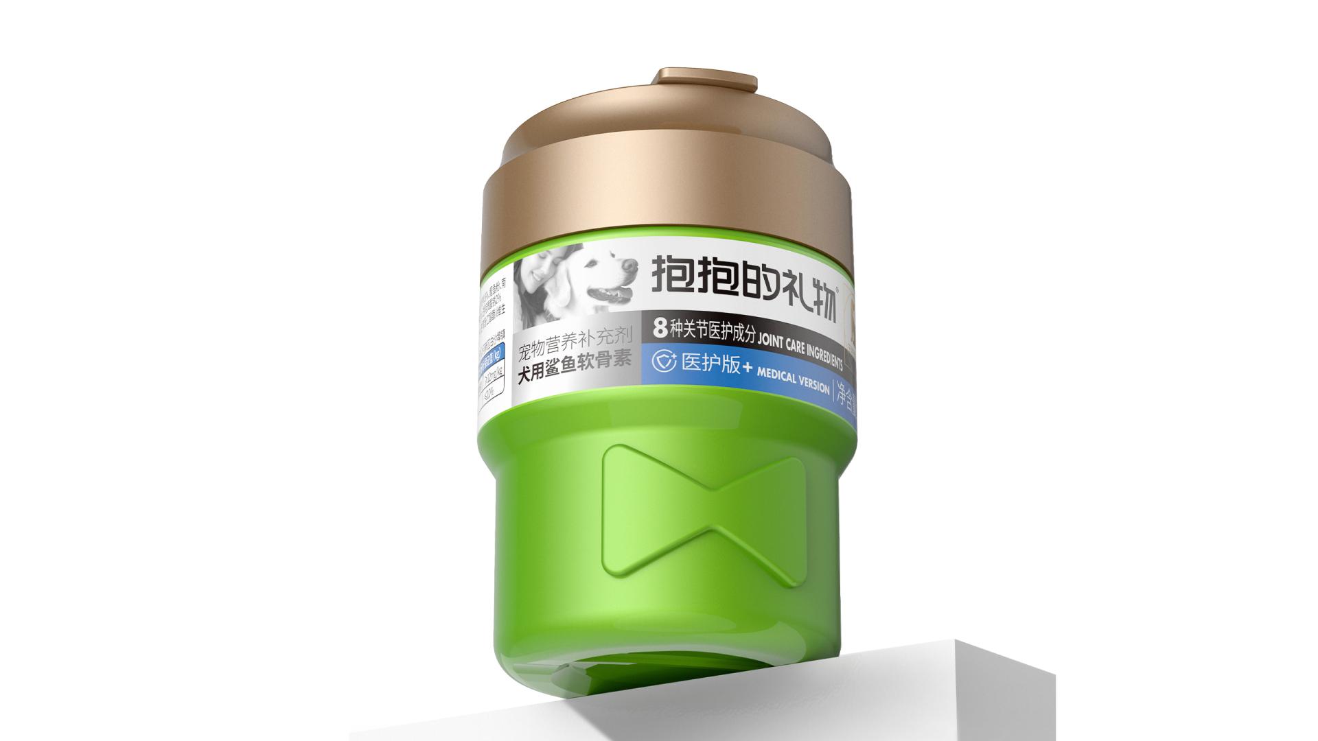
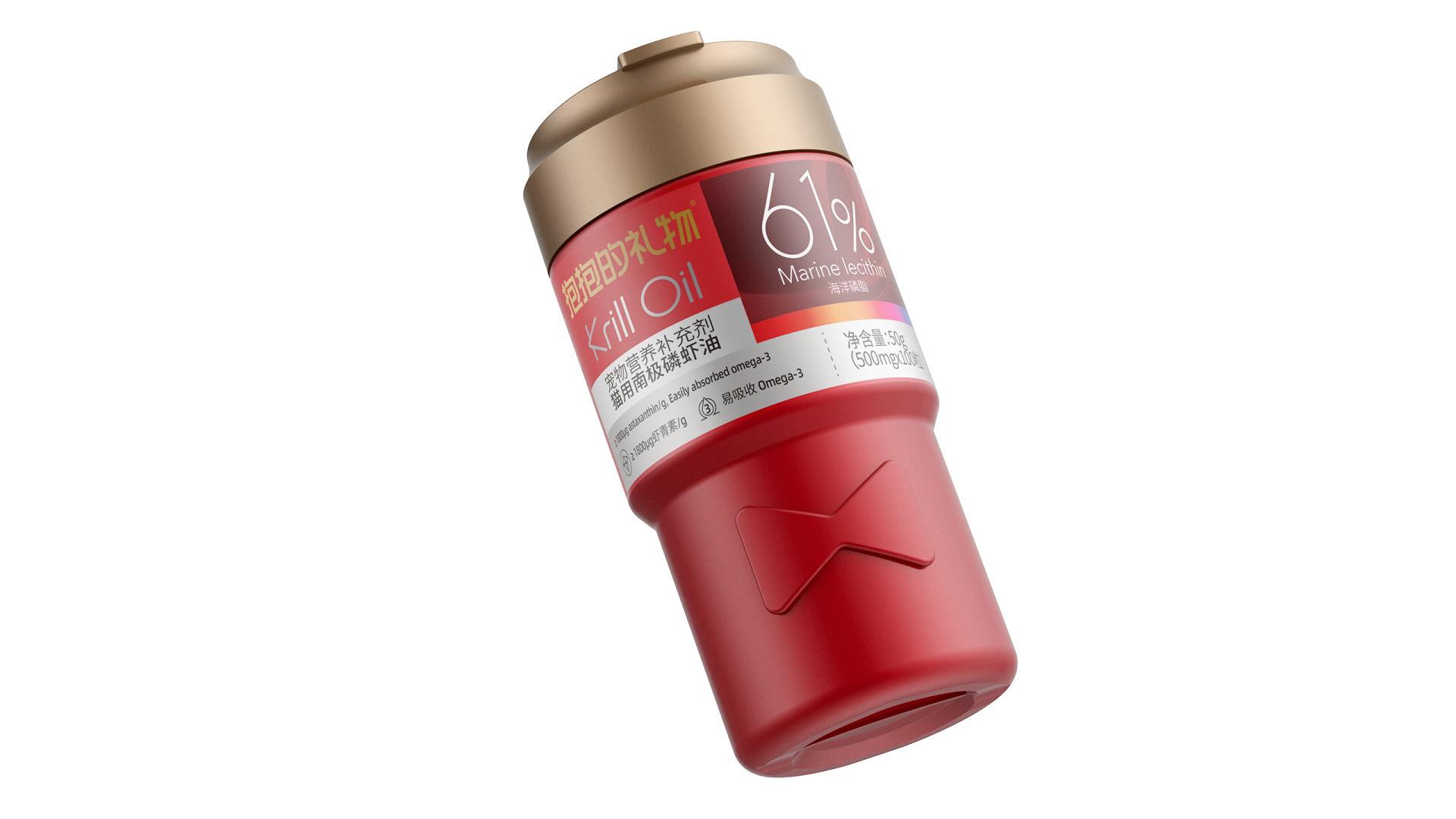
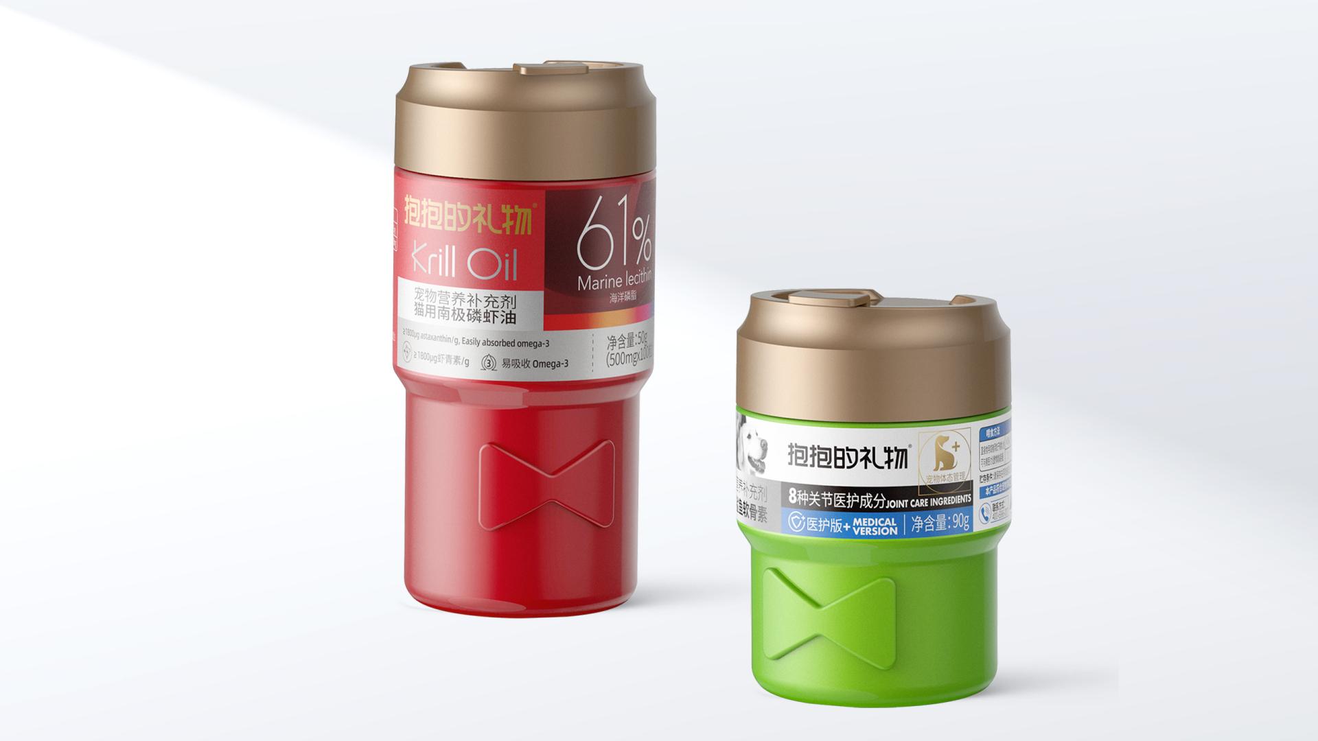
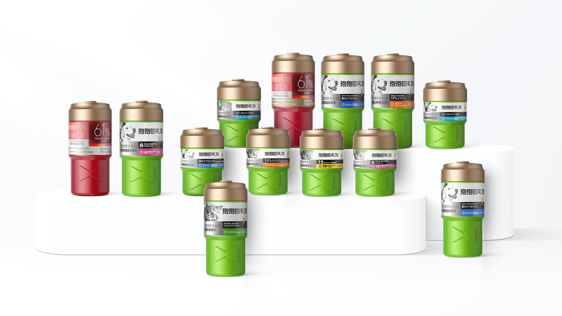
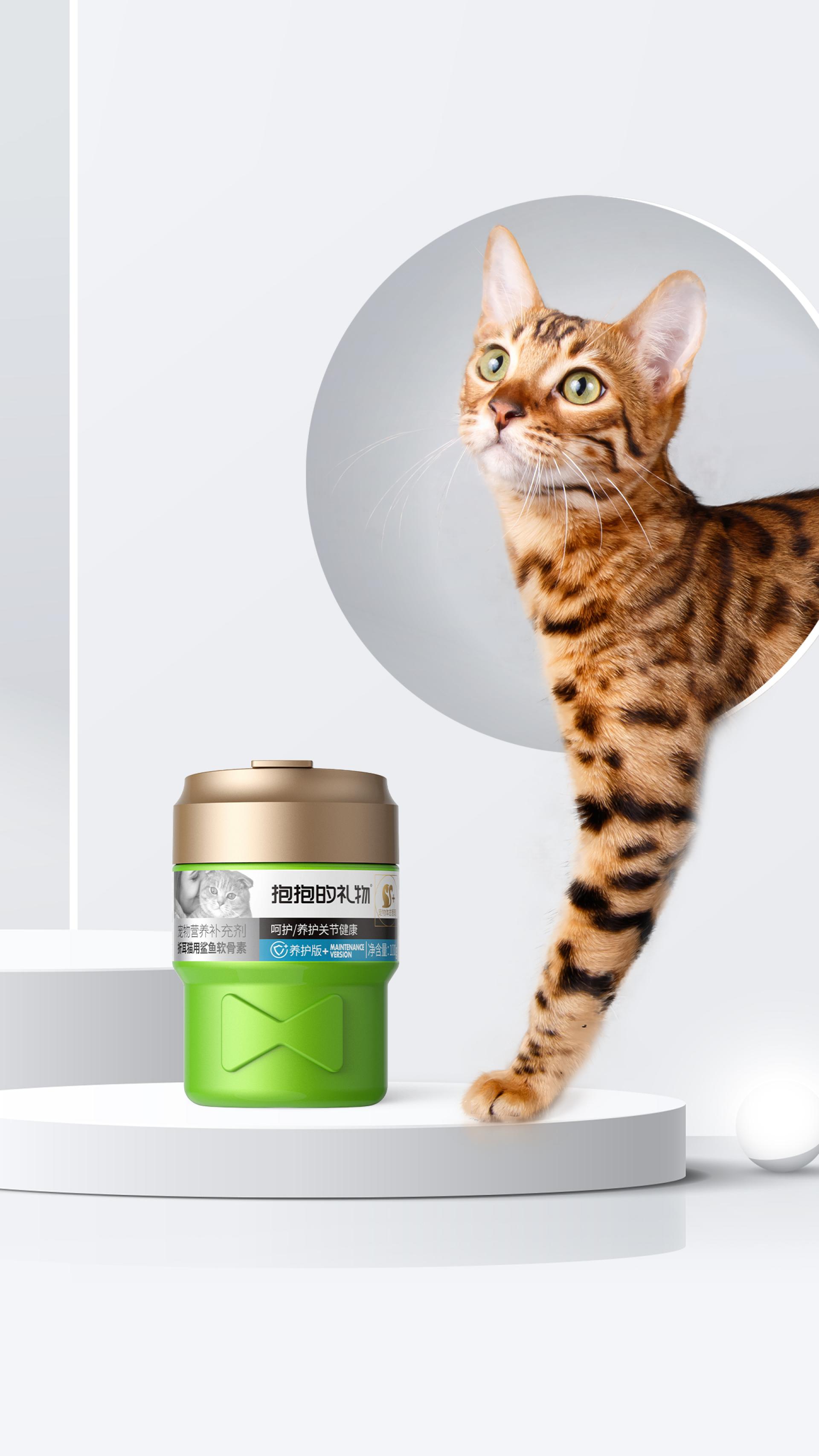
The packaging is tailored for a series of pet nutritional supplements, which aims to build a strong emotional bond with users while emphasizing the product’s functionality.
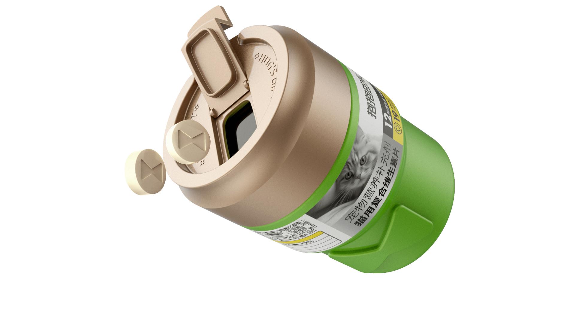
It features the brand’s signature bow motif, boosting brand recognition and giving a friendly, adorable visual effect. Such a design, by leveraging the traditional association of bows with gifts, also evokes gift-giving imagery and symbolizes the product as a gesture of affection from the owner to the dear pet. This adds a ceremonial aspect to pet feeding, enhancing the experience with warmth and care. Furthermore, the supplement tablets boast bow embossing to echo the packaging, creating a unified design language. This not only highlights the product positioned as a gift and adds a touch of elegance, but also deeply ingrains the brand’s unique image and philosophy in the minds of consumers.
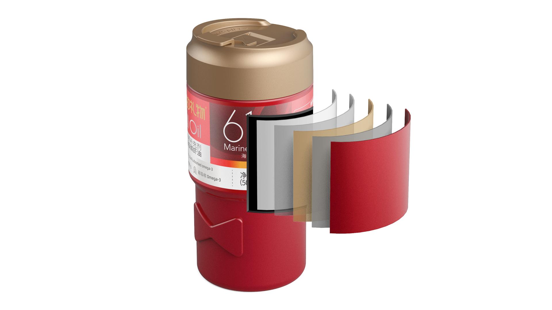
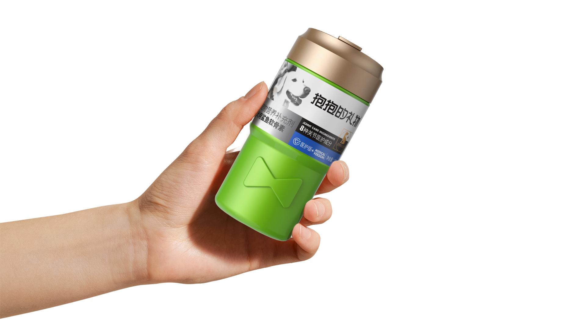
The packaging utilizes multi-layer co-extrusion technology and innovative materials to construct a five-layer barrier structure that protects against oxygen and moisture, ensuring the supplement’s quality. The cap has a mini-flip-top design for precise dispensing of tablets peruse, reducing unnecessary hand contact with the tablets and preventing cross-contamination. The ergonomic bottle, wider at the top and narrower at the bottom, offers a comfortable and stable grip. Thanks to the rectangular layout, all information is clear and easy to read. Additionally, red and green are adopted as main colors, with the former symbolizing vitality and care while the latter representing health and safety.
Credits

Entrant Company
2 Way+ Interior Design
Category
Interior Design - Residential
Entrant Company
LUSTRE lighting solutions
Category
Lighting Design - Mood Lighting

Entrant Company
Northeastern University
Category
Product Design - Heavy Machinery
Entrant Company
Leiman Interior Design INC.
Category
Interior Design - Lounge Area (NEW)