2025 | Professional
Frylo Fryums
Entrant
De Icebreaker
Category
Packaging Design - Snacks, Confectionary & Desserts
Client's Name
La Gajjar Consumer Products LLP
Country / Region
India
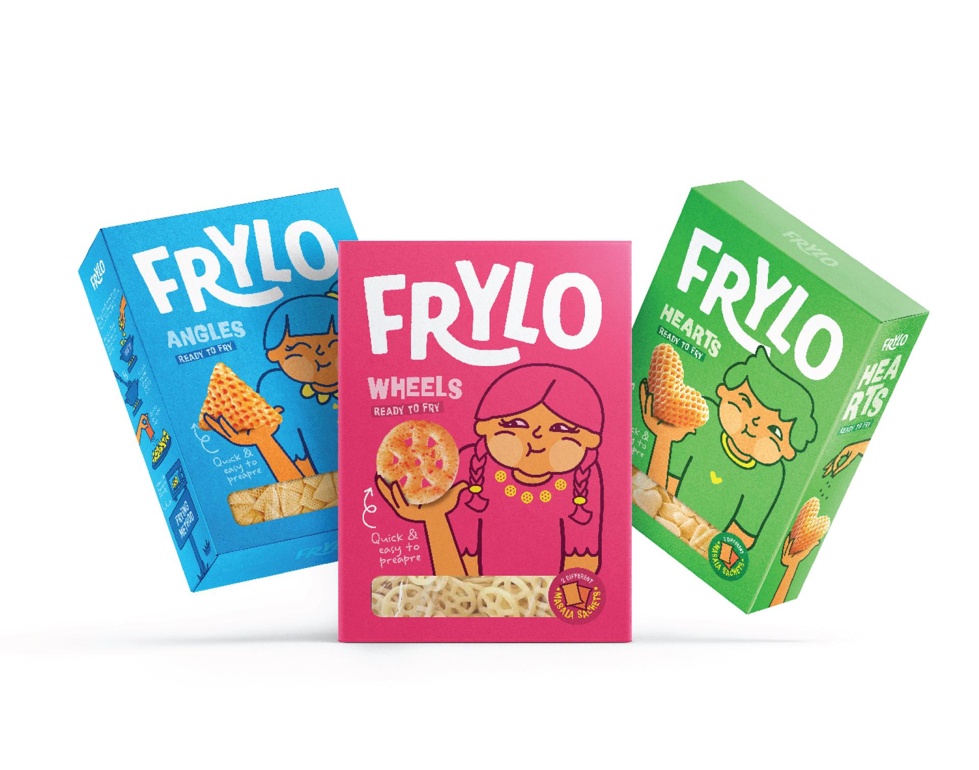
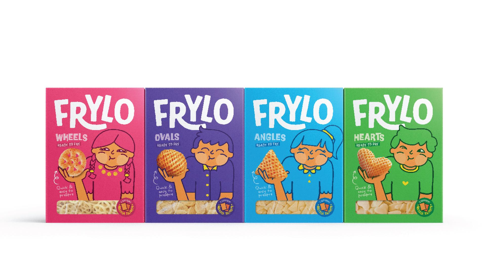
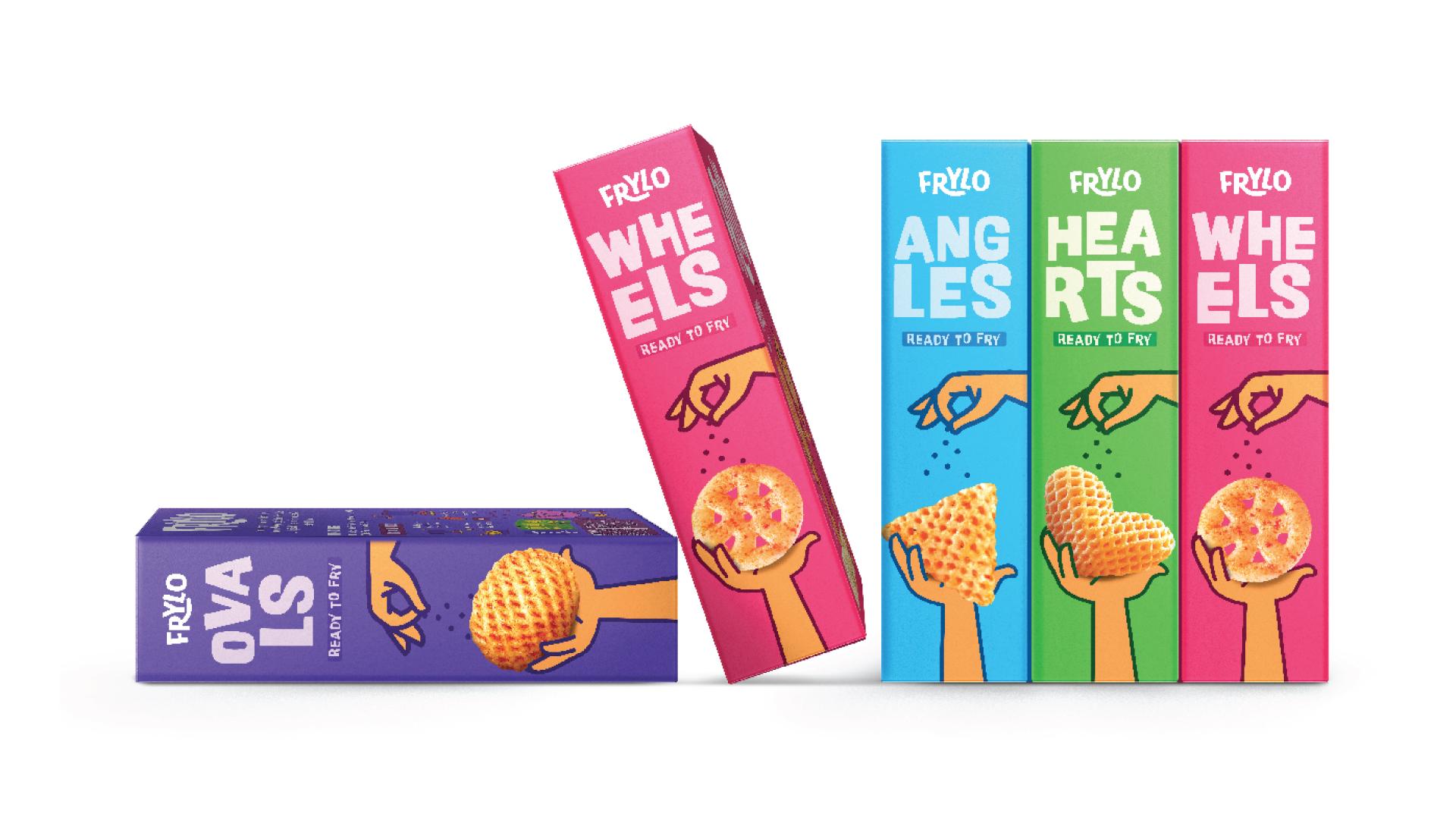
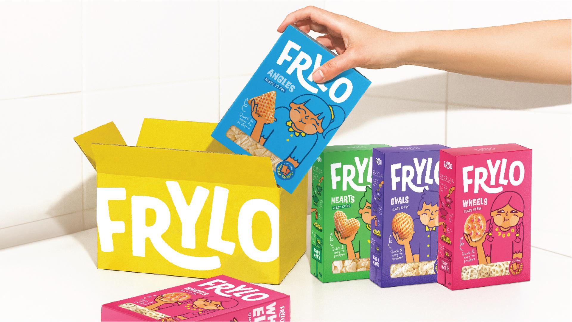
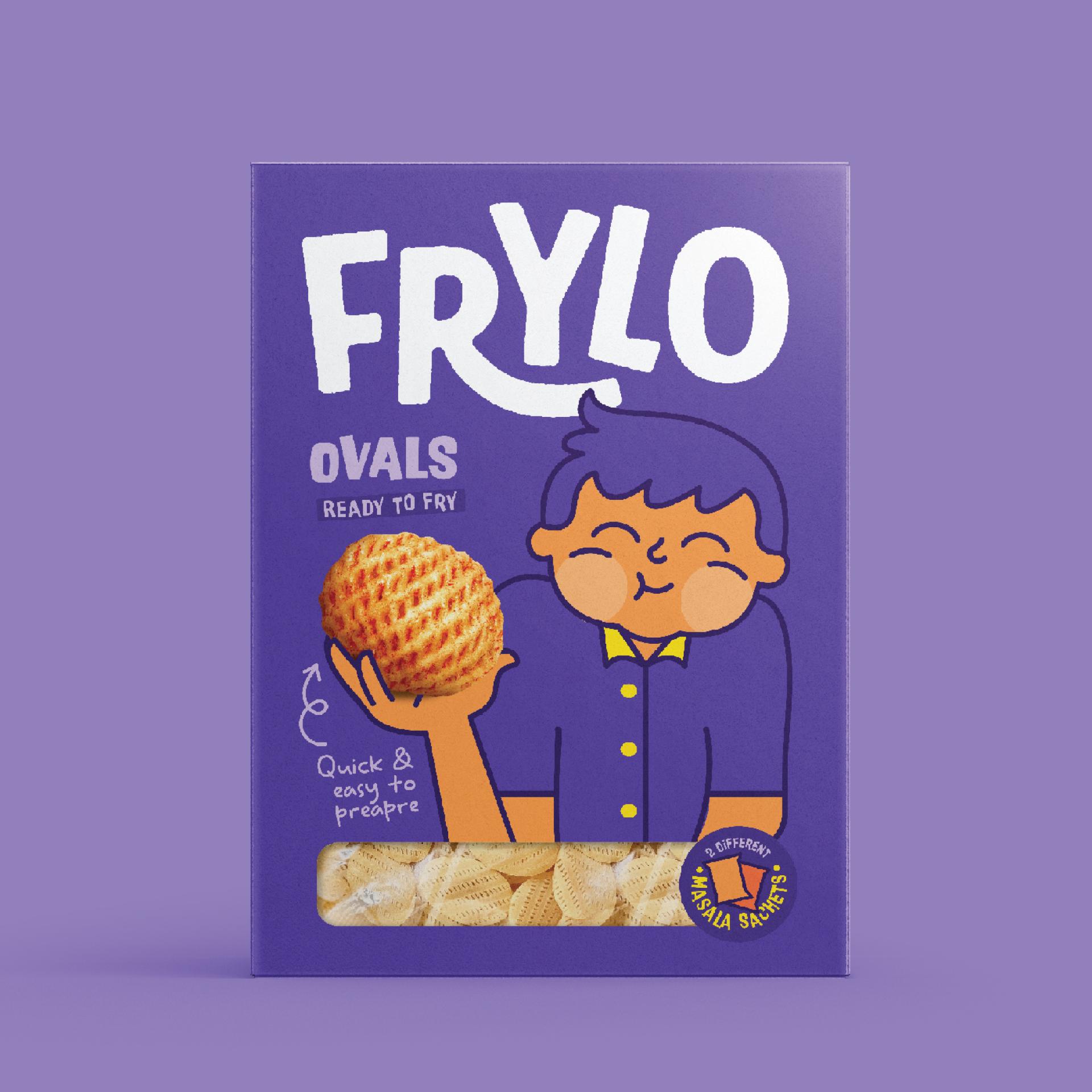
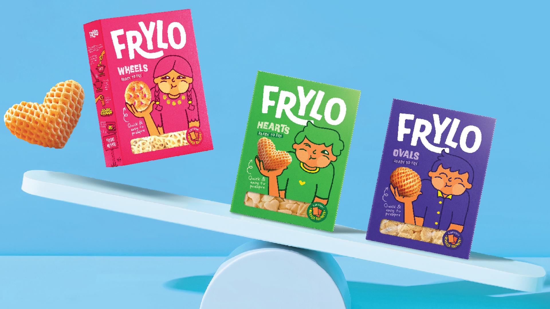
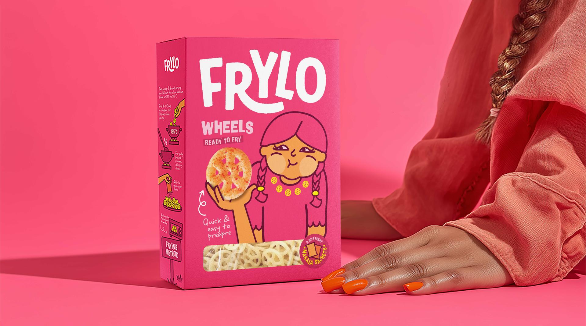
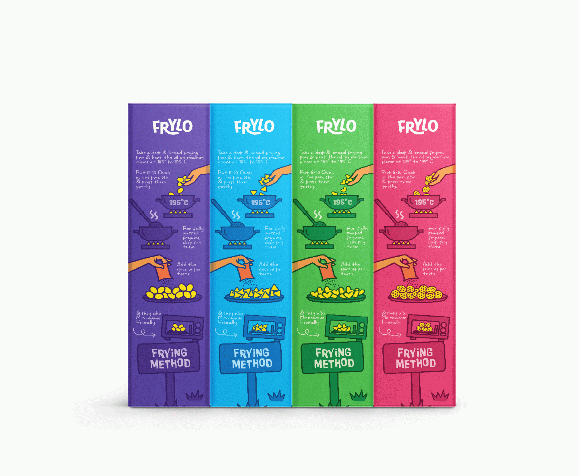
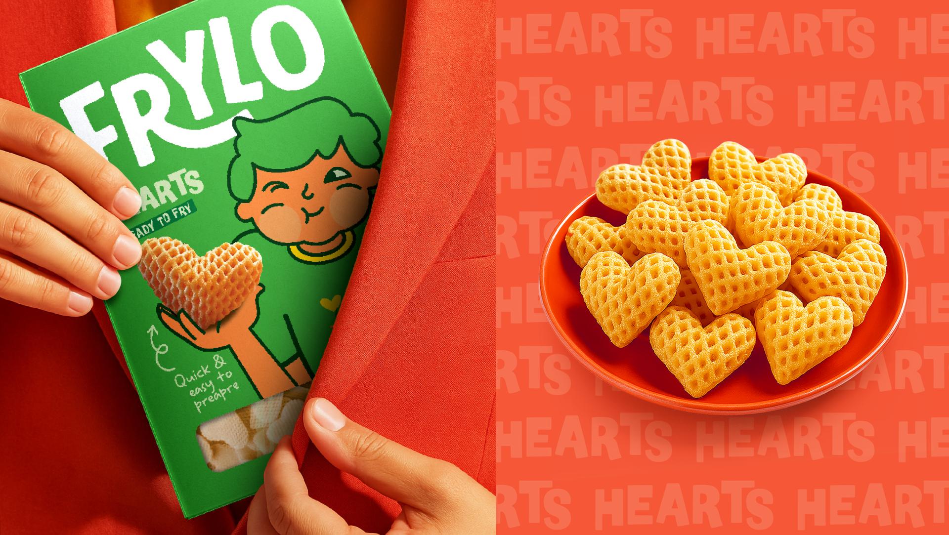
The heart of Frylo Fryums’ packaging strategy lies in capturing a universal snacking truth: when you find a snack that’s irresistible, you don’t stop at just one piece you go for a mouthful. That moment, when crunchy shapes burst with flavour and joy takes over, is innocent, indulgent, and utterly binge worthy. It’s a sensory explosion, the crisp crackle of the first bite, the warm hit of seasoning, and the soft, almost childlike smile that follows without you even realising. We wanted the packs to evoke that exact feeling at first glance. The illustrated characters are not mascots for the brand they’re stand ins for every snacker in that blissful instant. Their eyes close, cheeks full, and smiles widen in pure satisfaction, visually mirroring the user’s own experience. Each variant introduces a new character with a distinct personality, linked by a shared moment of playful indulgence. To root the design in both nostalgia and modernity, we chose bold, saturated colours that signal flavour and joy, contrasted with clean white typography for instant legibility. Transparent product windows were placed to give a tempting preview of the fryums inside, bridging trust and appetite appeal. The character illustrations extend beyond decorative value; they act as visual storytelling anchors, making the packs feel alive on shelf. The result is a packaging system that speaks directly to impulse, joy, and familiarity. It makes the consumer feel seen, reminding them that Frylo is not just something you eat, but something you get obsessed with, share with friends, and return to again and again. By embedding this “mouthful moment” into every variant through consistent character styling and vibrant backgrounds, Frylo becomes more than a snack brand, it becomes a trigger for happy, flavour packed memories. In an aisle crowded with snack brands fighting for attention, Frylo stands apart not by shouting louder, but by smiling wider, offering a design language that is as binge worthy as the product itself. This is packaging that doesn’t just hold a snack; it holds a feeling consumers will want to relive every time they pick up the pack.

Credits
Entrant
Chen Yu interior decoration Ltd.
Category
Interior Design - Beauty Salon
Entrant
GS Caltex, Favorite Medium, and GS ITM
Category
Product Design - UX / UI / IxD (NEW)

Entrant
Savannah college of art and design
Category
Product Design - Lifestyle

Entrant
Mengniu Guanyi Yogurt Zao 8 Tonton
Category
Packaging Design - Dairy, Spices, Oils, Sauces & Condiments