2025 | Professional

Pacific Tuna Sausage (Black Pepper Flavor)
Entrant Company
Sheng'an Kunhe (Beijing) Trading Co., Ltd.
Category
Packaging Design - Snacks, Confectionary & Desserts
Client's Name
Country / Region
China
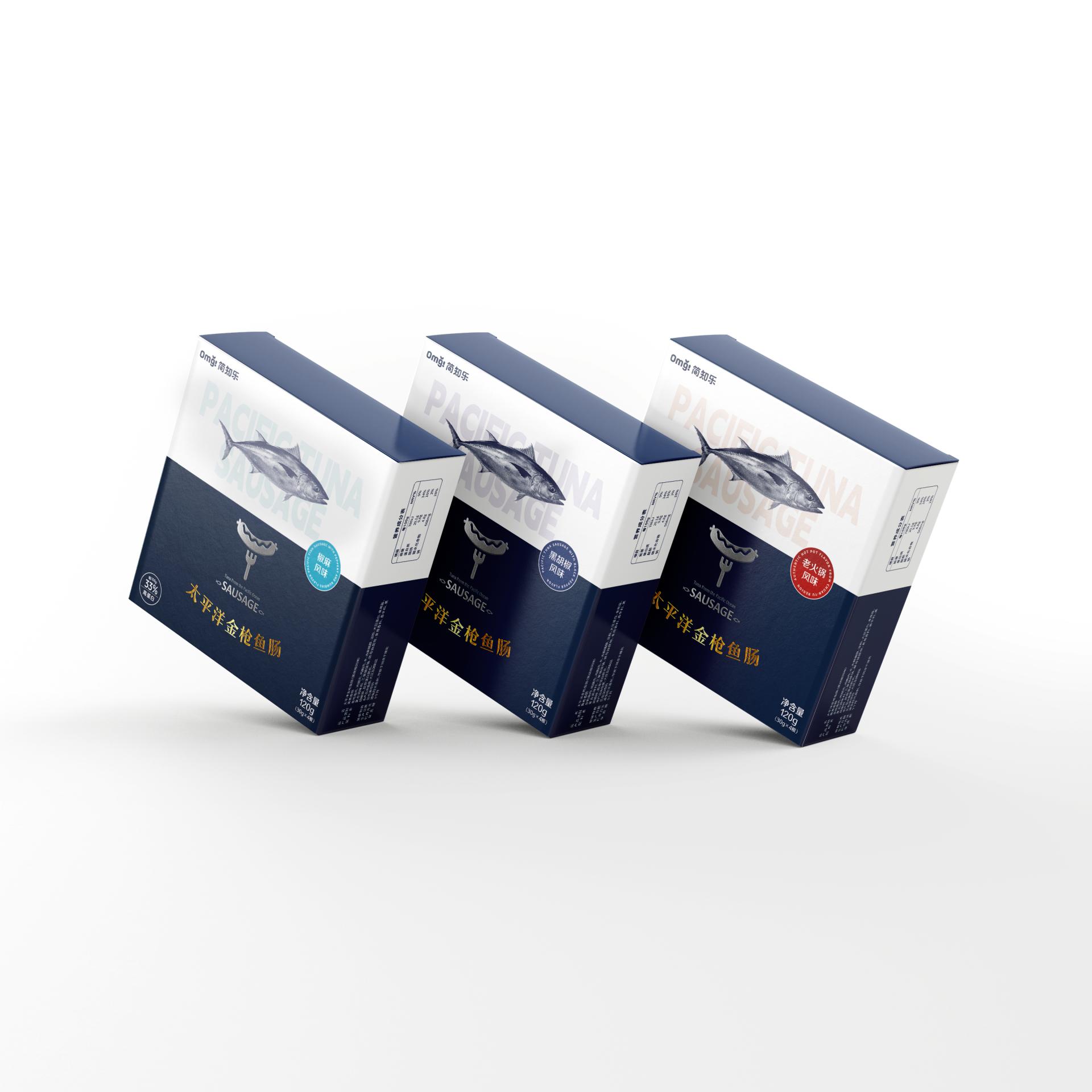
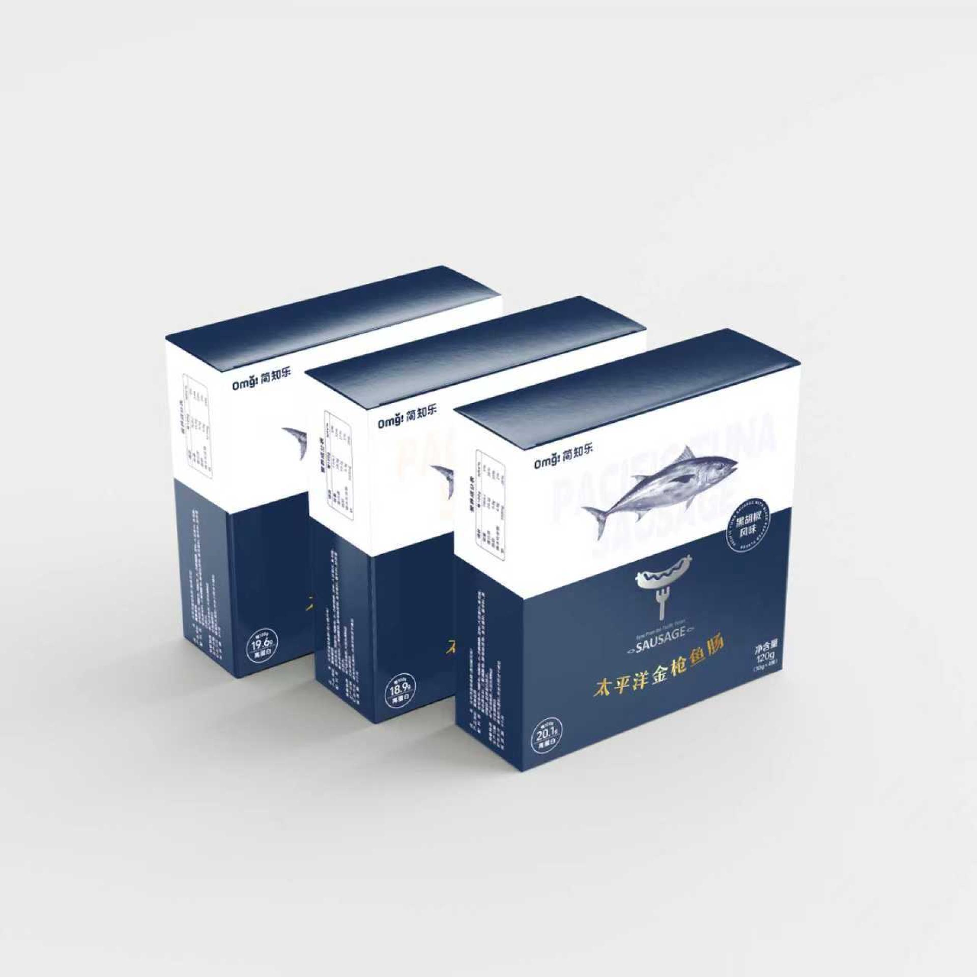
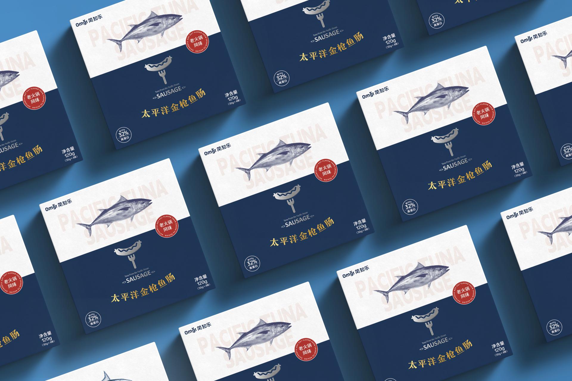
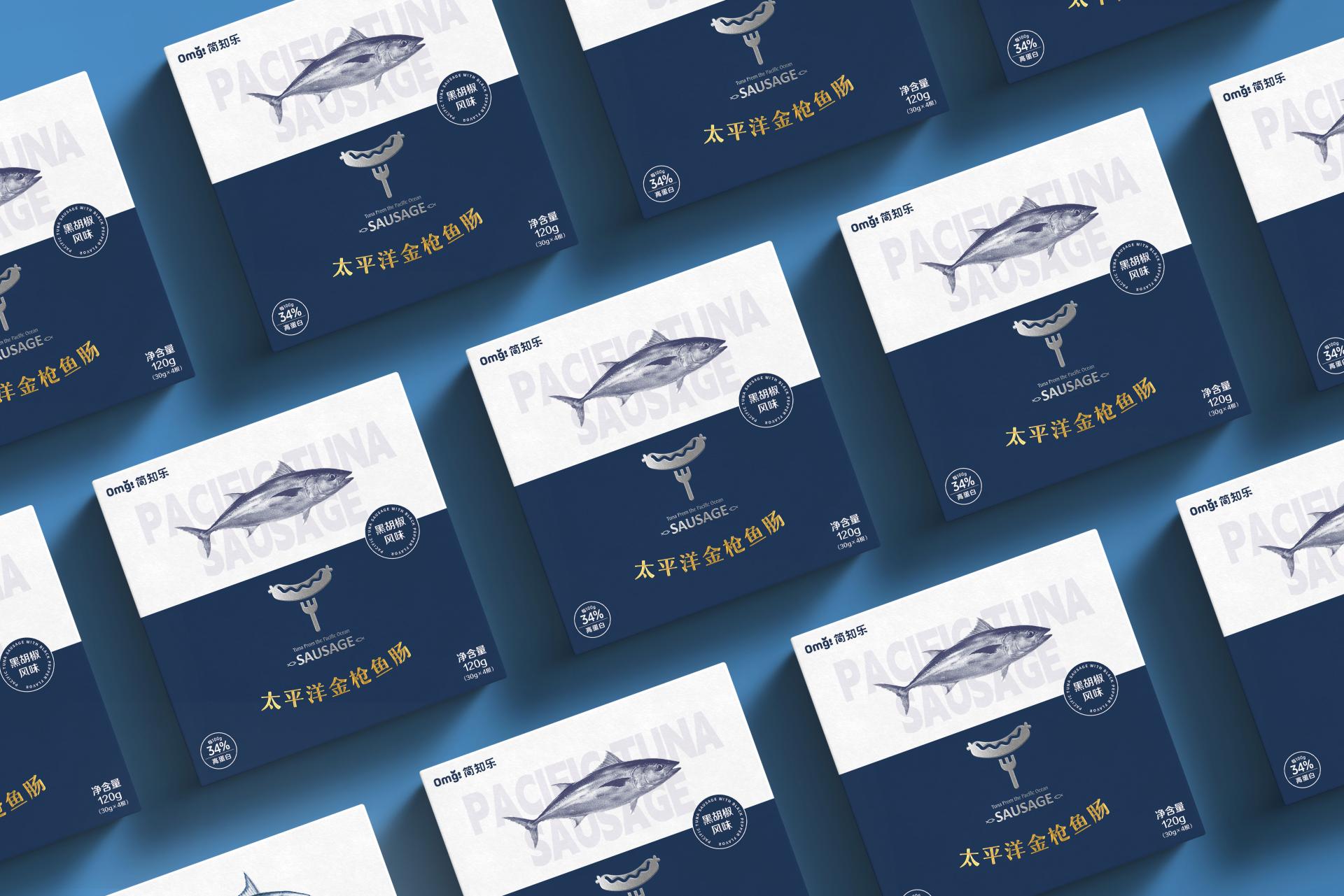
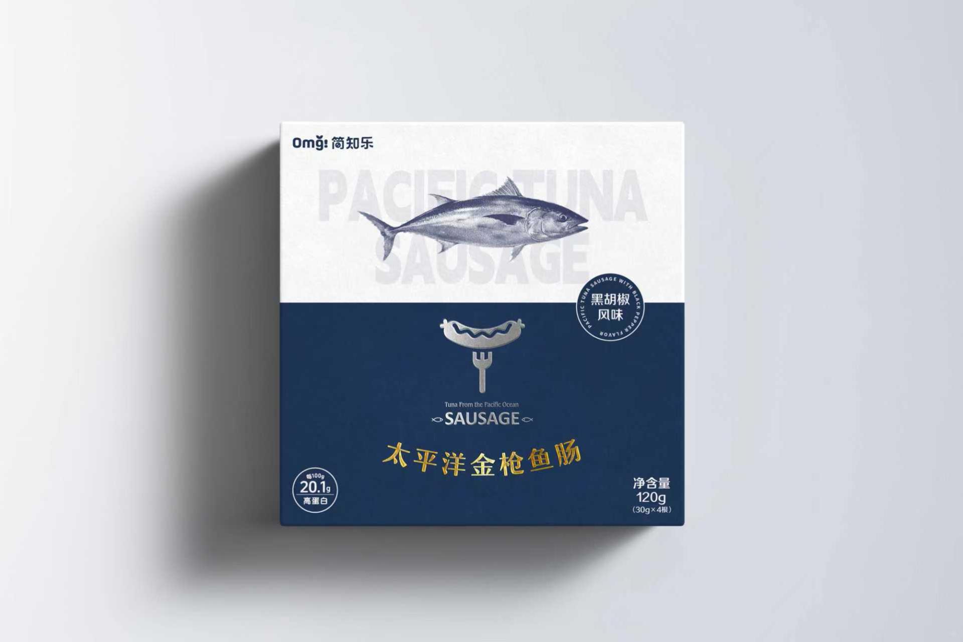
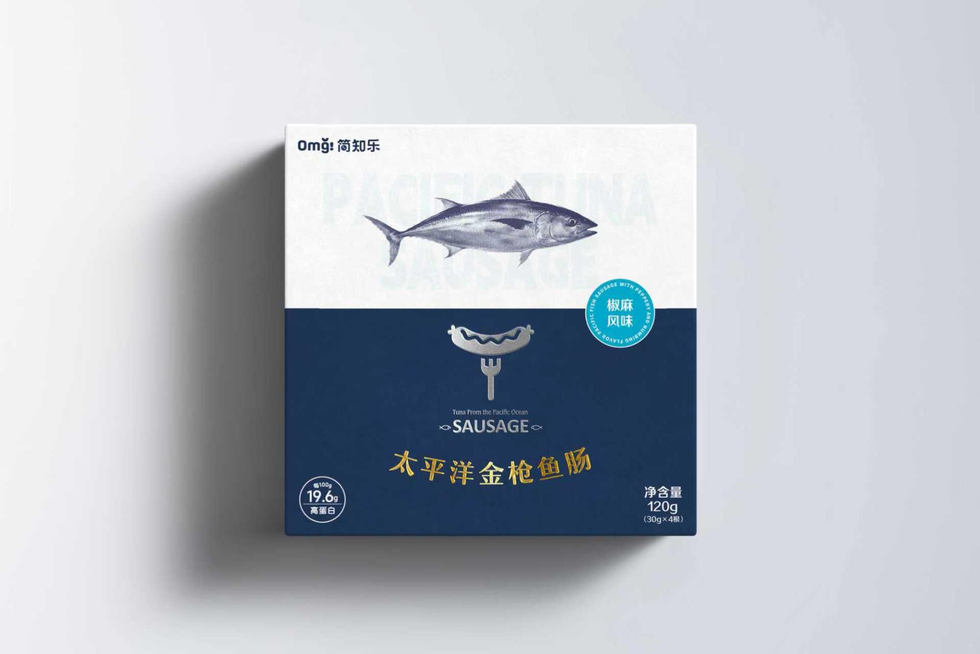
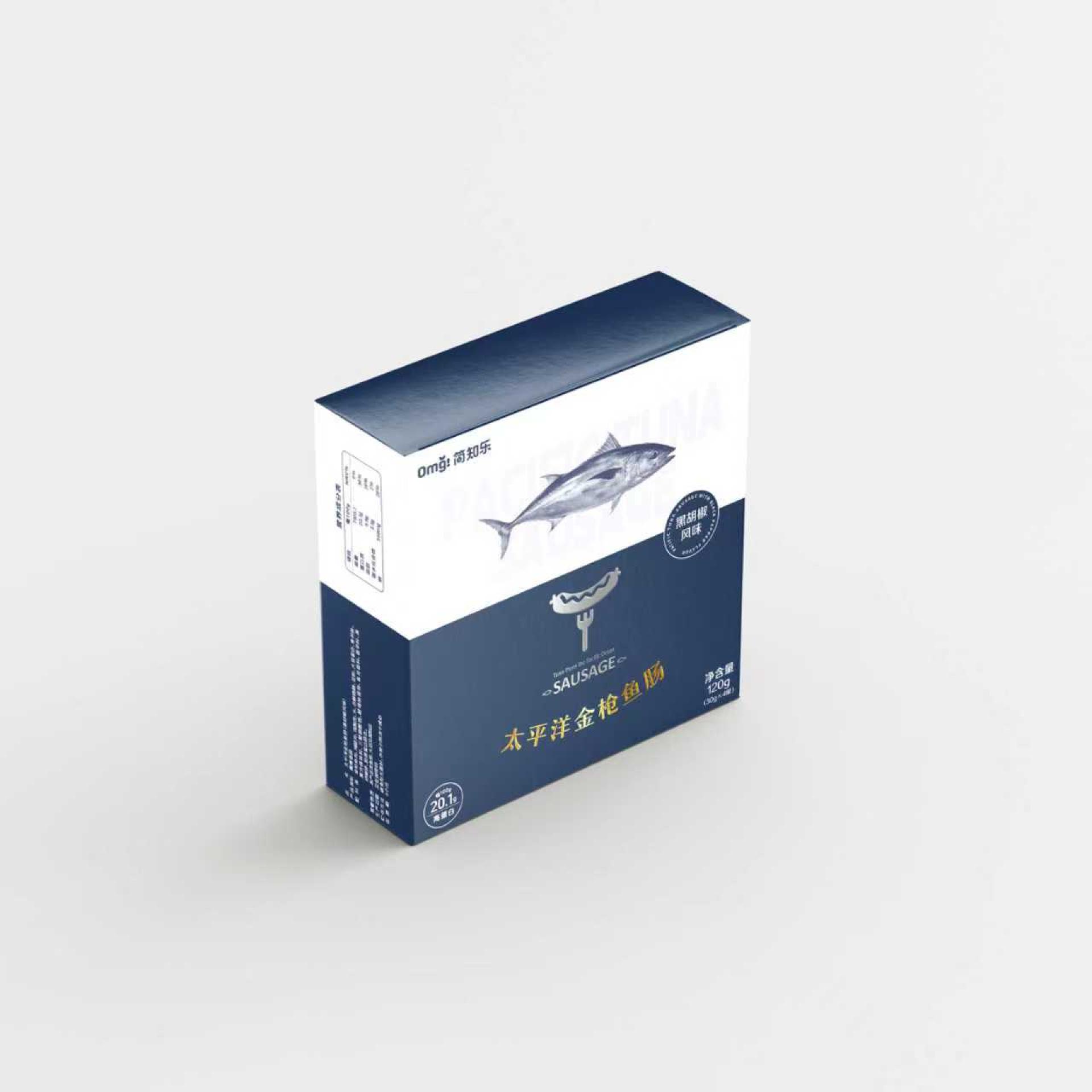
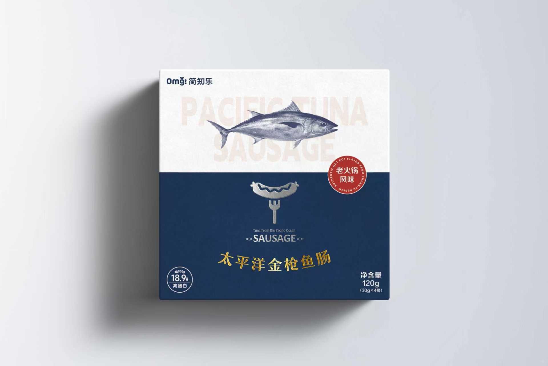
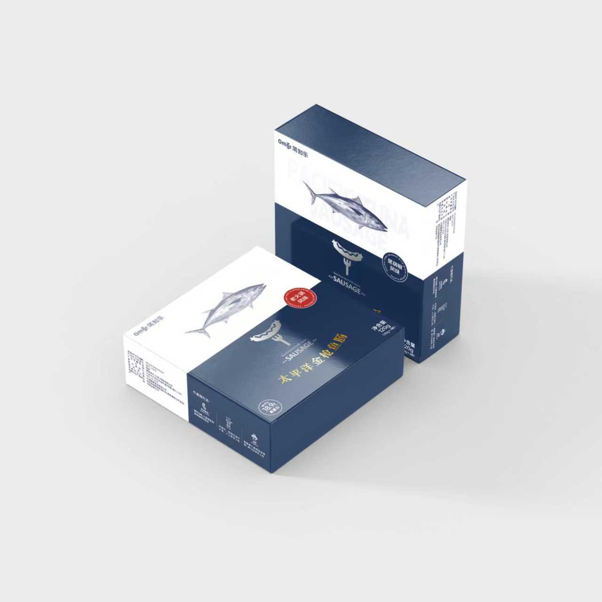
The packaging, themed on “freshness and health originating from the Pacific,” integrates the concept of health & wellness with the aesthetics of digital minimalism. Oriented to Gen Z and urban youth, it creates a style characterized by “freshness, vigor, and fun,” clearly conveying the product’s core values of “high quality & health” and “innovative flavor.”
Breaking away from conventional photography, the design team has established a highly refined system of geometric symbols. The packaging is ingeniously divided into two sections: the upper one features a sketch of the tuna against a light-colored background, visually revealing the core ingredient of the product; the lower one, rendered in deep ocean blue, presents a minimalist icon of a sausage resting on a fork, not only suggesting the usage scenario but also serving as a consistent product symbol to highlight the category and enhance memorability.
In terms of color selection, blue and white as main colors echo the product’s origin (ocean), and convey a sense of “freshness and low burden,” contributing to a professional international product image. The product name—Pacific Tuna Sausage—adopts gold to highlight the product’s premium quality and upscale position. Moreover, different flavors are distinguished through a round badge with different high-saturation color blocks (e.g., hot pot flavor is indicated with red). This approach creates a focal point while maintaining visual purity, facilitating easy identification and improving visual appeal.
The packaging utilizes a modular grid system, with meticulously arranged primary and secondary information (brand name/key selling points/flavor, etc.) leading to a clear visual hierarchy. Combined with generous negative space and clean fonts—simple yet modern—it naturally guides the viewer’s gaze in an orderly manner, enabling consumers to quickly grasp core information.
Credits
Entrant Company
Zhejiang Yunting Biotechnology Co., Ltd.
Category
Packaging Design - Beauty & Personal Care

Entrant Company
BOYUE DESIGN
Category
Interior Design - Bedrooms
Entrant Company
Zebra Education Group (Shenzhen) Co., Ltd.
Category
Product Design - Baby, Kids & Children Products

Entrant Company
Zhejiang Chaoxi Operation Management Co., Ltd.
Category
Fashion Design - Scarves, Ties, Hats, Gloves