2021 | Professional
TartarEnd Toothpaste
Entrant
Karen Watkins Design
Category
Packaging Design - Health & Wellness
Client's Name
TartarEnd LLC
Country / Region
United States
Gallery


About The Entry
STRATEGY // OBJECTIVE An exaggerated stochastic print pattern was used to represent the microscopic bacteria found in dental tartar and speaks to the scale of the periodontal problems that it creates for a percentage of the public who are biologically prone to painful scraping in the hygienist's chair. The swirling white patterns signify how brushing with the toothpaste whisks away the tartar and plaque. The raised embossed name and varnish on the box are deliberate haptic devices that further the sensation of tartar and plaque. Packaged in an apothecary style tube, the combined elements tell the story of a powerfully effective product backed by scientific research that addresses an historically painful and ugly problem with beauty and authority.
Credits

Entrant
THE VOLKS DESIGN
Category
Conceptual Design - Public Space
Entrant
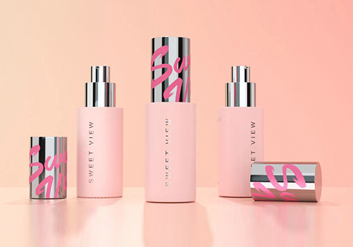
Hangzhou Chujian Brand Management Co., Ltd.
Category
Packaging Design - Cosmetics & Fragrance
Entrant
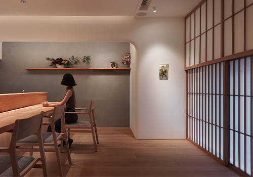
Variety Enterprise Co., Ltd
Category
Interior Design - Restaurants & Bars
Entrant
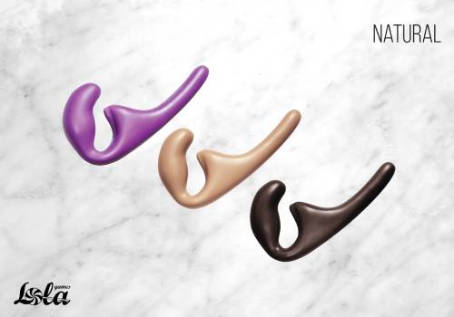
Lola Games
Category
Product Design - Unexpected Design