2026 | Professional

Mujercita
Entrant Company
A.S. SKARAKI & Co. LP
Category
Packaging Design - Wine, Beer & Liquor
Client's Name
ΒΙΚΤΩΡ Α.Β.Ε.Ε.
Country / Region
Greece
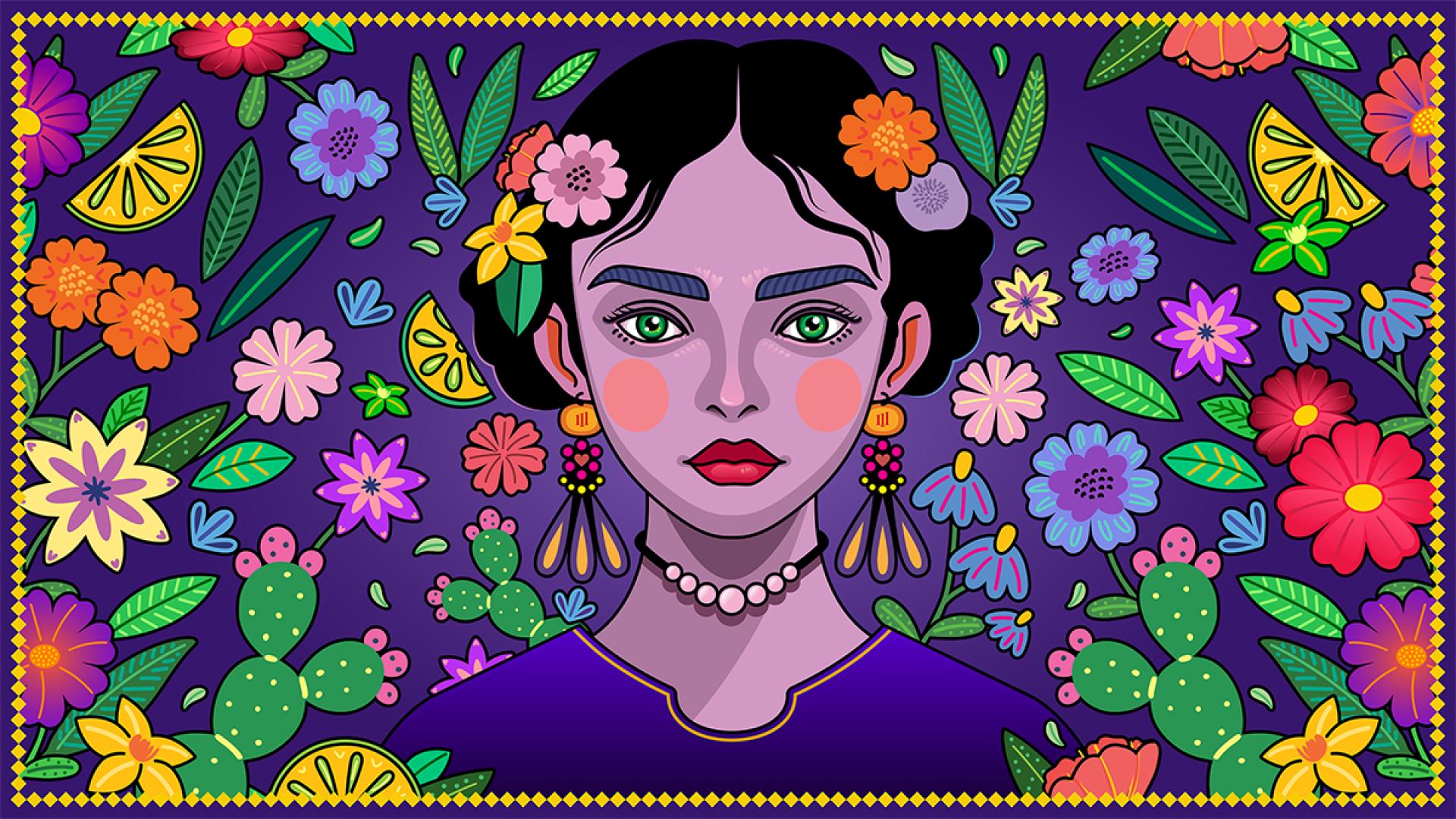
Mujercita is an alcoholic drink inspired by the spirit, intensity, and emotional richness of Mexican culture, expressed through a bold, character-driven label design. Rather than approaching Mexican visual heritage as decoration or stereotype, the project treats it as a living language, shaped by symbolism, colour, attitude, and presence. The design builds a strong visual identity that feels expressive and contemporary while remaining rooted in cultural reference.
At the centre of the label stands a female figure, frontal and unwavering, meeting the viewer’s gaze directly. She is not portrayed as an idealised icon, but as a presence: self-aware, composed, and confident. Her face becomes the anchor of the composition, establishing immediate connection and authority. The name Mujercita comes from Spanish and literally translates as “little woman”. In this project, Mujercita is neither fragile nor diminutive. She represents femininity as character and strength, carrying both warmth and attitude.
The illustration draws inspiration from Mexican folk art and ornamental traditions, particularly the use of decorative elements in hair and dress. Flowers, leaves, and symbolic motifs crown the figure’s head, referencing traditional adornment while also recalling the visual world of artists such as Frida Kahlo, where identity, nature, and ornament merge into a single expressive form. The hair becomes a landscape. An active visual field where culture, memory, and individuality coexist.
Secondary graphic elements expand this universe. Cacti, agave plants, and native Mexican flowers appear throughout the label as visual accents rather than literal storytelling devices. They function as cultural markers, reinforcing a sense of place and resilience without overwhelming the composition.
Saturated purples, deep blues, and vibrant accents reflect the expressive chromatic language of Mexico, where colour conveys emotion, celebration, and intensity. These tones introduce a sense of ritual and night-time energy, while warmer highlights add sensuality and warmth.
Typography remains bold and assertive, giving the label a strong centre of gravity. Supporting elements stay secondary, allowing the portrait and the name to lead. The scalloped shape of the label introduces a subtle ceremonial quality, referencing tradition while remaining graphic and contemporary.


Credits

Entrant Company
CATANINA (Beijing) Architectural Design Co., Ltd./ WANG ZHONGLI
Category
Interior Design - Office

Entrant Company
Weiran Yin
Category
Landscape Design - Regenerative Landscape Design (NEW)

Entrant Company
AECOM
Category
Landscape Design - Residential Landscape

Entrant Company
PEARL RIVER PROPERTY&PEARL RIVER DECORATION
Category
Interior Design - Residential