2026 | Student

Dongshui Mountain Tea: Retail Packaging System
Entrant
Guangdong Ocean University
Category
Packaging Design - Herbal
Client's Name
Country / Region
China
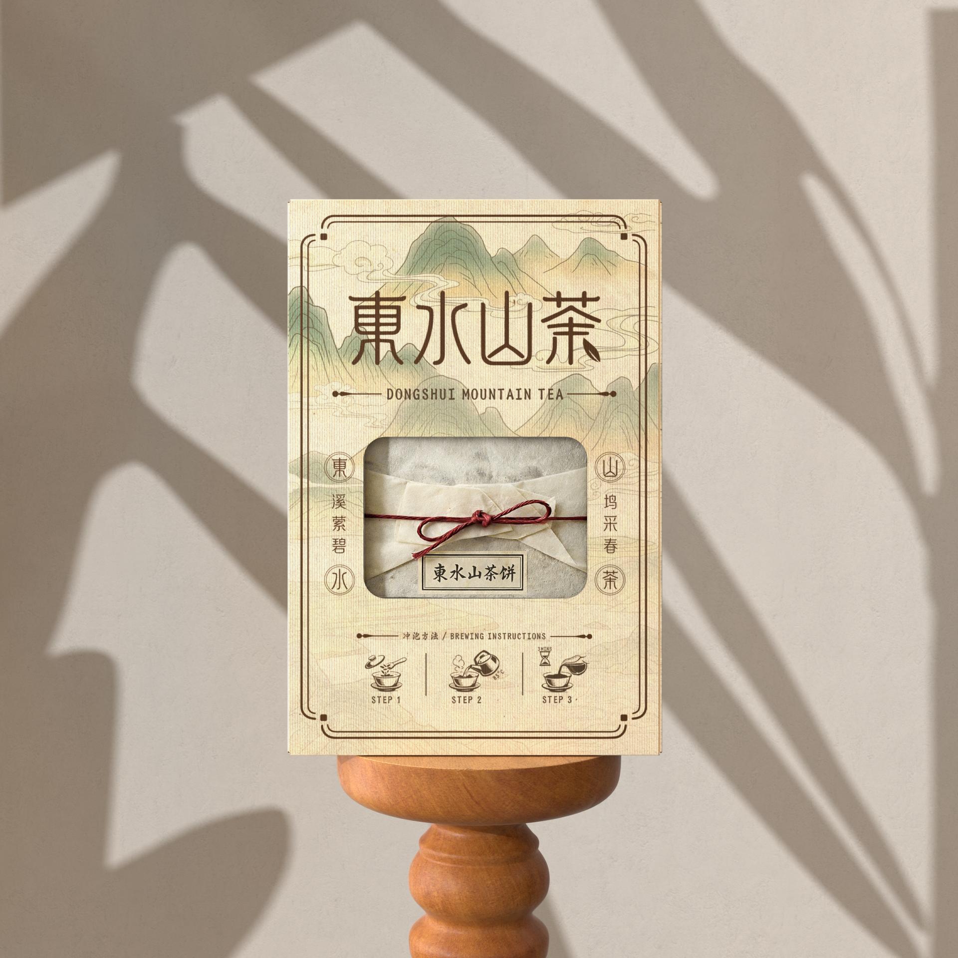
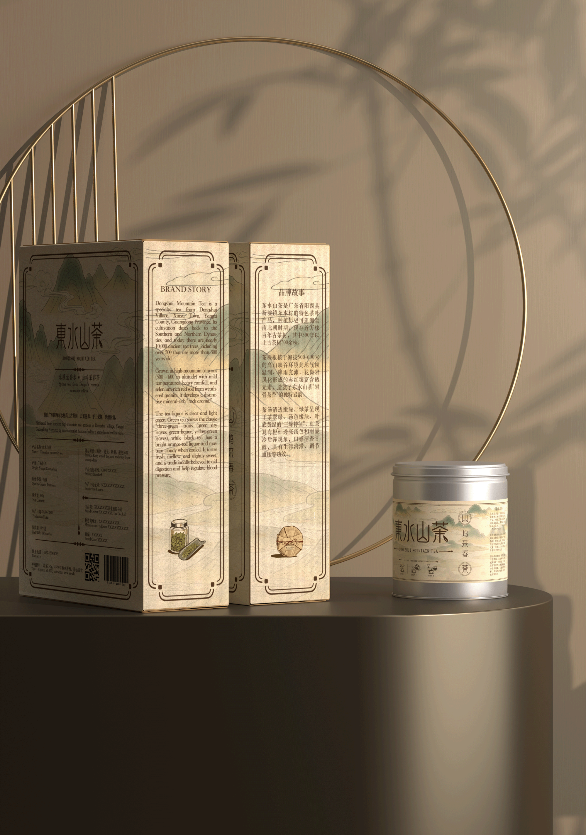
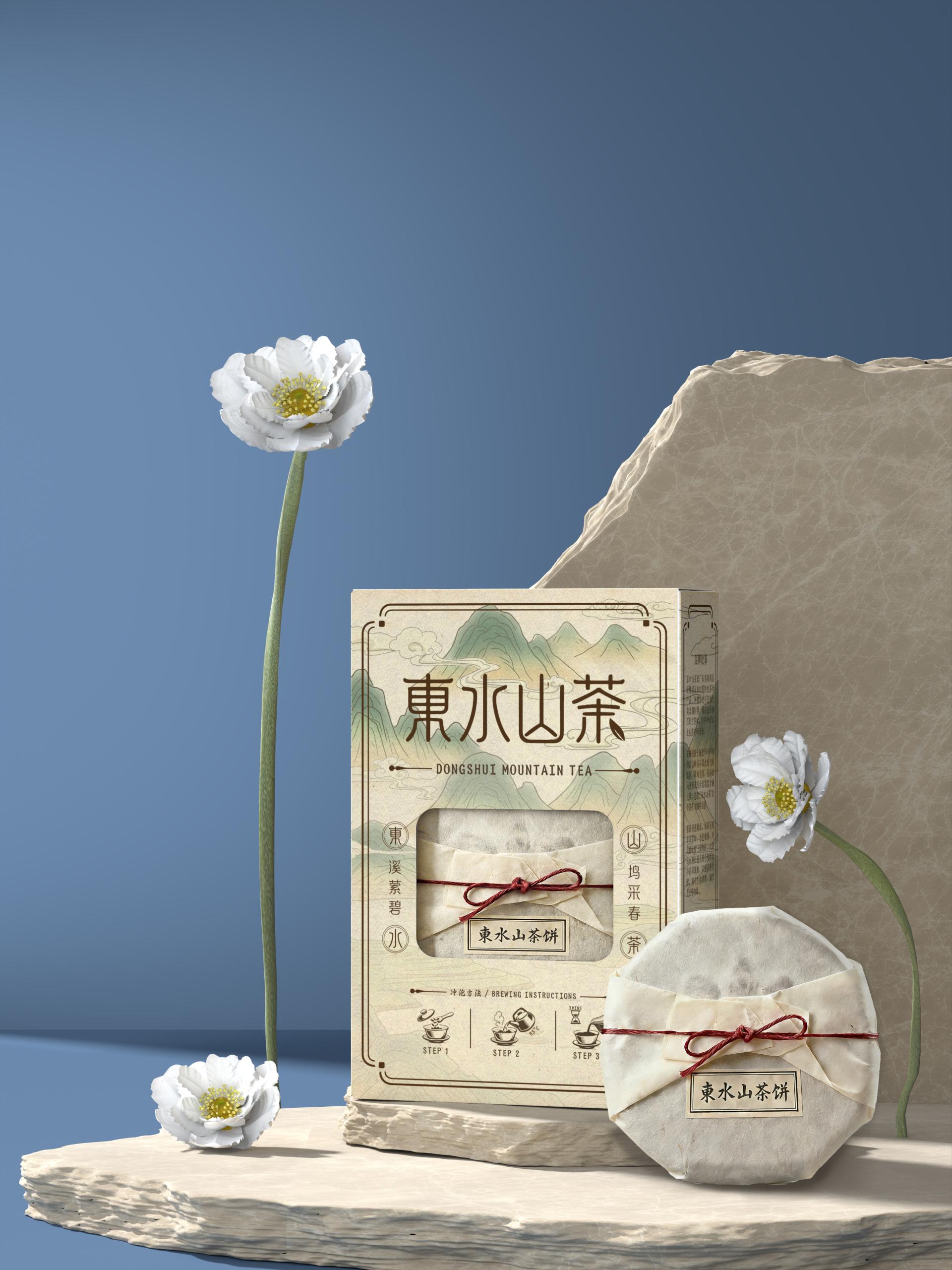
Dongshui Mountain Tea is a contemporary retail tea packaging system inspired by the mountain landscape of Dongshui Village, Yangxi, Guangdong, and the region’s long tea-making tradition. The Dongshui tea-making craft is recognized as municipal intangible cultural heritage by Yangjiang City, and this project reinterprets that heritage through a clear, retail-ready identity—where cultural meaning is carried by structure, material, and the act of opening.
The visual language centers on a contemporary shanshui (mountain-and-water) illustration. Layered linework redraws the tea-growing highlands at 500–600 meters above sea level, turning local terrain into a consistent signature applied across tins, cartons, and sachets. A deep ink green palette echoes the forested elevation and references the tea’s “Three Greens”—green dry leaves, green liquor, and green infused leaves—offering an immediate sensory cue of freshness and clarity. Seal-inspired motifs and vertical inscriptions borrow the spacing and composition of traditional stamp design, forming a subtle frame that reinforces an Eastern tone and pulls attention toward the window.
The defining innovation is the “Heaven is round, Earth is square” window. A circular tea cake is revealed within a square carton, transforming visibility into meaningful structure: the round–square contrast references traditional Chinese spatial philosophy while also providing an honest, at-a-glance view that strengthens trust at the point of sale. Inside, the tea cake is wrapped in handmade bark paper; its natural folds contrast with the carton’s crisp geometry, bringing craft warmth into an otherwise precise form. A red cord knot completes the package as a contemporary reinterpretation of traditional sealing.
Micro brewing icons condense key steps into a glanceable guide, keeping the front layout clean while reducing reading friction. The side panels act as an “extended narrative layer,” keeping the front shelf-clear while adding brand story and origin context.
The window lets the tea cake be seen first on the shelf; once opened, the folds of handmade bark paper and the red cord closure place origin and craft directly in the hand—so tradition is not only referenced, but felt and trusted.


Credits
Entrant
Leszek Kalandyk, LK & Projekt Architects
Category
Architectural Design - Residential

Entrant
Shanghai ci see PR consulting Co., Ltd.
Category
Interior Design - Showroom / Exhibit

Entrant
LANSONG DESIGN GROUP
Category
Landscape Design - Residential Landscape

Entrant
Guangzhou GVL International Planning & Design Co.,Ltd.
Category
Landscape Design - Residential Landscape