2021 | Professional

SAKURA SHIMIZU
Entrant
arica design inc.
Category
Packaging Design - Rebrand
Client's Name
Sakura Shimizu
Country / Region
Japan
This package was created as part of a flower artist branding project. Sakura Shimizu is an artist who works directly with flowers and makes use of the characteristics of the flowers. In order to directly express Sakura Shimizu's sincere attitude toward flowers, I designed a symbol mark using the typography of the kanji “花”.This character means flower.
Japanese florist logos are often made of English characters with flowers and plants as motifs. In order to differentiate from those marks, I dared to design with "kanji" typography and express it straight and clean.
The package also reflects Sakura Shimizu's concept of "utilizing the beauty and gorgeousness of the flowers themselves". To enhance the color and beauty of the flowers themselves, all brand tools were created in gray. This gray color is a brand color that gives consumers a solid and high-quality image and does not impair the goodness of the flowers themselves.
The achromatic flower boxes and paper bags make the original vivid colors of the flowers stand out. I designed them to best showcase the artist's work.
Using the typography of “花” as a brand symbol, we created all kinds of brand tools such as shop cards, postcards, and wrapping paper. This symbol of Kanji will impress consumers with the status of Sakua Shimizu as a Japanese flower artist, and have an imposing brand image.


Credits

Entrant
Diavelo
Category
Transportation Design - Bicycles / Motorcycles

Entrant
inDare Design Strategy Limited
Category
Product Design - Other Product Design

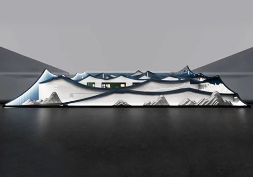
Entrant
V.M Design
Category
Interior Design - Commercial
Entrant
KEY DESIGN STUDIO
Category
Conceptual Design - Exhibition & Events (NEW)