2021 | Professional

Modernity By the Picturesque Riverbank
Entrant Company
Yang Chi-Nan Architects & Planners
Category
Interior Design - Commercial
Client's Name
Country / Region
Taiwan
The main tone of the bank aims for building up a neat and organized place with an obvious contraction of the choice of colors. With the basic use of white, dark red, dark blue, and some brownish colors of the floor, the place is divided into compartments. The colorfulness not only helps establish the corporate identity but also creates a welcoming and cheerful ambience for both the employees and the customers.
On the outside, the facade of the bank is rather fluid, smooth and clean in lines, with a sense of firmness supported by the black pillars. On the inside, it contains a clean and bright space for the customers to easily figure out the service of each section. The flow is rather smooth and easy for the users to access different departments.
Each space is framed rectangularly that gives a sense of organization. The use of cubic shaped armchairs enhance a serious and well-disciplined atmosphere for negotiation, discussion and other business purposes between customers and tellers. As for the use of glass partition panels, it ameliorates the spatial perception within a narrowed hallway. With the use of dark blue in the middle of the glass, it still broadens up the space with its transparency yet maintains privacy for the customers.
In order to soften the sharpness of the space, the use of lighter colored wooden floor and dark colored carpet are applied to provide a sense of steadiness. Some parts of the circular-shaped ceiling lamps and partition panels between employees also generate a symbol of harmony and being well-rounded.
Credits
Entrant Company
Triangler Co., Ltd.
Category
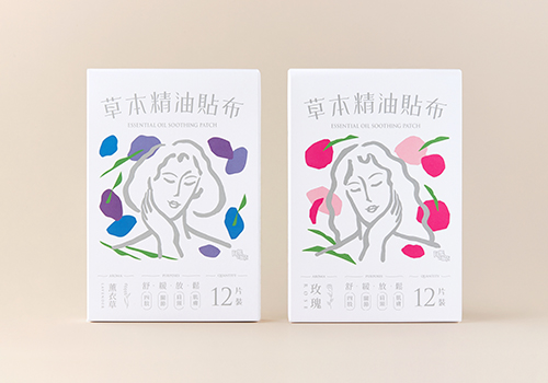
Packaging Design - Health & Wellness

Entrant Company
Relevance International
Category
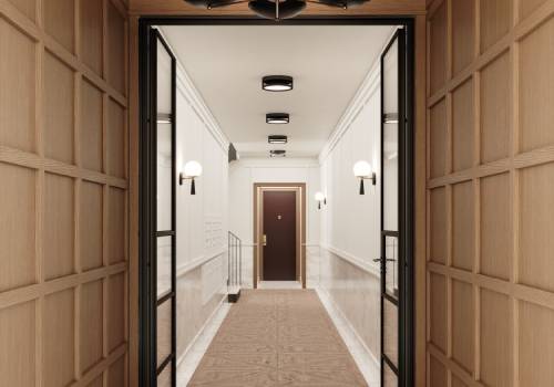
Interior Design - Renovation

Entrant Company
JDID INC.
Category
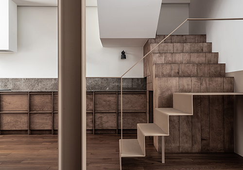
Interior Design - Residential

Entrant Company
H&S Concept
Category
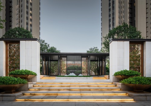
Landscape Design - Residential Landscape
