2021 | Professional

Souldar Cracker
Entrant
Yeqin Chen
Category
Packaging Design - Snacks, Confectionary & Desserts
Client's Name
Dali Foods Group
Country / Region
China
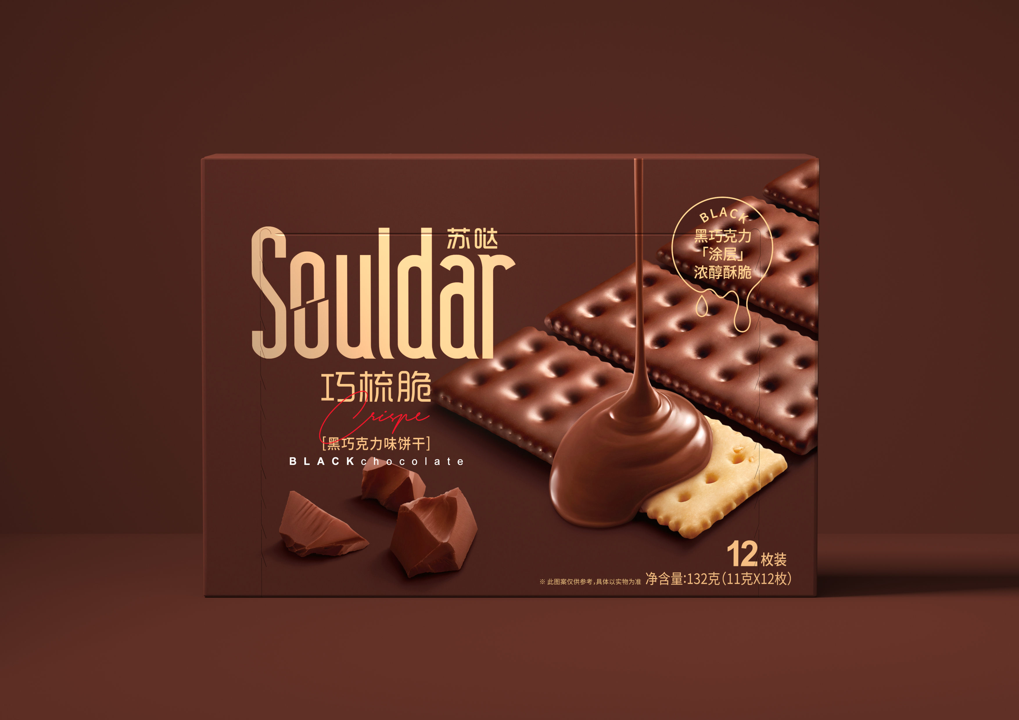
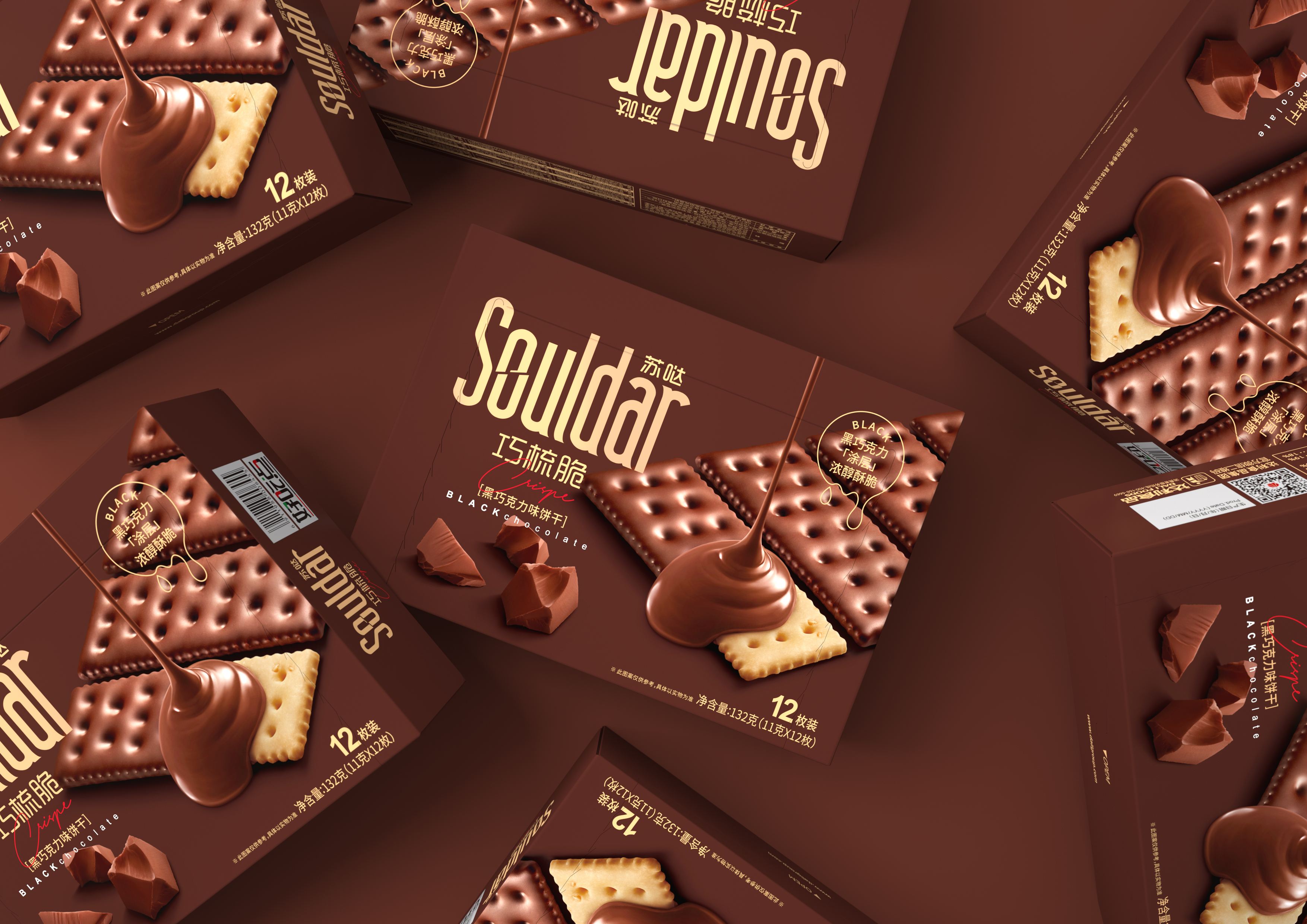
In addition to protection products, food packaging is shouldering themission of transferring product information to consumers, cause their appetite sense. In reality, we need through the visual, taste, smell, and other sensory perception and experience to finish building feeling, causing appetite. But the packing can only visual rendering. So in the design, we need to use visual to evoke the imagination from other sensory experiences. Top-down rain fall chocolate sauce realized the scene from static to dynamic, create the most easily transfer appetite of telepresence. Specular highlights on the surface of the performance and the local show biscuit’s primary colors, color contrast in the deep color of large area formation, breaking the visual sense of dead at the same time, pass the sense of freshness and quality of products. Packaging integral colour collocation chose brown and goldas the main color to represent product flavor and characteristics with visual perception , and then combined with a little white. Concise design and colour combination, clearly conveys the product information and the transmission of feeling, appetite also both the visual aesthetic feeling and comfort.
Credits
Entrant
Antennae Designers Office
Category
Interior Design - Home Decor (NEW)

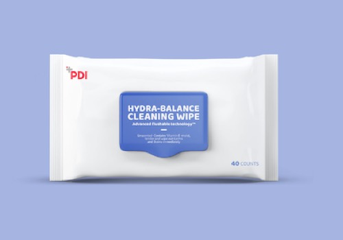
Entrant
ROCOFISH.SHANGHAI
Category
Packaging Design - Medical

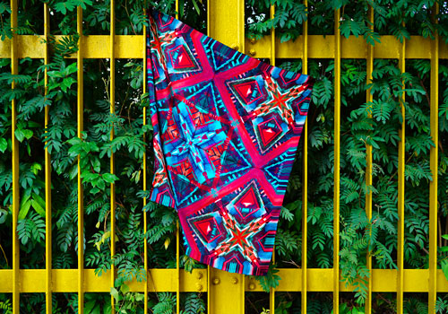
Entrant
Invisibilis Movere Limited
Category
Fashion Design - Scarves, Ties, Hats, Gloves

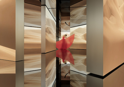
Entrant
Sangu Design(Guangzhou)Co. Ltd.
Category
Interior Design - Exhibits, Pavilions & Exhibitions
