2021 | Professional
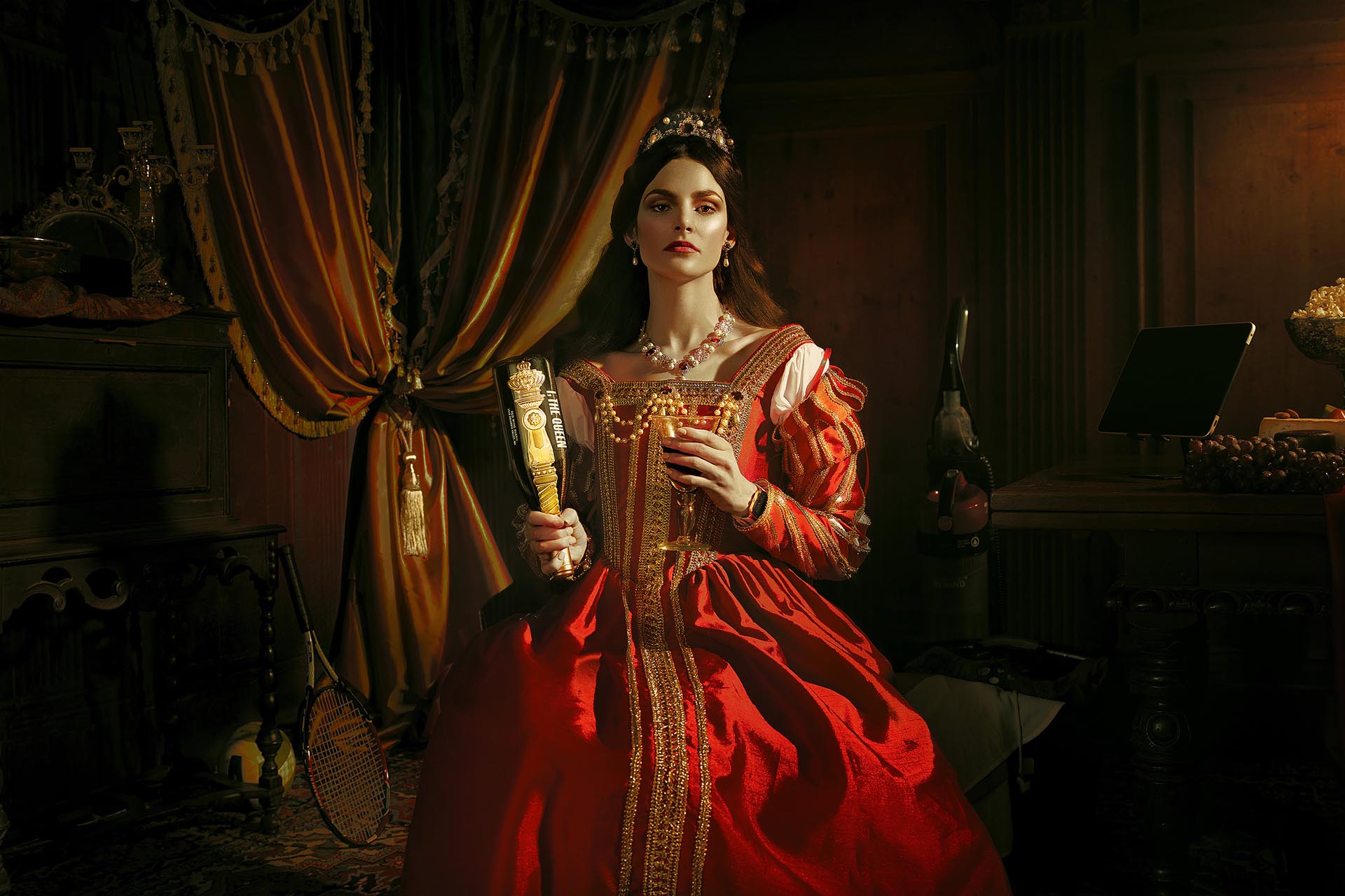
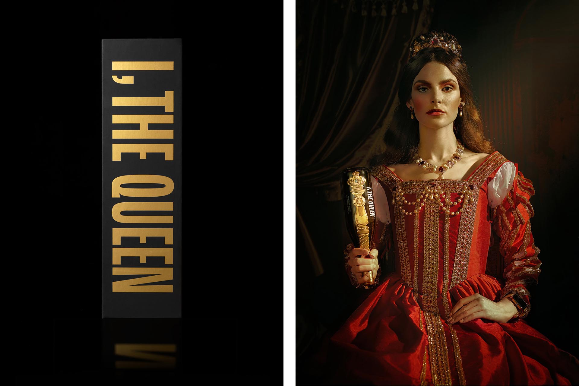
I, THE QUEEN
Entrant Company
Mubien Brands + Workshop Built
Category
Packaging Design - Wine, Beer & Liquor
Client's Name
Scepter & Sword Wine Co.
Country / Region
Spain
Turning Social Conventions Upside Down
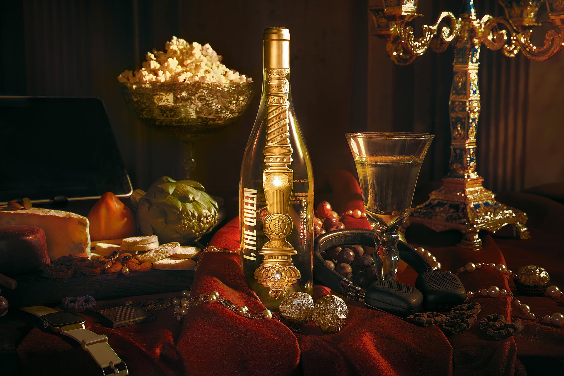
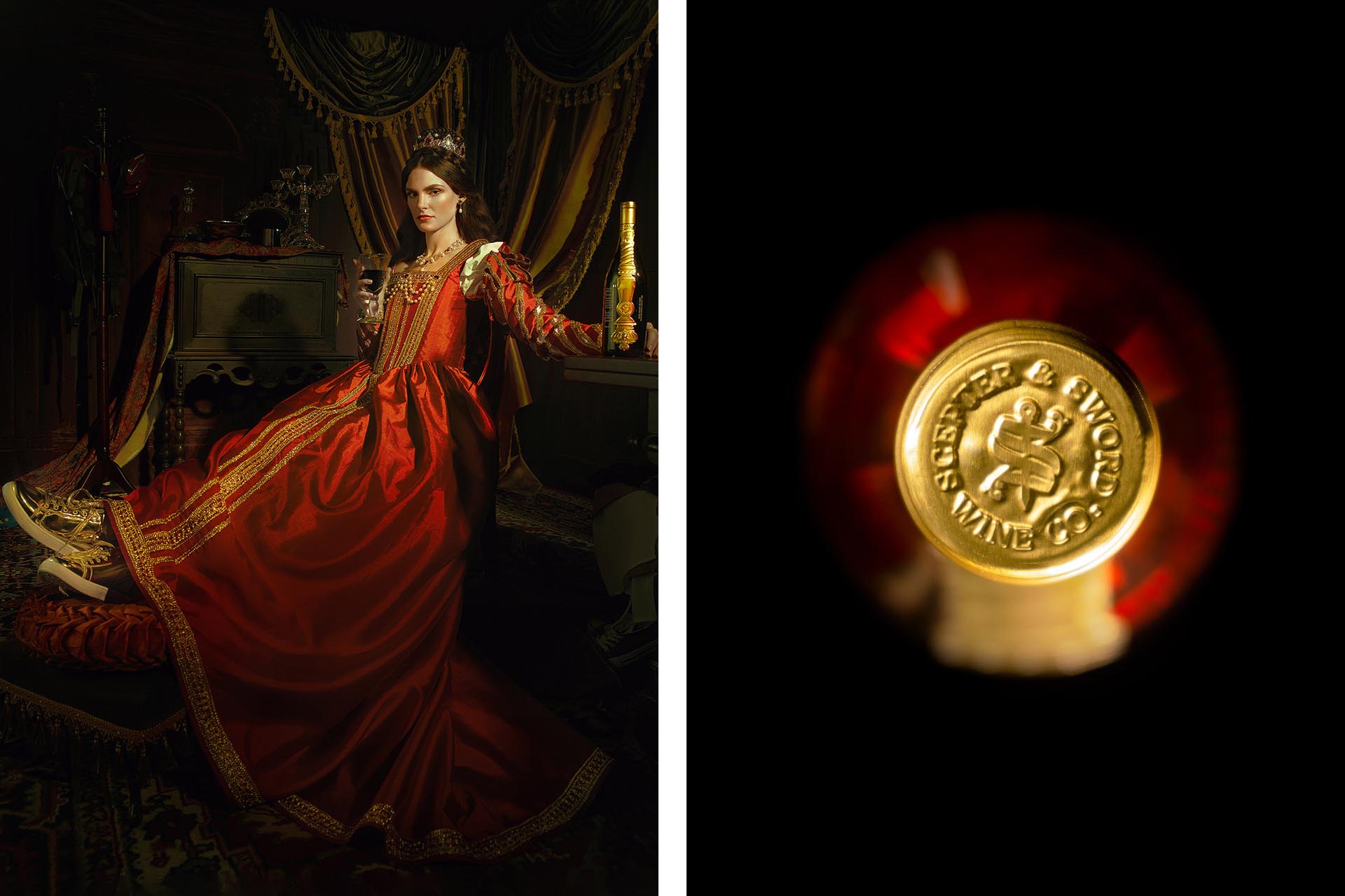
Scepter & Sword Wine Co. produces premium wines from Columbia Valley, WA, one of the world’s most exciting up-and-coming wine-producing regions. But this is a wine company unlike any other. It was founded with the mission of building a wine-oriented, experiential platform to help inspire curiosity, provoke discussion, and challenge perceptions around social equality while celebrating female empowerment.
Building the Brand Foundation
At the core of the brand is the desire to motivate social change by challenging perceptions that are formed by misguided social conventions. The idea of provoking critical thinking through a simple experience fascinated us.
A fine wine, it can be argued, is the ultimate device to spark discussion, tell stories, and yes, celebrate female empowerment.
Concept
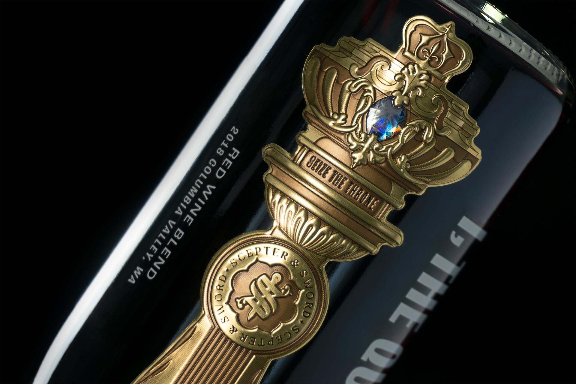
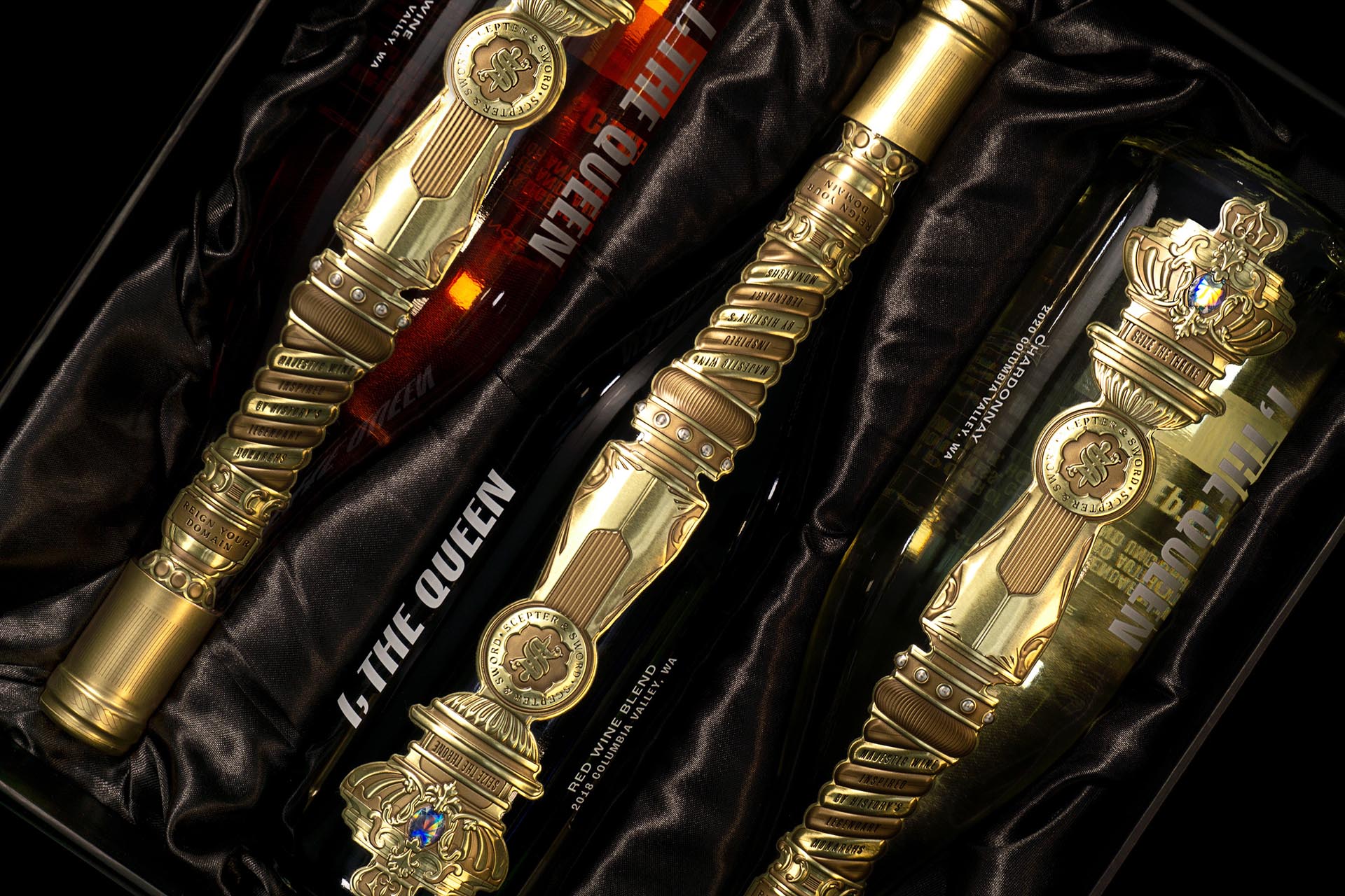
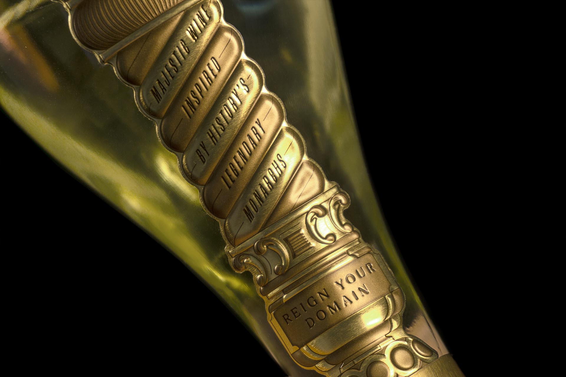
Our team reviewed art museums, books, and archives to learn more about the role of Queens through history. The imagery of the scepter became a point of interest as it appears in different shapes and sizes and is present in many cultures throughout history. We also believed that the visual interest of the scepter was bound to inspire curiosity since it is not an object commonly seen or referred to today. With its ornamental design details, sparkling pearls, gleaming gems, and gold bling, who wouldn’t do a double-take when encountering one of these?
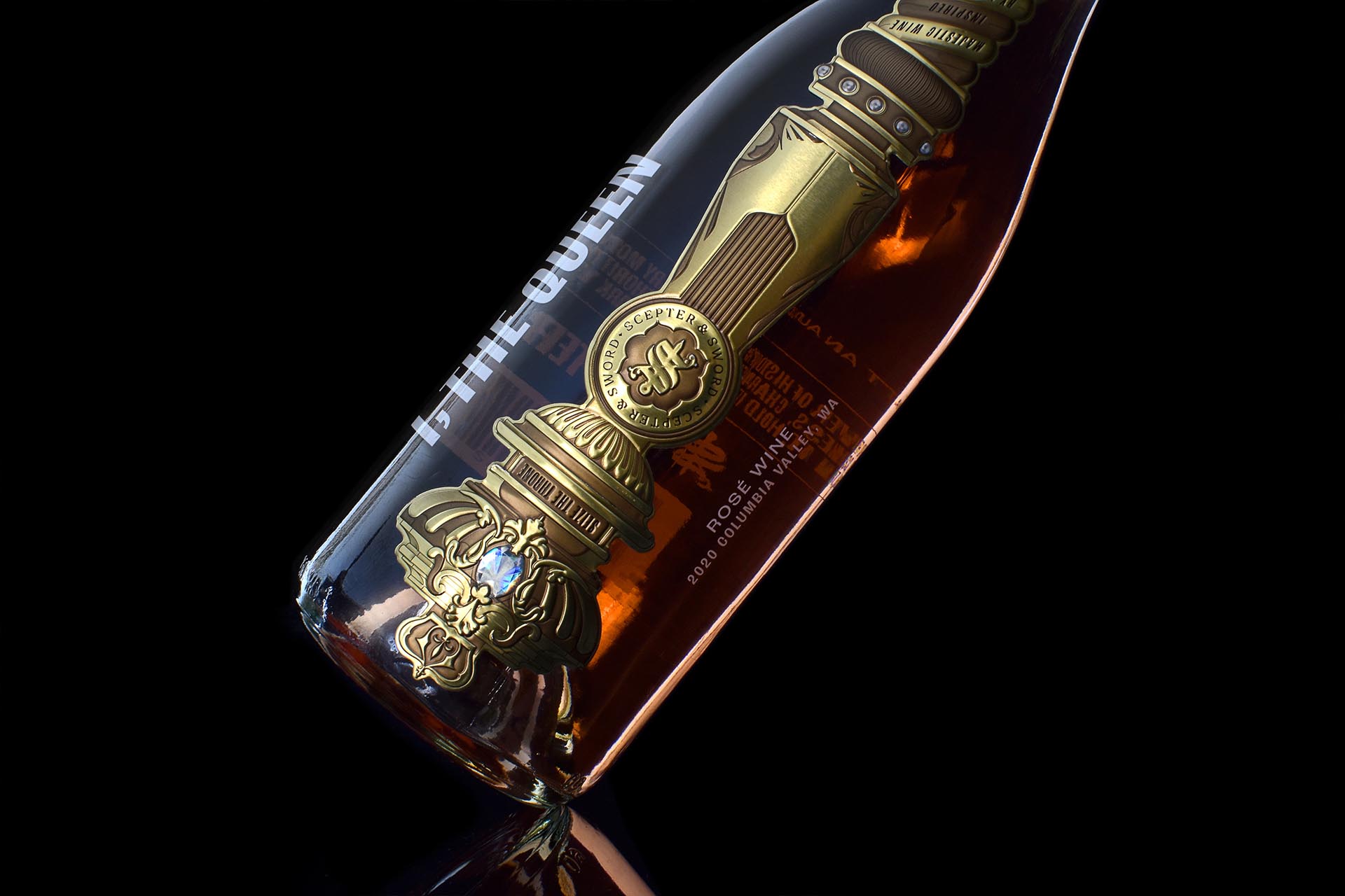
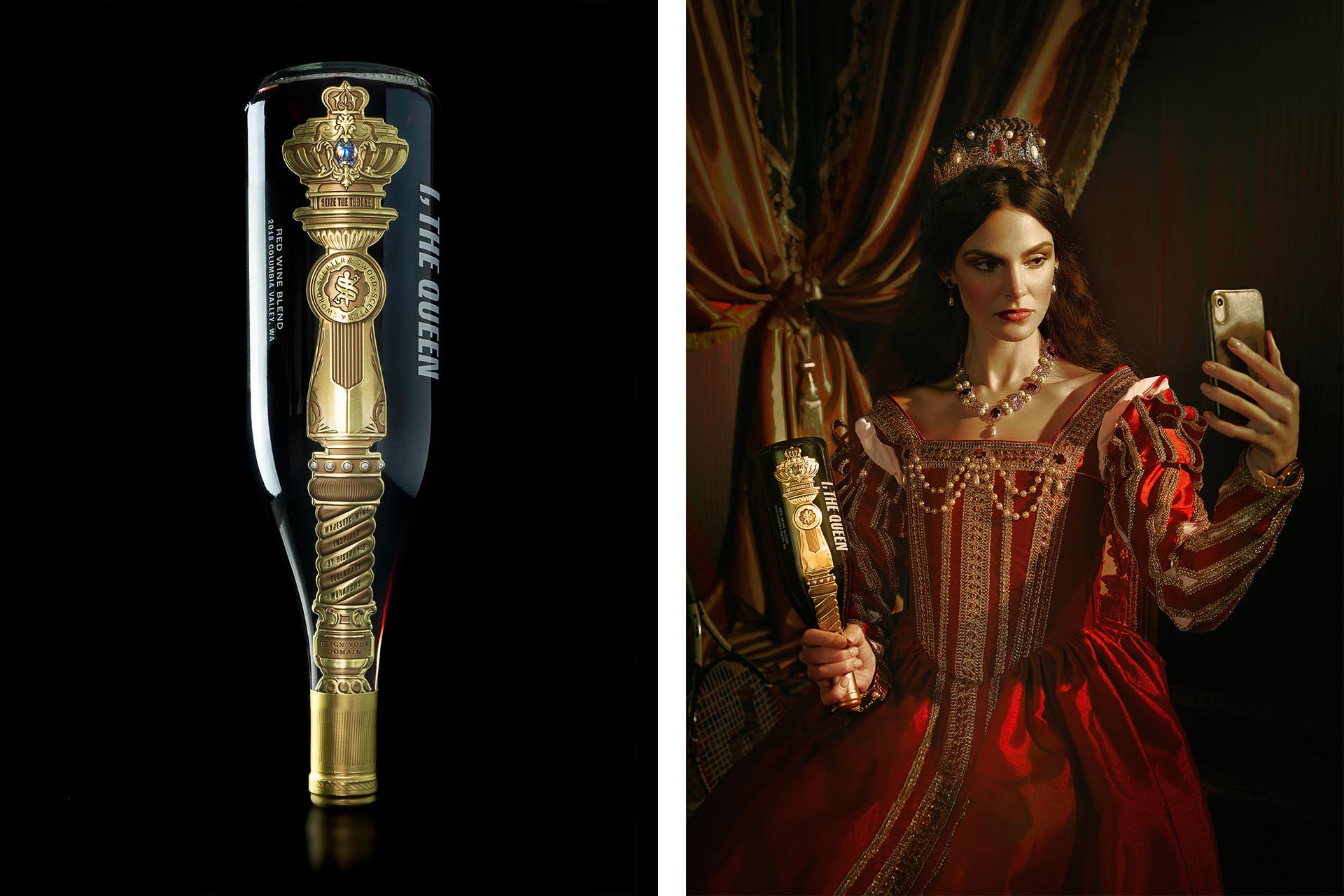
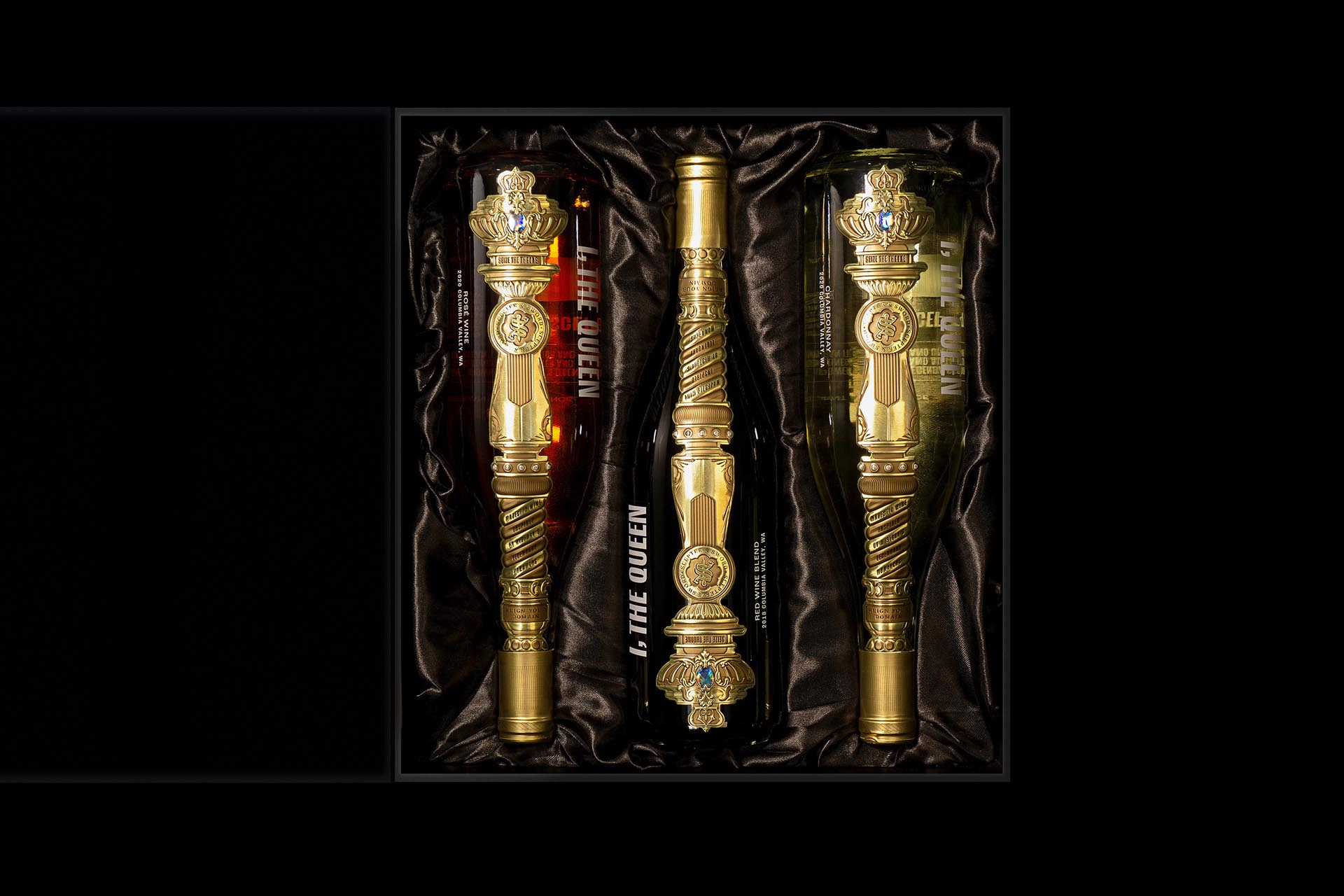
While we designed the entire packaging experience around the historic scepter, we wanted to play freely with the concept of time to produce a relevant brand that makes you think and really question your perception. The packaging reflects this approach, shunning old wine traditions and embracing new ideas:
A label that demands to be turned upside down where it becomes a scepter, the symbol of her authority and empowerment.
Clear glass bottles promote the concept of transparency while allowing customers to see the beautiful colors and hues of the quality wine inside.
Finally, we designed a distinctive metallic label application that runs vertically through the entire face of the bottle, from the neck to the base.
Entrant Company
JACKY.W DESIGN
Category
Interior Design - Beauty Salon
Entrant Company
Beijing Xinjingrun Real Estate Co., Ltd.
Category
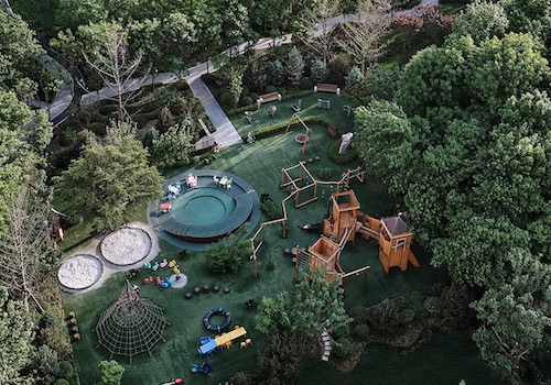
Landscape Design - Residential Landscape
Entrant Company
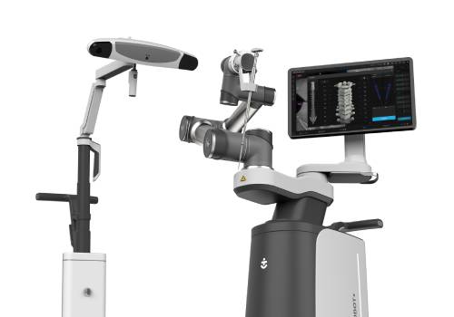
Nanjing Truedoc Medical Technology Co., Ltd.
Category
Product Design - Scientific Instruments, Medical Devices & Research Equipments
Entrant Company
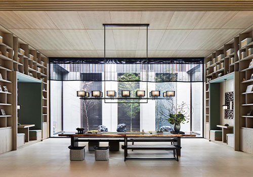
MANS DESIGN (SHENZHEN)CO,LTD
Category
Interior Design - Commercial