2019 | Professional
Zhe Gu Tea
Entrant
SunDesign Brand&design(beijing)co.ltd
Category
Packaging Design - Health & Wellness
Client's Name
-
Country / Region
China
About The Entry
Zhe Gu Tea's unique logo originates from Chinese Xiao Zhuan font and was improved to resemble slim tea leaves. The bird on the package symbolizes the ancient tale in which a dying Zhe Gu bird revived after eating tea leaves. The growing area of this tea, Dong Shan hill, is known for its Buddhist shrine. After baking, tea turns into ball looking like Buddha beads which inspired the high end ceramic package’s round shape. The landscape painting is consisted of tea balls conveying a sense of Zen.
Featured Media
Entrant
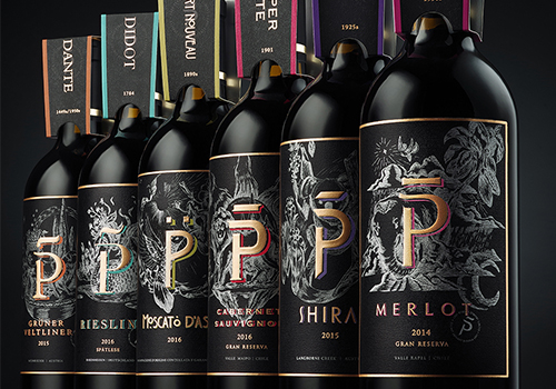
Jansword Zhu
Category
Packaging Design - Wine, Beer & Liquor

Entrant
Burn-heb Interior Design Co.,Ltd
Category
Interior Design - Home Stay / Airbnb

Entrant
Kong Studio
Category
Interior Design - Office
Entrant
BEAMY
Category
Packaging Design - Self-Promotion