2022 | Professional
Dolomis Trento Doc
Entrant
KILLERIDEA
Category
Packaging Design - Wine, Beer & Liquor
Client's Name
Dolomis
Country / Region
Italy
Gallery


About The Entry
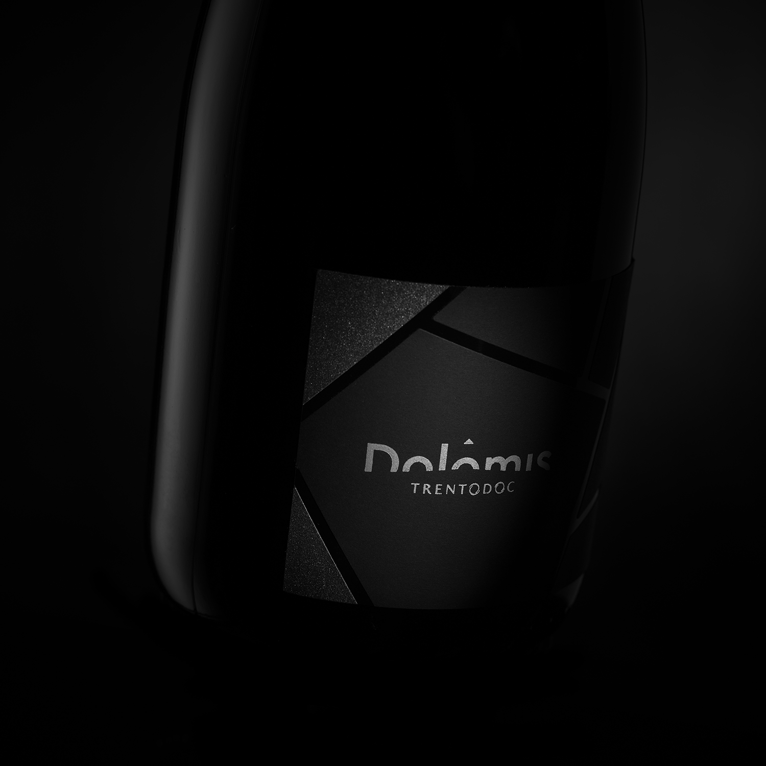
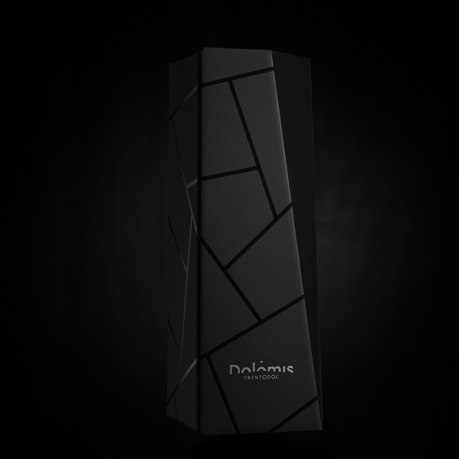
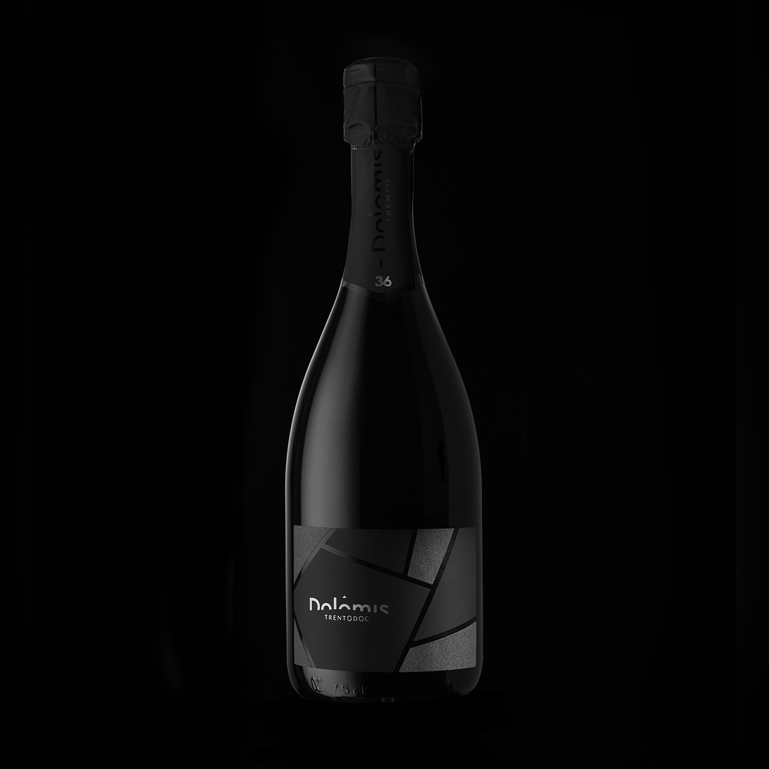
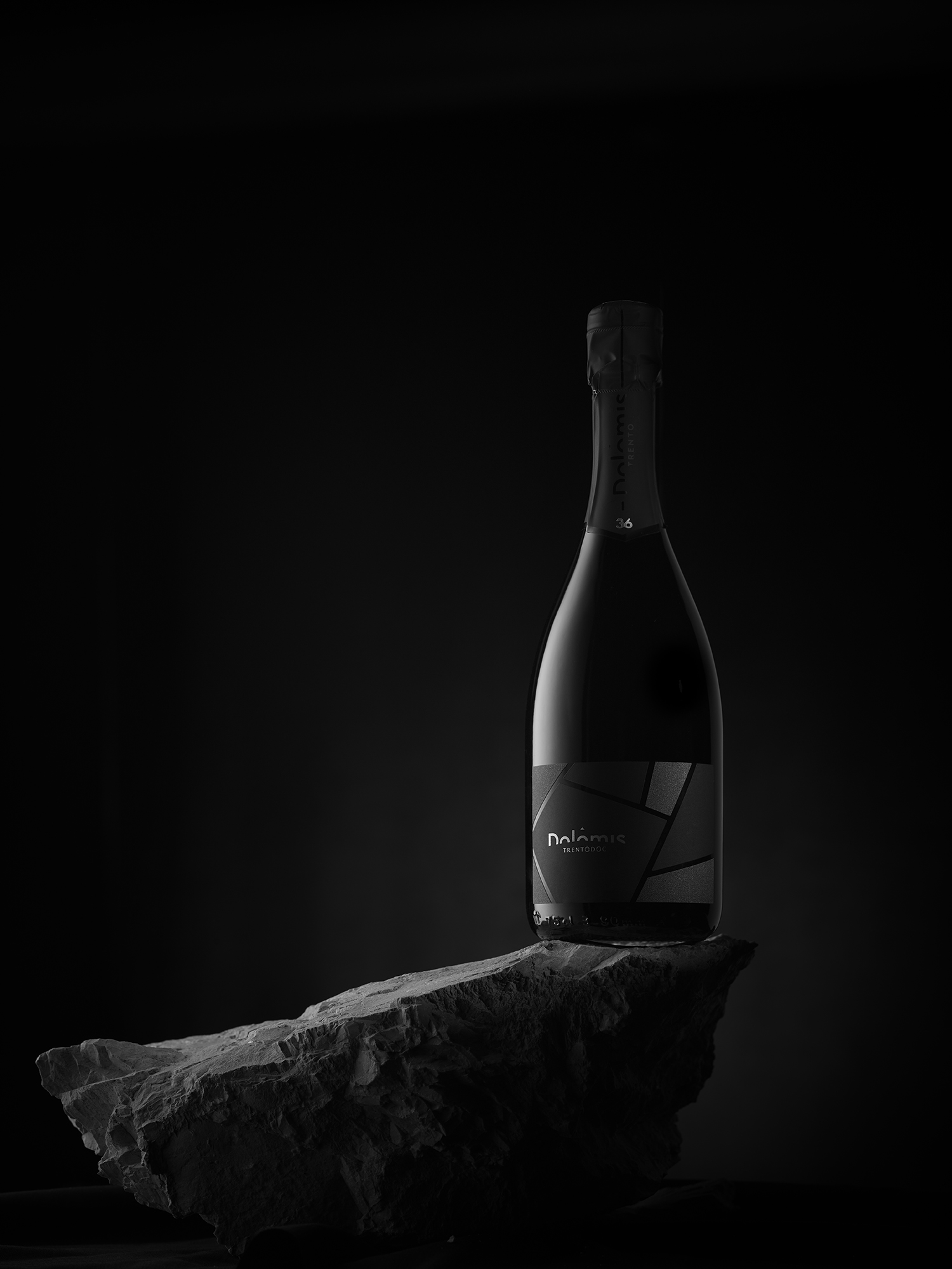
the idea of the whole project is linked to the land on which the vines are born. it is a very rocky terrain and the roots touch the Dolomite rock. hence the name of the project and all the design part of the box and the label. to have a rock-like tactile effect, the label was created by overlapping two layers of paper. on top of the paper, real Dolomia dust was positioned by means of two different screen printing frames. in this way each bottle is a unique piece and the tactile experience is very realistic. The box that encloses the bottle has been made with a particular shape reminiscent of a chipped rock. the paper that covers the box is the same as the label (Manter Ispira Nero mystery). the box is embellished with thick UV paint.
Featured Media
Credits

Entrant
Koleksiyon
Category
Furniture Design - Office Furniture
Entrant
Fong Ho Architecture Interior Design
Category
Interior Design - Home Stay / Airbnb
Entrant
Beijing Wuyao Cultural and Creative Co. Ltd.
Category
Packaging Design - Wine, Beer & Liquor
Entrant
We Can interior Design
Category
Interior Design - Restaurants & Bars