2024 | Professional
Xijiu Matured Liquor
Entrant
Chengdu Times Fashion Art Design Co., Ltd
Category
Packaging Design - Wine, Beer & Liquor
Client's Name
-
Country / Region
China
Gallery
About The Entry
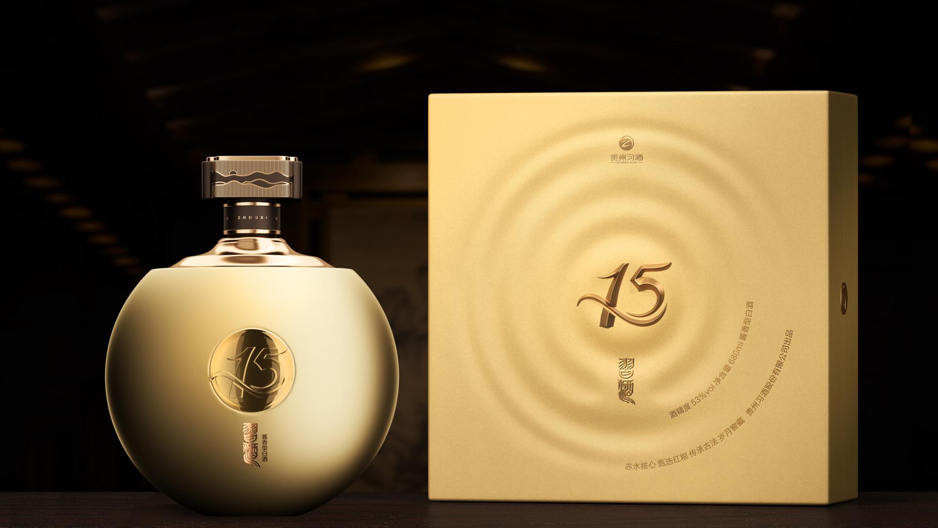
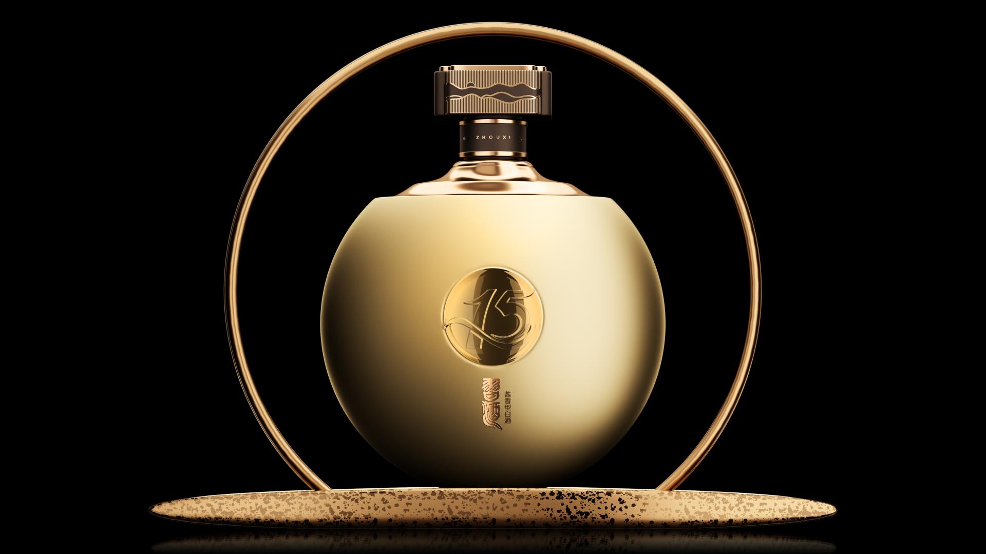
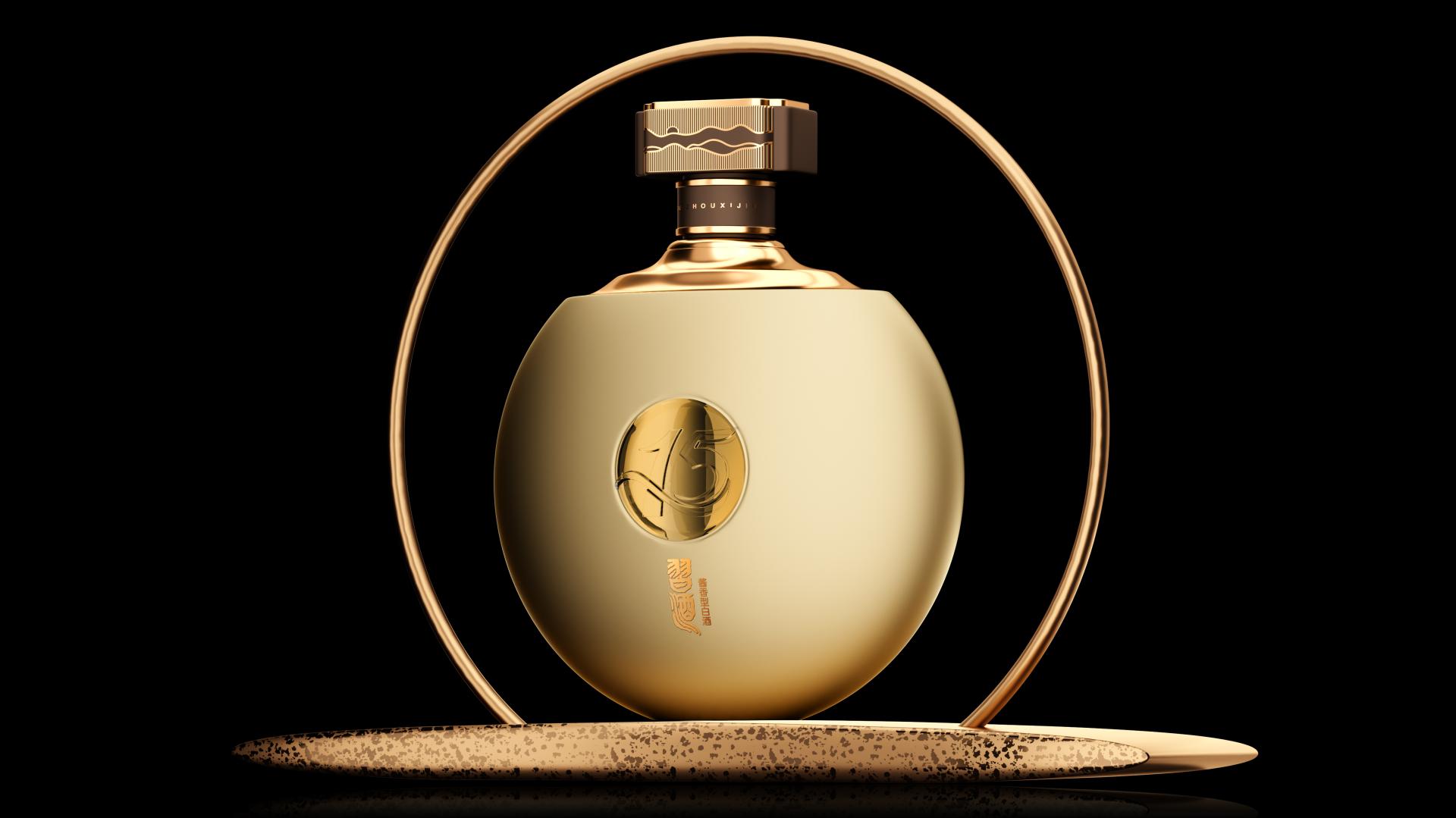
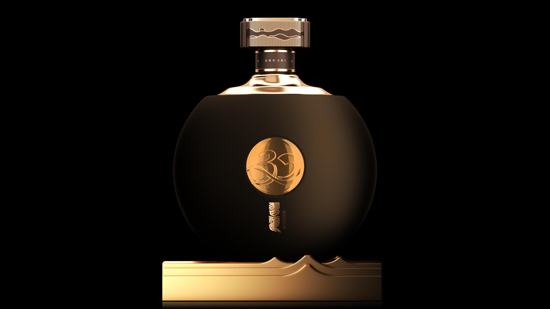
The packaging for Xijiu Matured Liquor Series integrates and interprets the symbolic essence of the circle in traditional Chinese culture, blazing a new trail in fusing classical aesthetics with modern tastes.
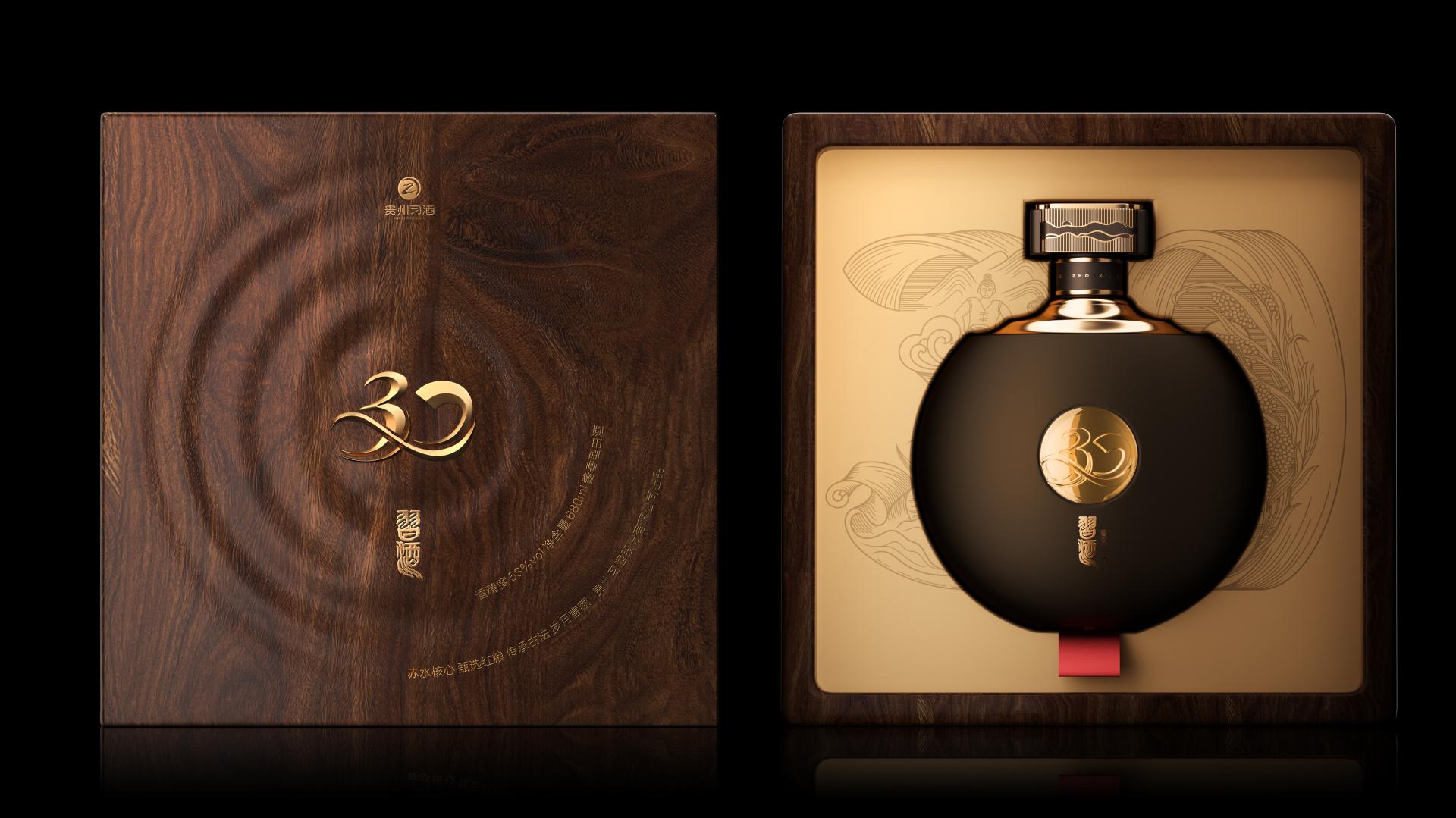
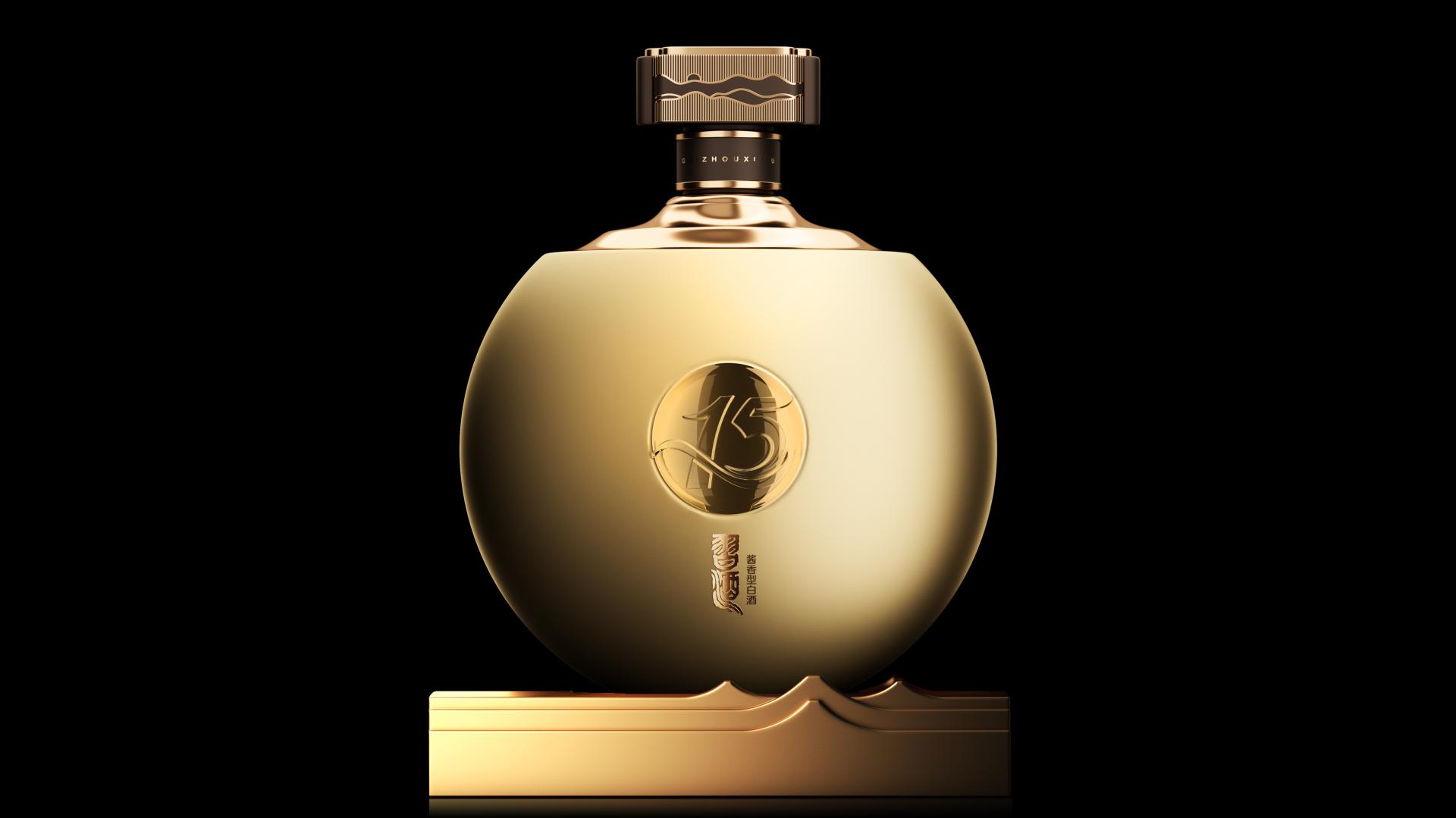
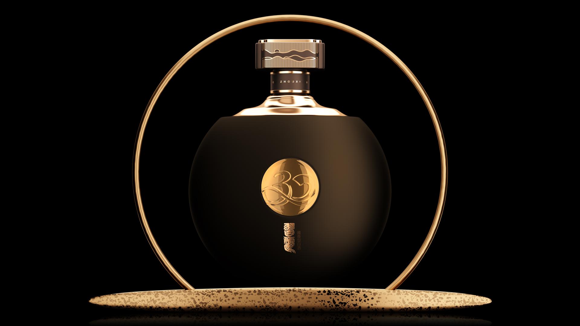
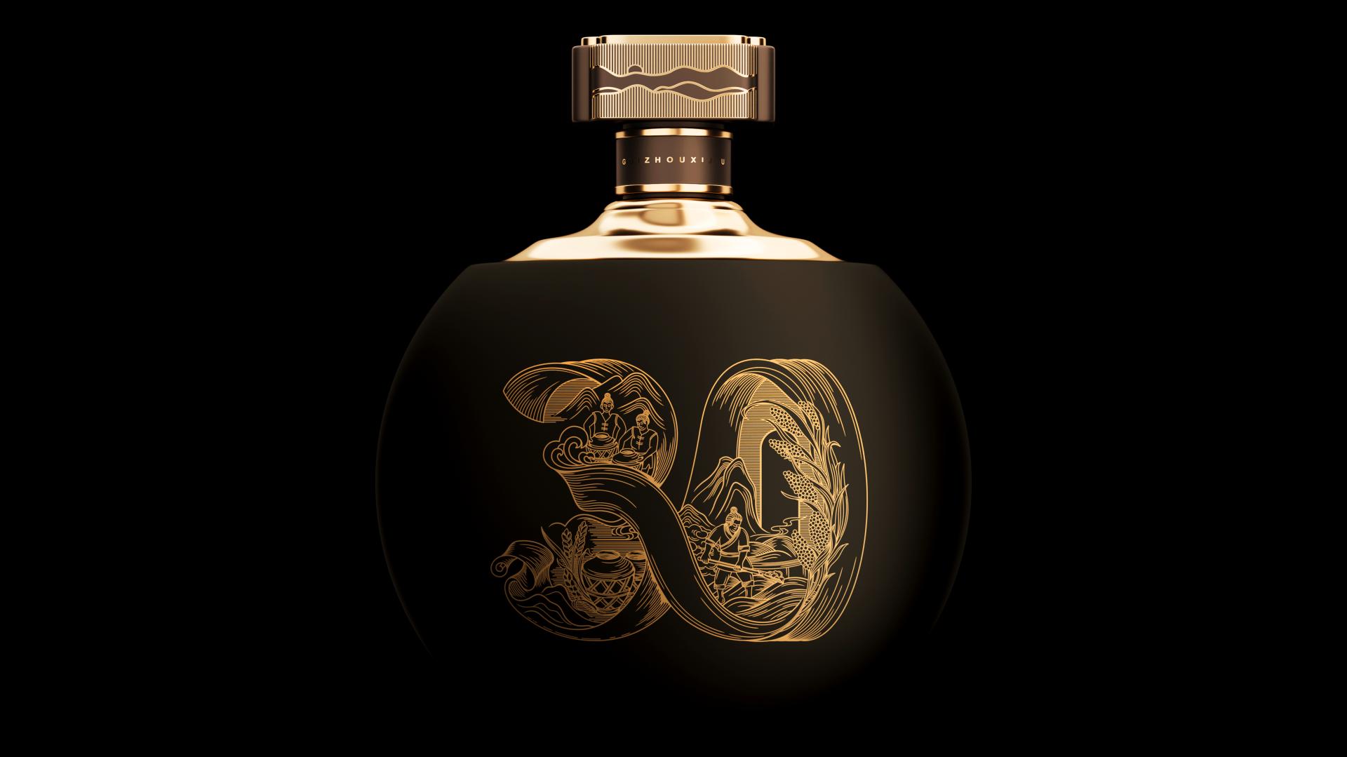
The bottle retains Xijiu's classic drum silhouette, drawing inspiration from an esteemed piece collected in the Palace Museum—Pale Green Jade Disc Decorated with Silkworm Motifs and Bearing an Imperial Inscription. Its circular shape symbolizes completeness, embodying the preciousness and perfection of the matured liquor. This circular form also reflects the universal aspiration for fulfillment in both life and career. Moreover, the 15- and 30-year age statements are laser-engraved on two bottle varieties, with a sleek style reminiscent of fluttering ribbons—a nod to the refined tradition of literati enjoying liquor and composing poetry by a winding stream. Their fluid lines also evoke the rich liquor aroma, connecting consumers' visual experiences with their olfactory senses. To emphasize the high quality of Xijiu and the spirit of craftsmanship, the inner packaging features an original woodcut-style illustration. This artistic element combines the essence of Chinese culture spanning over five millennia with the landscape along the Chishui River and premium ingredients, vividly reflecting the sophistication and heritage of liquor brewing.
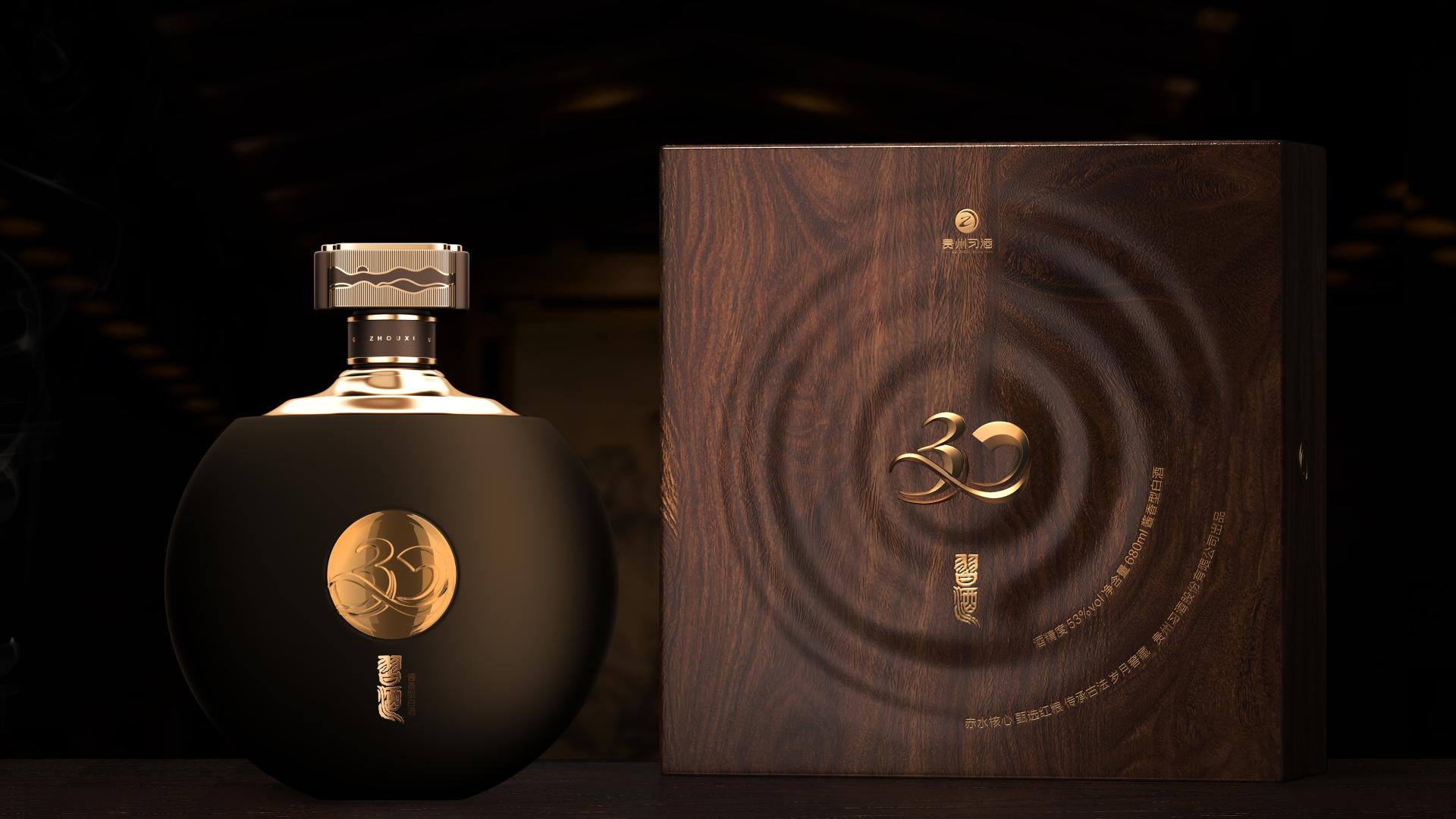
The bottle shoulder integrates auspicious connotations such as "Ascending Step by Step" and "Glorious Years Flowing Like Gold". Further combined with a design reminiscent of an award podium, these elements convey the reverence for time and the brand's sincere wishes for consumers. Inspired by the Carved Red Lacquer Square Box with Loong Motifs collected in the Palace Museum, the cap features a four-sided, auspicious shape (Sihe Ruyi in Chinese), symbolizing the perfect alignment of time, place, craftsmanship, and harmony among people. The stylized mountain silhouette on the base of the bottle is complemented by the sunrise illustration on the side of the cap, evoking the distinctive allure of Chinese landscape.
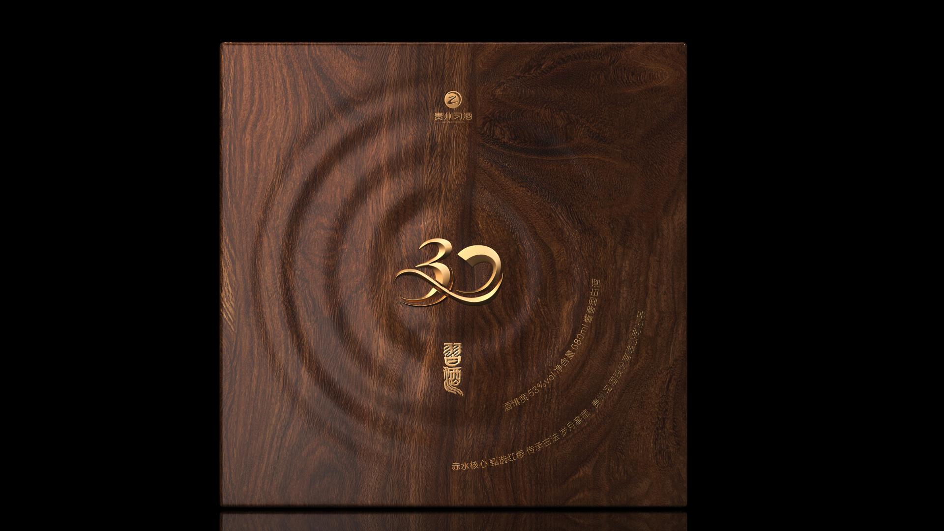
The outer box integrates patterns of ripples and growth rings, symbolizing liquor maturation and flavor enhancement over time. These elements also represent the harmony of nature and time, reflecting that the best things come from patience and natural progression.
Credits
Entrant
China Academy of Art
Category
Conceptual Design - Products

Entrant
BYHEALTH Co., Ltd.
Category
Packaging Design - Health & Wellness
Entrant
Protoscapes
Category
Architectural Design - Renovation
Entrant
Ondo Studio
Category
Interior Design - Retails, Shops, Department Stores & Mall