2025 | Professional

Prepared Food Packaging Design
Entrant
Stand Communications Limited
Category
Packaging Design - Prepared Food
Client's Name
Fish & Sheep
Country / Region
Hong Kong SAR
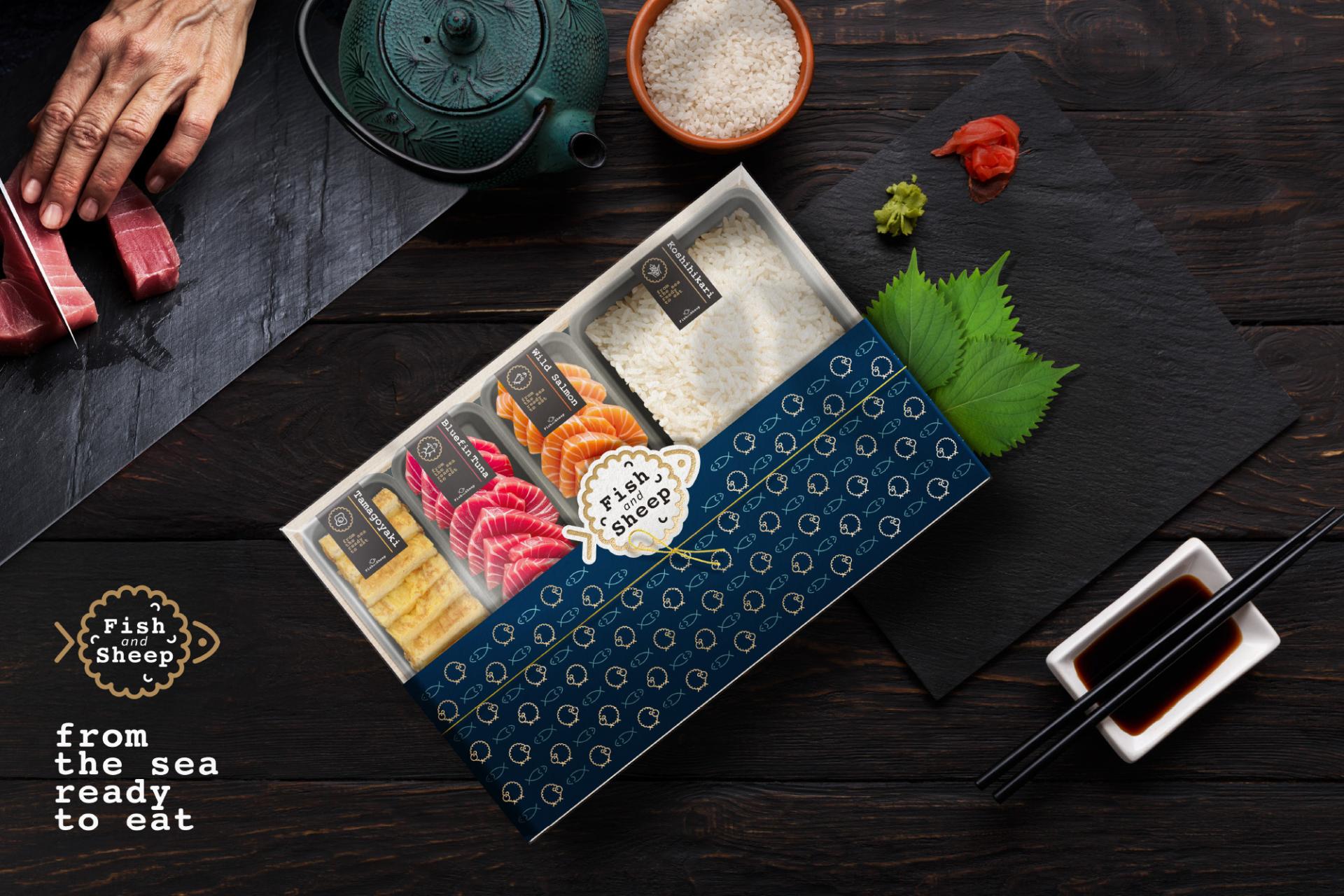
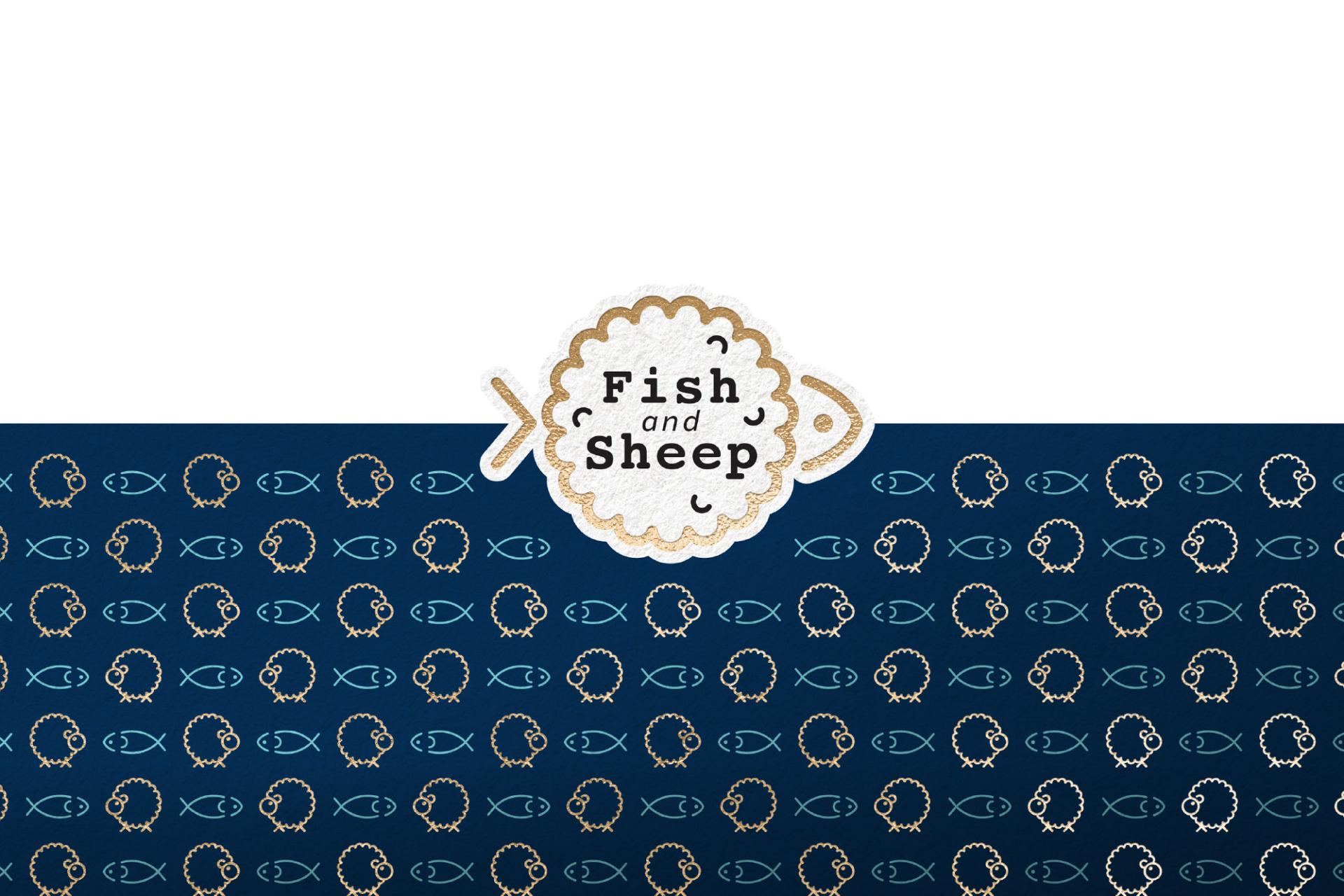
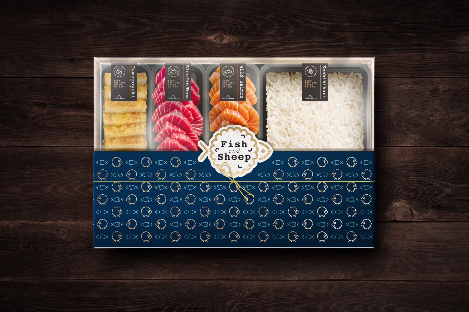
Fish & Sheep — capturing the ocean’s freshness and the warmth of the fields in every bowl of sashimi rice. The name combines “fish” and “sheep,” forming the Chinese character for “fresh,” a symbol of pure quality and exquisite taste. Our logo blends the silhouette of a fish and a sheep in one circular design, representing the harmony between vibrant seafood and fluffy white rice, and the perfect balance in every meal.
The secret behind our freshness is an advanced flash-freeze preservation method. By rapidly lowering the temperature in just minutes, only the finest ice crystals form, protecting each ingredient’s natural texture, bright color, and delicate aroma. Even after long-distance delivery, opening the package feels like tasting it moments after preparation.
Our packaging is wrapped in a deep ocean blue, evoking depth, purity, and freshness. Inside, ingredients are arranged in neat, individual compartments made from sealed trays, ensuring hygiene and preventing flavors from mixing. The orderly presentation enhances appetite appeal, while the fish-and-sheep pattern printed on the lower section subtly reinforces the brand’s story.


Credits
Entrant
City Garden Company
Category
Landscape Design - Small-Scale Landscape Project
Entrant
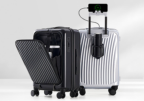
Guangdong OIWAS Luggage And Bag Group Co., Ltd
Category
Product Design - Travel Accessories

Entrant
Ralph Appelbaum Associates
Category
Interior Design - Exhibits, Pavilions & Exhibitions

Entrant
The Grid Studio (M) Sdn Bhd
Category
Interior Design - Living Spaces