2021 | Professional
LiKouBei
Entrant
Shenzhen Excel Brand Design ConsuItant CO. , Ltd.
Category
Packaging Design - Wine, Beer & Liquor
Client's Name
Yangyang International Winery
Country / Region
China
Gallery


About The Entry
It is composed of three calligraphic Chinese characters, Li, Kou, and Bei, to form a series of wines.
The ink-color freehand calligraphy with dry pen deconstructs the charm of Chinese characters. The three Chinese characters are combined to explain the brand spirit of "He".
"Strength" symbolizes the vigorous and powerful vines. The beauty of strength originates from the vigorous vitality of the grapes and symbolizes the pursuit of excellence. The "mouth" is like the shape when wine is poured into the wine glass, dynamic and charming; while the wine entrance is sweet Moet Yue, which means He's mellow taste, is a good wine that has been handed down by word of mouth; "Shell" is the vigorous and huge of Helan Mountain, and it is also of great value, and it is a good brand. It symbolizes that after hard work, the brand will definitely gain more value and recognition.
Entrant
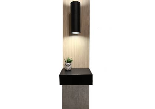
ML Design Co
Category
Furniture Design - Other Furniture Design
Entrant
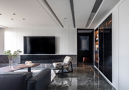
The Above Design (Shanghai) Co., Ltd
Category
Interior Design - Residential
Entrant
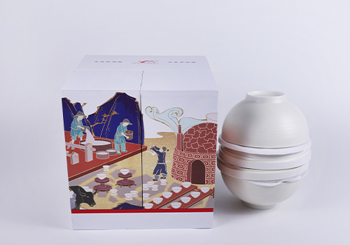
北京戈雅金峰品牌设计事务所
Category
Packaging Design - Structural (NEW)
Entrant
Phenom Design Studio
Category
Interior Design - Restaurants & Bars