2026 | Professional
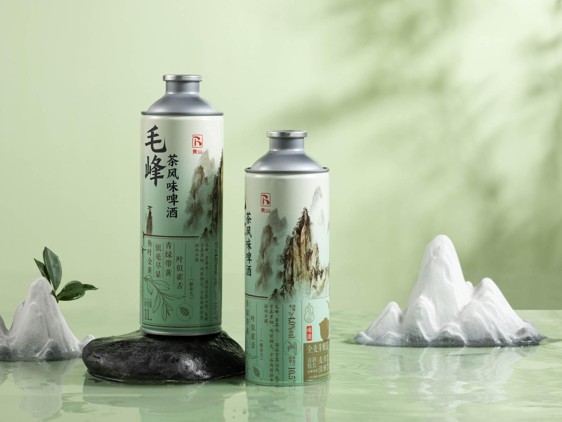
Mount Huangshan Maofeng Tea Flavor Beer
Entrant
China Resources Snow Beer (China) Co., Ltd.
Category
Packaging Design - Wine, Beer & Liquor
Client's Name
China Resources Snow Beer (China) Co., Ltd.
Country / Region
China
This tea-infused beer, crafted from Huangshan Maofeng green tea, carves out a distinctive niche in the flavored beverage category by combining innovative brewing craftsmanship with a deeply rooted cultural narrative. Leveraging a craft-brewing process alongside advanced tea-extraction technology, it captures the delicate, natural aroma of Huangshan Maofeng while achieving a harmonious balance between tea and beer, ultimately yielding a smooth, layered flavor profile and a clean, lingering finish.
The innovation extends far beyond flavors into a meticulously crafted visual identity that harmonizes the refined subtlety of tea with the crisp refreshment of beer. Anchored by the evocative narrative “Born of the Mountains, Closer to the Sky,” the design distills four core cultural motifs—towering peaks, sea of clouds, the iconic “sparrow-tongue” leaf form, and poetic sensibility—into a cohesive, scalable, and distinctive visual language. The packaging unfolds as a visual poem: an ink-wash mountain backdrop, rendered with intentional negative space to suggest drifting clouds, embodies Huangshan’s ethereal, lofty spirit; a stylized graphic of the “sparrow-tongue” tea leaf—faithful to Maofeng’s signature shape—immediately conveys the product’s key ingredient and flavor character; and architectural cues drawn from Anhui’s tradition further anchor the product in its geographic and cultural origin. Typography plays a pivotal role as well, with expressive calligraphy presenting the poetic descriptor “leaves like sparrow tongues, green with a hint of yellow,” transforming obscure tea terminology into emotive visual storytelling that elevates perceived quality and articulates the compelling product value. The color palette draws directly from the natural appearance of Huangshan Maofeng—vibrant green accented with warm yellow undertones—complemented by stone brown and soft, mist-like white. This color harmony reflects the tea’s terroir while seamlessly bridging classical Chinese aesthetics with modern refreshing appeal. Together, these elements create a highly distinctive presence on the shelf, turning the packaging into a silent yet powerful visual statement that instantly evokes the tea-infused beer’s unique flavor profile and echoes its cultural roots.


Credits

Entrant
明志科技大學(Ming Chi University of Technology)
Category
Packaging Design - Innovative

Entrant
Donghua University
Category
Fashion Design - Avant-Garde

Entrant
Fujian Zhaopu Real Estate Development Co., LTD. / Xiamen C&D Construction Operation Management Co.
Category
Architectural Design - New Category

Entrant
KANKEI DESIGN STUDIO
Category
Landscape Design - Residential Landscape