2026 | Professional
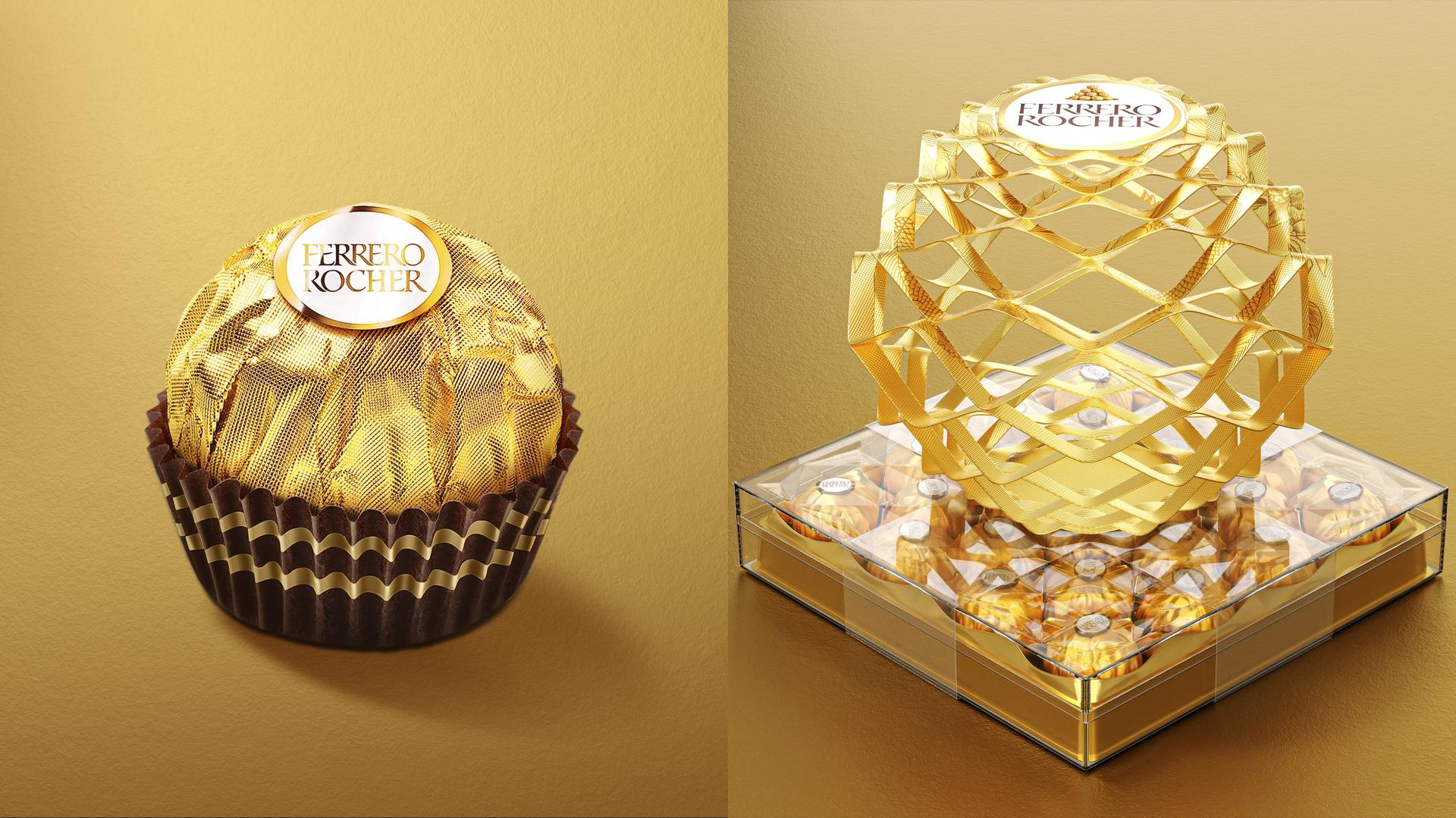
Ferrero Rocher Gold Ball
Entrant
BLACKANDGOLD DESIGN (SHANGHAI) CO., LTD.
Category
Packaging Design - Structural
Client's Name
FERRERO TRADING (SHANGHAI) CO., LTD.
Country / Region
China
Ferrero Rocher, with its iconic golden spherical chocolate (we called golden ball) as the core brand visual. With luxurious golden packaging and rich flavor, it has become a global symbol of premium gifting. The product's distinctive round form naturally embodies the profound meaning of "fulfillment", symbolizing reunion, perfection, and heartfelt sentiment. Rooted deeply in the brand DNA of Rocher, we create a distinctive die-cut packaging design. It seamlessly fusing the "fulfillment" imagery of the Rocher golden sphere with Eastern emotional values, creating a gift that has high aesthetic appeal and interactive experience.
Breaking free from the flat constraints of traditional packaging, the design uses precision die-cut craftsmanship to achieve a 2D-to-3D transformation. In its initial state, the die-cut forms a smooth golden surface drawed with Eastern auspicious symbols: koi, magpies and peonies, signifying reunion, wealth, and good fortune. As the folded structure is gently unfolded, the flat patterns gradually rise into a full 3D sphere. It perfectly echoing the signature golden spherical shape of Ferrero Rocher.
This work is not merely an innovation in packaging structure. It also symbolizes the transformation of good wishes from illustrated imagery into tangible heartfelt gifts. It echoes Ferrero Rocher's luxurious golden tone while translating traditional blessings into tactile visual language, completing a dual ritualistic experience—from visual perception to emotional connection.


Credits

Entrant
Fangyuan Design
Category
Architectural Design - Renovation
Entrant
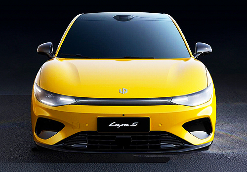
Zhejiang Leapmotor Technology Co.,Ltd
Category
Transportation Design - Automobiles
Entrant
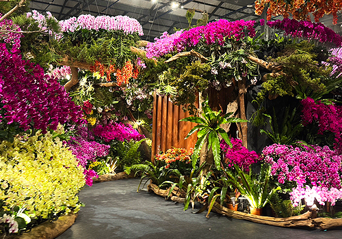
儷景景觀設計有限公司Li Jing Landscape Design Co., Ltd.
Category
Landscape Design - Temporary / Event Landscape

Entrant
Cheng Chung Design (HK) Ltd.
Category
Interior Design - Residential