2026 | Professional

SONGDA Teen Series
Entrant
SONG DA
Category
Packaging Design - Beauty & Personal Care
Client's Name
Jin Jing, Ding Linjing, Dong Jie, Zhang Han
Country / Region
China
Gallery


About The Entry
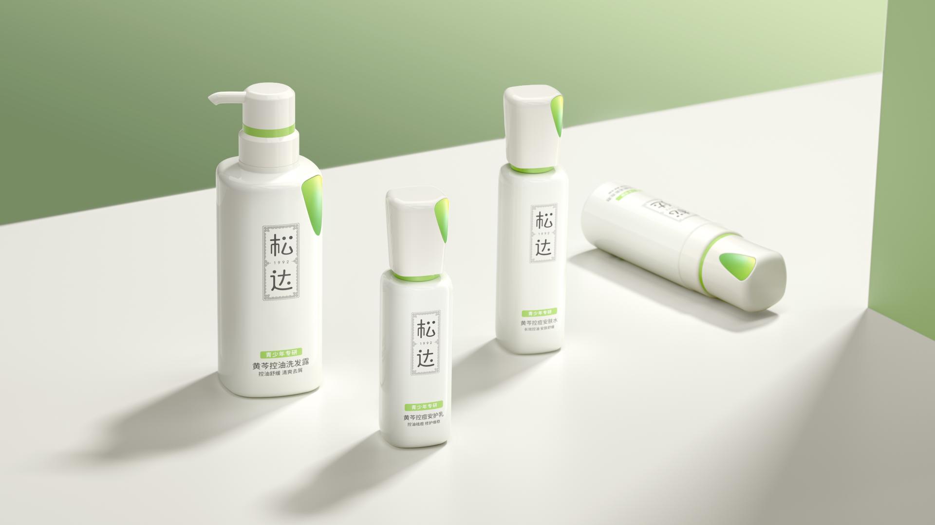
As an expert in skincare for teenage oily and acne-prone skin, SONGDA is committed to solving adolescent acne concerns. We understand and embrace acne as an "imperfect" yet natural part of growing up, cherishing and accompanying teens through every step of their journey.
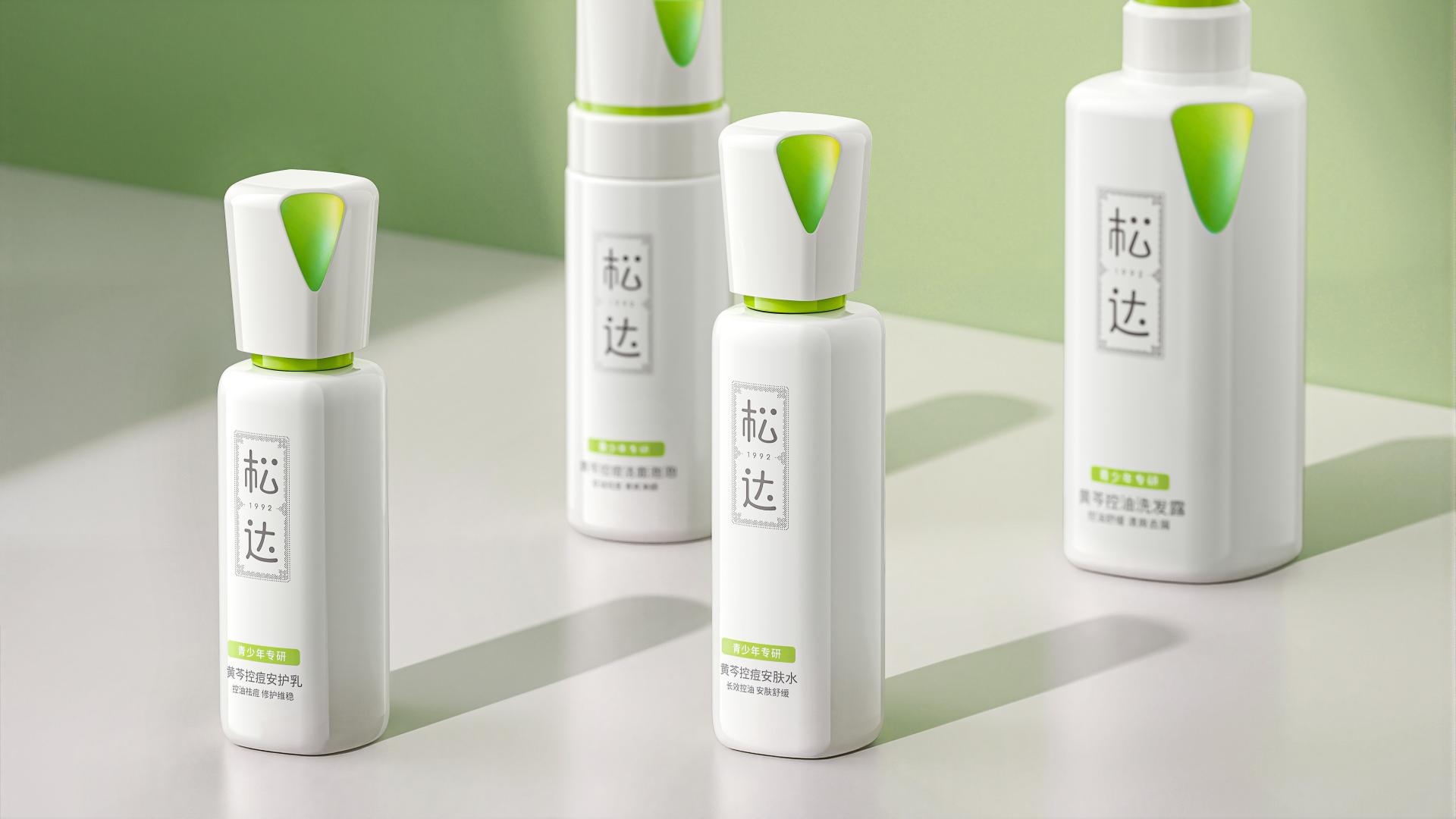
Design Concept "Unfinished Youth": The packaging intentionally incorporates a visual notch, breaking traditional standards of flawless perfection to let inner colors flow naturally. Rather than a defect, this design softly embraces the authentic state of youth, establishing a deep emotional resonance with the teenage user demographic.
The bottle design adopts round-within-square structural language: the square symbolizes rationality and the gradually emerging edges of adolescence, while the circle represents inclusiveness and gentle care for teenagers. Refined proportions create a silhouette that feels both modern and emotionally grounded, reflecting the transformation of youth. The cap and triangular detail introduce an innovative iridescent gradient finish that echoes the signature “notch” concept, allowing color to appear as if it naturally grows from within. Within a clean geometric framework, the packaging unleashes a dynamic vitality that breaks free from conventional constraints, unifying functional performance with emotional storytelling and giving tangible form to the idea of "unfinished youth."
Every detail of the packaging is designed to strive for the ultimate user experience in terms of visual appeal, tactile experience, and user interaction.
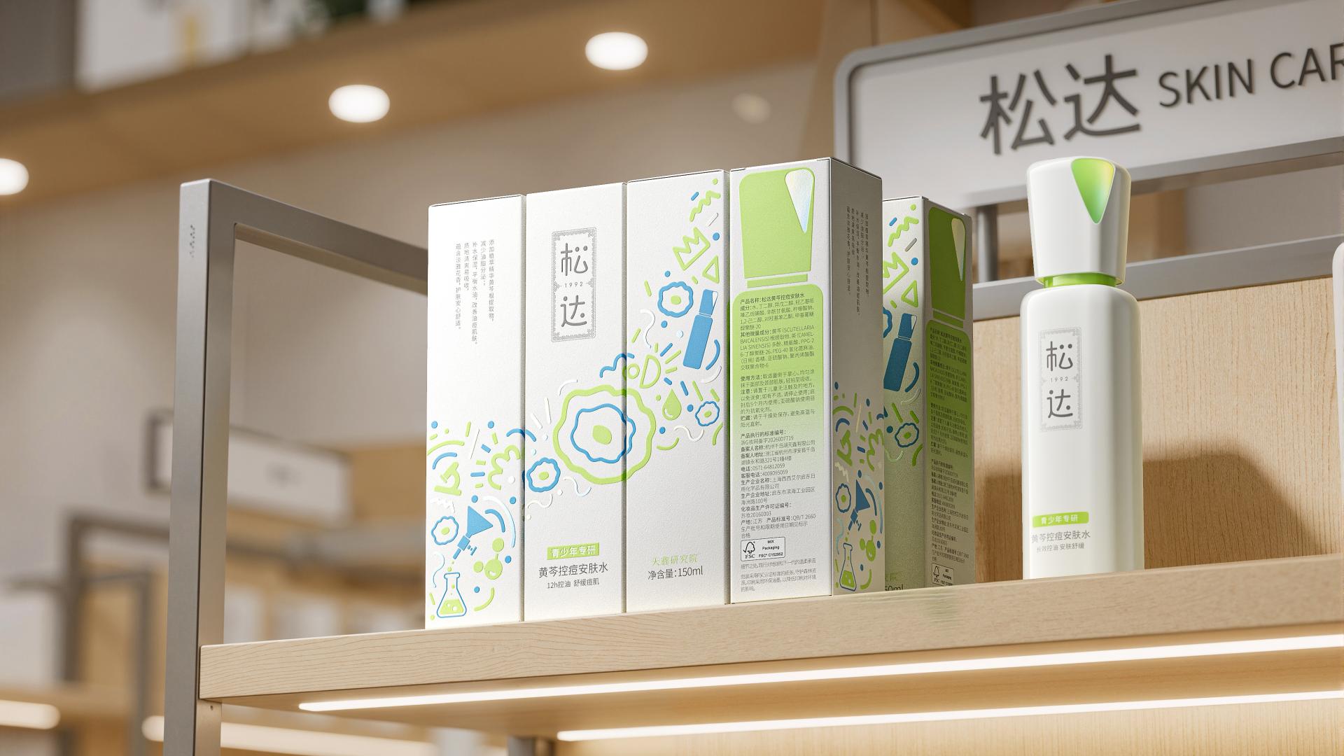
In terms of refined craftsmanship, the carton features full-surface embossing to enhance the dimensionality of key graphics and the "Teen Research" typography, establishing a distinctive tactile identity. The subtle contrast between selective pearlescent foil stamping and the matte background creates a delicate, light-catching sheen, expressing a disciplined, professional aesthetic through sensory details.
For the bottle interaction, a specially engineered “click-lock closure” reduces the number of screw rotations, enabling quick opening and precise sealing, while the satisfying click sound reinforces ergonomic feedback. Through carefully refined interactions and craftsmanship, the design delivers a smooth, intuitive, and trustworthy user experience for teenagers.
The packaging adopts a free-flowing hand-drawn graffiti style, using expressive and spontaneous lines to reflect the authentic emotions and vibrant energy of teenagers.
Credits
Entrant
VITAL MEDTECH Co, Ltd.
Category
Product Design - Medical Devices
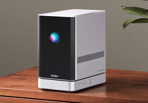
Entrant
AOSU LIFE PTE. LTD.
Category
Product Design - Smart Home
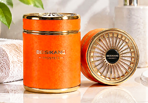
Entrant
Dongguan Beisikang Technology Co., Ltd./BEISIKANG Fragrance inc
Category
Product Design - Hobby & Leisure
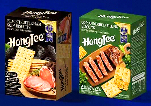
Entrant
GUANGDONG HUANGJI FOOD CO., LTD
Category
Packaging Design - Snacks, Confectionary & Desserts