2026 | Professional

B Beworths
Entrant
Minch Global Trade Inc.
Category
Packaging Design - Health & Wellness
Client's Name
-
Country / Region
United States
Gallery



About The Entry
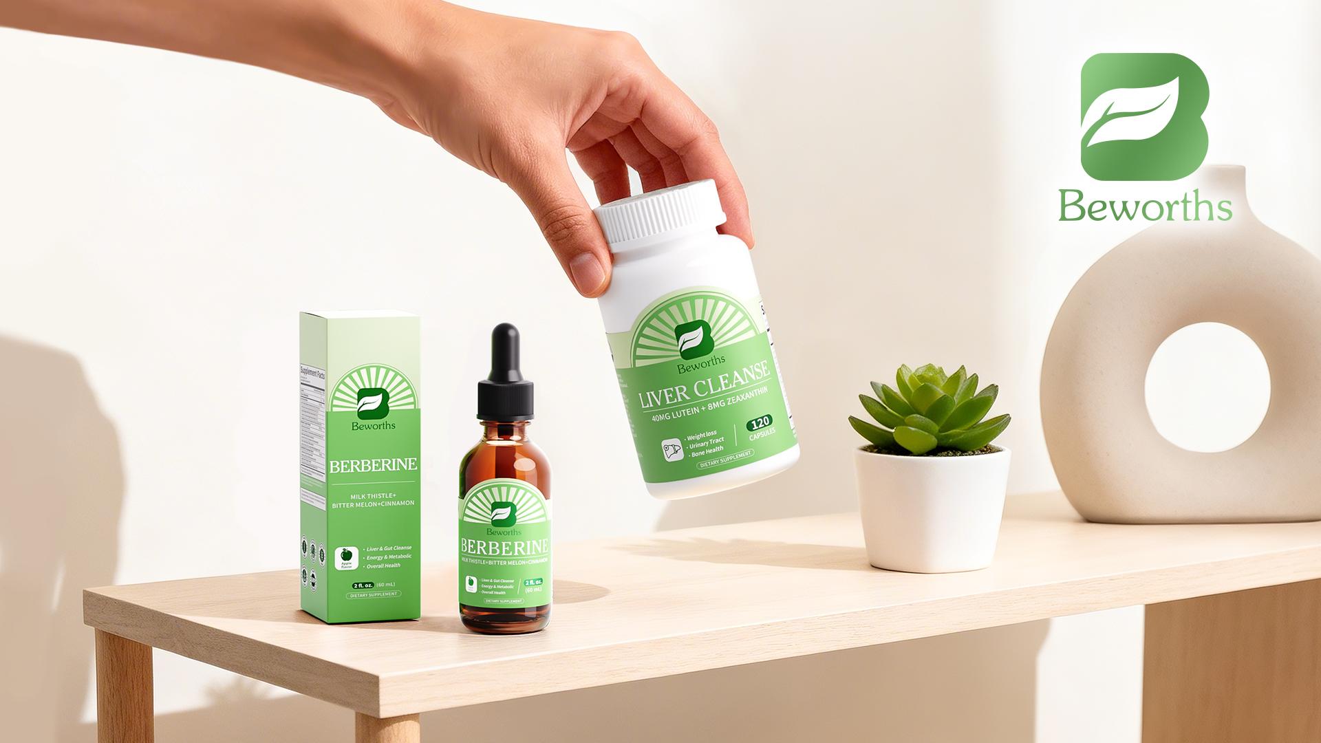
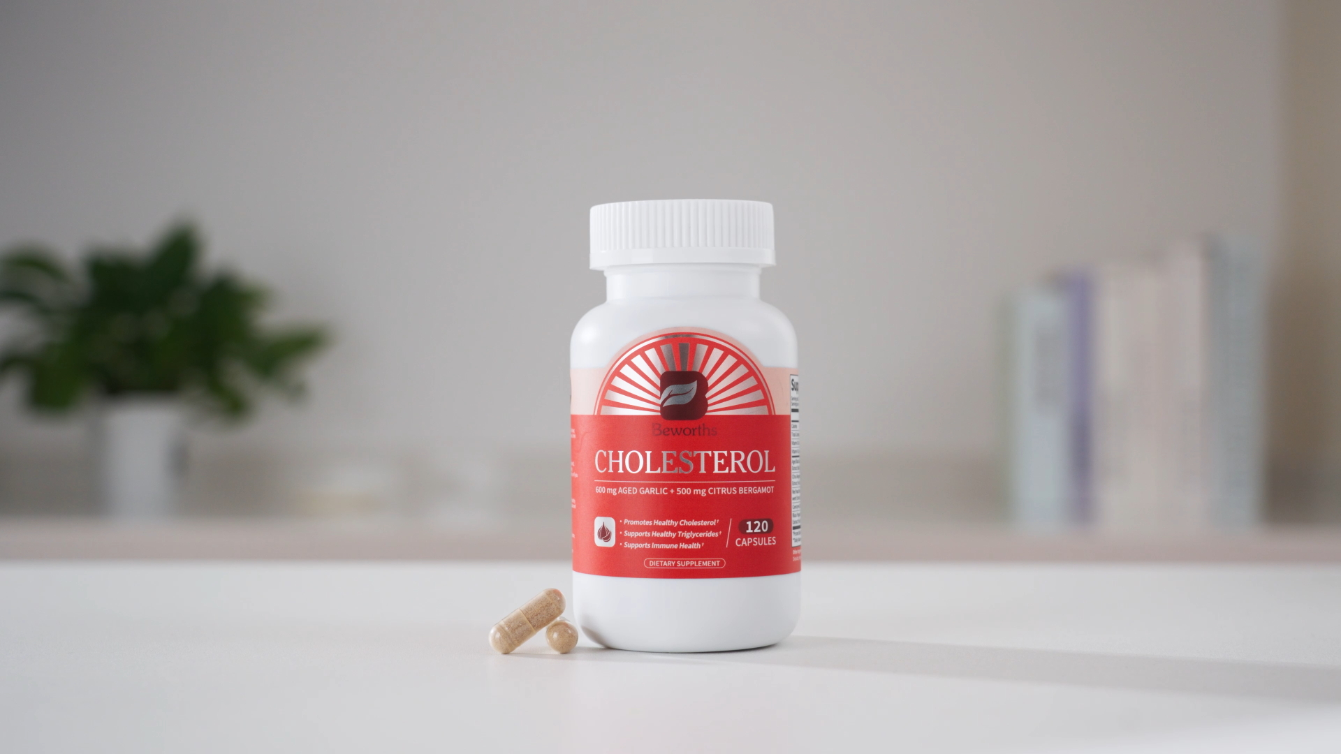
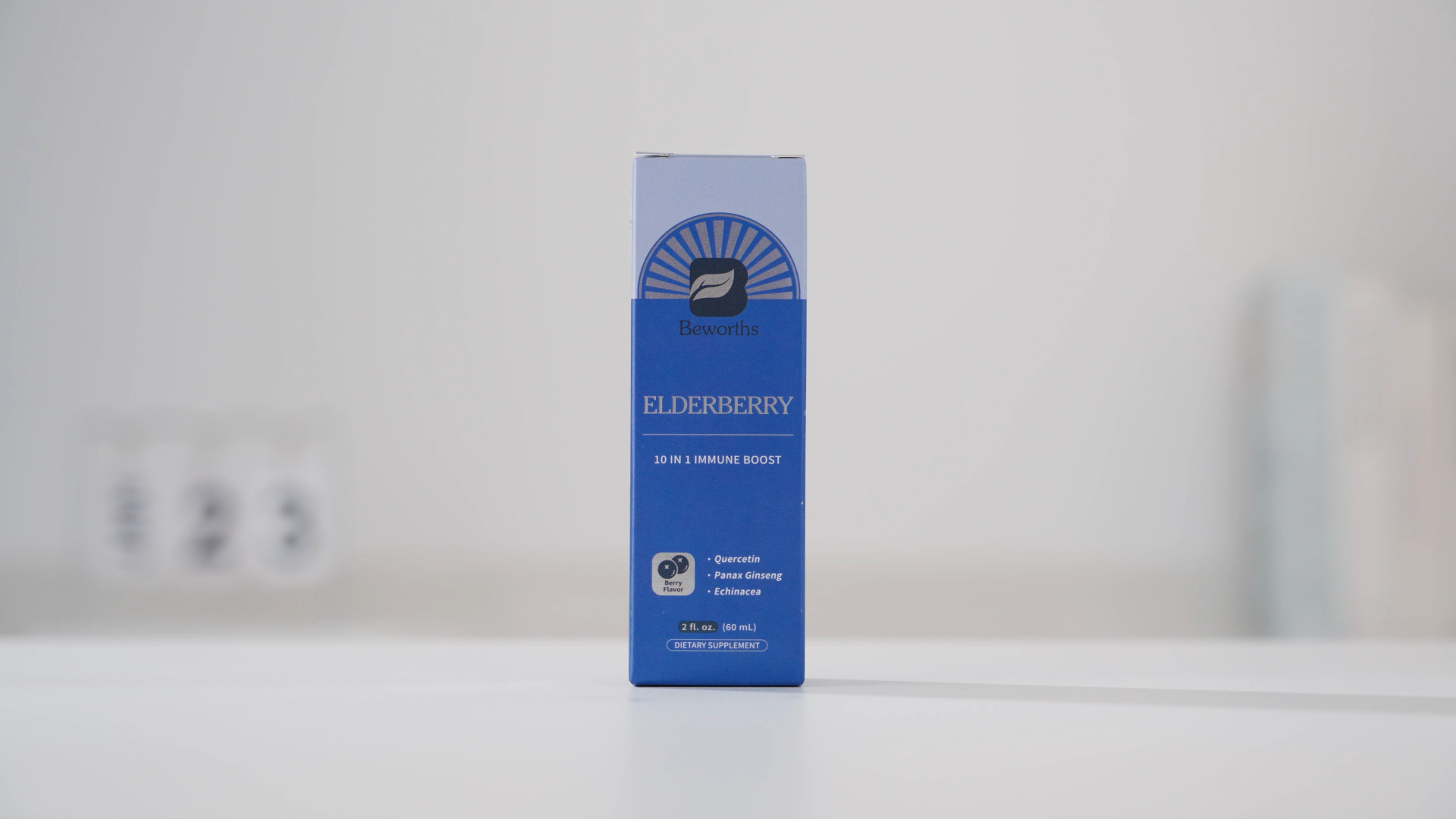
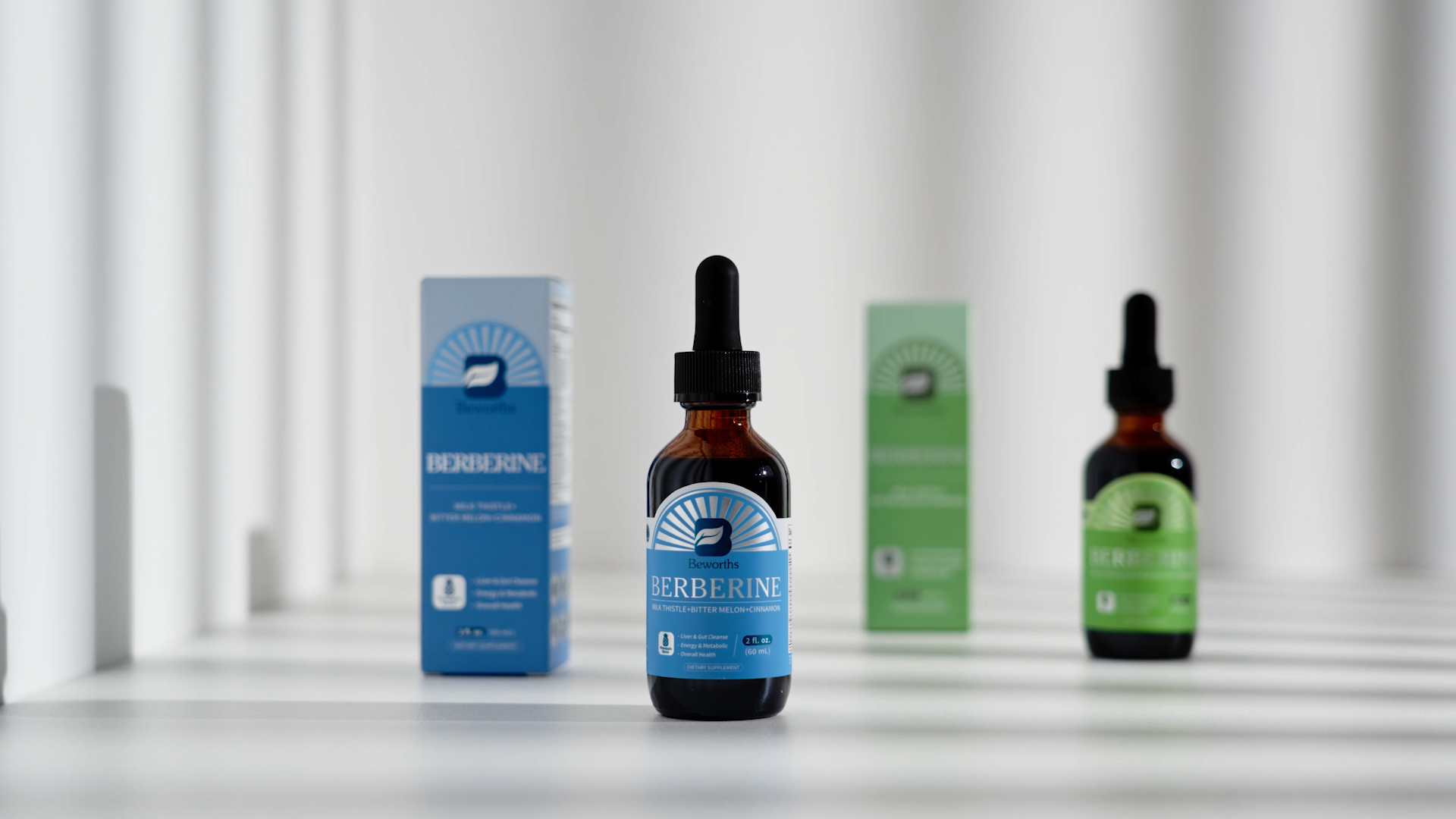
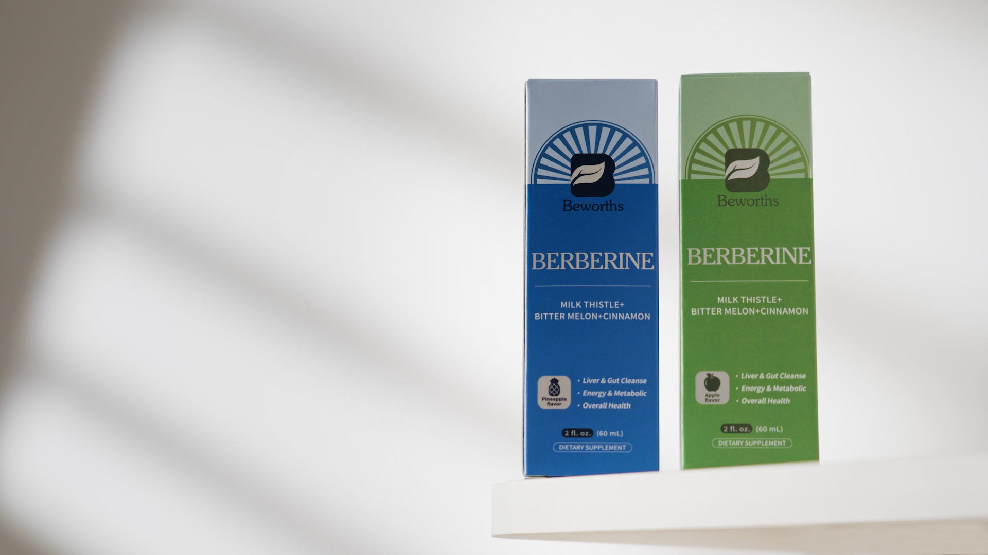
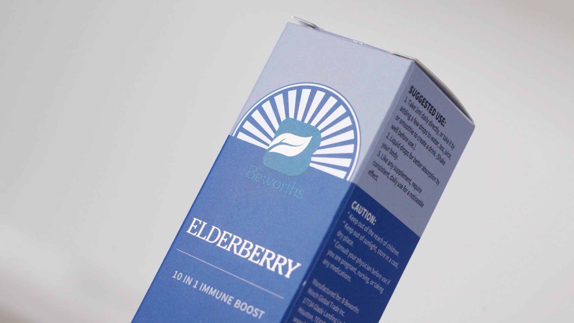
The packaging series of B Beworths adopts "Natural Radiance, Gathered Energy" as its core design concept. It integrates the brand logo with outward radiating halo graphics to build a unique brand symbol with strong visual focus and vibrant vitality. Centered on the brand logo, the regularly arranged radial lines extend outward in layers, creating a visual effect of shining sunlight and continuous energy release. It vividly implies that the nutritional ingredients of the product diffuse from the core to nourish the body, providing long-lasting energy support and physical vitality for the human body.
Inspired by natural sunlight, original energy and the growth of all things in nature, the radial graphic design is intuitively associated with warm solar radiance and pure natural temperament. It fully conveys a positive, healthy and revitalizing attitude towards life, which is highly consistent with the core product philosophy of the brand’s health supplements — improving physical and mental state comprehensively from the inside out. The in-depth integration of radial energy graphics and the brand logo upgrades the brand identity from a single visual mark to the visual and energy core of the entire packaging system, effectively enhancing brand recognition and connotation.

Entrant
Mi Associates Pte Ltd
Category
Interior Design - Office
Entrant
Taiyang Design
Category
Interior Design - Office

Entrant
Jinge Interior Decoration Co., Ltd.
Category
Interior Design - Residential

Entrant
Li Ning (China) Sports Goods Co., Ltd.
Category
Fashion Design - Textile & Materials