2026 | Professional

Macho
Entrant
Spellcaster UK
Category
Packaging Design - Dairy, Spices, Oils, Sauces & Condiments
Client's Name
Ledo / Frikom
Country / Region
United Kingdom
Gallery
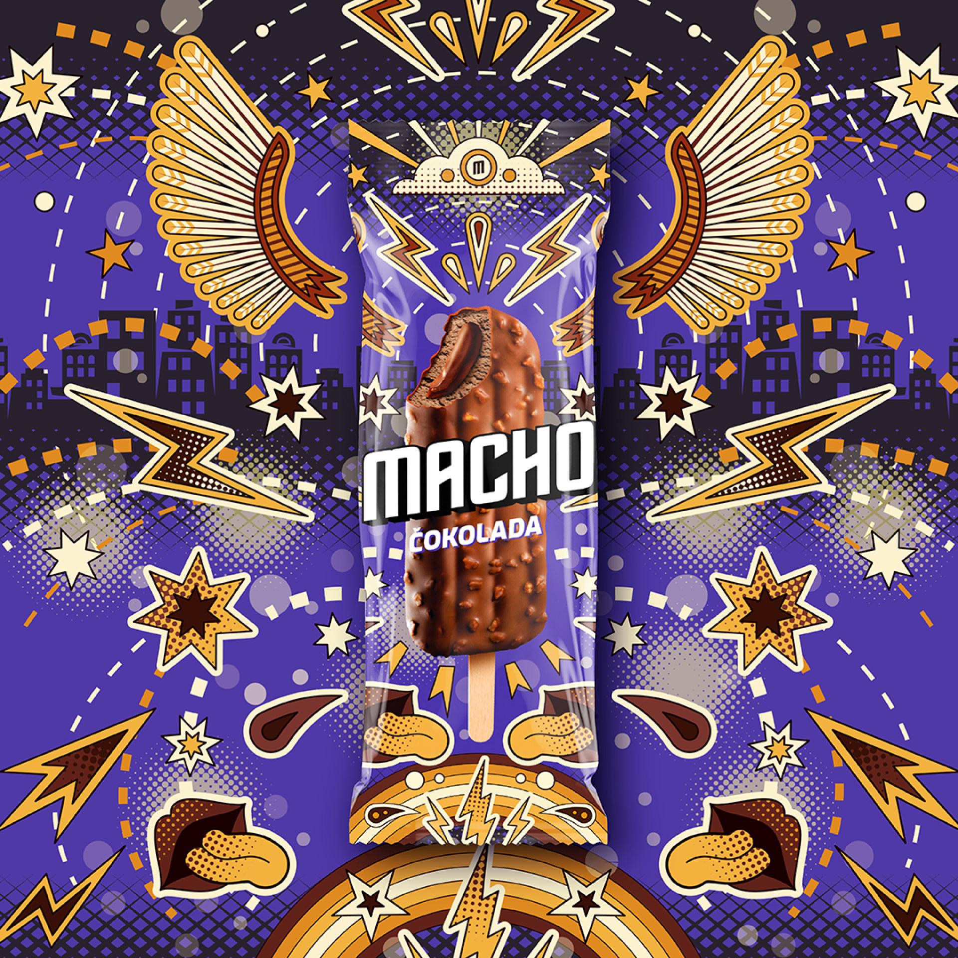
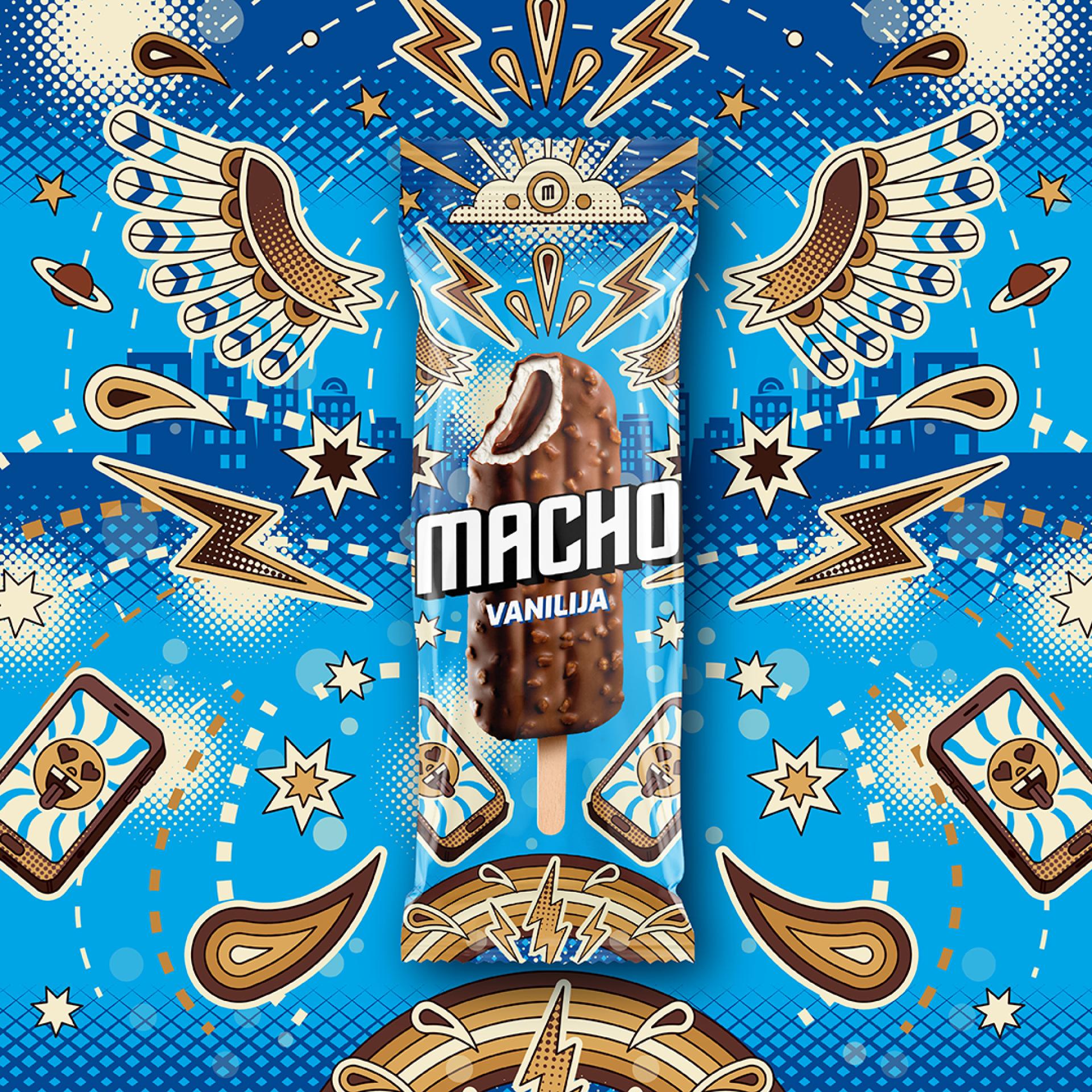

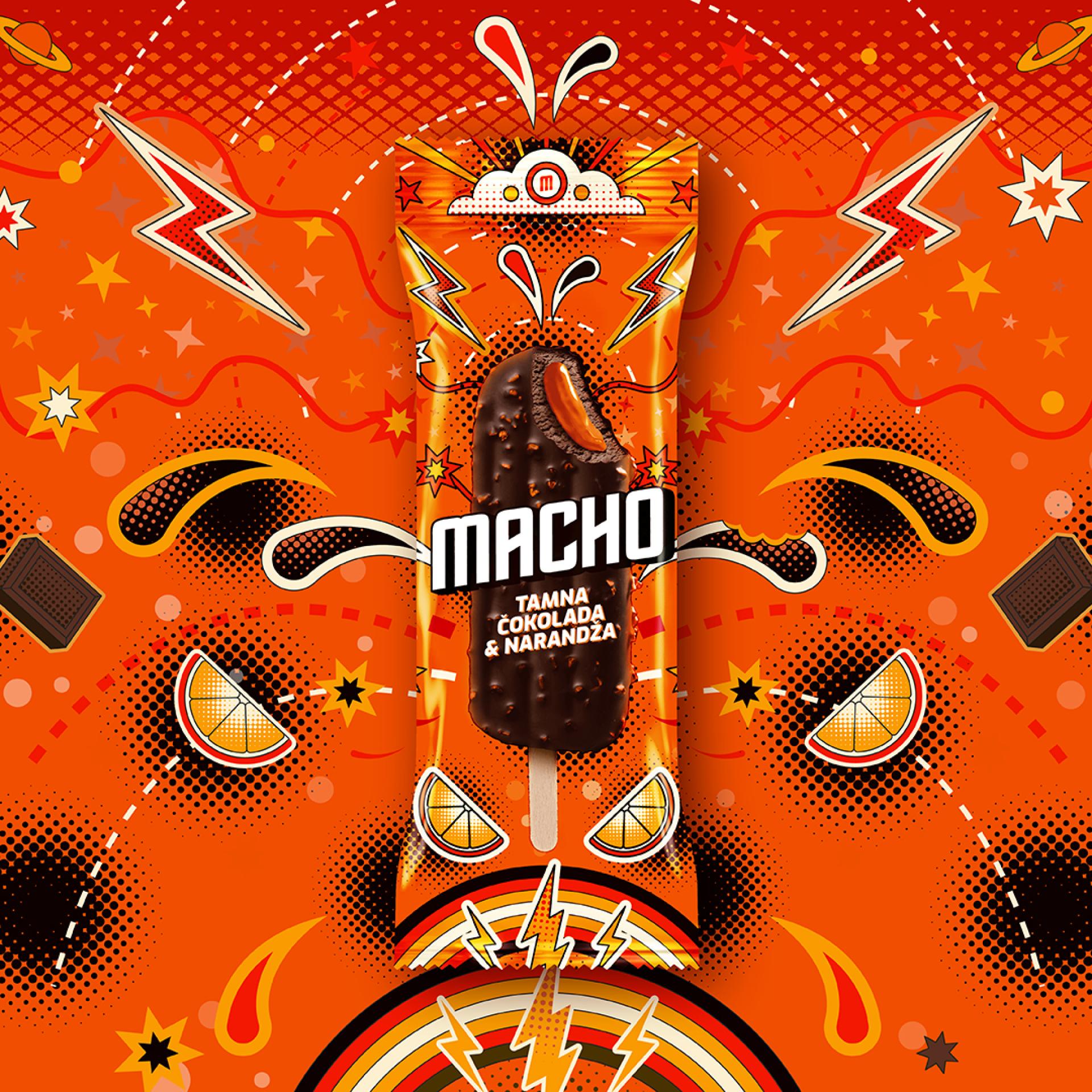
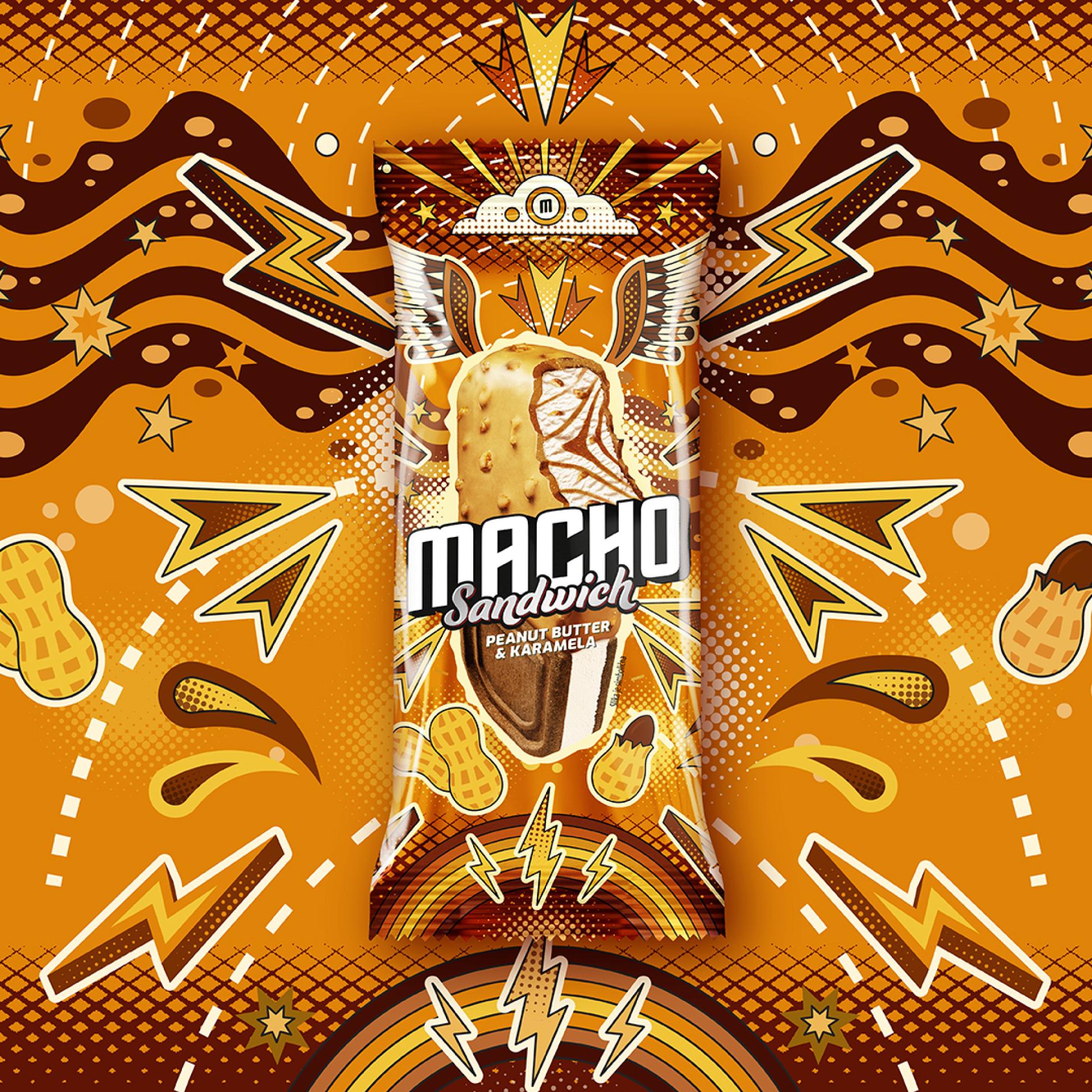
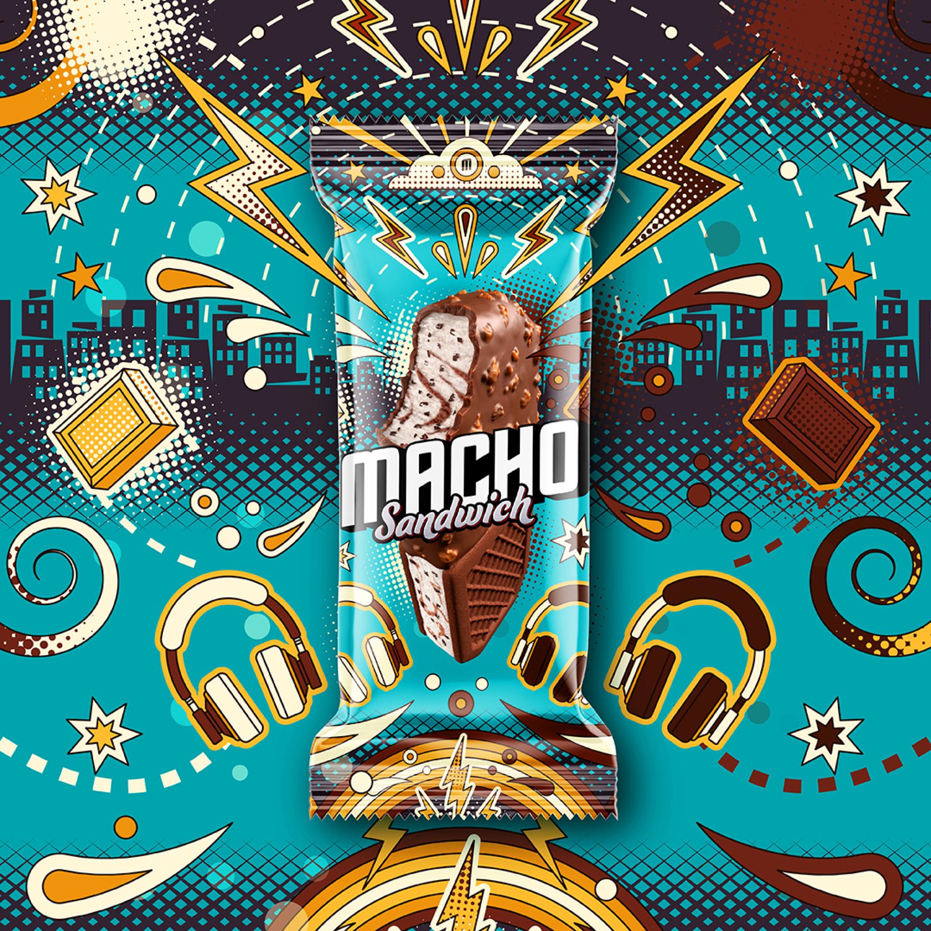
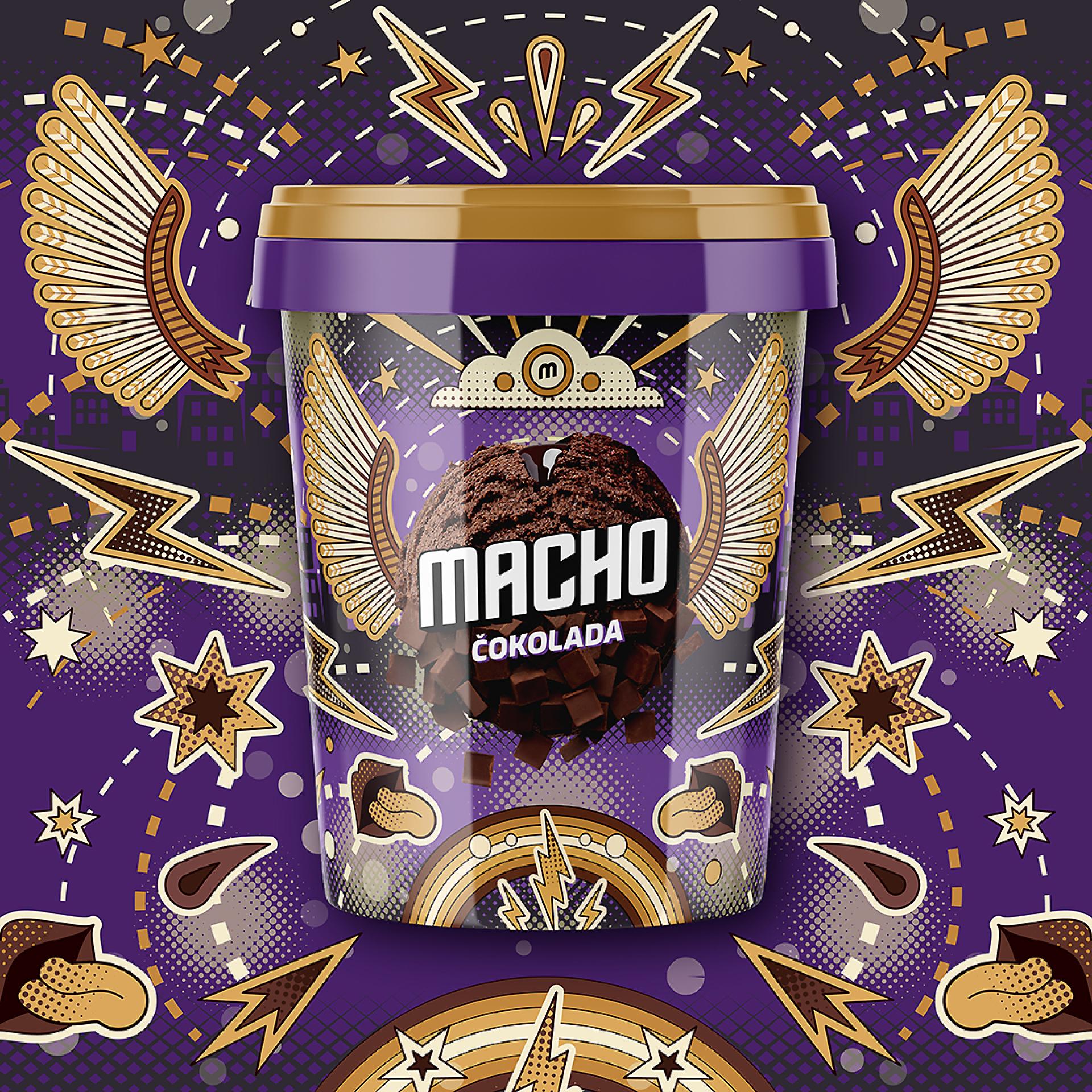
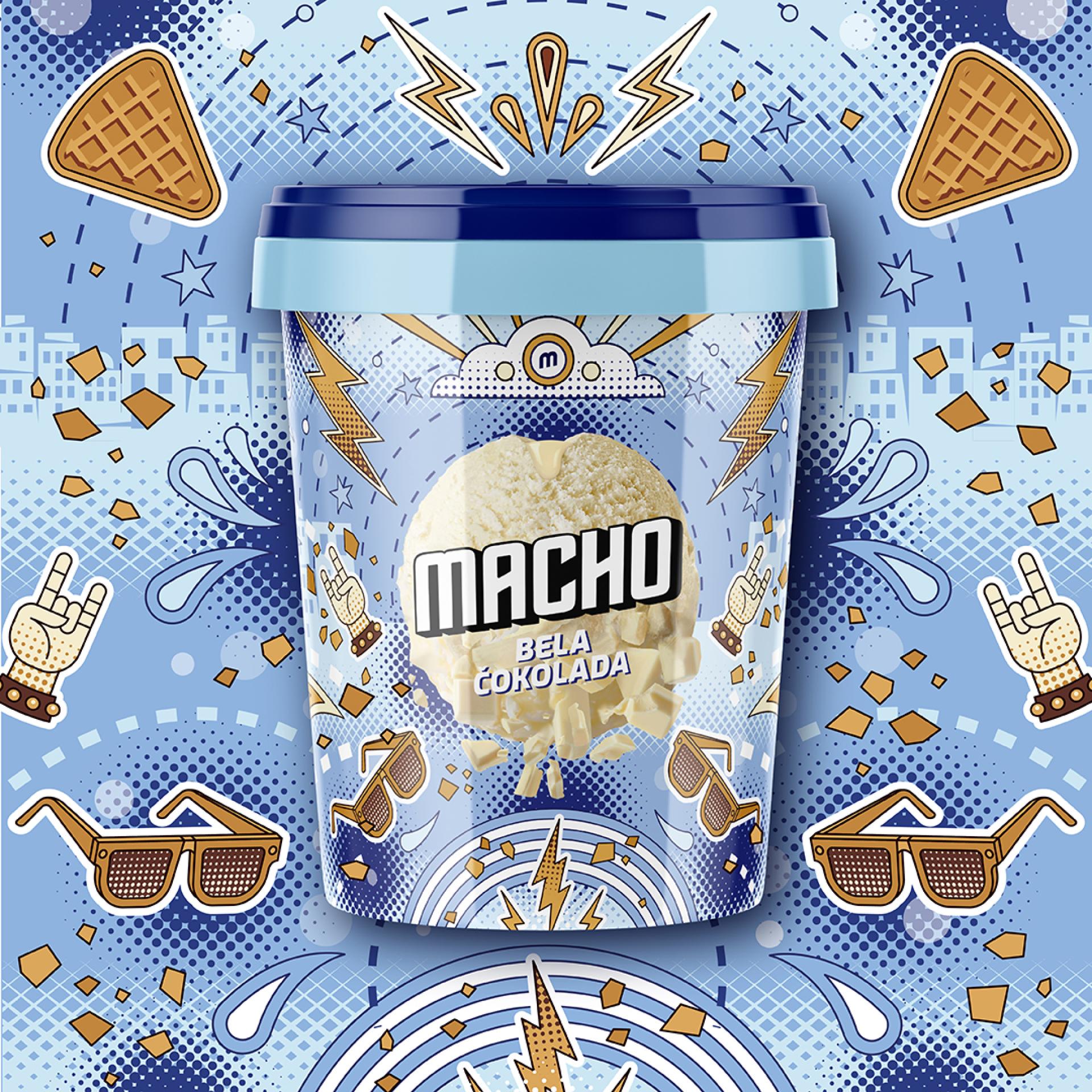
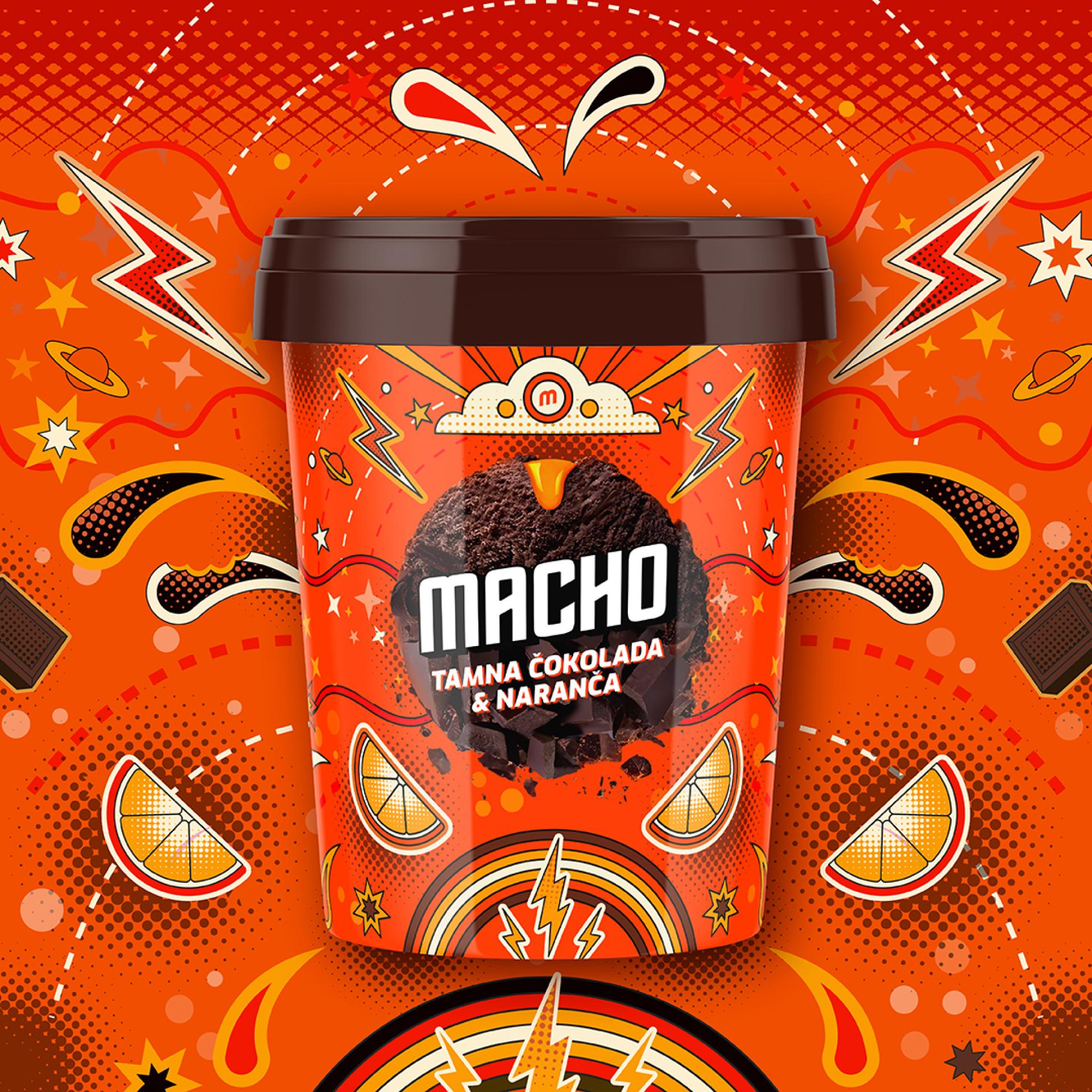
About The Entry
The Challenge: Overcoming a Dated Legacy
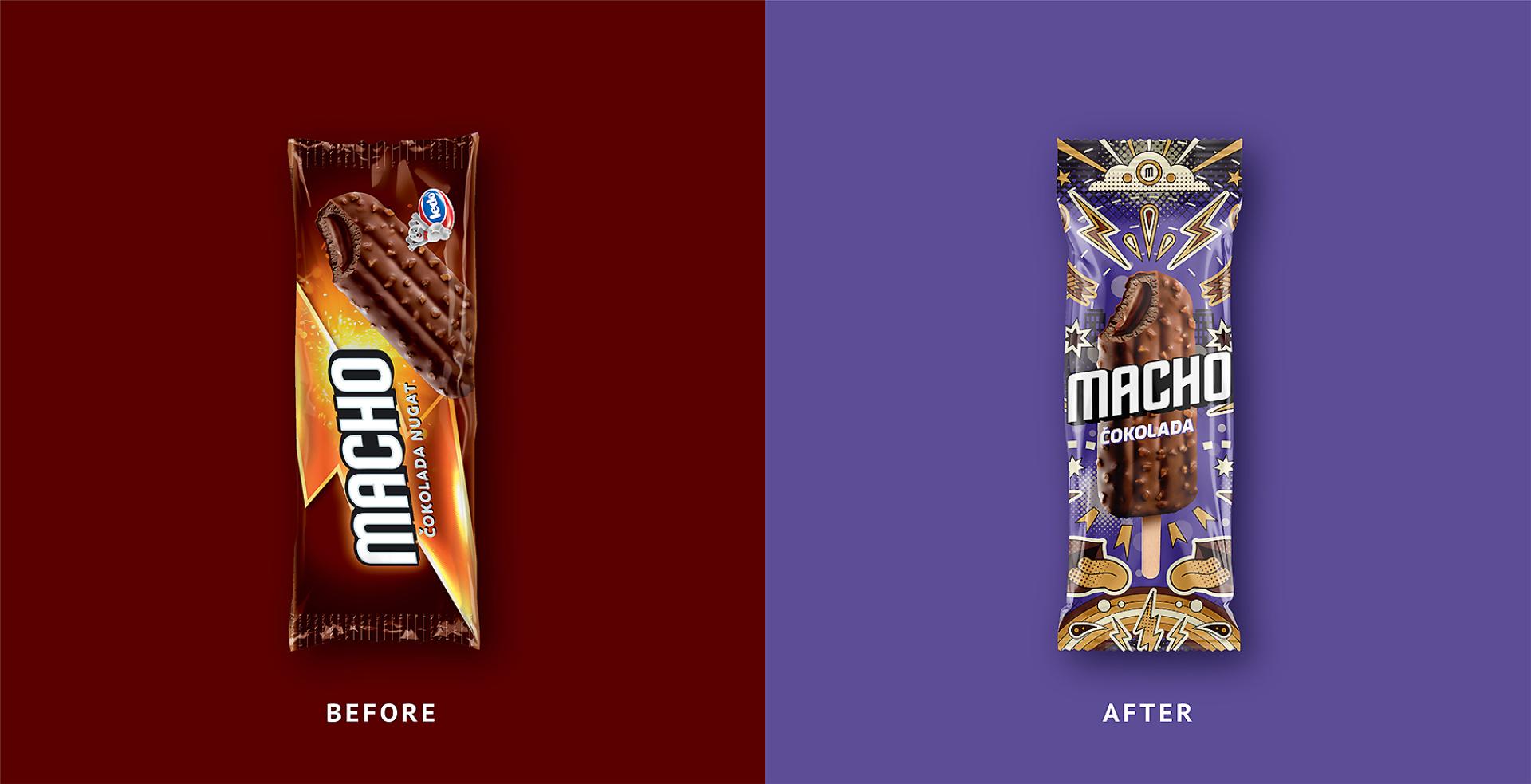
For decades, Macho has stood as one of Croatia's most recognisable ice cream brands. It is a mainstream product that has grown up alongside generations of consumers, enjoying exceptionally high market awareness. However, this profound familiarity eventually became its biggest hurdle.
Over time, the brand's visual identity grew inconsistent and dated. On supermarket shelves, the product range lacked the powerful impact expected given its strong heritage. Furthermore, younger consumers increasingly perceived it as a nostalgic brand belonging to previous generations rather than an exciting option for their own demographic.
The name added another layer of complexity. "Macho" carries strong masculine connotations reflecting a vastly different cultural moment. Because renaming the product was never a viable option, ignoring the shifting perceptions of masculinity would have made any redesign feel disconnected from contemporary audiences. The core challenge was clear: preserve decades of valuable brand equity while making the product relevant again for a modern generation. The primary objective was not to completely reinvent Macho, but to restore its cultural confidence and commercial appeal through targeted design alone.
The Solution: Redefining Modern Confidence
The strategy started with a very simple premise. Instead of distancing the brand from its legacy name, the creative team chose to redefine what "Macho" means today. Rather than relying on outdated gender stereotypes, they reinterpreted the concept as a symbol of confidence, individuality, and bold attitude.
This fresh, modern interpretation became the foundation for an entirely new packaging system. Visually, the updated identity draws deep inspiration from pop art, graphic illustration, and vibrant street culture:
Bold Typography & Graphics: Energetic graphic elements and strong colour contrast create an unmistakable shelf presence.
Distinct Flavour Profiles: Every individual flavour received its own unique colour palette while remaining part of a highly cohesive family.
The Commercial Result
The redesign deliberately embraces the emotional nature of impulse buying by communicating pure excitement before ingredients. Ultimately, this thoughtful design successfully reconnected Macho with a new generation, sparking a significant increase in sales without ever sacrificing its truly iconic historical recognition.
Credits
Entrant
Yuan Ben Design Studio
Category
Fashion Design - Jewelry

Entrant
Haoxing Chen
Category
Architectural Design - Renovation
Entrant
Nanjing University of the Arts
Category
Conceptual Design - Lifestyle
Entrant
Croft
Category
Product Design - Hardware, Power & Hand Tools