2022 | Professional

HUUE Delivers A Fresh, Full Spectrum Take On Cannabis
Entrant Company
Digital Surgeons
Category
Packaging Design - Other Packaging Design
Client's Name
HUUE
Country / Region
United States
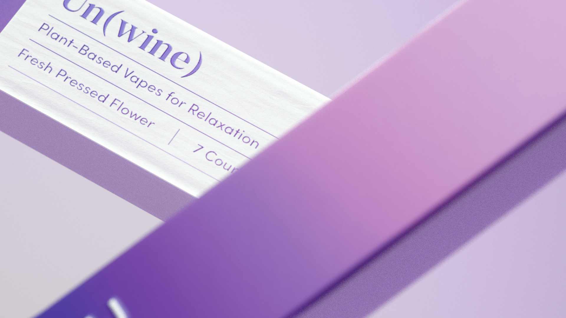
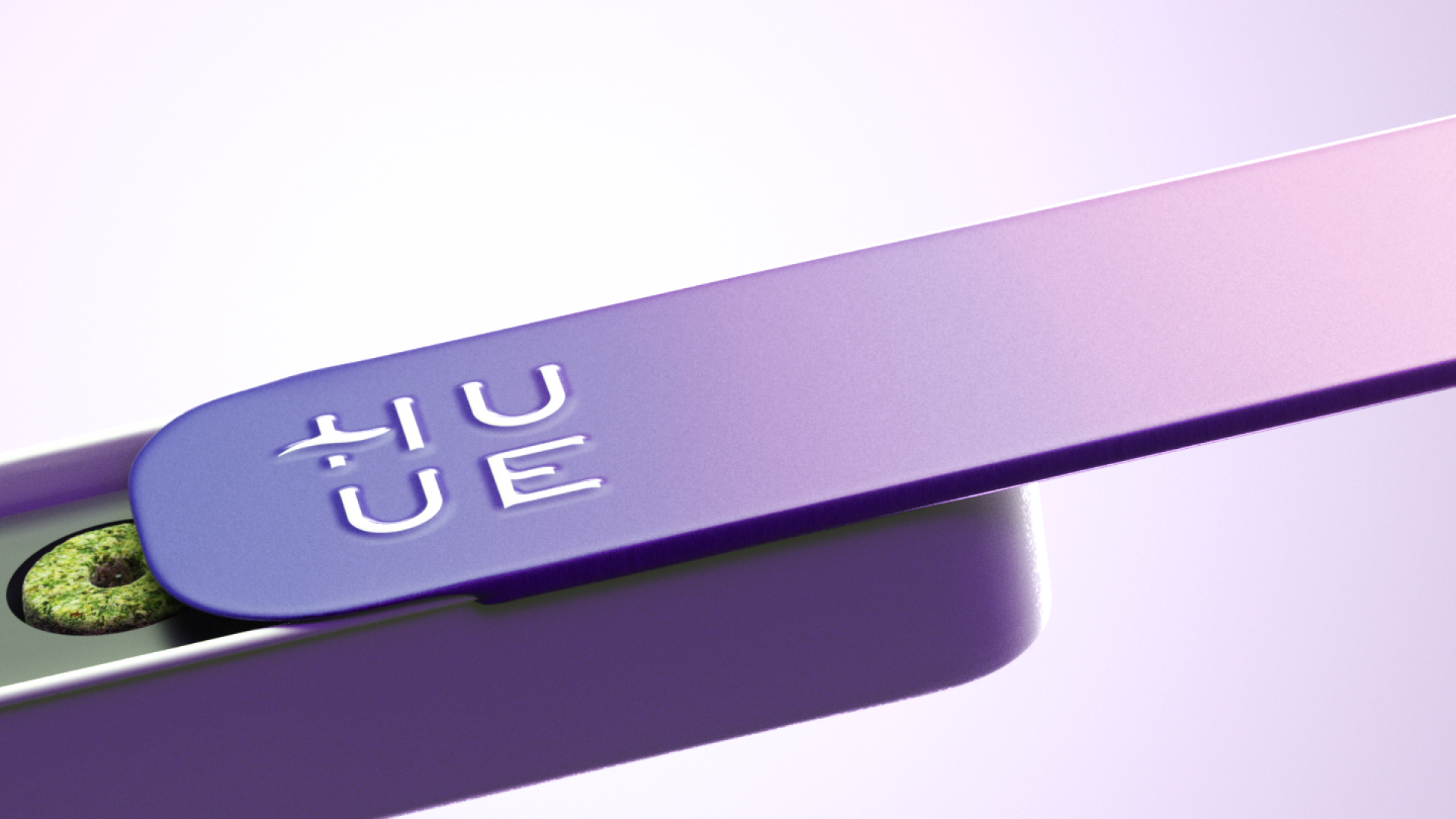
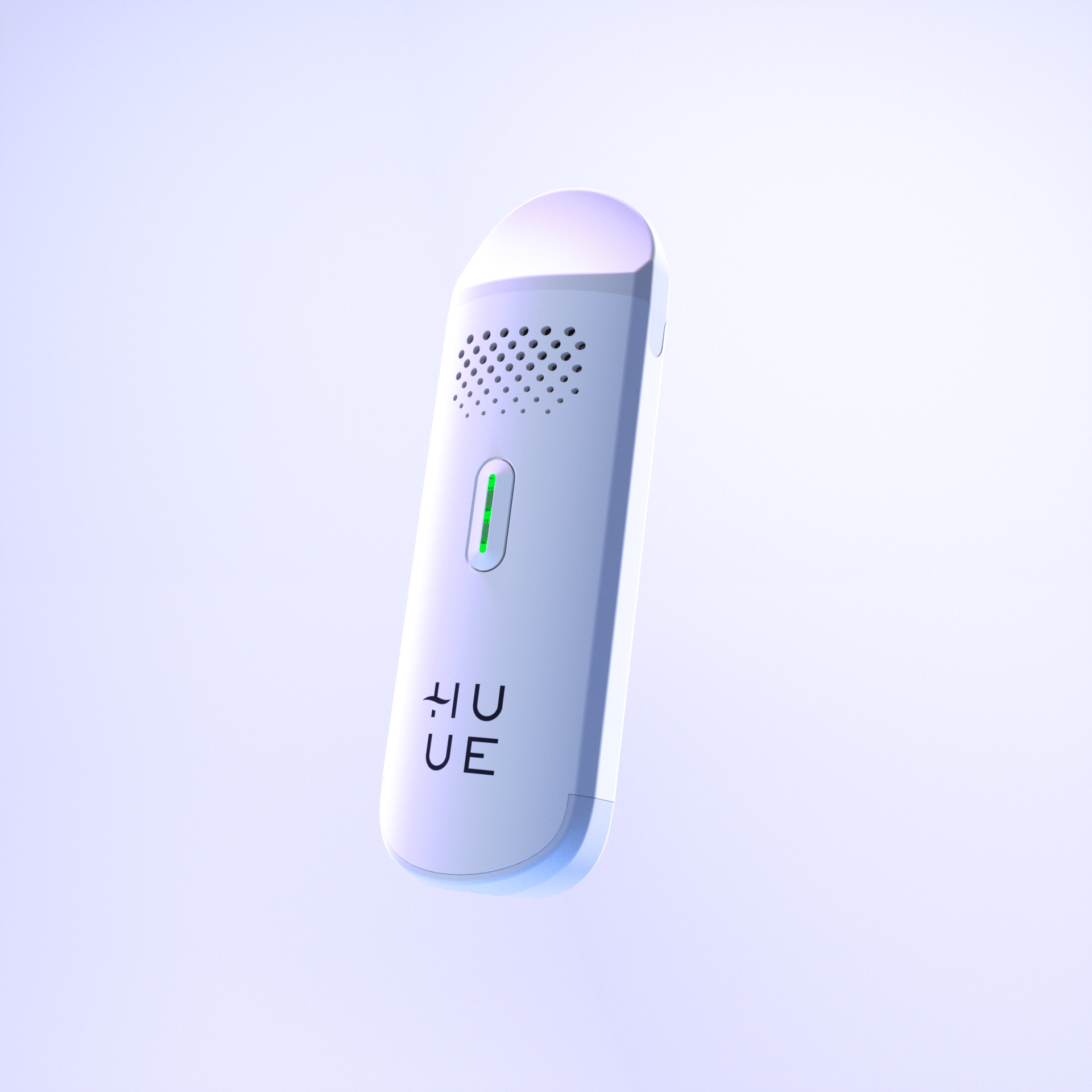
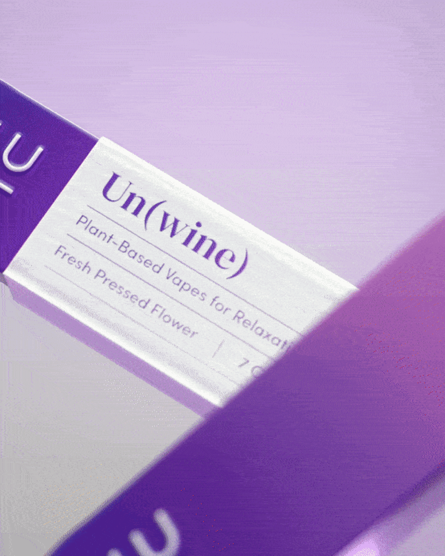
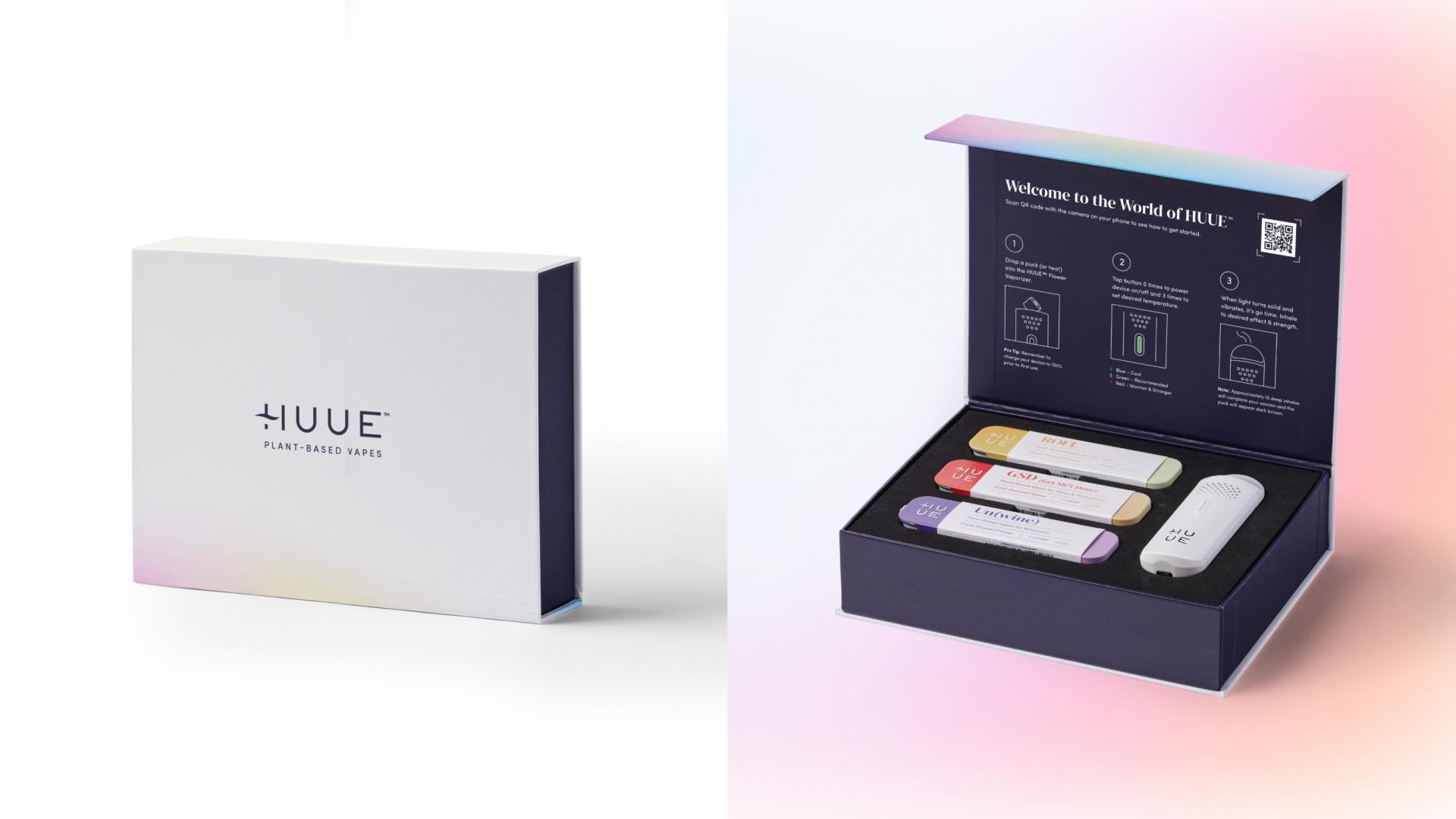
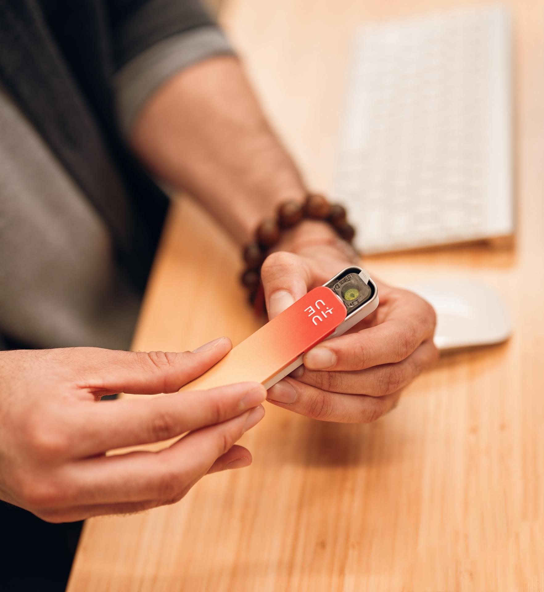
HUUE™ is an elevated cannabis experience for those always on-the-go, designed to help high performing people show up as the best versions of themselves for work, play, and everything in between. HUUE™ offers the terpene-rich benefits of traditional flower in a compact and convenient puck for an all-natural, discreet vaporization experience. Digital Surgeons had the pleasure of designing the full brand strategy and portfolio for HUUE™, including naming, positioning, and brand identity (logo, packaging, website, point of sale, and GTM materials).
The Challenge
Cannabis is confusing to those not “in the know.” As legalization expands across the nation, an overwhelming number of cannabis solutions are hitting the shelves, many leaning heavily into cannaculture. These options alienate a massive subset of potential consumers–new everyday users, from moms to athletes to CEOs–who will come to see and use cannabis as a part of their wellness regimen. These new users are not only apprehensive to try cannabis, but struggle to identify the right products and strains for their unique needs. A new solution was needed: one that eliminates confusion, transforms the way we talk about cannabis, and grants access among the general population.
The Solution
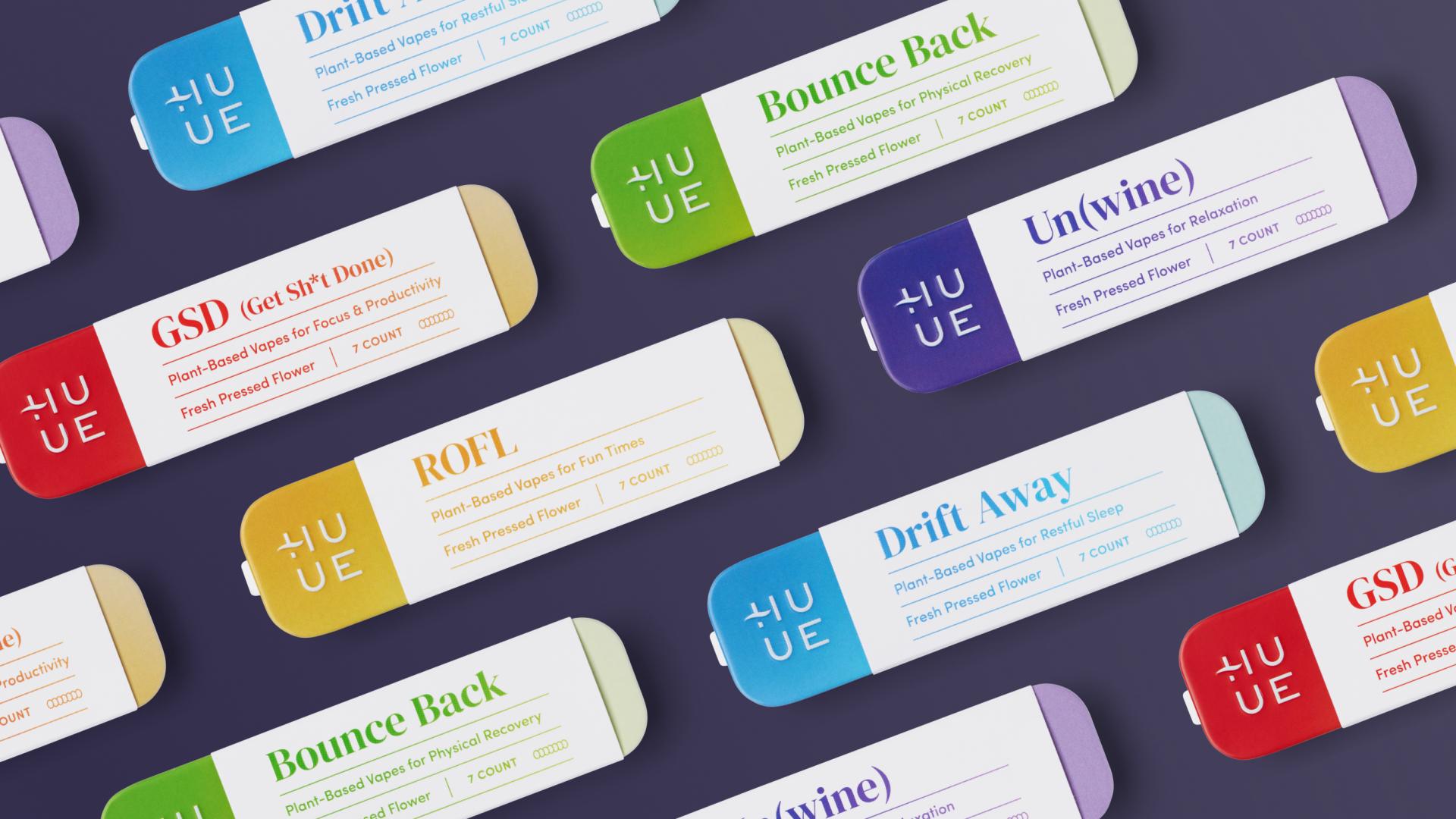
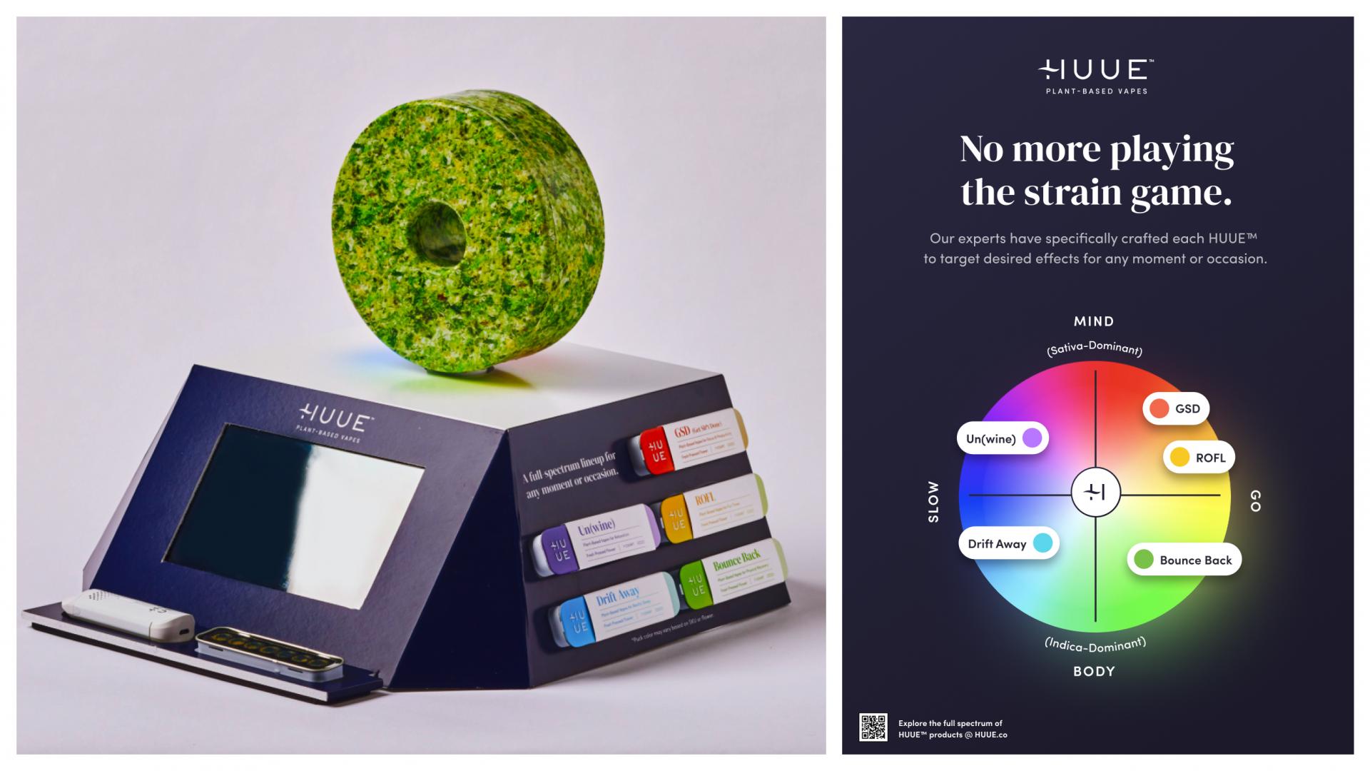
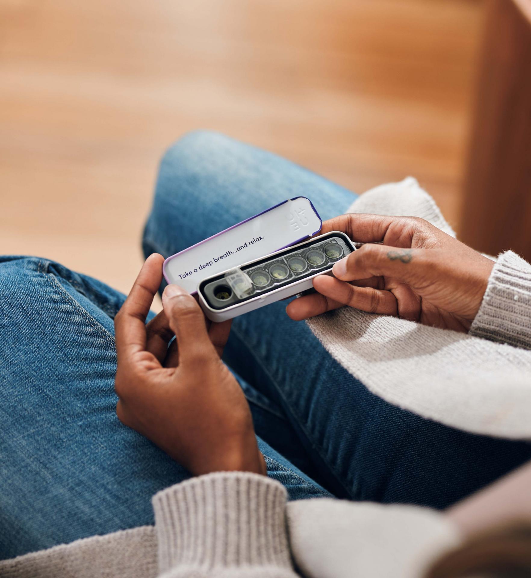
Based on deep customer research, HUUE™ fuses an elevated, modern apothecary look and feel with a system that lines up to the functional need for discretion, freshness, and ease of use. HUUE™’s packaging design pays homage to the full spectrum benefits of all-natural cannabis and embraces the spectrum in every sense of the word: full spectrum benefits [of cannabis], full spectrum people [with unique needs], full spectrum lives [that are enhanced and enriched with our product], and the full spectrum of color [used as our primary flavor modality]. We mapped the suite of flavors across the color wheel using a quadrant system of Go, Slow, Mind, Body for ease of use and to create endless ability to scale with partnerships or new flavors over time. And for those always on-the-go, our portable tins slip effortlessly into a pocket or purse with a smell-resistant seal that allows users to take their cannabis anywhere with full discretion.

Credits

Entrant Company
Beijing Hengxiang Future Technology Development Co., LTD
Category
Product Design - Textiles / Floor Coverings
Entrant Company
WYN Interior Design
Category
Interior Design - Residential
Entrant Company
gad
Category
Architectural Design - Commercial Building
Entrant Company
YOMA Design
Category
Interior Design - Living Spaces