2022 | Professional
Colors and the Origin
Entrant
TOTEM Interior Design
Category
Interior Design - Commercial
Client's Name
Z POWER
Country / Region
Taiwan
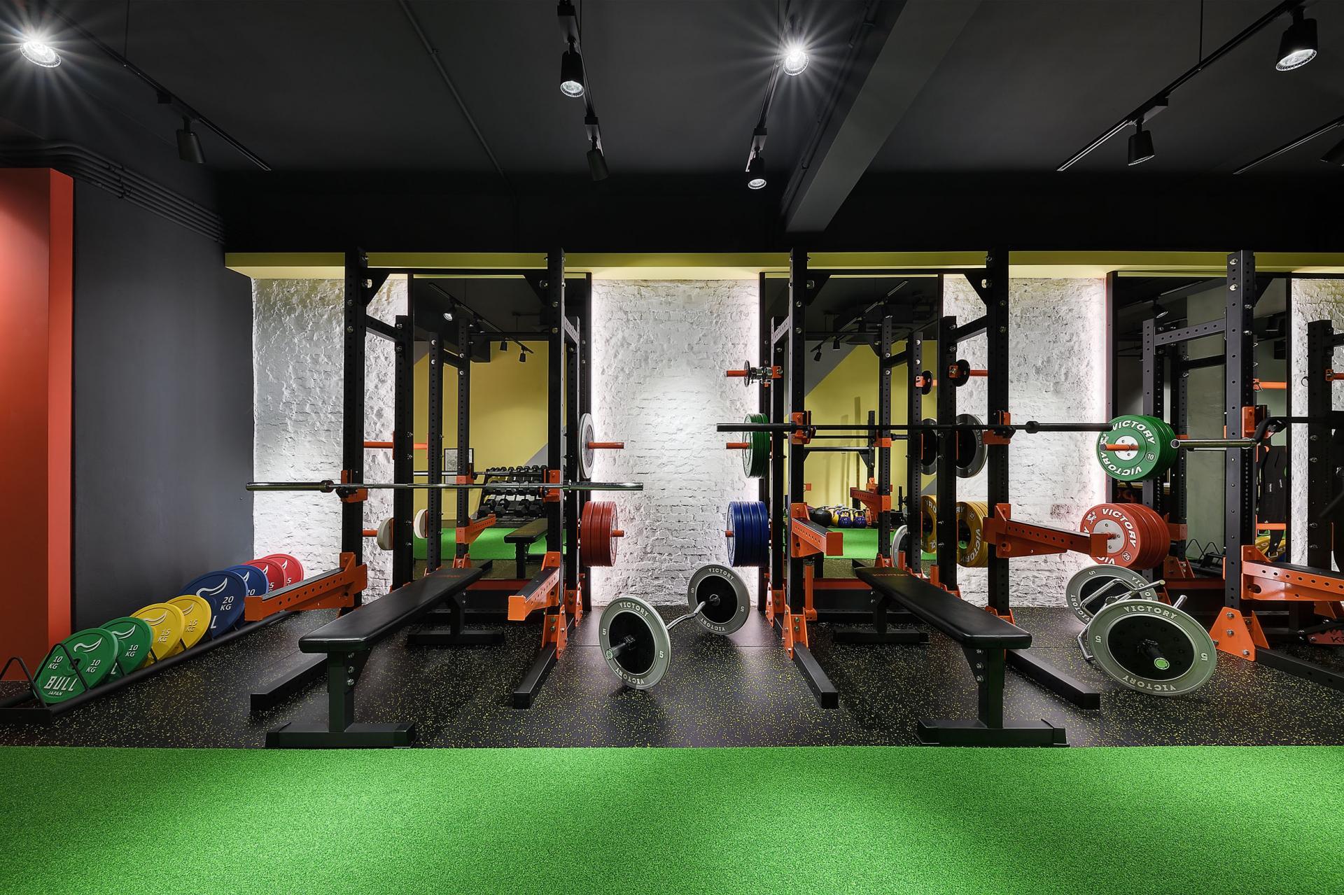
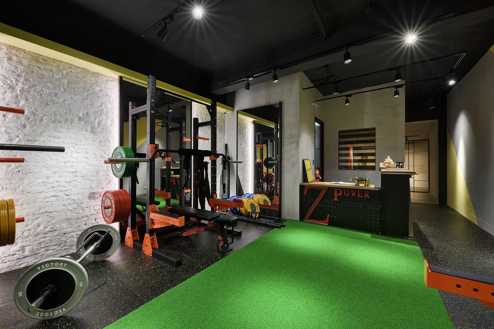
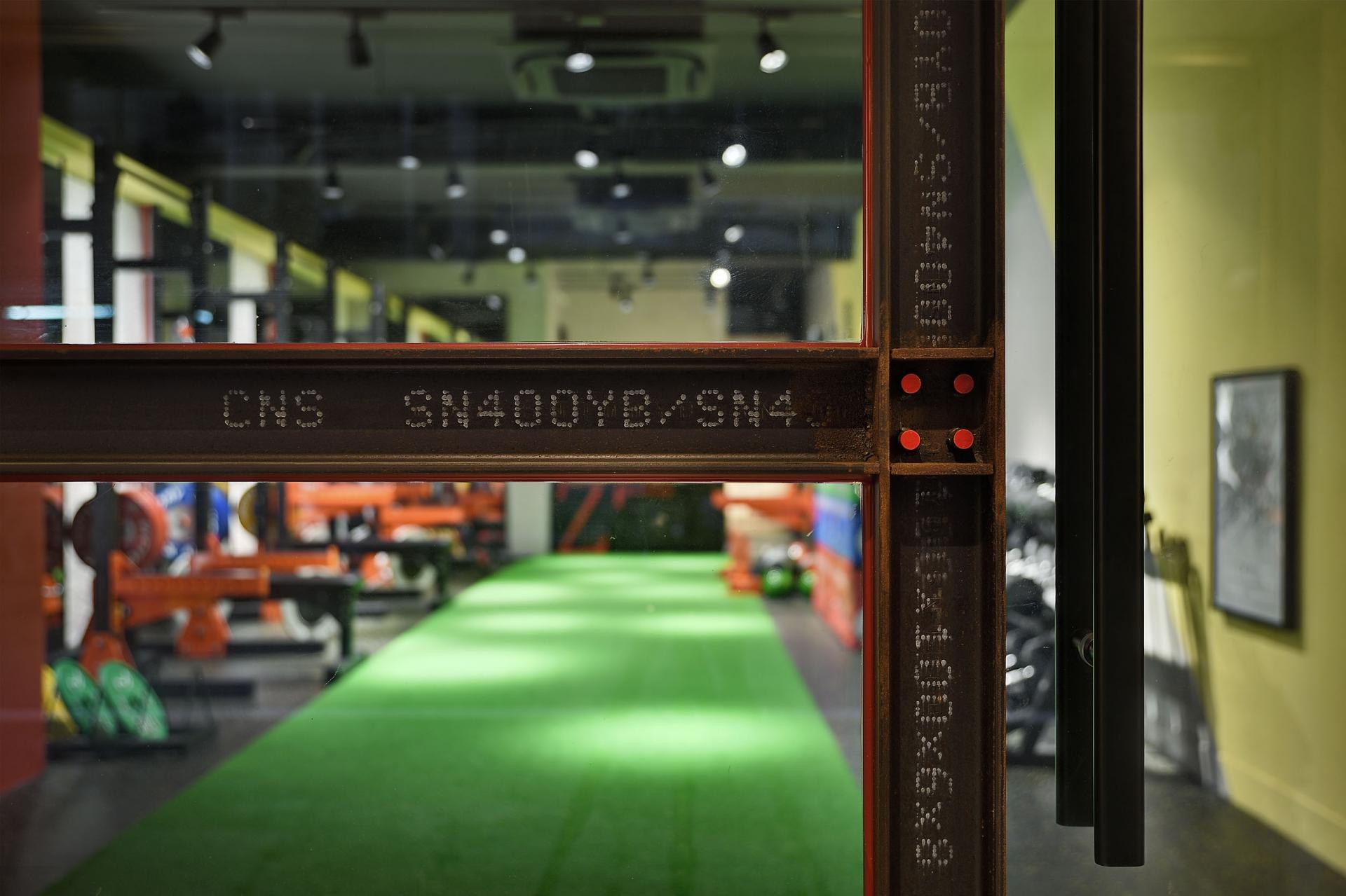
Taking “Z Power,” the steel-structured logo at the counter as the core value of the design, the space embodies the coexistence of power, gentleness, and aesthetics. The designer applies colors expressing “happiness, hope, power and stability” onto basic elements symbolizing “simplicity and origin.” The positive energy created at the gym offers users experiences of “purity, beauty and confidence.” The main concept of the tone is borrowed from PANTONE’s 2021 Colors of the Year: the combination of “Ultimate Gray” and “Illuminating,” symbolizing “solid and dependable” quality from the well-thought-out feelings, and power of hope that is “bright and warm.” Once entering the space, brick walls and the taboo-breaking “period red” form as an opening page welcoming customer on the left side. The red of “vitality and adventure” coordinates with the grass green of “life, health, and nature.” The arrangement of the bare brick walls, which are commonly hidden under the surface, emphasizes the concept of simplicity, essence and the origin. The designer applies techniques of deconstruction and the idea of less is more, to balance the use of vibrant colors. The steel structured bars installed on the gate are kept as they look like originally; without use of cement and monolithic ornament, the bare brick walls are shown; the architectural concrete sets up a wall of simplicity, while the wires and beams are exposed without extra veneers covered on the ceiling. The designer combines simple yet effective color blocks and geometric shapes with naturally bold texture. Vivid design languages therefore contribute to users’ vigorous energy. The natural elements symbolizing “the origin” are set as the starting point of the gym. While the vibrant color tone is an extension to subconsciously motivate someone’s mind, the design languages are effective to promote the concept of energetic workout and well-being. While the pandemic rages all over the world, the design can express and send out messages of unshakable power, hope and happiness, through language of colors and geometry. Misfortune and disaster will come to an end one day, when a greater future is waiting for us somewhere.


Credits
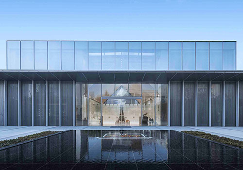
Entrant
ZWA
Category
Architectural Design - Residential
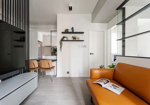
Entrant
Our Interiors Limited
Category
Interior Design - Residential
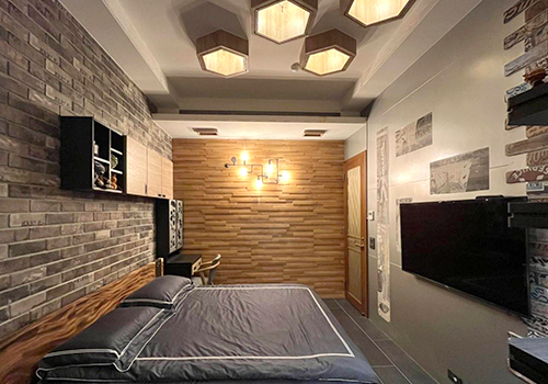
Entrant
China University of Technology
Category
Interior Design - Residential
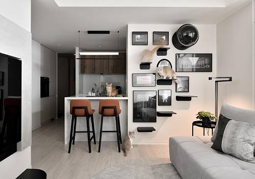
Entrant
51.INTERIOR
Category
Interior Design - Living Spaces