2023 | Professional
TPYE TEA PACKAGING
Entrant
DOWELLDESIGN
Category
Packaging Design - Non-Alcoholic Beverages
Client's Name
-
Country / Region
China
Gallery


About The Entry
The visual design is based on the concept of "returning to the roots", comparing the outer box to the soil, and restoring the original ecology of tea rooted in the soil with the inner box, creating a minimalist sense of nature that is true and pure.
Origin of nature.
To simplify the complexity and return to the roots.The material is processed with cardboard at one time, saving resources and reducing industrial pollution. The design discards complex elements, triggers the free imagination of the public with stronger inclusiveness, and gives the design a second vitality.
Neutral beige gray.
With beige gray as the main color of the package, the inner box is used with white, balanced and simple. The strong tendency to abandon color is to release ostentatious but also restrained introversion, which is extremely tense.
Rational white space.
From the outer box to the inner box, there is a consistent large area of white space, rational restraint; The calm atmosphere is quietly rendered, consistent with the attributes of tea, and builds a light and natural product atmosphere.
Credits
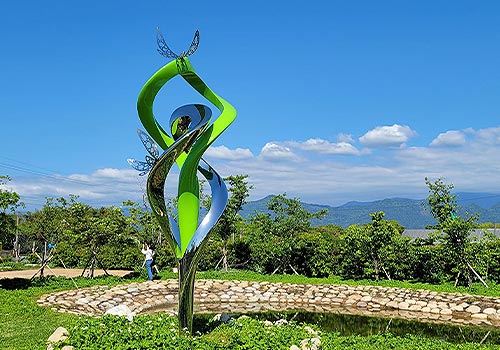
Entrant
GOOD STYLE CREATIVE CO., LTD.
Category
Landscape Design - Sculpture Design
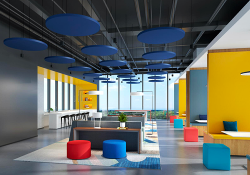
Entrant
Shenzhen HUAYI Decoration Design Co., Ltd. & RICE Design
Category
Interior Design - Office
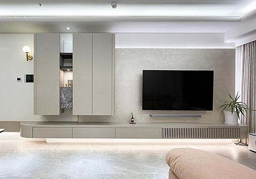
Entrant
映錦室內設計
Category
Interior Design - Residential
Entrant
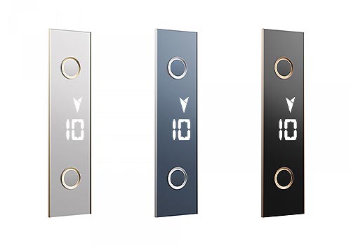
Otis Technology Development(Shanghai) Co.,Ltd.
Category
Product Design - Other Product Design