2023 | Professional

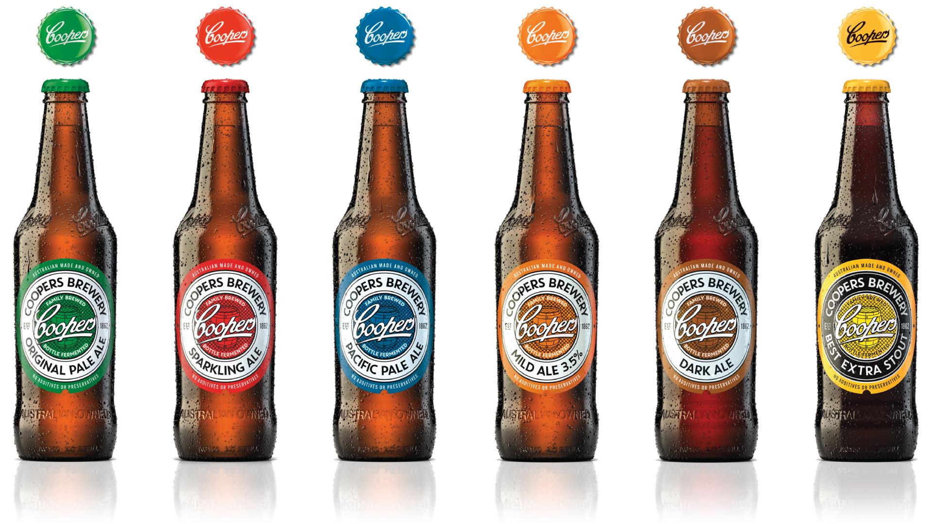
Coopers Ale - crafting an icon into the next generation.
Entrant Company
Cowan
Category
Packaging Design - Rebrand
Client's Name
Coopers
Country / Region
Australia
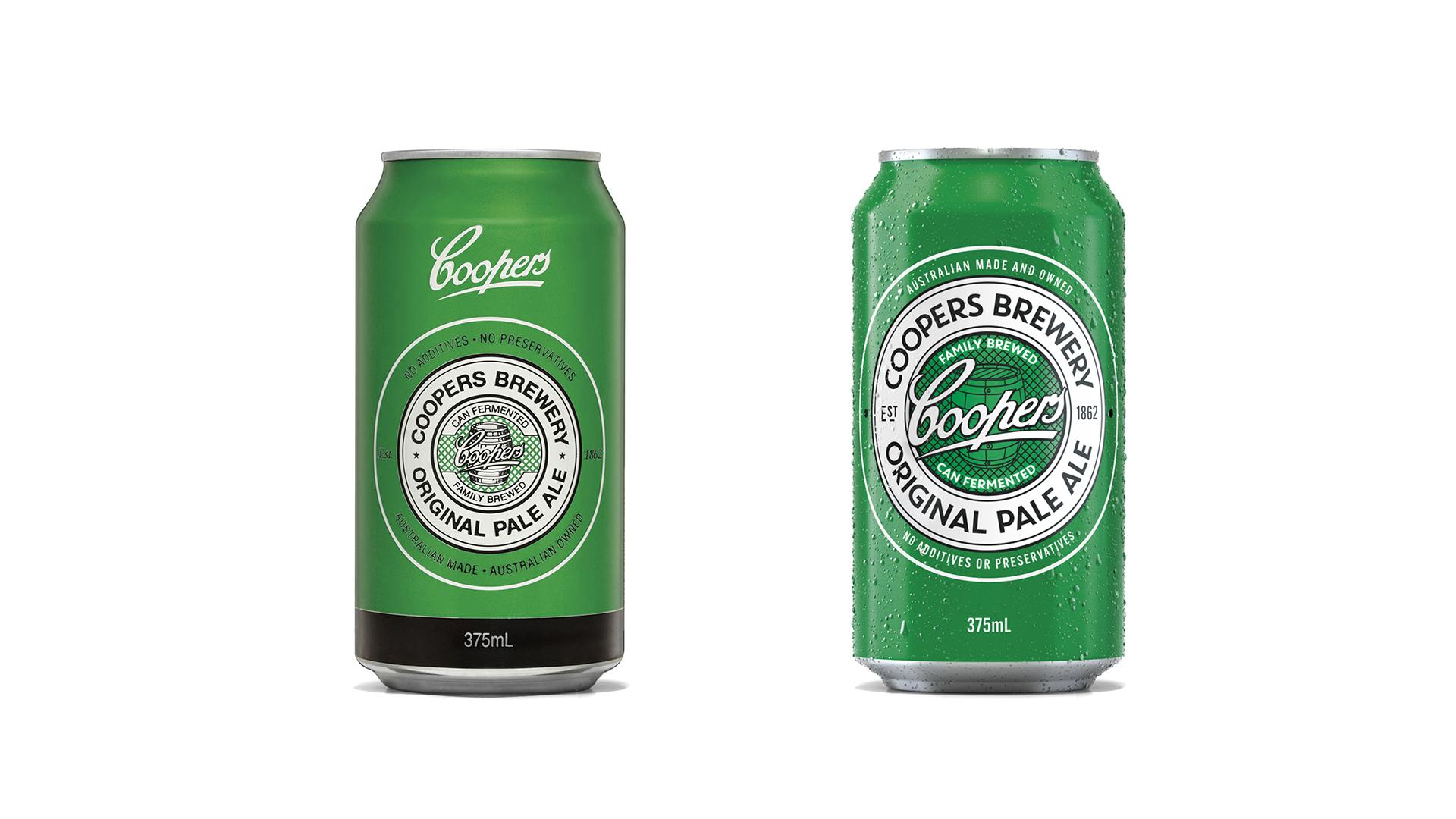
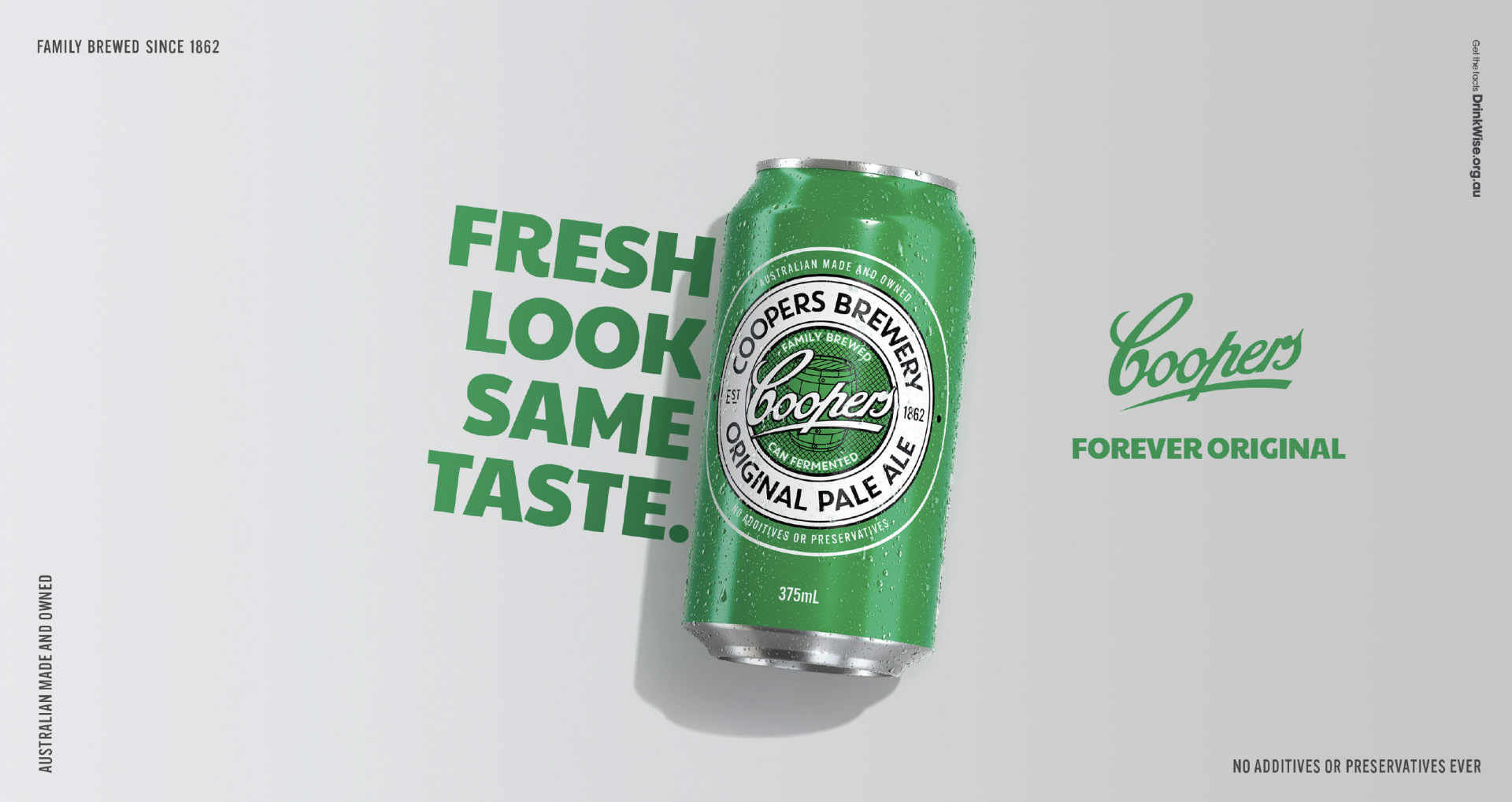
Refreshing an icon is both an honour and a very delicate task. Particularly when it’s a beloved 160yr old Australian ale house. At Coopers Brewery, the packaging was in need of a revamp – for the first time in its history, the family-owned brew house was looking at its packaging from a strategic, Masterbrand-focused point of view. The appetite for major change was met with caution, but the need to do something to appeal to future generations and amplify its distinctive assets was clear – to align with their brand position, Forever Original. As the original craft beer, now amidst a sea of craft beers, the key task was to evolve the brand’s most distinctive asset, the Coopers Ale roundel. With the need to respect our deeply loyal Coopers drinkers, rigorous testing around the elements within the roundel helped us understand what to amplify and reduce.
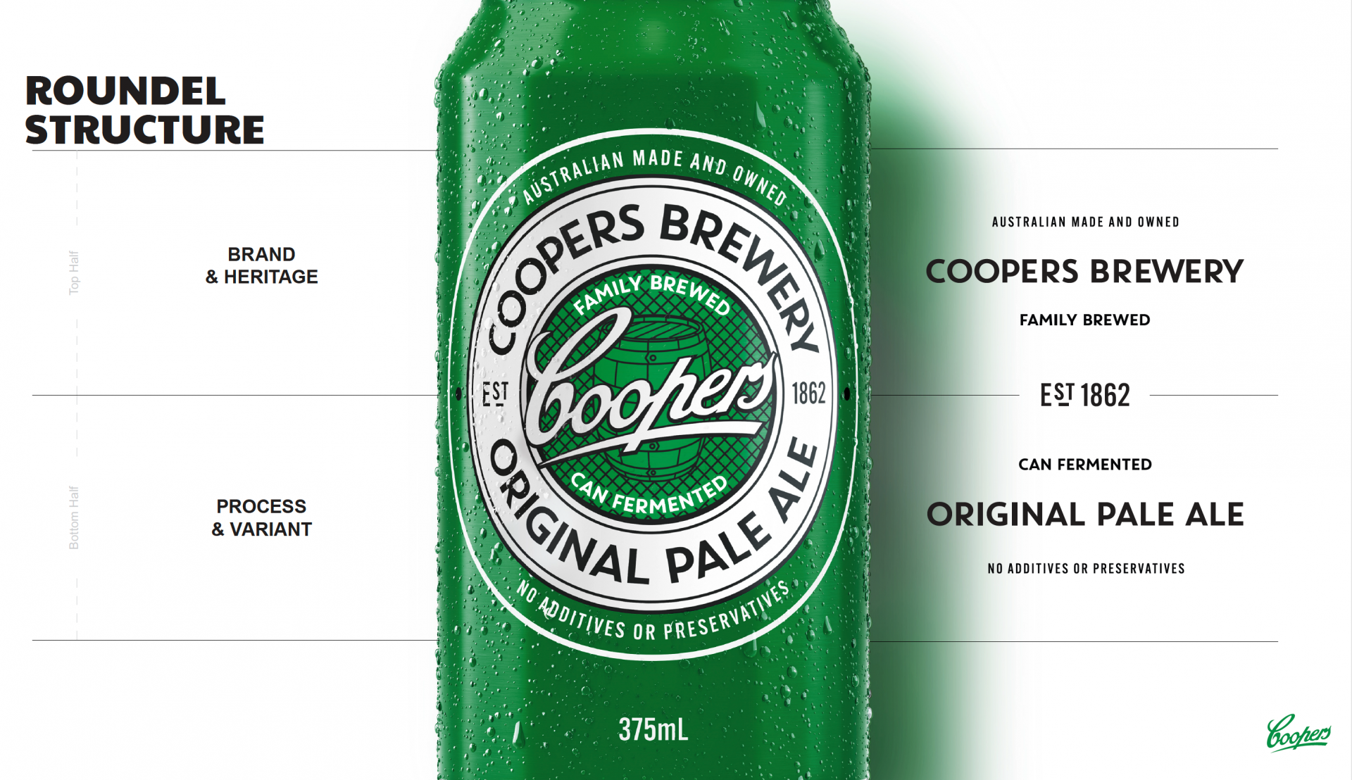
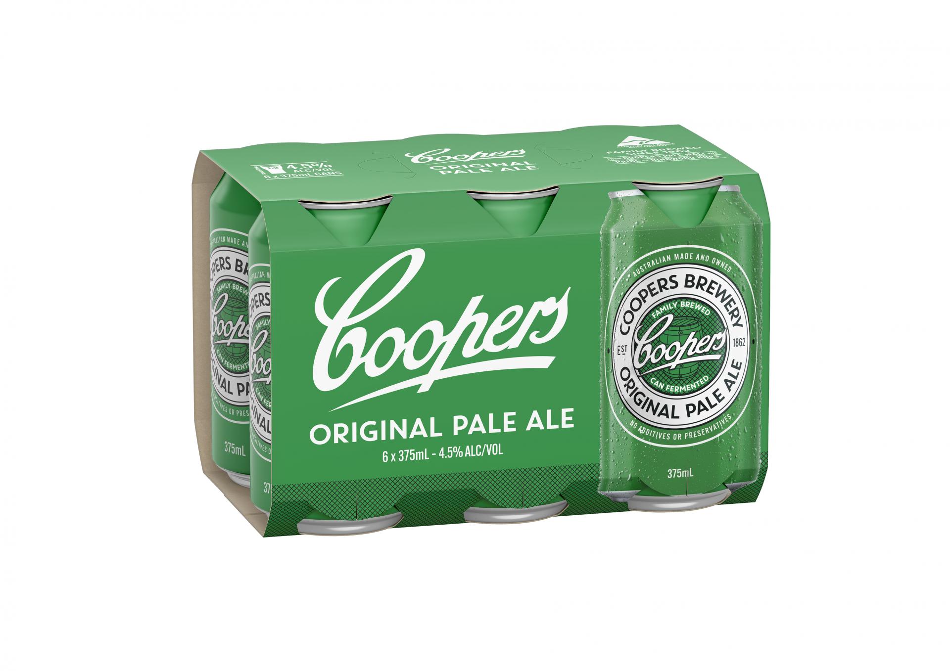
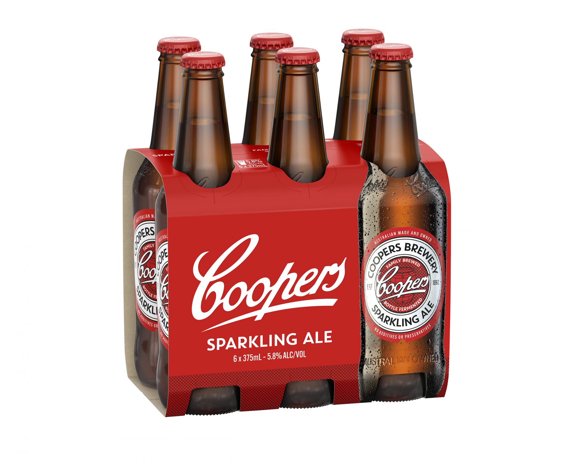
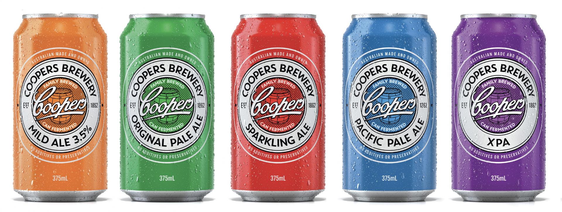
The existing can featured elements with great storytelling capability, they just lacked presence, craft and meaning in their current form. The existing packaging also featured the Coopers logo twice (inside the roundel and above it). We began with increasing the size of the logo, proud and centred inside the roundel, and removing its second appearance from the pack. Next we focused on hierarchy, with the top of the can telling a brand and heritage story, and the bottom half speaking to process and craft. Separated by EST. 1862, now more prominent. The line weight, fonts, barrel and hatching details were all crafted for balance and modernity. Without the need for the two logos on front of pack, we removed the neck label on the bottles – nodding to original bottles in a sustainable approach.
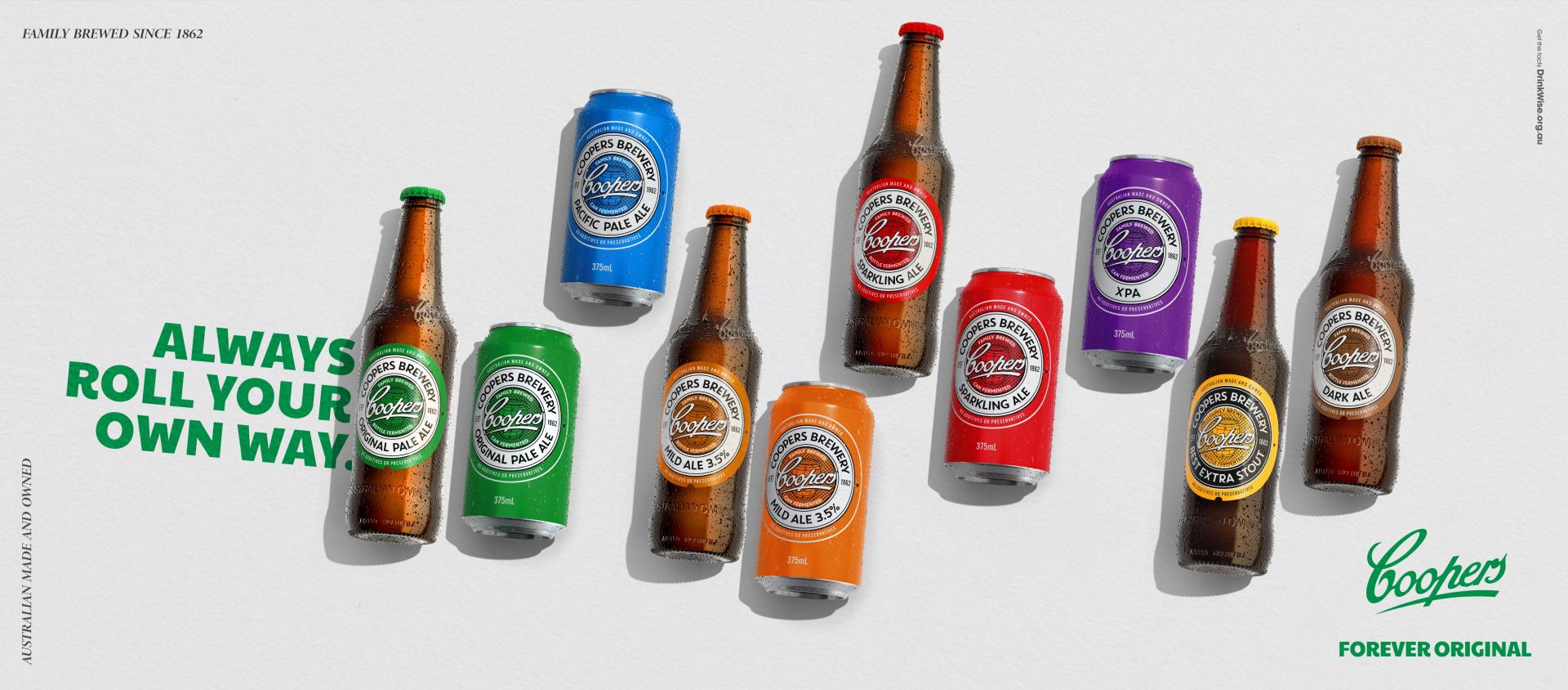
The final piece of the puzzle was to bring consistency and ease of shop-ability to the 6packs and cartons across the range. We introduced romance copy, increased Masterbrand prominence and variant visibility across the full range of ales to great success. Released in late 2022 - so far, loyalists love it and our next gen drinkers are noticing it. An Aussie icon set for generation next. Cheers!
Entrant Company
WALL.LINK LLC
Category
Product Design - Imaging & Vision

Entrant Company
Ningbo Jinge Culture Media Co., Ltd.
Category
Product Design - Other Product Design


Entrant Company
HZS
Category
Architectural Design - Office Building


Entrant Company
FTA
Category
Architectural Design - Business Building
