2020 | Professional

Adaptive Unity
Entrant Company
ON Design Lab, ltd
Category
Interior Design - Living Spaces
Client's Name
Country / Region
Taiwan
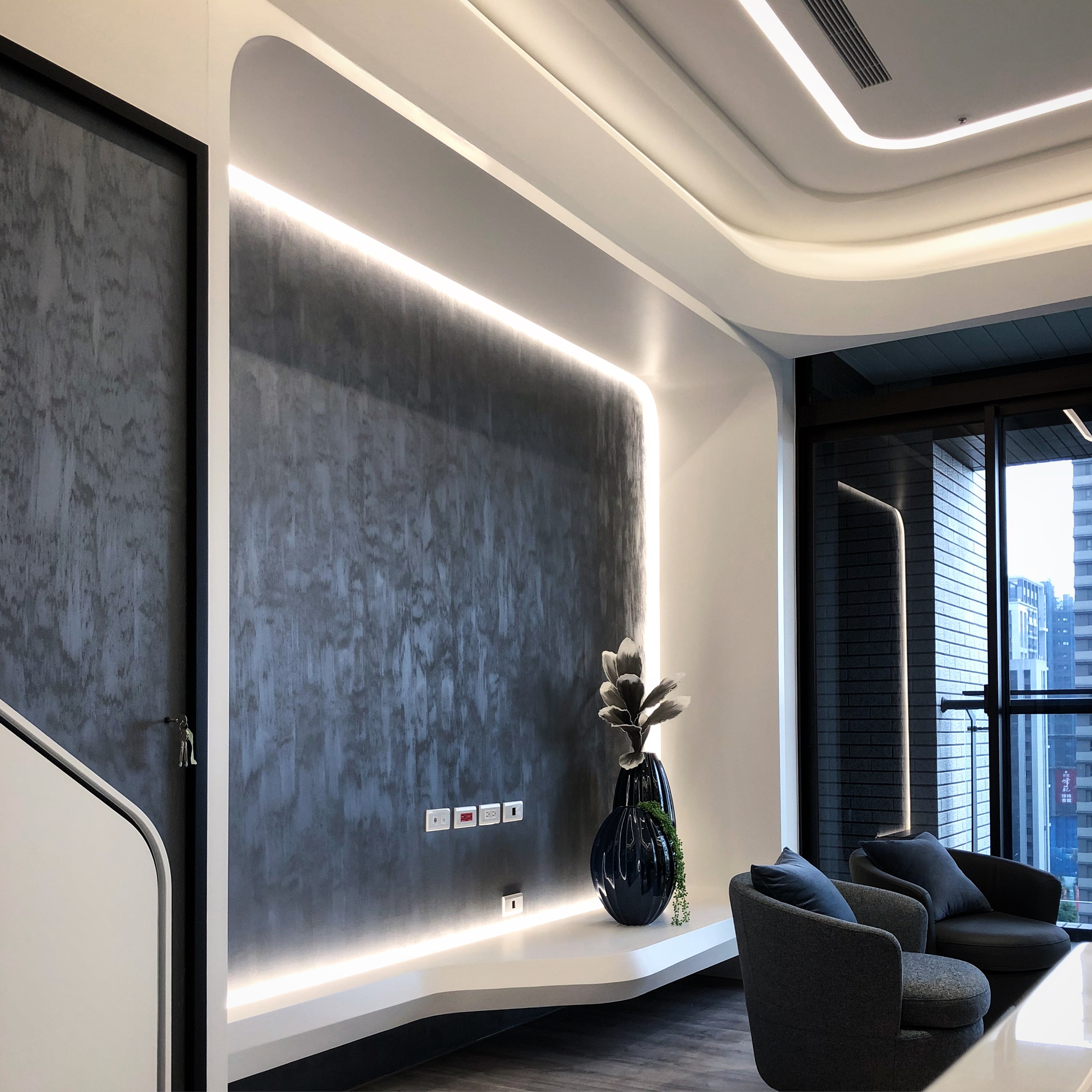
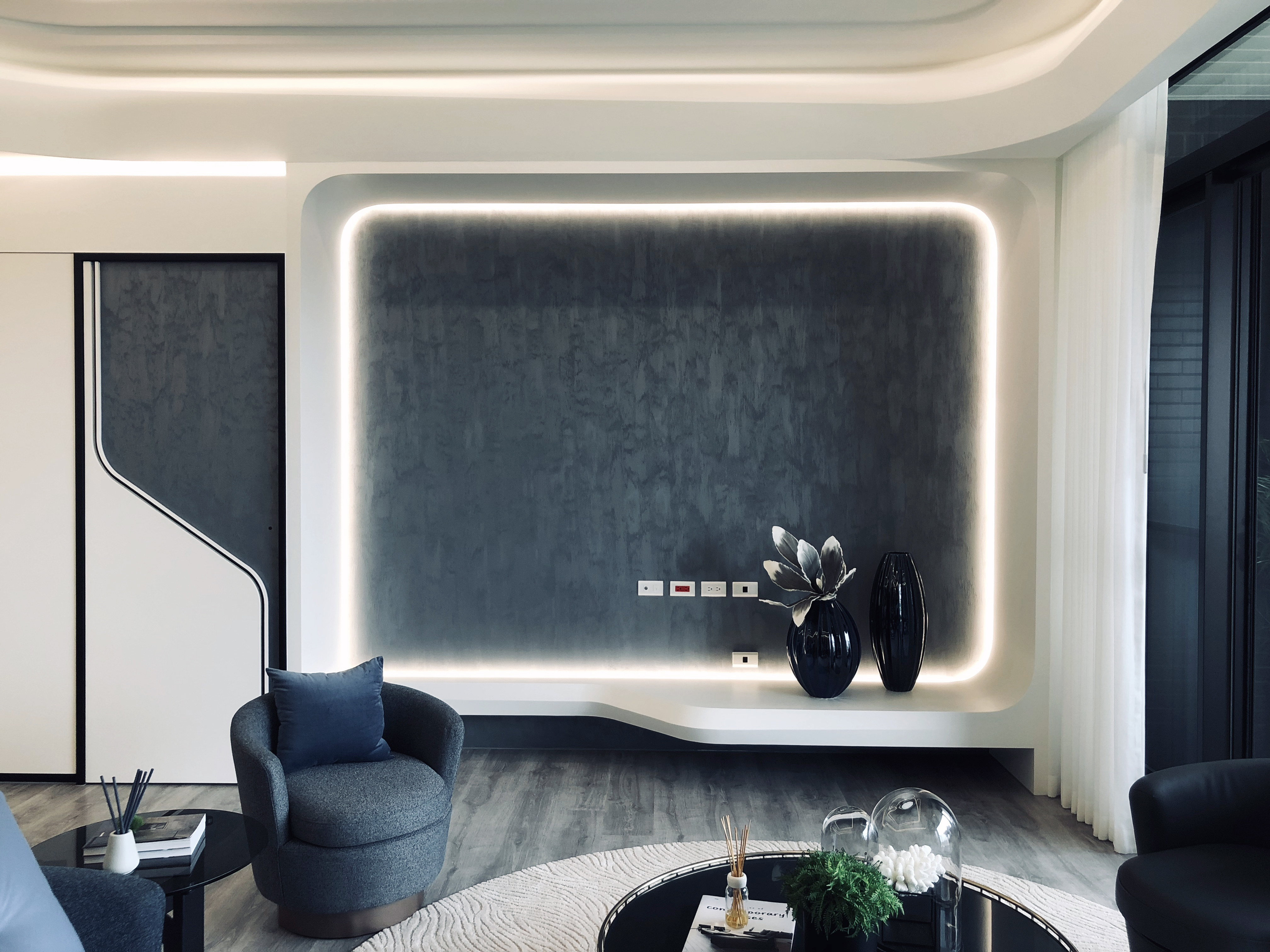
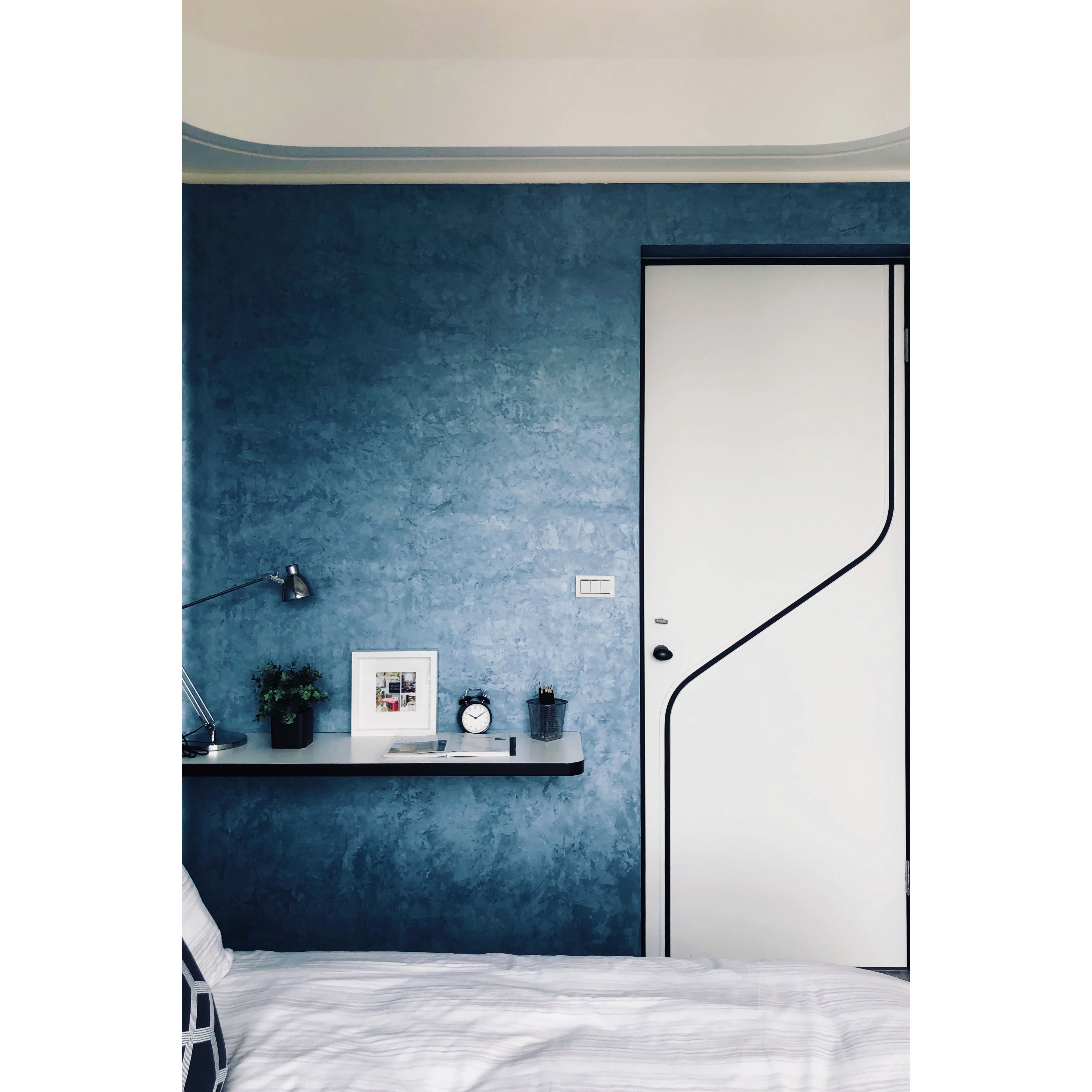
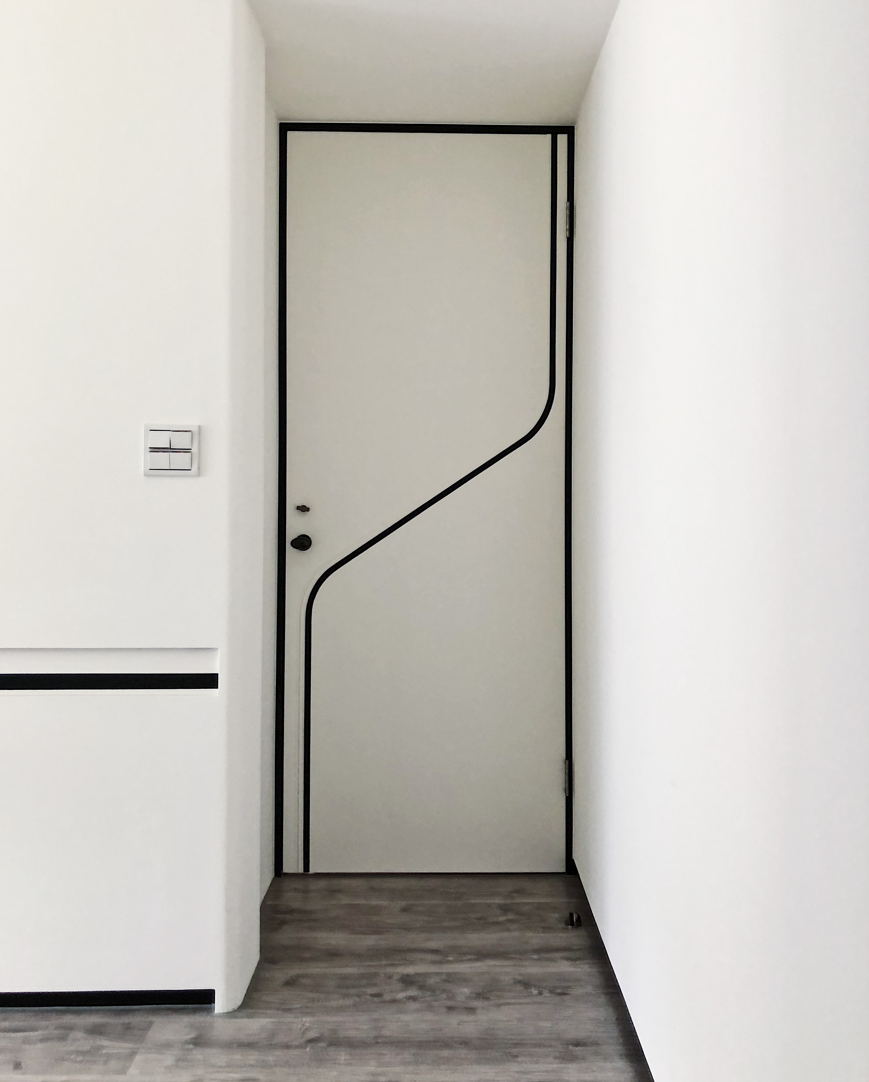
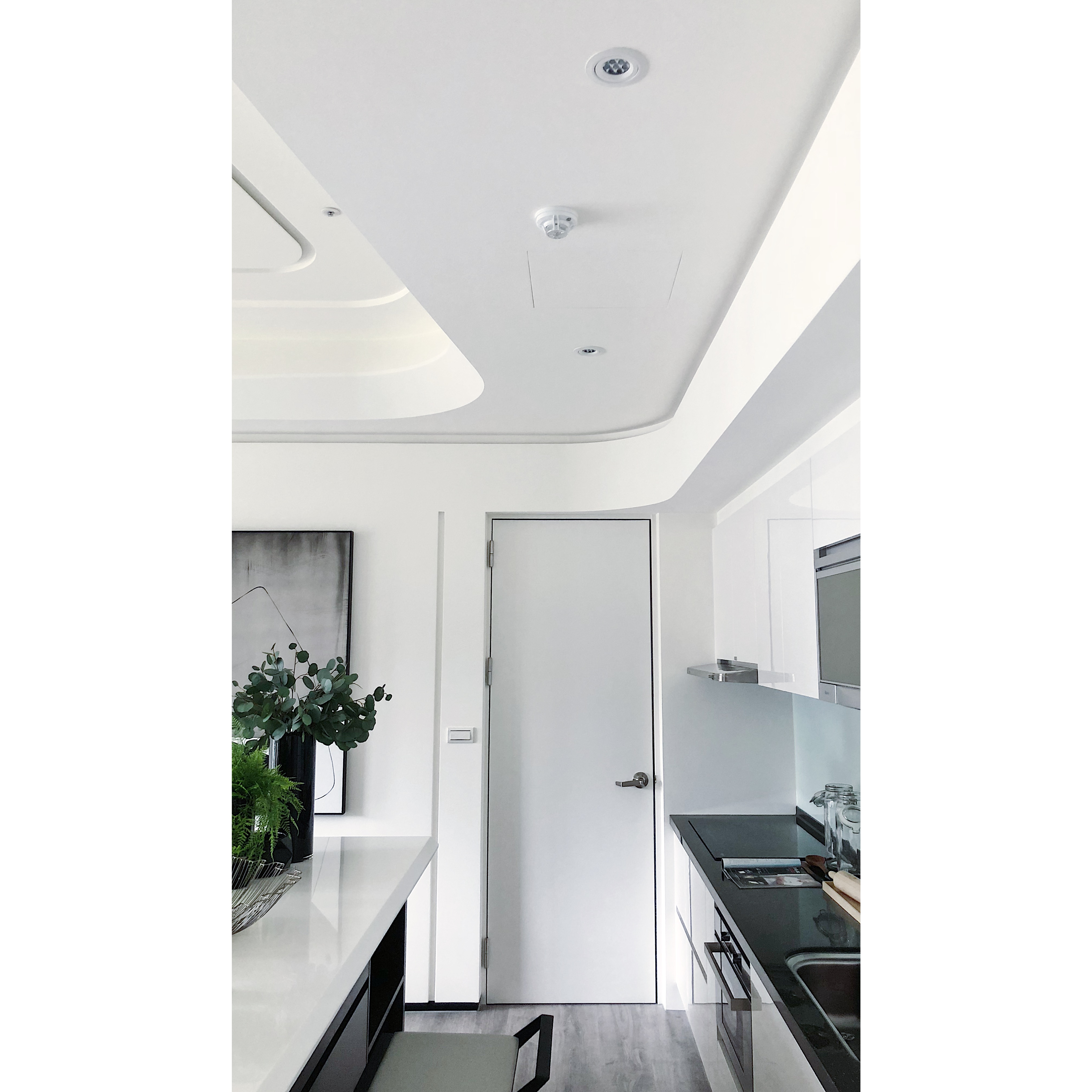
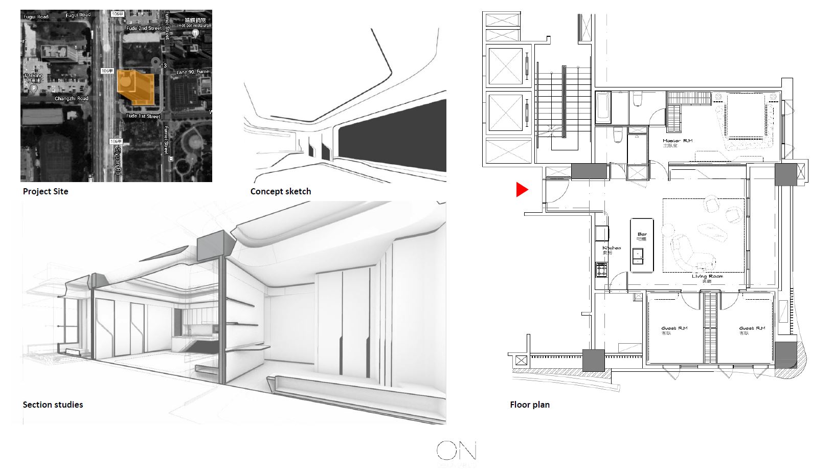
The challenge of this project is to build upon existing typologies to enhance the quality and experience of a typical urban apartment. We believe the way to achieve this goal is a sinuous language that connects all the zones within the space based on its already defined rigidity of space. The three key words for this project are continuity, fluidity, and seamless.
City apartments are often low in ceiling, sharp in corners, and rigid in typologies. The design method plays with undulating curvature and layered juxtaposition to enhance movement and rhythm of space. The continuity of lines is consistent in defining different zones of the apartment and eliminates all dead corners for extended views. The adaptive nature of the language elevates the original typology and maximizes the architectural proportion. The navy-blue Venetian plaster artwork adds an extra layer of stylistic sensation to inject energy into the contemporary design language. The zoning of spaces is defined based on the visual transparency, rather than walls or partition. The user experiences the spaces based on the relationship of spatial intimacy and geometric continuity.
The execution for the project is built upon maximizing visual capacity while maintaining the basic living functionality. As a result, the feedback is very positive as this design visually and spatially enlarged the architectural proportions and created a seamless effect that elevated their initial expectation. We believe this project is an example to explore possibilities for all small to medium sized city apartments in the future.


Credits
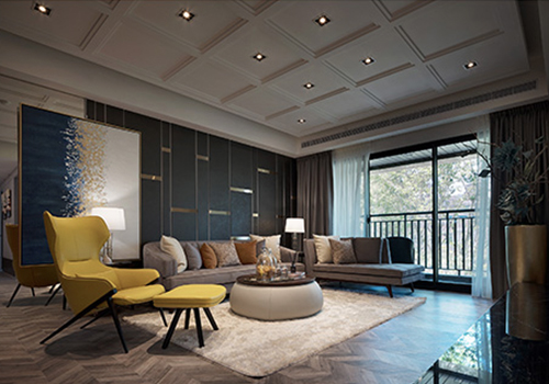
Entrant Company
Peter Interior Design
Category
Interior Design - Residential
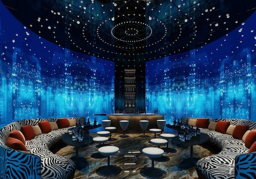
Entrant Company
Xiamen GANGLONG Decoration Engineering Co., Ltd
Category
Conceptual Design - Entertainment
Entrant Company
Yang-Jue Interior Design
Category
Interior Design - Recreation Spaces
Entrant Company
Arizon Design
Category
Interior Design - Commercial