2023 | Professional

Nut Plus co-brand with Chinese National Geography
Entrant Company
Three Squirrels Co., Ltd.
Category
Packaging Design - Snacks, Confectionary & Desserts
Client's Name
Three Squirrels Co., Ltd.
Country / Region
China
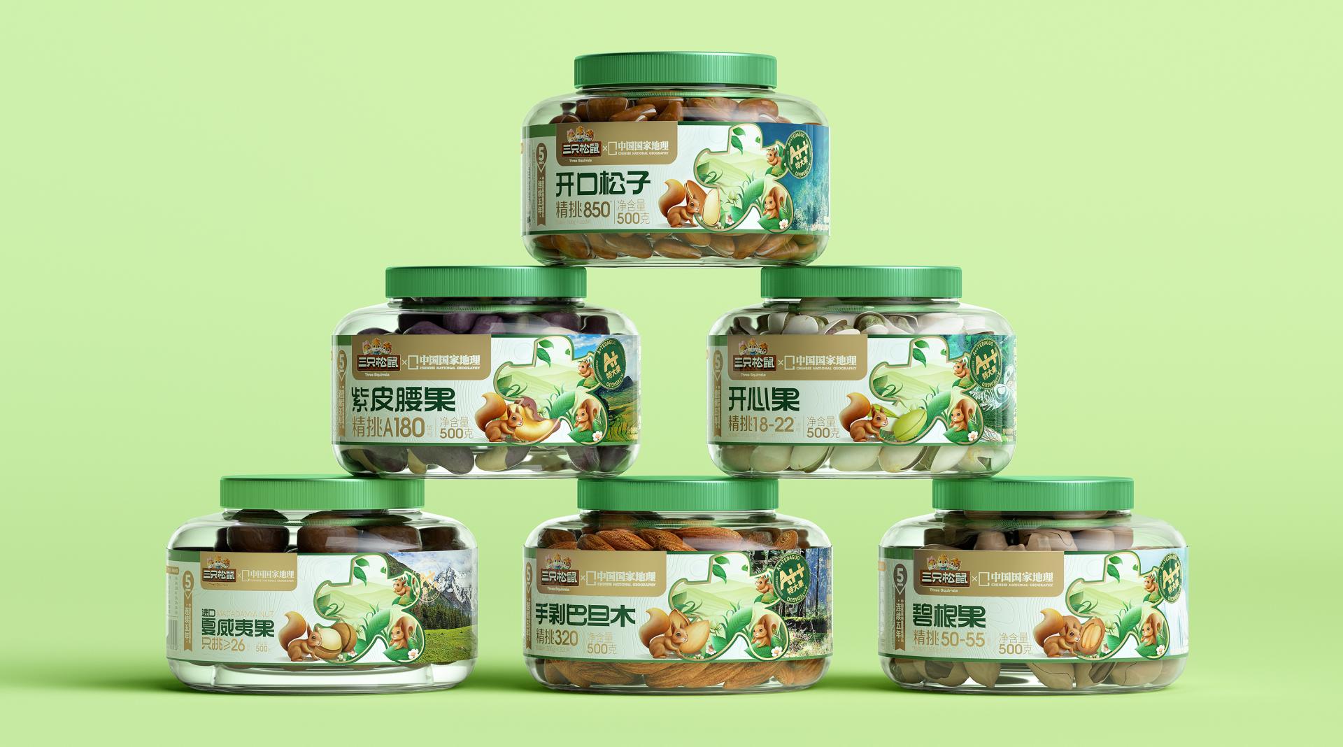
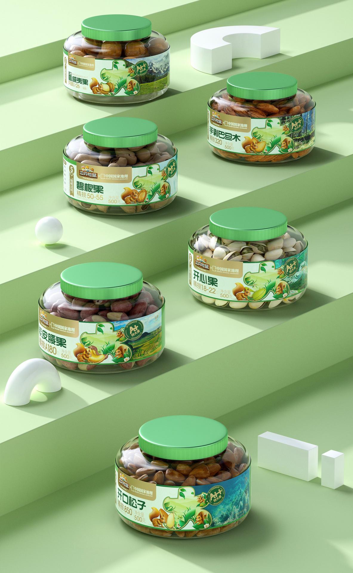
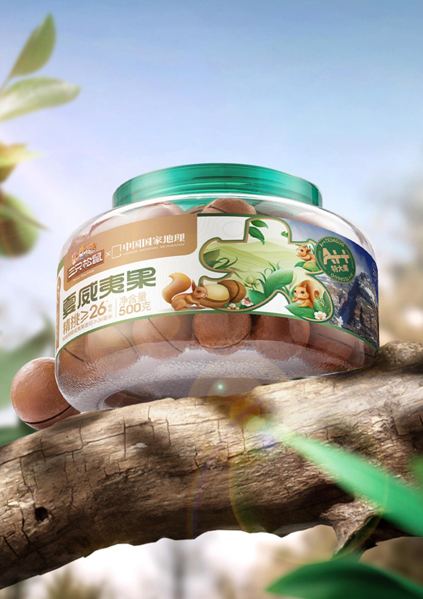
This packaging is designed for a product of carefully selected, large-sized nuts. Driven by a consumer-centric approach, the packaging showcases essential information in a modular fashion, effectively conveying the product’s intrinsic value, enhancing brand recognition, and bolstering consumer purchasing decisions.
For most consumers, premium nuts possess three main characteristics: large size, excellent ecological origins, and meticulous selection. Therefore, the design team focuses on expressing these three points in the packaging design.
The design effectively translates the brand’s internally established top-tier product standard (A++) into a readily understandable symbol, represented by the Chinese character “大” (large). This representation carries a significant visual impact, allowing for clear legibility, memorability, and shareability, thereby firmly ingraining the notion of “large size” within the minds of consumers.
Visually, the design connects the squirrel’s natural habitat - the tree hollow - with the central symbol “大” (large), blending meticulously detailed realistic illustrations with actual landscape photos from Chinese National Geography (CNG). This combination vividly captures the natural ecological environment in which the nuts grow. Furthermore, distinguished landmarks explored by CNG, such as mountain peaks, waterfalls, and grasslands, are selected to enhance consumer perception of the product’s great quality, while also offering a glimpse into the diverse ecological origins of the product.
In terms of design details, the packaging’s background pattern employs hand-drawn contour lines to symbolize geographical terrain and altitude, thereby enhancing the overall visual texture. The use of transparent packaging provides consumers with a direct view of the actual product, effectively conveying the inherent value of these “large nuts.”
Color palette-wise, green signifies the nuts’ natural and wholesome ecological origin; gold emphasizes their preciousness and exceptional quality; while beige not only communicates the product’s attributes but also fosters a sense of security and warmth, thereby deepening consumer affinity. The harmonious fusion of these three colors yields a captivating visual effect, heightening consumer awareness and igniting a heightened desire to acquire the product.


Entrant Company
Ease Design
Category
Interior Design - Mix Use Building: Residential & Commercial
Entrant Company
Shenzhen Tigerpan Design Co., Ltd.
Category
Packaging Design - Non-Alcoholic Beverages
Entrant Company
Hello-Tech
Category
Packaging Design - Sustainable

Entrant Company
Wuxi Weineng Vision Trading Co., Ltd
Category
Product Design - Bakeware, Tableware, Drinkware & Cookware