2024 | Professional
Budweiser Supreme
Entrant Company
Anheuser-Busch InBev (China) Co., Ltd
Category
Packaging Design - Wine, Beer & Liquor
Client's Name
Country / Region
China
The new packaging of Budweiser Supreme follows the brand's core selling point of ‘selected single malt’. It uses a simple and modern design style, with refined elements and visual language, to interpret the pure malt aroma and excellent quality of Budweiser Supreme.
The streamlined body of the bottle complements the overall design. The bottle retains a larger transparent area to showcase the proud golden beer of Budweiser Supreme in a more intuitive way, inviting consumers to experience the pure malt aroma derived from the selected single malt.
The design of the label leverages a clean white space to create a clear visual experience. On the pure white background, the golden logo of Budweiser Supreme shines brightly. The smooth gilt lettering echoes the golden liquor and the delicate golden trim, enhancing the premium tonality of the brand.
The design of the bottle neck wrapped in gold foil adds a sense of ritual when consumers open the product: unveiling the gold foil, the golden liquid and pure malt aroma surges forth, perfectly presenting the exceptional quality of Budweiser Supreme.


Entrant Company
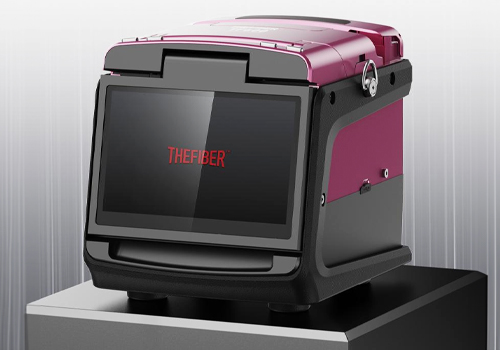
INNO Future Technology (Shenzhen) Co., Ltd.
Category
Product Design - Digital & Electronic Devices
Entrant Company
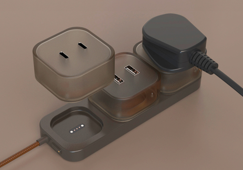
Yingfei Zhuo
Category
Product Design - Office Equipment
Entrant Company
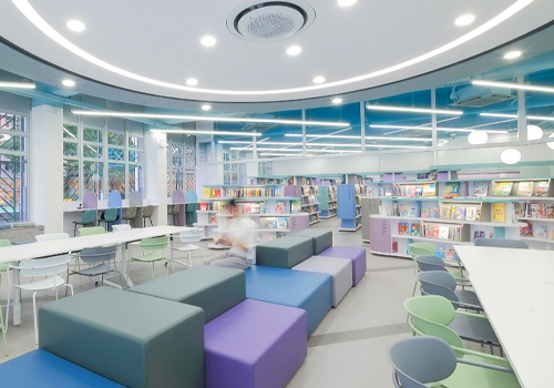
Design Action
Category
Interior Design - Educational (NEW)
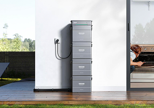
Entrant Company
Zendure DE GmbH
Category
Product Design - Eco / Green (NEW)