2024 | Professional
BYHEALTH Packaging Design
Entrant
BYHEALTH Co., Ltd.
Category
Packaging Design - Health & Wellness
Client's Name
Country / Region
China
Byhealth is a renowned brand focused on dietary nutritional supplements.
In the past, Byhealth has achieved great success in pharmacy sales. Now, consumers are increasingly inclined to shop online. The packaging displayed online has a different logic from that of offline sales channels, and consumer behavior habits are also different. To better adapt to the online shopping environment and to embrace the increasingly youthful user demands, we have initiated this packaging upgrade project specifically for online sales.
The new packaging design takes the brand genes of Byhealth's global raw materials as the starting point, creating a set of abstract minimalist graphics, matched with a dopamine-style color scheme and meticulous typography. The bright colors provide users with a healthy, energetic, relaxed, and pleasant visual experience, distinguishing it from the cold, rigid style of most competitive products that resemble pharmaceuticals. The simple and clear icons on the label not only reflect the functionality of the product but also help consumers quickly identify the products they need, aiding in sales. Research has shown that such a design is more adaptable to online display screens and has a good click-through rate advantage.
The bottle is made of environmentally friendly HDPE material, and the label uses a film-free treatment technology, which is 100% recyclable eco-friendly paper. The patterns and text on the label are printed with eco-friendly ink, and the packaging materials meet SGS testing and certification standards, which are beneficial to the sustainable development of the Earth.
Additionally, the bottle cap utilizes industry-leading tri-color cap technology, offering excellent sealing performance to ensure product quality. The 13mm tear ring handle has been tested 500 times, ensuring that it can be easily torn open by women and the elderly. The crescent-shaped cap edge design takes into account the average thickness of people's thumbs, ensuring that it can be pushed open with one hand. The design of the cap connected to the bottle body prevents the loss of the cap. This cap design takes into account both product quality and user experience considerations.


Credits
Entrant
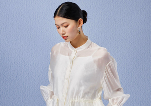
ERAL FASHION
Category
Fashion Design - Textile & Materials (NEW)
Entrant
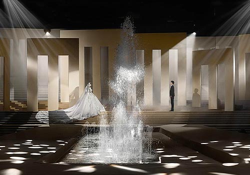
HPH Event Design
Category
Interior Design - Stage
Entrant
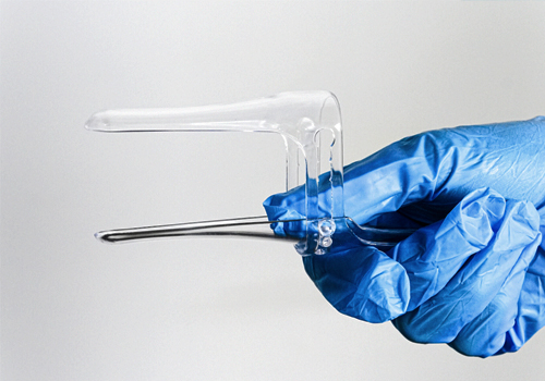
Functional Form Block Allies
Category
Product Design - Pregnancy & Maternity

Entrant
Shanghai Powerlong Industrial Development Group Co., Ltd
Category
Architectural Design - Plazas