2025 | Professional
Blue Peacock Camellia Oil
Entrant
Guangzhou Shenglan Food Co., Ltd.
Category
Packaging Design - Dairy, Spices, Oils, Sauces & Condiments
Client's Name
Country / Region
China
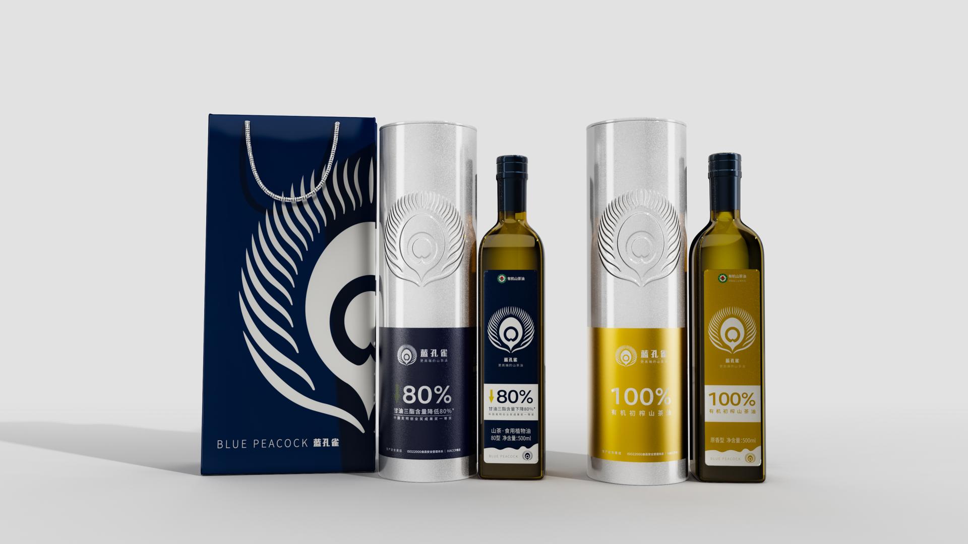
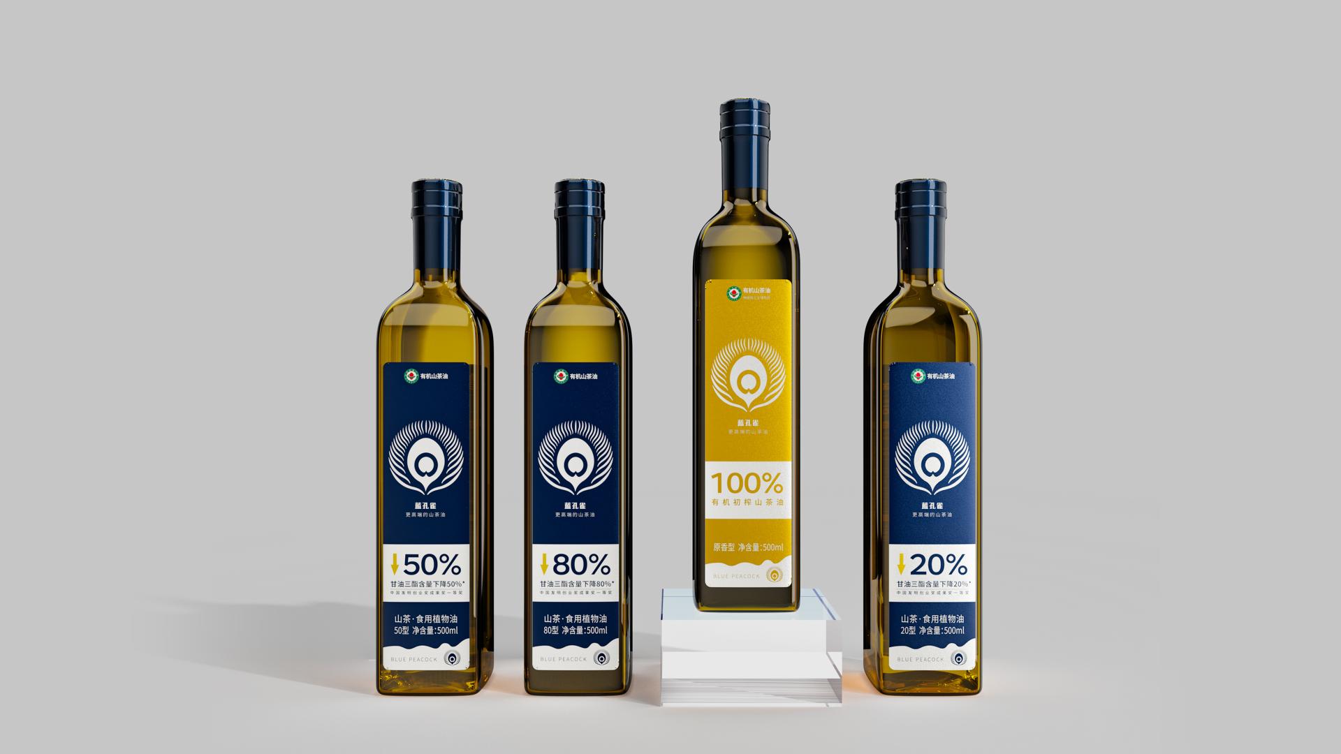
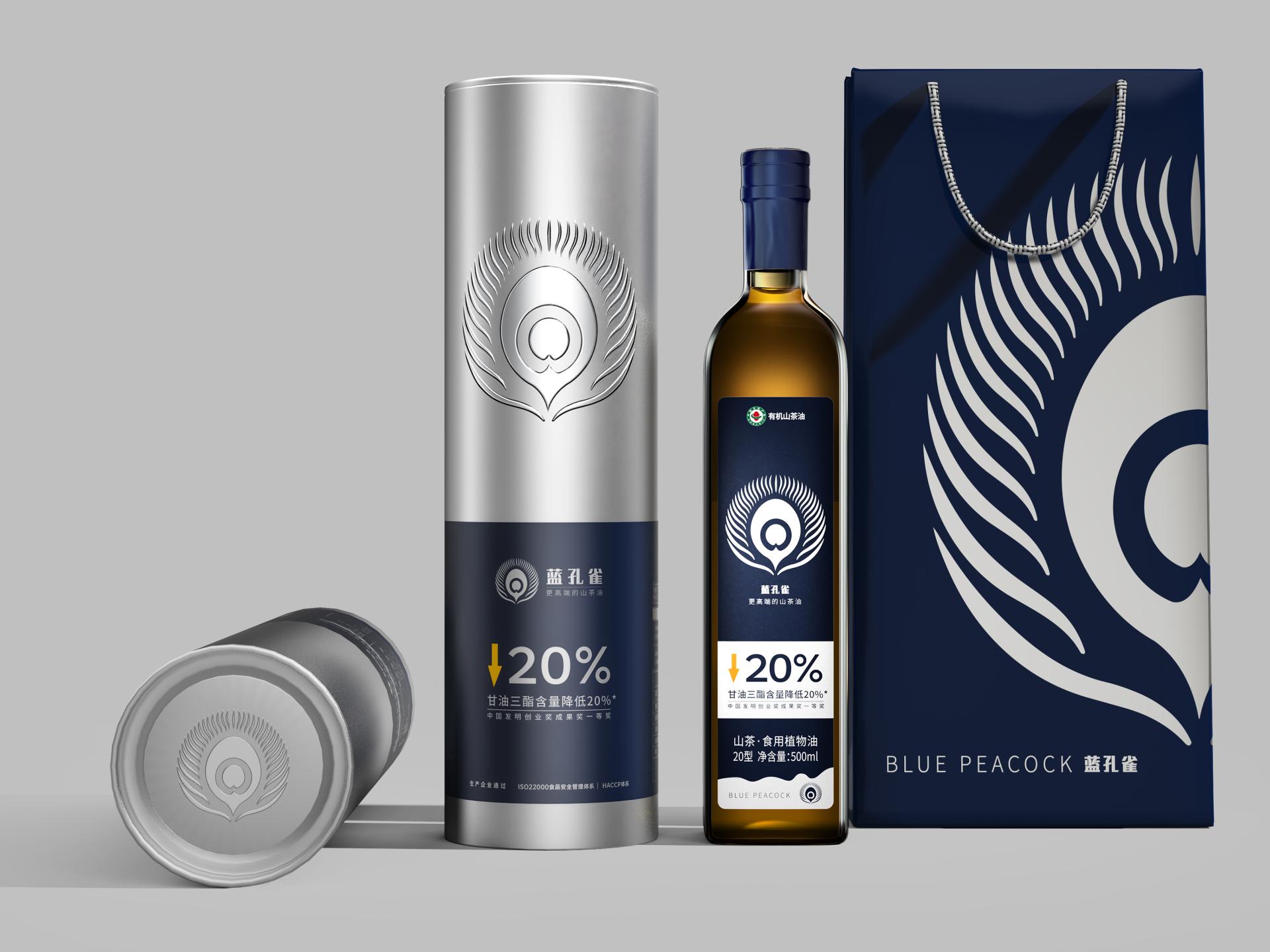
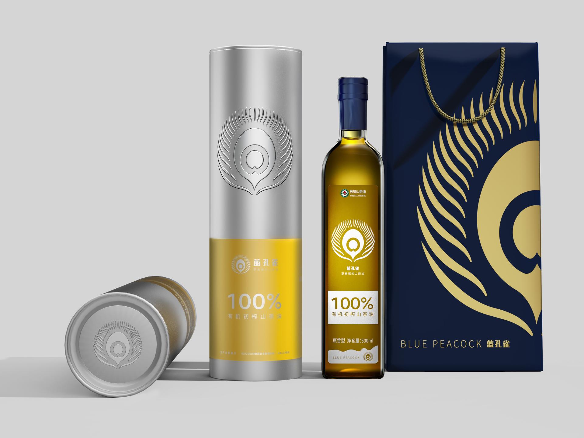
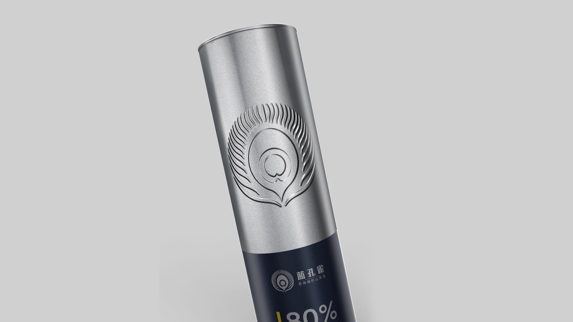
The packaging design for Blue Peacock Camellia Oil innovatively employs numbers as a central visual component, helping the product's critical attributes and values to be perceived intuitively, thereby quickly engaging users and promoting interaction. The packaging prominently features the number 20%, 50%, or 80%, which, when combined with downward arrows, visually demonstrates the product's efficacy in reducing triglyceride levels. The 100% label emphasizes the product's purity as 100% organic first-pressed camellia oil. By using numbers as the main visual element, the design not only attracts health-conscious consumers who prioritize natural quality but also makes the product's health benefits and pure origins clear, simplifying the selection process for users.
In terms of color choice, in view of the natural qualities and health value of the packaged camellia oil, a minimal color palette—either blue and silver or yellow and silver—is chosen to emphasize the numbers on the packaging and communicate the brand's core values, thus enhancing the product's pure and premium image.
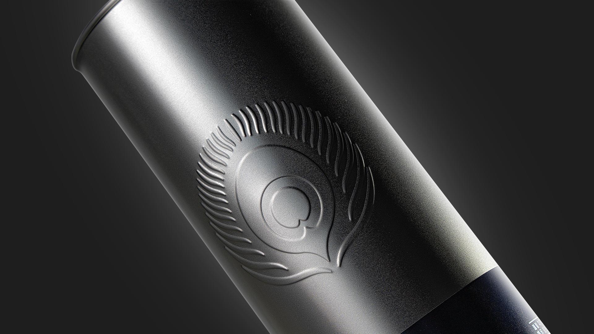
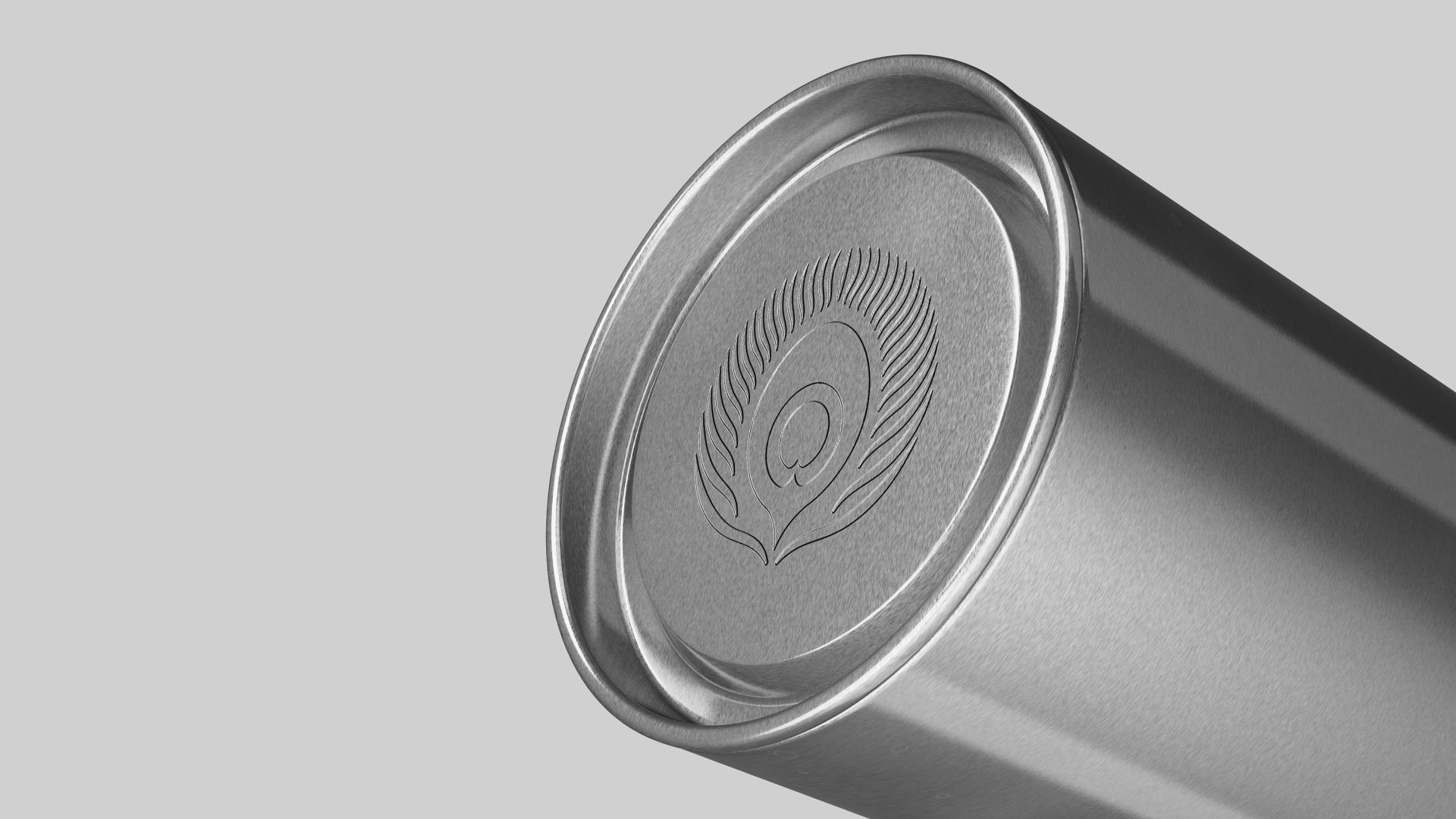
With regard to materials, tinplate is selected to convey a sense of quality and environmental value, while its durability ensures the oil's freshness and quality. Additionally, the embossed logo further strengthens brand recognition, reflecting a commitment to craftsmanship and attention to detail.
Credits

Entrant
Underdog Kitchen Company
Category
Product Design - Sustainable Living / Environmental Preservation
Entrant
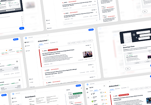
Stocknews AI
Category
Product Design - UX / UI / IxD (NEW)
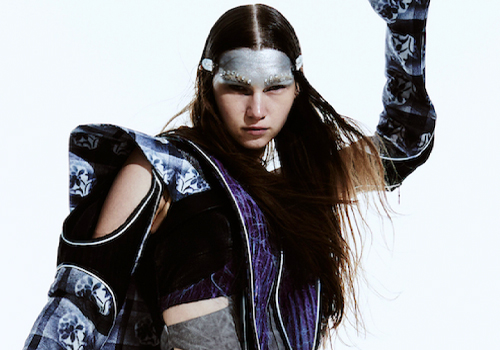
Entrant
Royal College of Art
Category
Fashion Design - Innovation (NEW)

Entrant
A-point design
Category
Packaging Design - Fashion, Apparel & Accessories