2025 | Professional

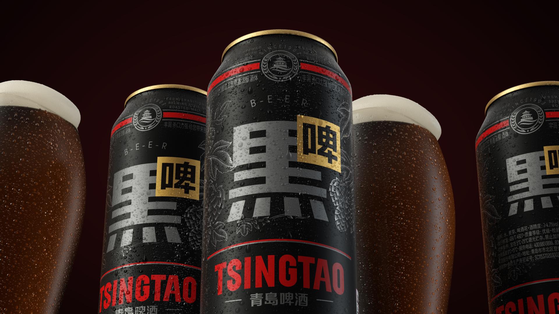
Tsingtao Stout Beer
Entrant Company
Shenzhen Tigerpan Design Co., Ltd.
Category
Packaging Design - Wine, Beer & Liquor
Client's Name
Tsingtao Beer Co., Ltd.
Country / Region
China
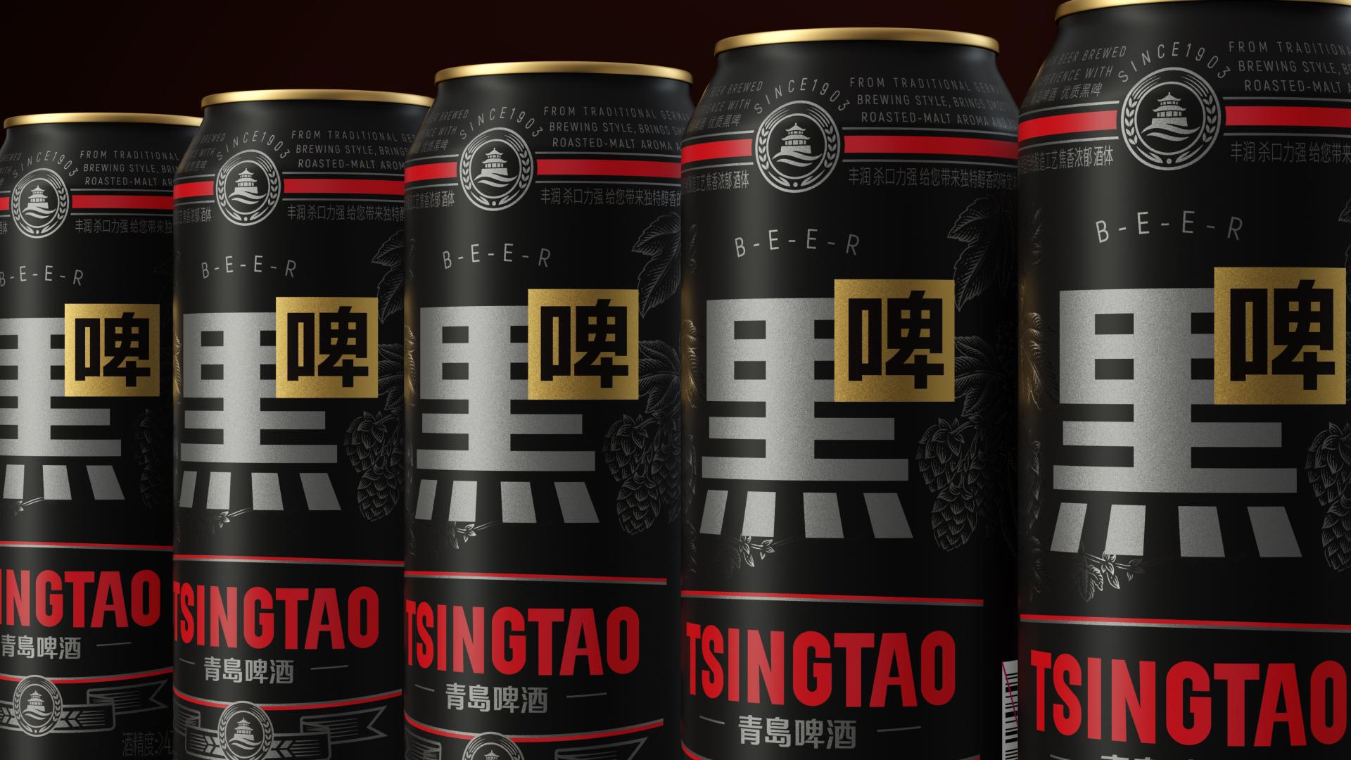
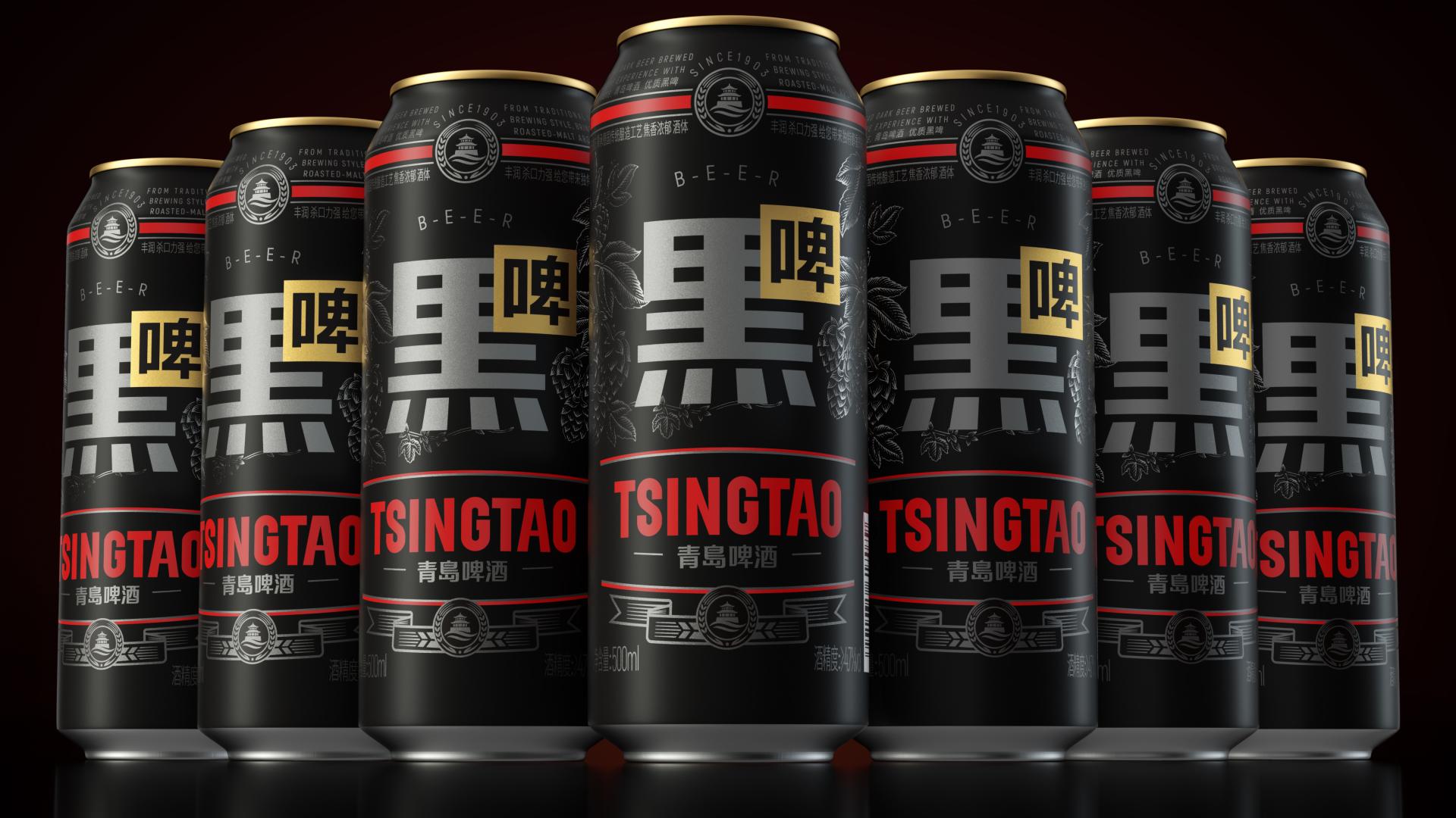
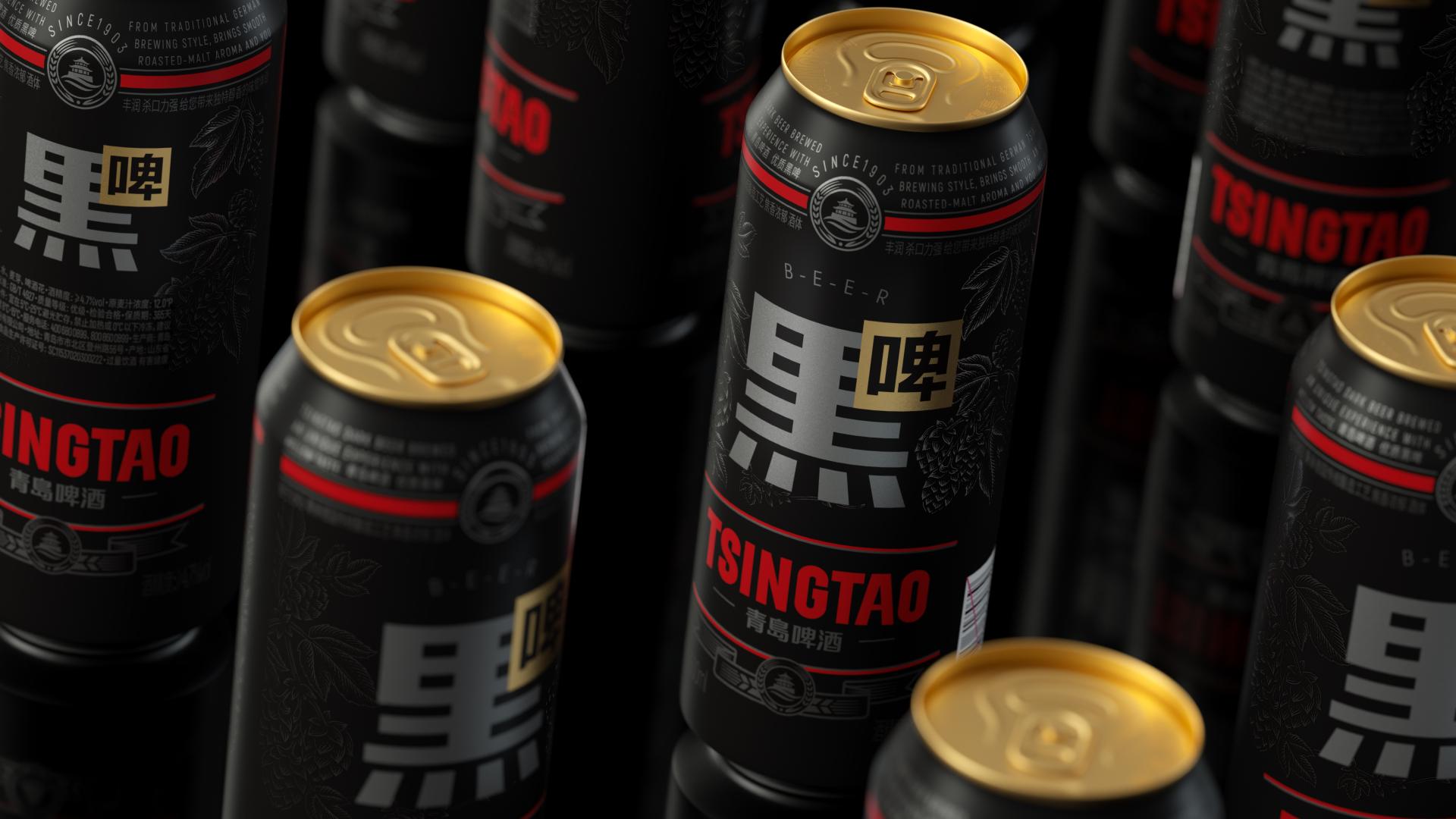
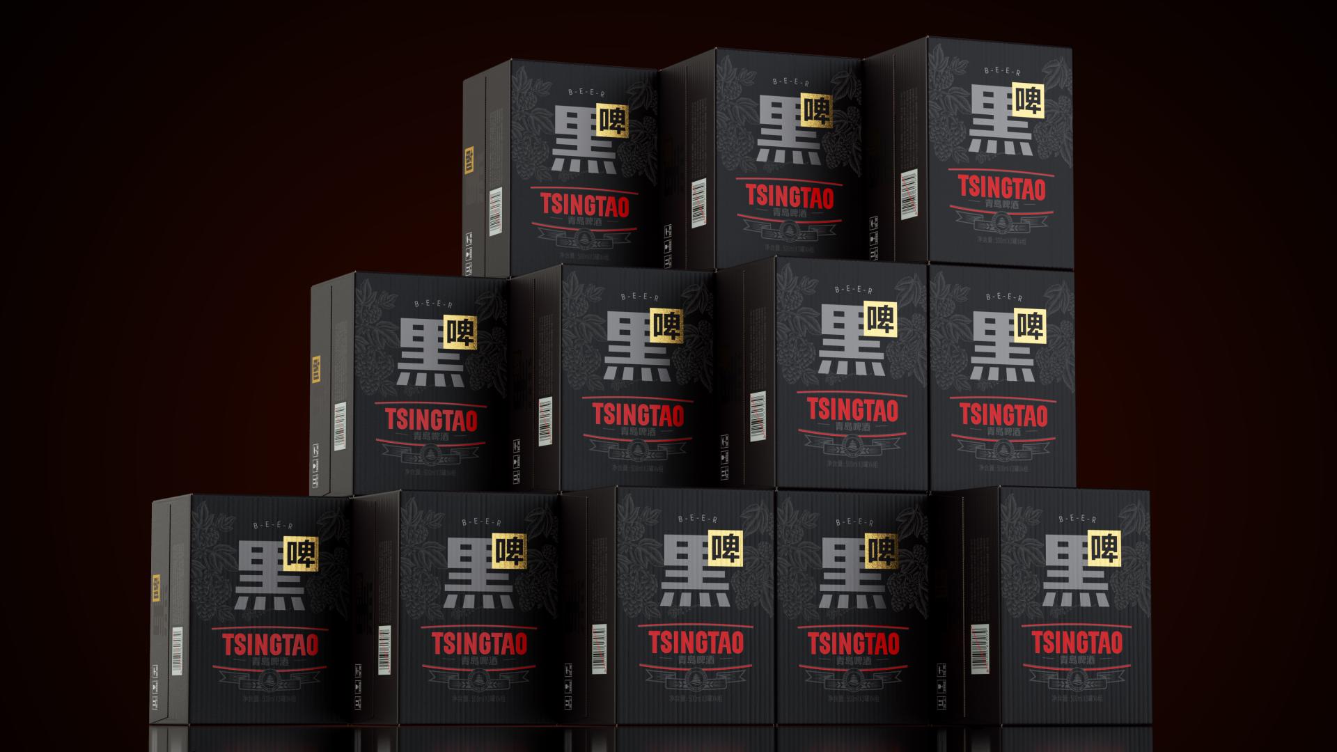
In the niche market of Chinese stout, our design aims to establish a unique visual identity by utilizing a flat design language to artistically represent Chinese characters. The bold use of silver combined with fashionable black and red creates an elegant yet striking packaging that redefines stout in the Chinese market. The core idea is to introduce a distinctly Chinese representation of stout, moving away from the English-dominated market. By integrating Chinese characters into the design, we aim to make the product more relatable and appealing to local consumers, positioning it as a cultural icon.
Credits
Entrant Company
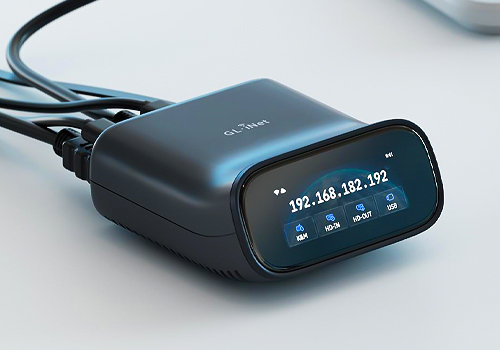
SHENZHEN GUANGLIANZHITONG TECH CO.,LTD
Category
Product Design - Telecommunications
Entrant Company
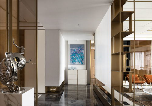
深圳市正象空间设计有限公司
Category
Interior Design - Living Spaces
Entrant Company
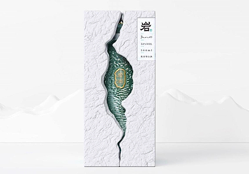
Guangdong Voion Eco Packaging Industrial Co., Ltd.
Category
Packaging Design - Wine, Beer & Liquor

Entrant Company
Yuyi Shen
Category
Architectural Design - Cinema / Theater (NEW)