2025 | Professional

New Amsterdam Vodka Redesign
Entrant Company
forceMAJEURE Design
Category
Packaging Design - Wine, Beer & Liquor
Client's Name
Gallo
Country / Region
United States
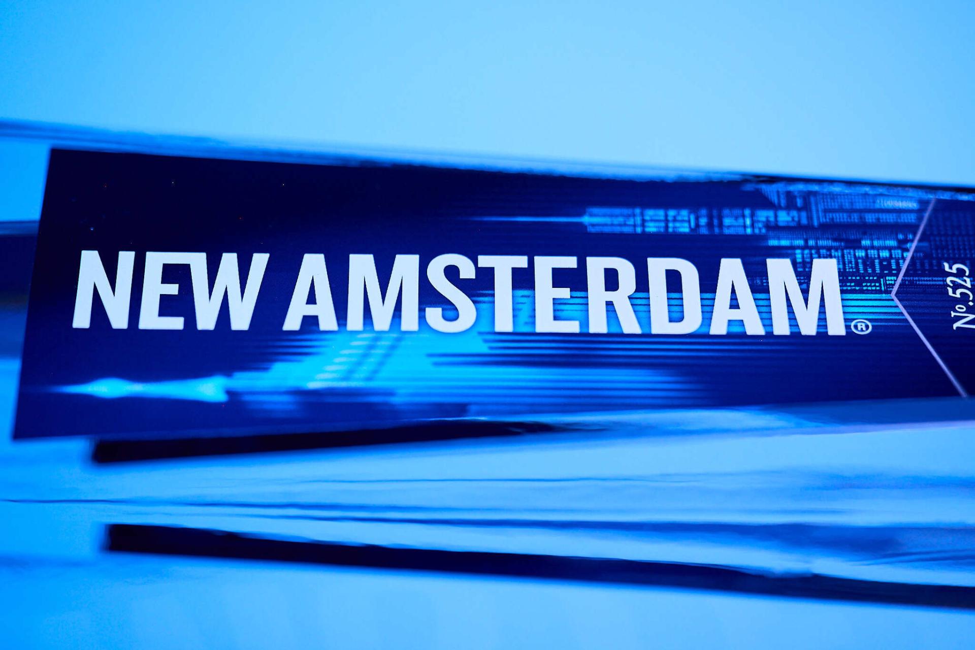
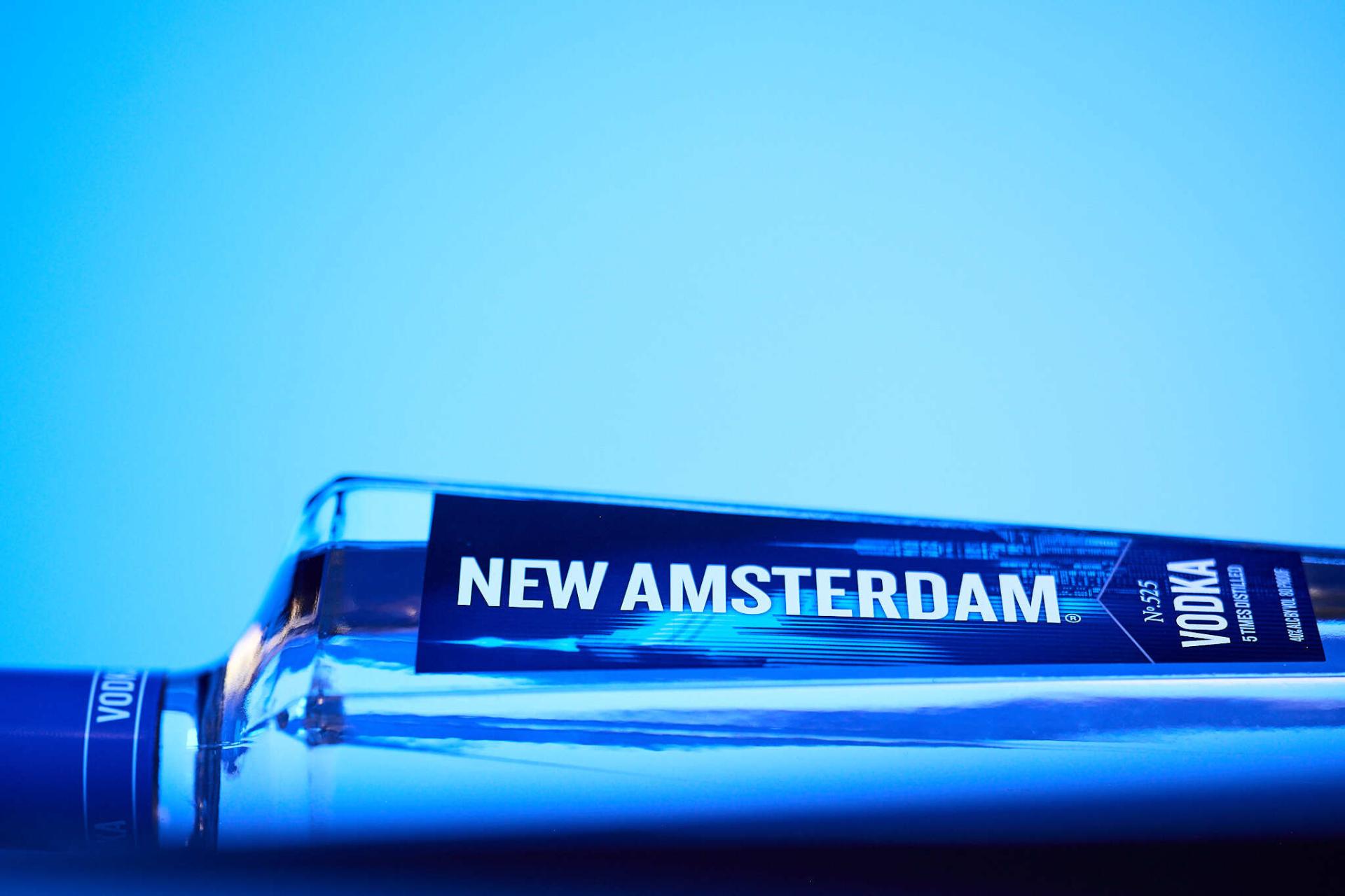
New Amsterdam Vodka partnered with forceMAJEURE for its first major rebrand in fifteen years. The objective was clear: refresh the visual identity and packaging to strengthen the brand’s relevance with a new generation of consumers while energizing its presence for loyal fans.
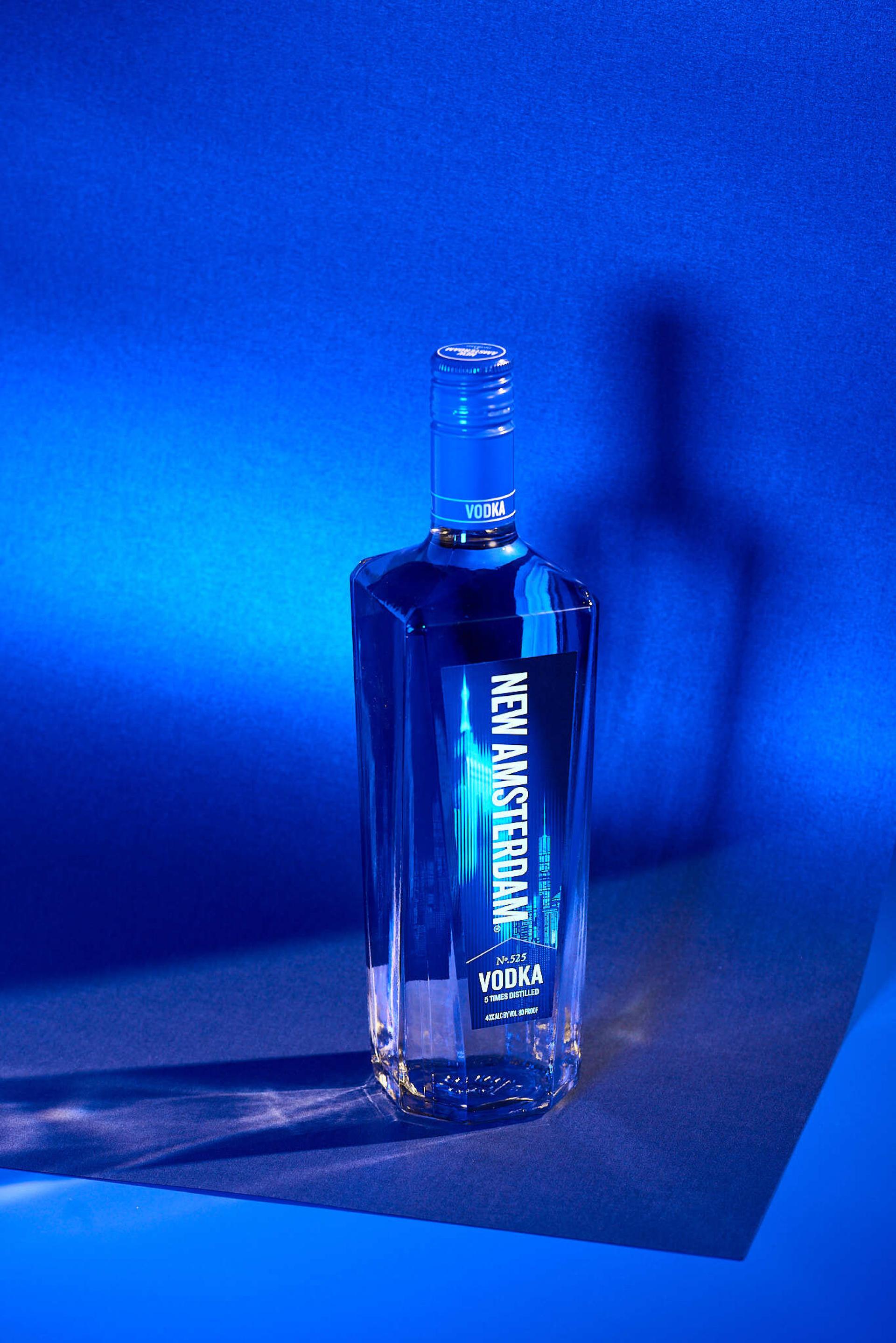
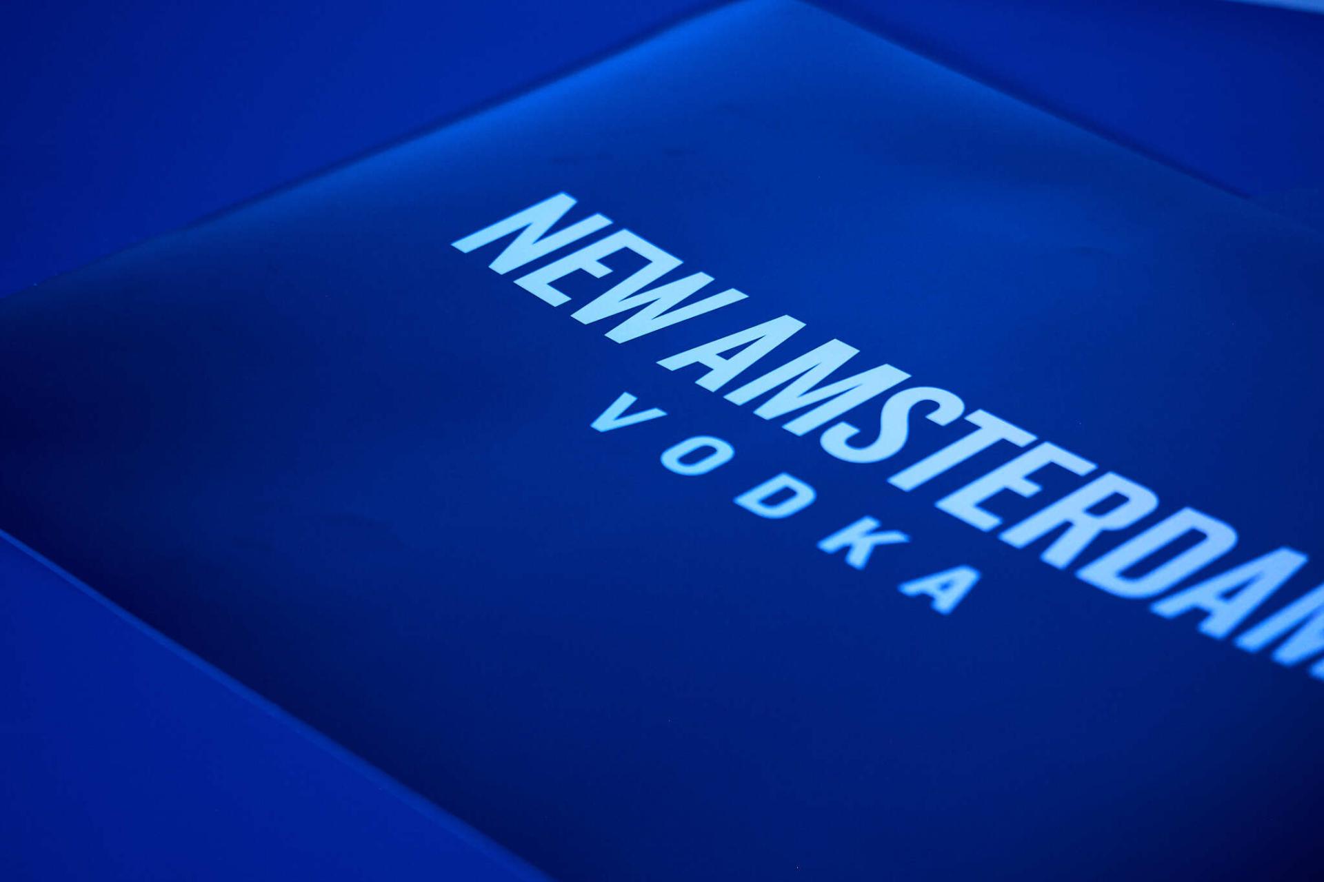
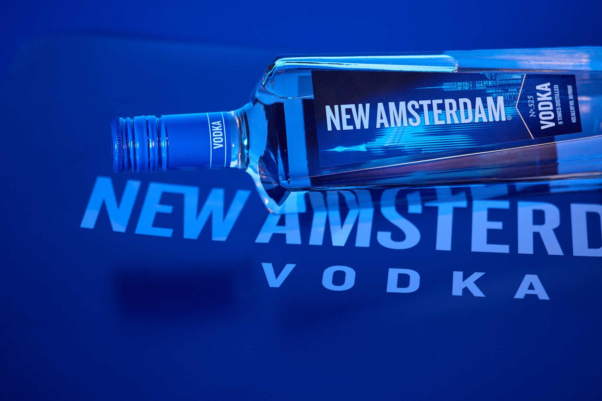
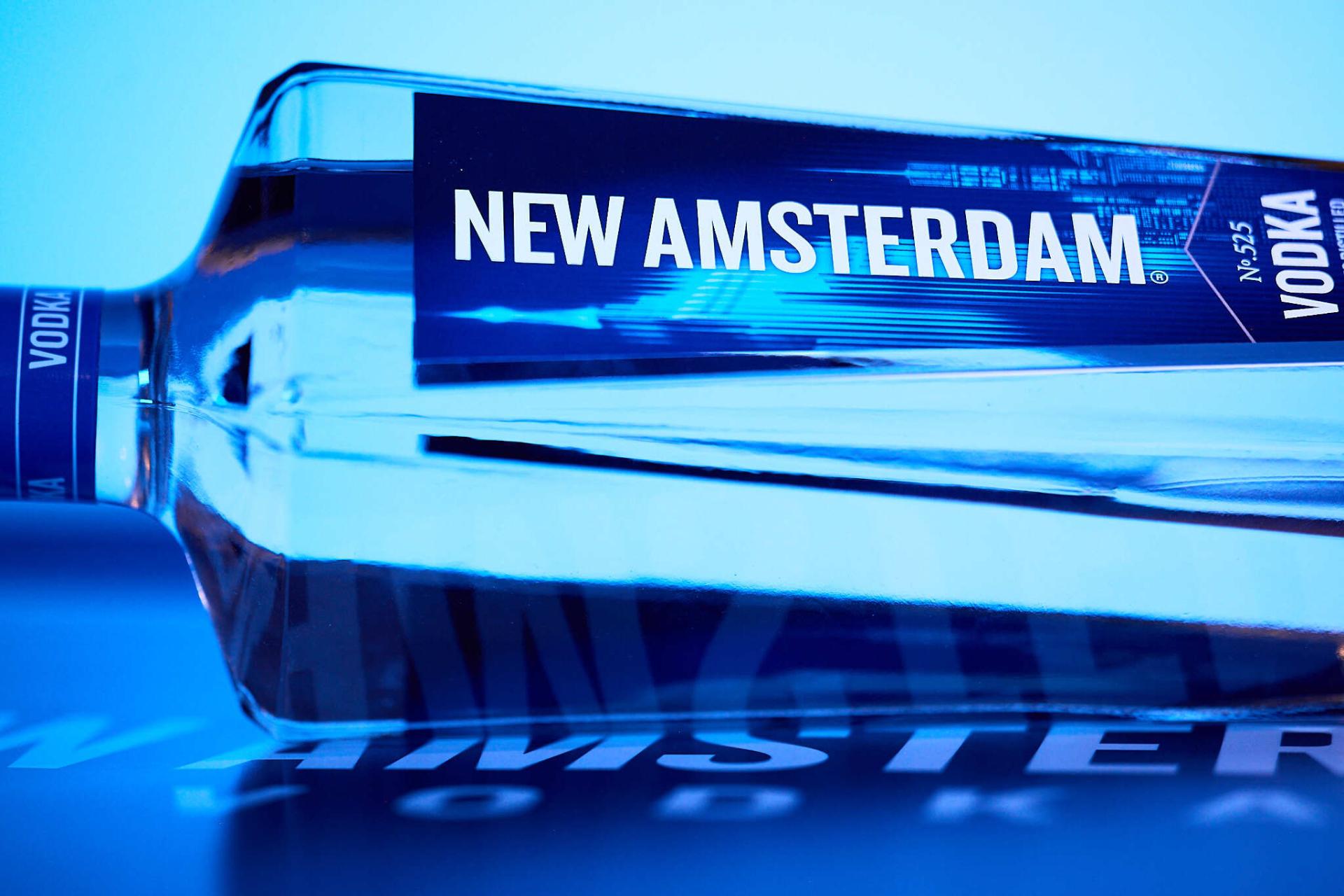
We began by reconnecting the brand with the spirit of its namesake. Inspired by the energy, verticality, and architectural strength of New York City, we created a new visual identity that feels bold, modern, and unmistakably urban. The refreshed logotype retains its signature tall letterforms and is now paired with a new emblem, a stylized skyline framed in a sharp pentagon. This new mark brings structure and consistency across all brand expressions.
The packaging redesign enhances the bottle’s silhouette with strong architectural lines, premium detailing, and a more contrasted label layout. We introduced a dynamic color palette of electric blue and crisp white to inject vitality and contemporary flair. The iconic skyscraper illustration on the bottle was reimagined using vibrant color and light effects to evoke movement, nightlife, and the energy of celebration. Every element of the design was crafted to reinforce New Amsterdam’s status as a bold, American-made vodka. From label textures to metallic finishes, the new packaging elevates the sense of craft and charisma.
With this comprehensive rebranding effort, New Amsterdam returns to the market with renewed confidence, asserting a clear identity and commanding attention at every touchpoint.


Entrant Company
CSWADI
Category
Architectural Design - Airports (NEW)
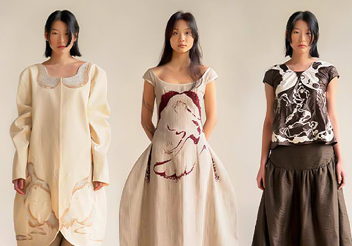
Entrant Company
Parsons School of Design
Category
Fashion Design - Haute Couture

Entrant Company
观海景观营造社(See the sea design group)
Category
Landscape Design - Residential Landscape

Entrant Company
CEAN SPATIAL
Category
Interior Design - Lobby (NEW)