2025 | Professional
Churin Leaderfoods Red Sausage
Entrant Company
Harbin Churin Leaderfoods Co., Ltd.
Category
Packaging Design - Prepared Food
Client's Name
Country / Region
China
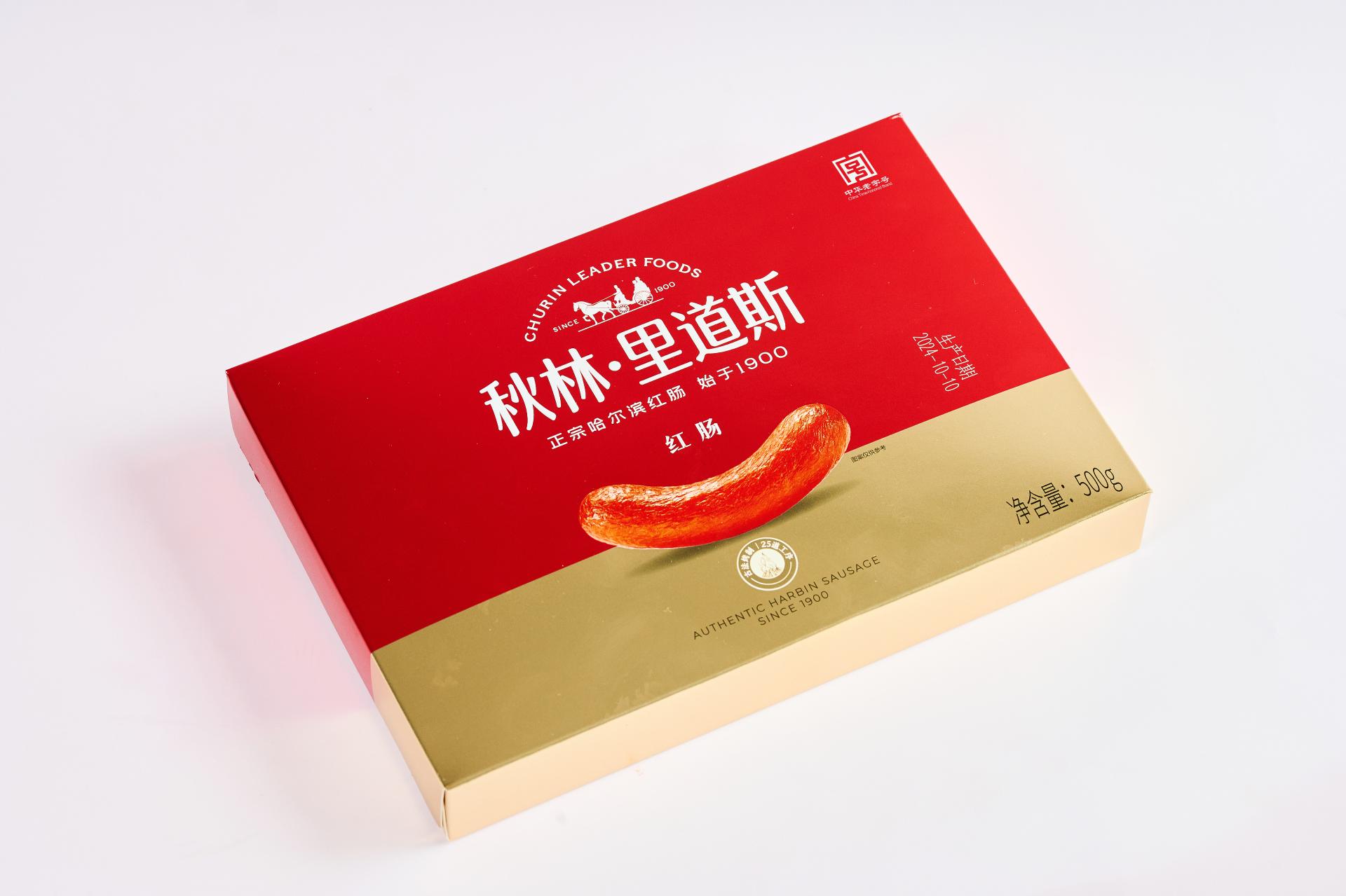
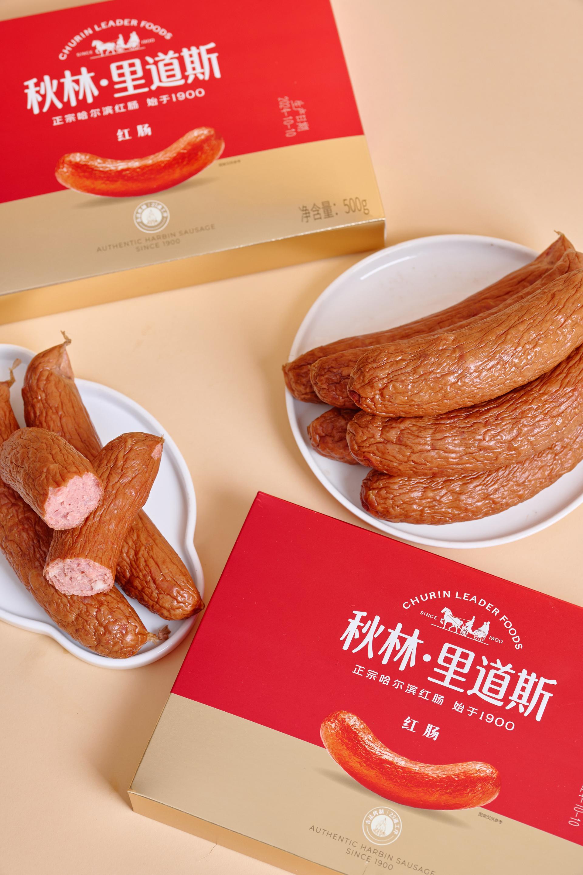
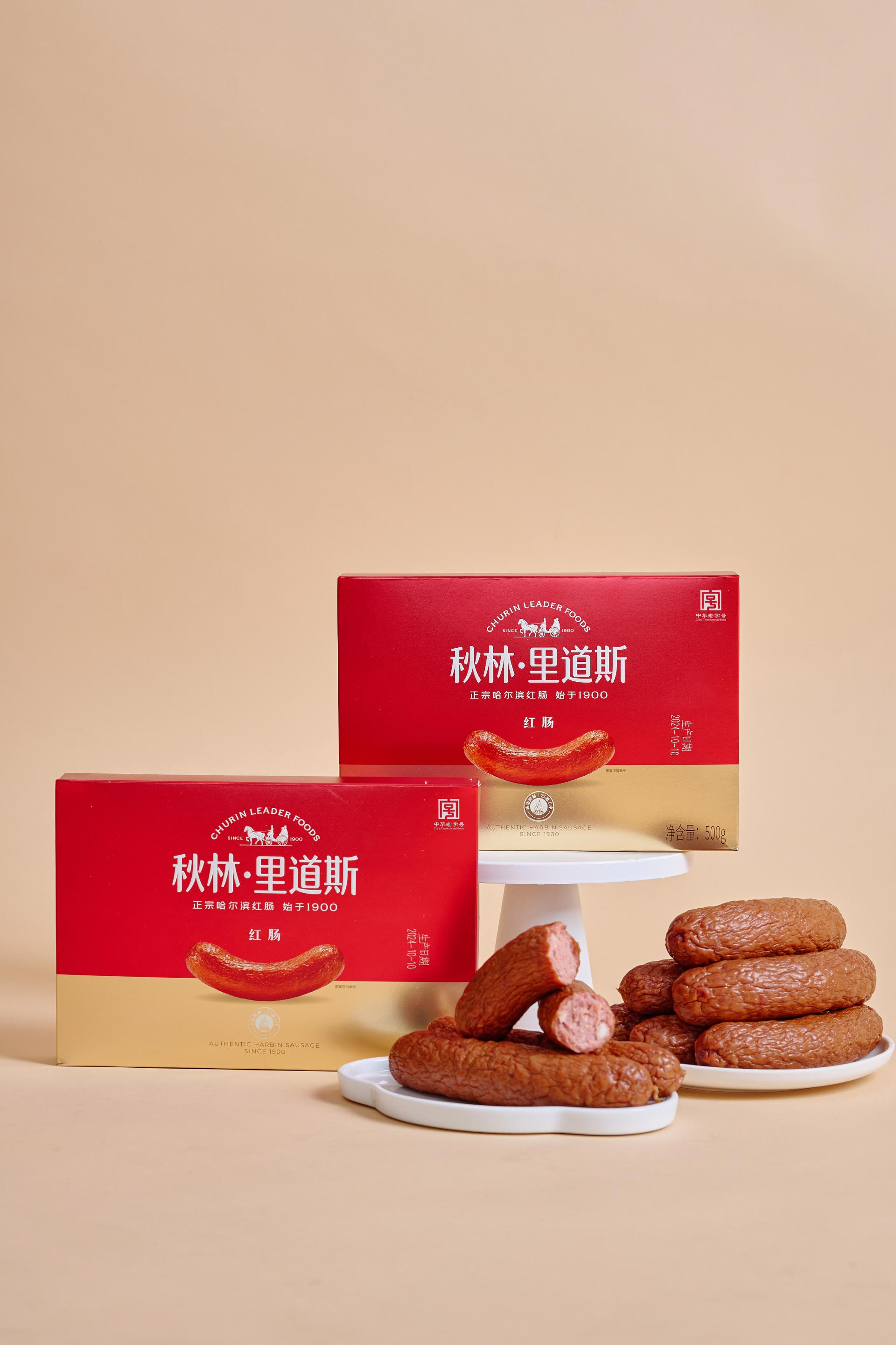
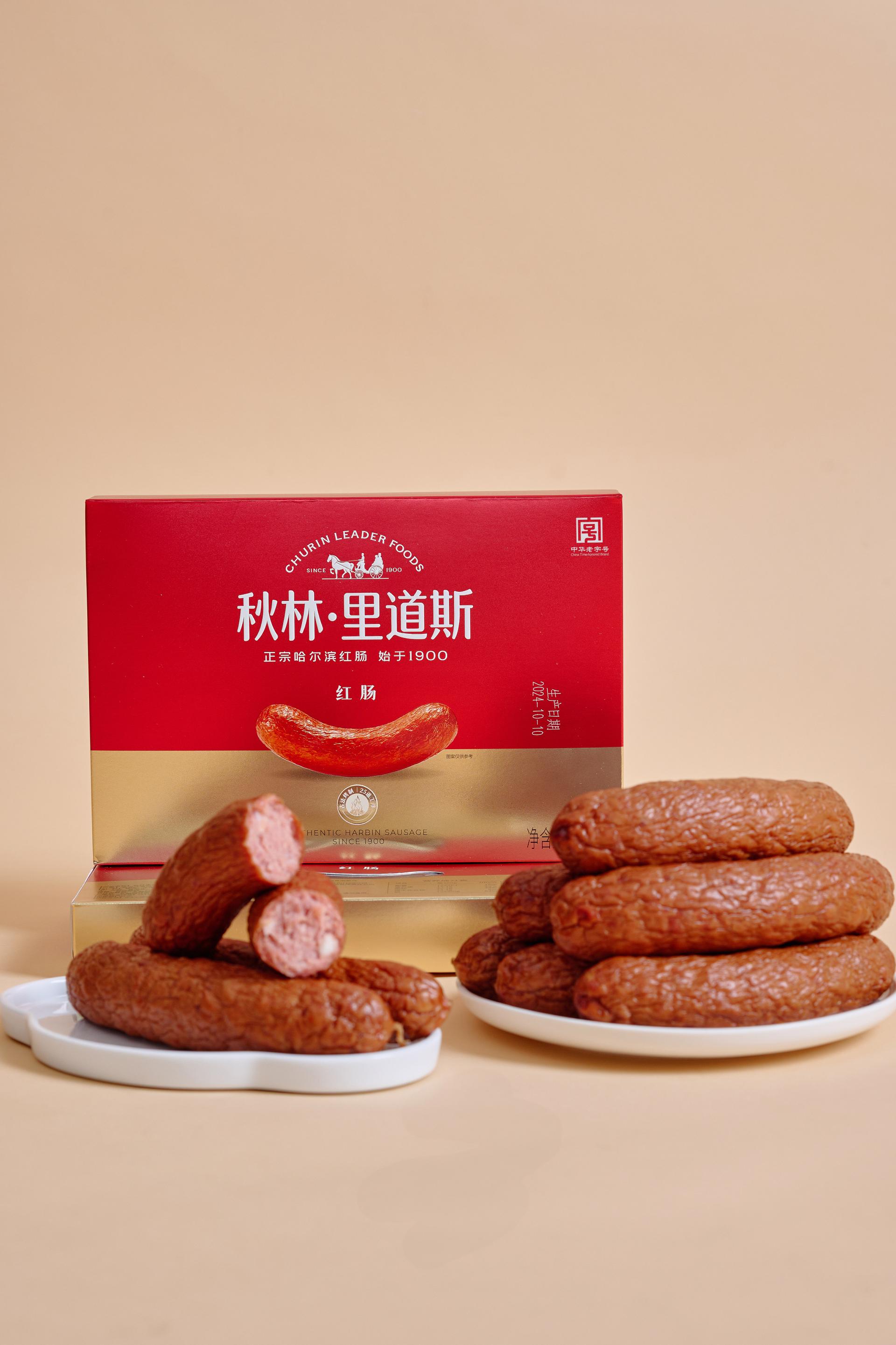
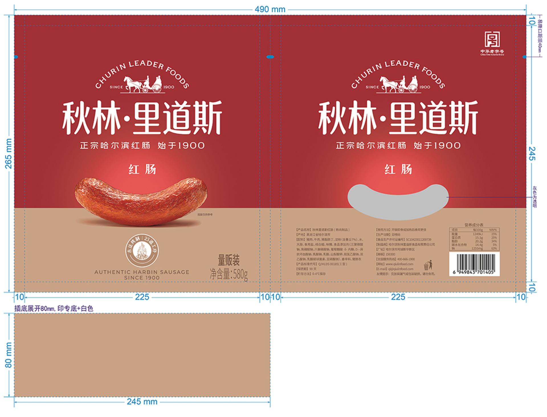
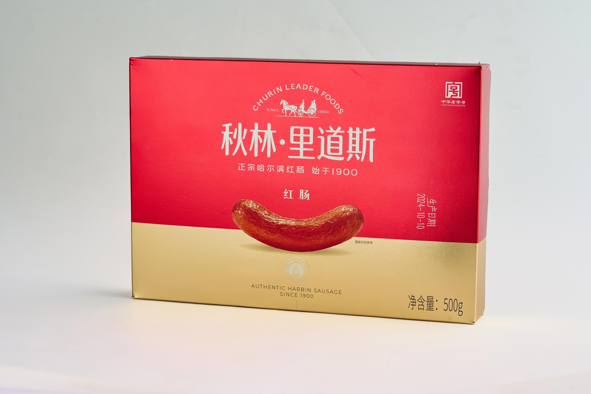
This packaging is newly designed for Churin Leaderfoods Red Sausage, rooted in the brand’s century-long heritage. Centered on “inheriting tradition with a fresh expression,” it establishes a visually compelling system that balances cultural depth with contemporary aesthetics, clearly conveying the brand’s promise of “authentic Harbin sausage, a century of quality.” The color strategy features a bold red and gold palette, creating a powerful and emotionally resonant visual identity. The red draws from the distinctive hue of sausages smoked with fruitwood, authentically representing the product while continuing Churin's visual legacy since 1900—symbolizing enduring craftsmanship and dedication to tradition. Gold signifies quality and the passage of time, reflecting the honored status and refined artisanship of a “China Time-Honored Brand,” adding a sense of prestige and luxury. Applied in the golden ratio, these colors enhance visual balance and shelf impact, creating a memorable brand impression. Graphic and layout design follow the modern “less is more” philosophy, using a minimalist structure to carry rich cultural narrative. Iconic brand elements—“Est. 1900,” “China Time-Honored Brand,” and “Harbin’s City Card”—are distilled into meaningful, time-weighted visual motifs seamlessly integrated into the composition. Rather than mere decoration, they serve as narrative threads, unfolding along the viewer’s visual journey to form a clear timeline from past to present. The focal point emphasizes the product itself, rendered in high-definition realism to highlight the sausage’s texture and luster, reinforcing category recognition and appetizing appeal. This tangible representation contrasts with abstract brand symbols, creating a dual expression of “concrete and abstract,” “material and spirit”—meeting immediate consumer recognition while evoking emotional connection and cultural resonance. Design language blends Russian-inspired symmetry with Chinese aesthetic principles of negative space, using deliberate emptiness to create visual breathing room. This ensures clear information hierarchy, allowing key messages to stand out with elegance and clarity.
Credits
Entrant Company
Longzhi Design Engineering Office
Category
Interior Design - Residential
Entrant Company
Yufeng Zhao, Qiao Tang, Ziwen Zeng, Xinmu Hu
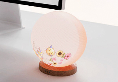
Category
Conceptual Design - Smart Technologies

Entrant Company
China Shaanxi Huaqing Palace Cultural Tourism Co., Ltd
Category
Product Design - Imaging & Vision
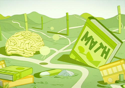
Entrant Company
Xinxun Liao
Category
Conceptual Design - Education