2025 | Professional

Pomi Packaging Adaptation for U.S. Market
Entrant Company
QNY Creative
Category
Packaging Design - Dairy, Spices, Oils, Sauces & Condiments
Client's Name
Pomi USA
Country / Region
United States
Share :
facebook sharing buttontwitter sharing buttonlinkedin sharing buttonemail sharing buttonsharethis sharing button
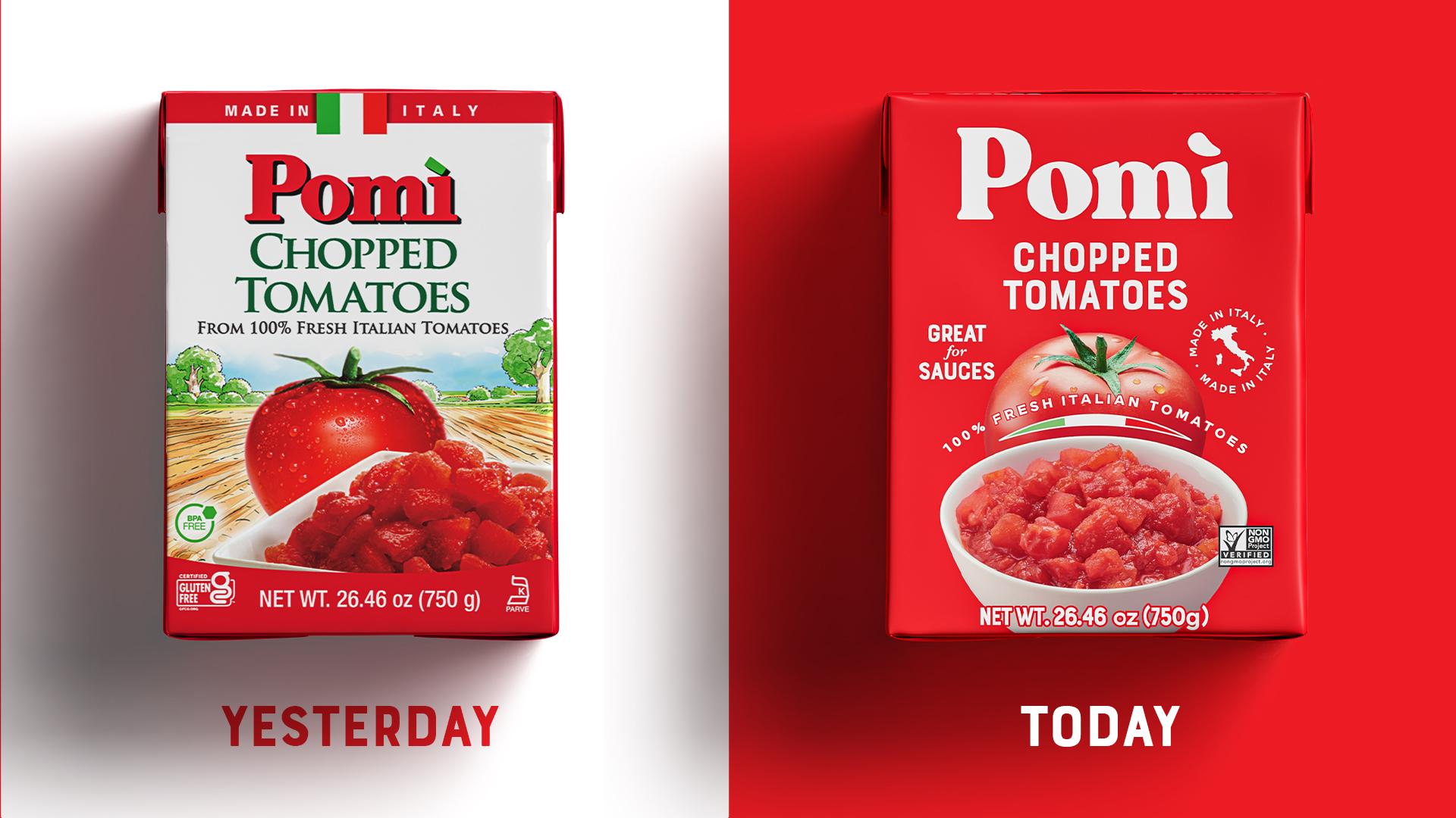
At the core of our Pomì packaging redesign lies a harmonious blend of tradition and innovation, with an unwavering commitment to sustainability. Our goal at QNY was to adapt this global refresh for the U.S. market, honoring Pomì’s heritage while elevating its presence for modern consumers.
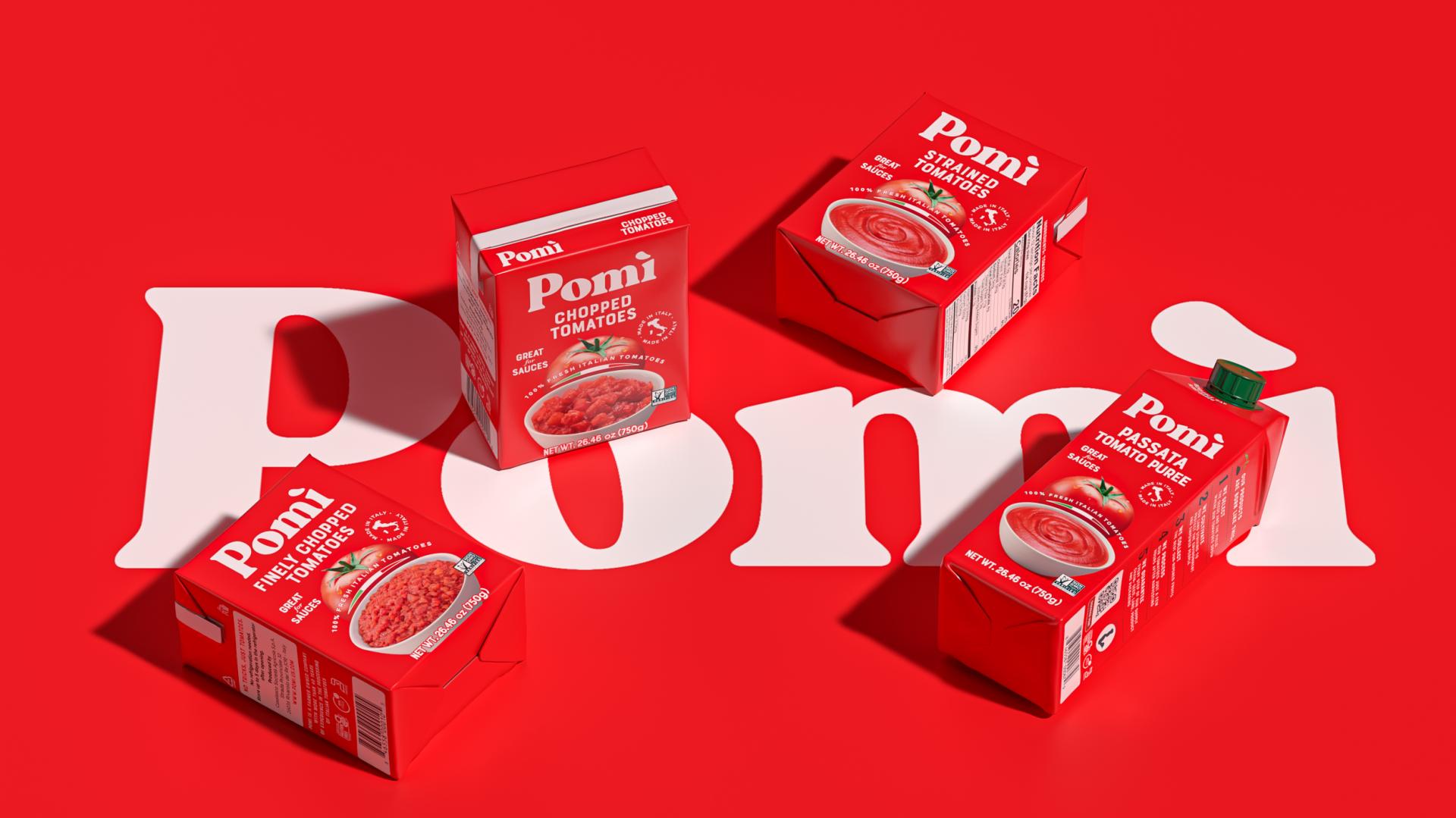
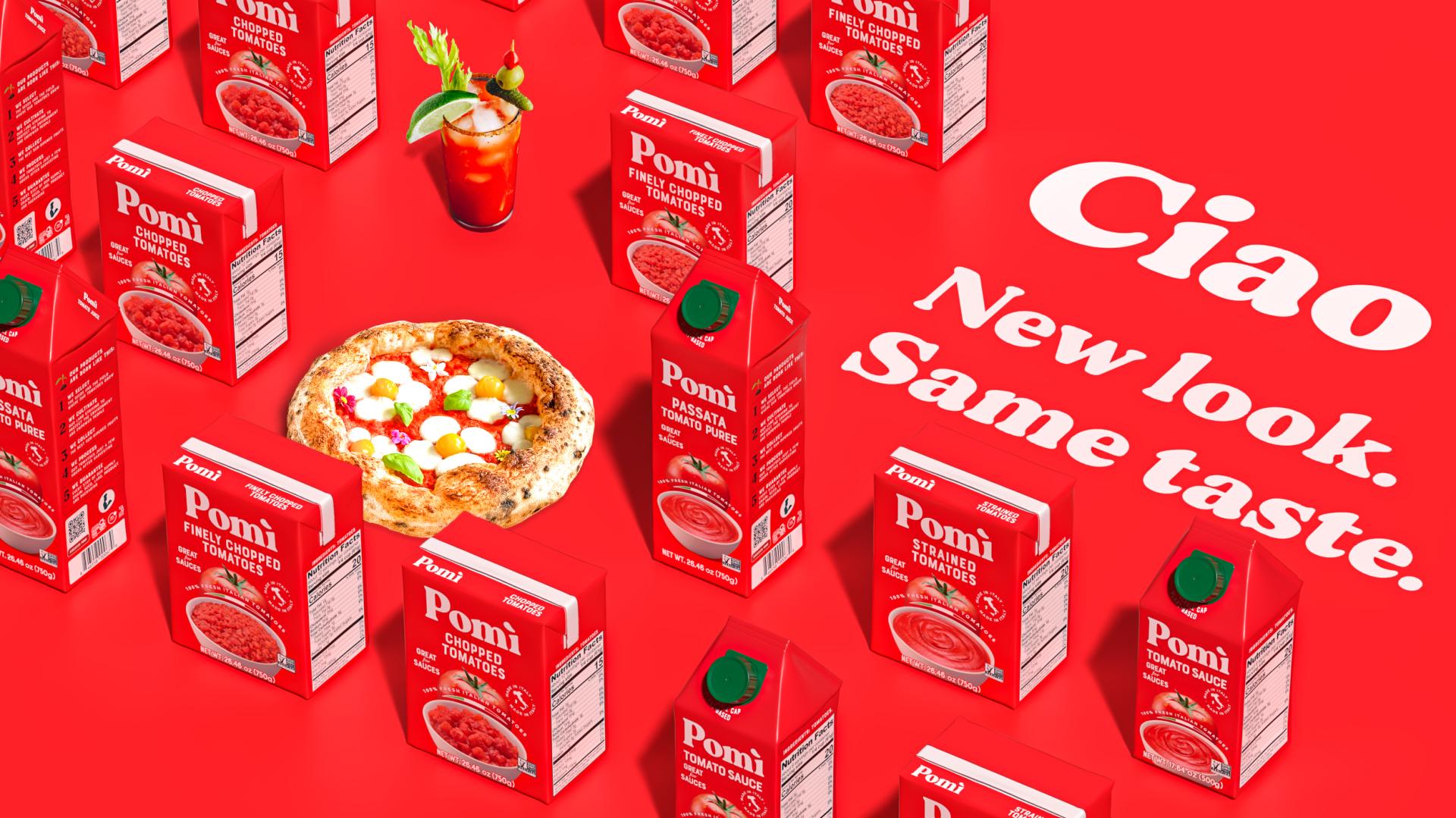
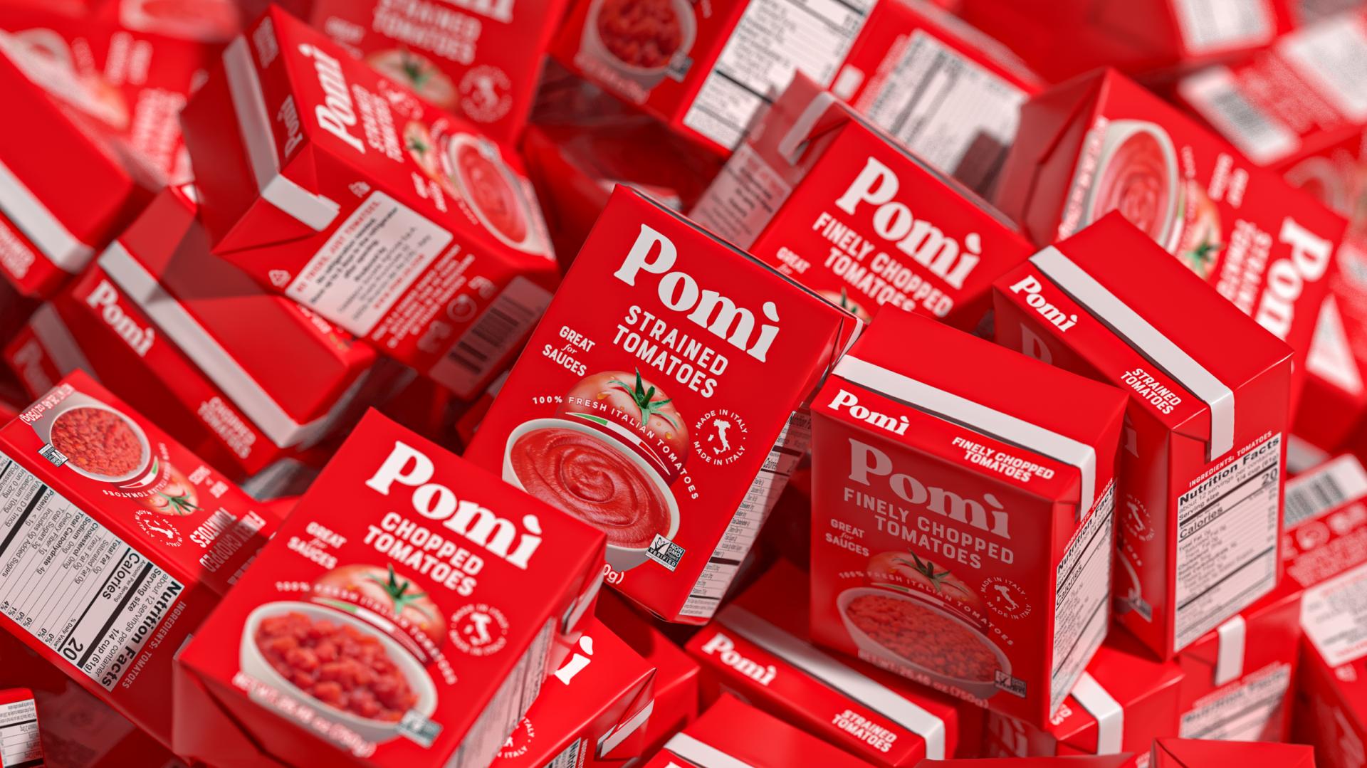
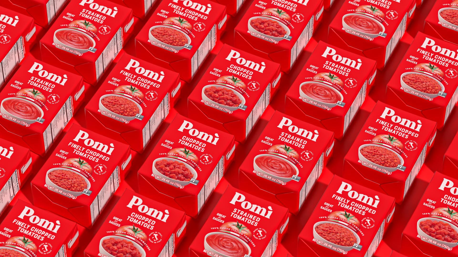
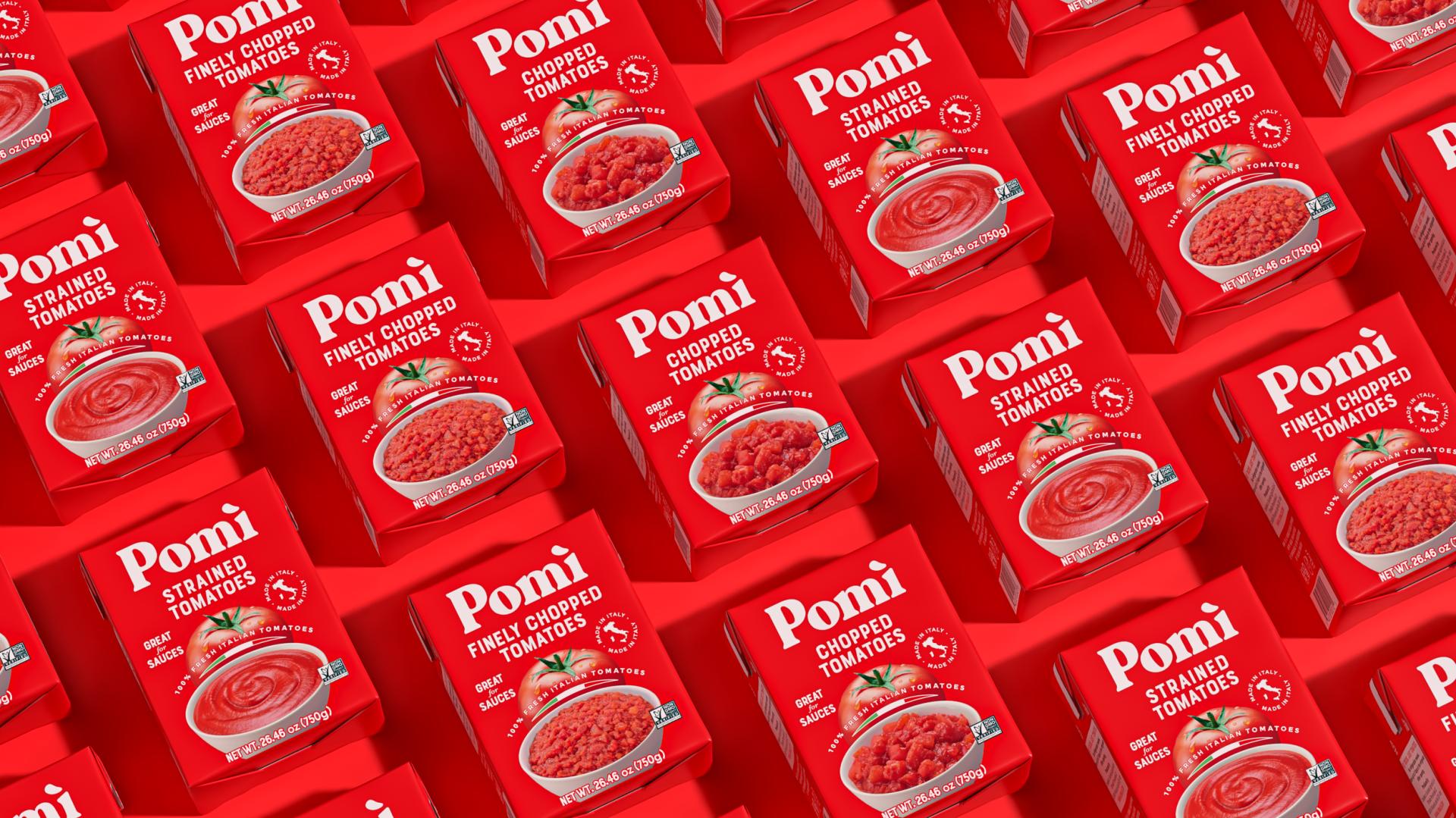
At the heart of the design is the iconic Pomì tomato, symbolizing the brand's commitment to purity and quality with its single ingredient: tomatoes, no additives. This image now sits on a bold red backdrop, making the pack visually striking and instantly recognizable on shelves. We added clear, legible identifiers for each tomato variant—strained, chopped, passata, and purée—on the Principal Display Panel (PDP) to support quick consumer recognition. The Pomì logo was enlarged to enhance brand presence, while a visual of fresh tomato sauce in a white bowl was introduced on the PDP to inspire culinary creativity. To reinforce authenticity, the Italian flag and “Made in Italy” seal feature prominently on the front panel.
The bowl of sauce serves multiple purposes: it helps shoppers quickly identify the product, acts as a serving suggestion, and conveys texture, readiness, and quality.
It communicates that Pomì is a convenient, time-saving choice for homemade sauces, assuring consumers of its suitability for their recipes.
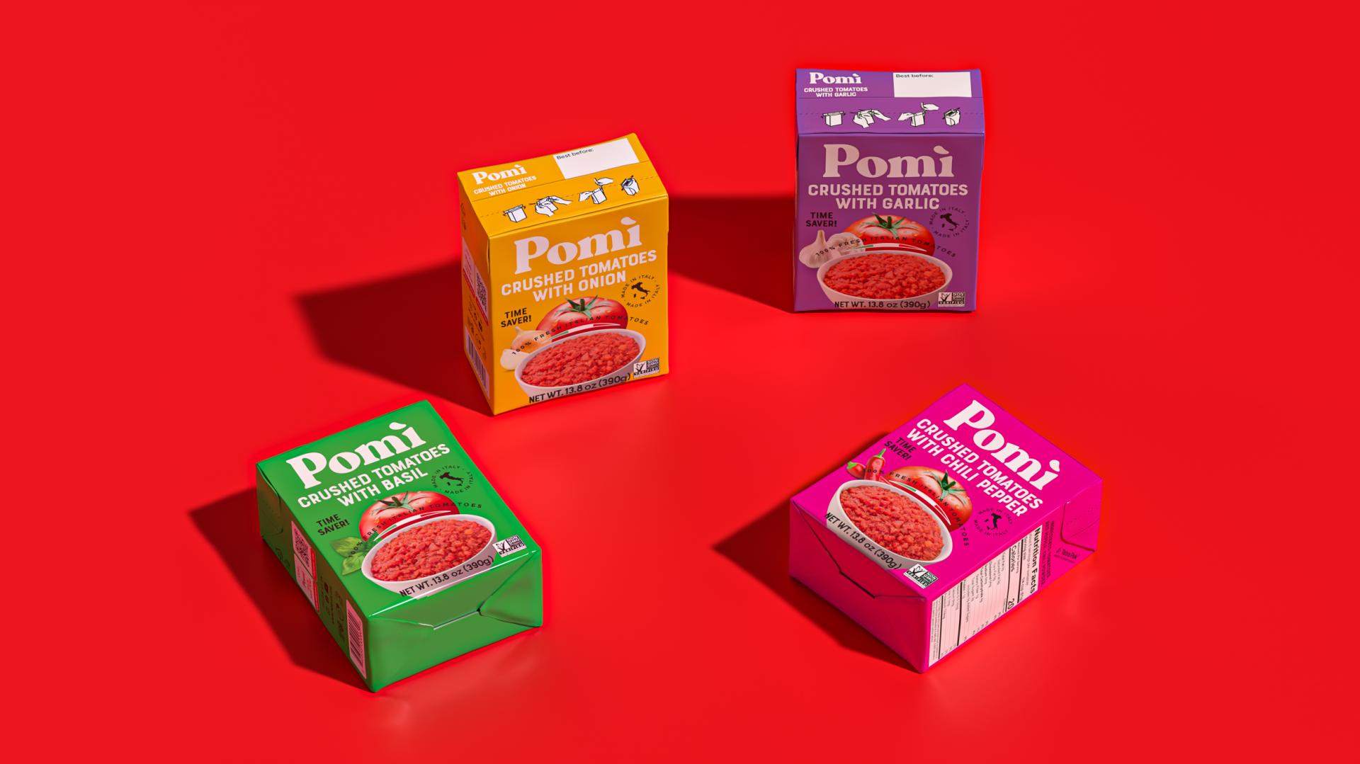
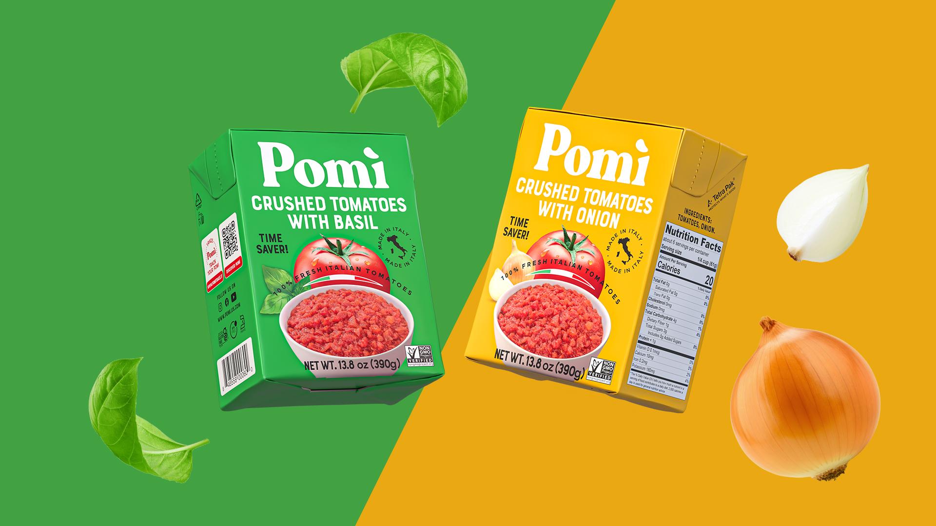
To meet the U.S. demand for convenience and variety, we introduced an exclusive line of 13.08 oz Crushed Tomatoes with Basil, Garlic, Chili, and Onion in Tetra Pak cartons. Each flavor is uniquely color-coded for easy recognition and shelf impact, acting as a visual cue to the taste inside. These bold, vibrant packs are designed to disrupt the aisle and guide consumers toward the right flavor for their cooking needs. Functional callouts and flavor tags clearly position the line as a solution for quick, flavorful meals without additional prep.
Together, these elements communicate a unified story of quality, innovation, and Italian authenticity. The redesign ensures Pomì stands out as a leader in sustainable, Made-in-Italy tomato products—offering U.S. consumers a convenient, beautiful, and trustworthy way to bring real Italian flavor to their kitchens.
Credits

Entrant Company
Yue+ Deco
Category
Interior Design - Commercial


Entrant Company
Gnd N+ Design
Category
Interior Design - Showroom / Exhibit


Entrant Company
SHAPELLX US INC
Category
Fashion Design - Lingerie / Intimates


Entrant Company
JTL Gatlin( chongqing)
Category
Landscape Design - Residential Landscape

