2026 | Professional
Maèntu
Entrant Company
Redfish di Giovanni Murgia
Category
Packaging Design - Wine, Beer & Liquor
Client's Name
Mack & Schuhle Italia
Country / Region
Italy
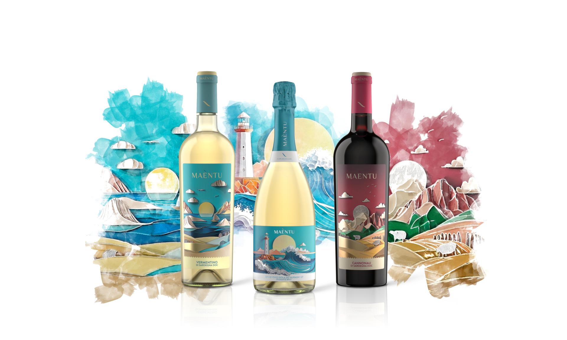
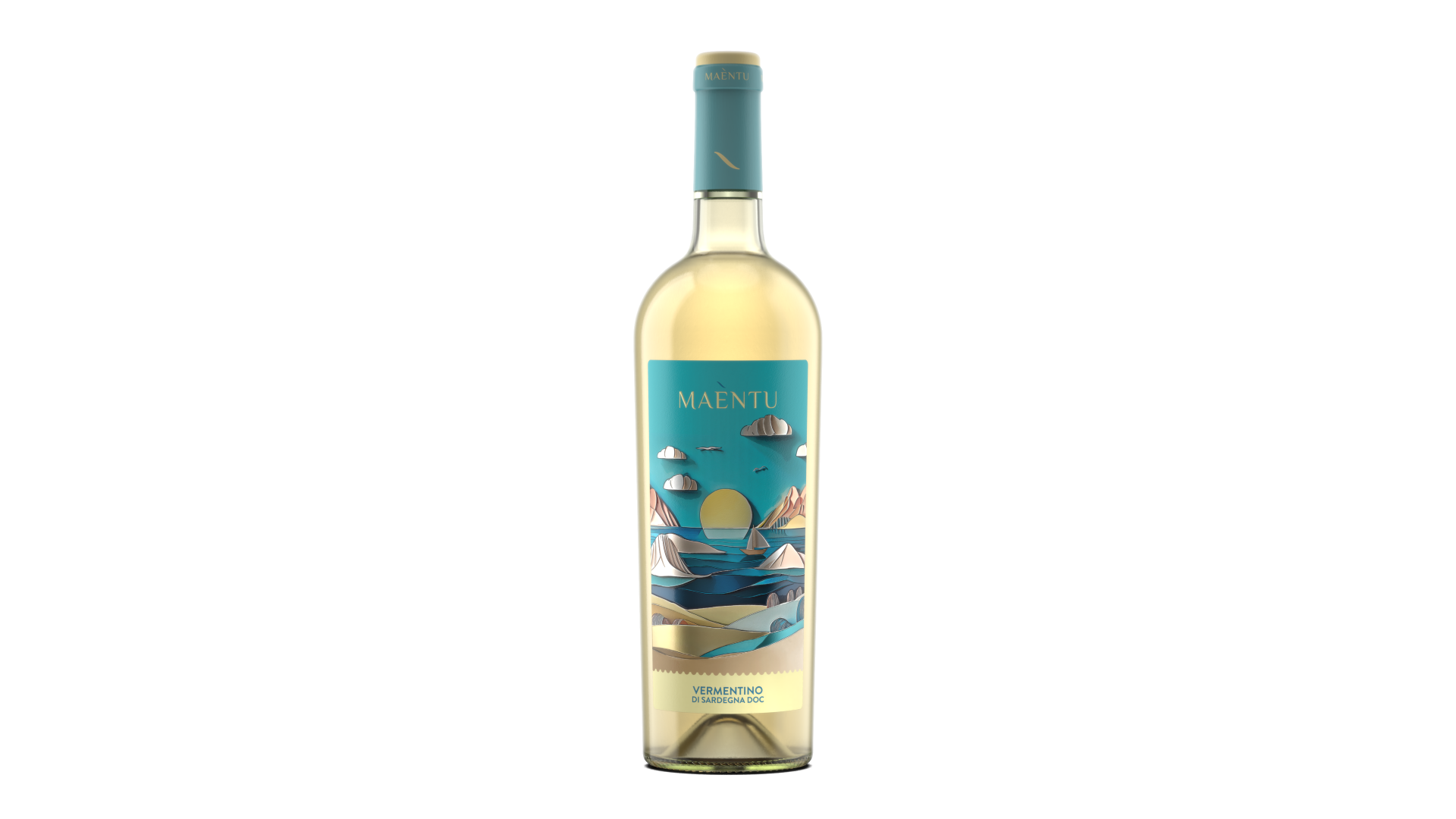
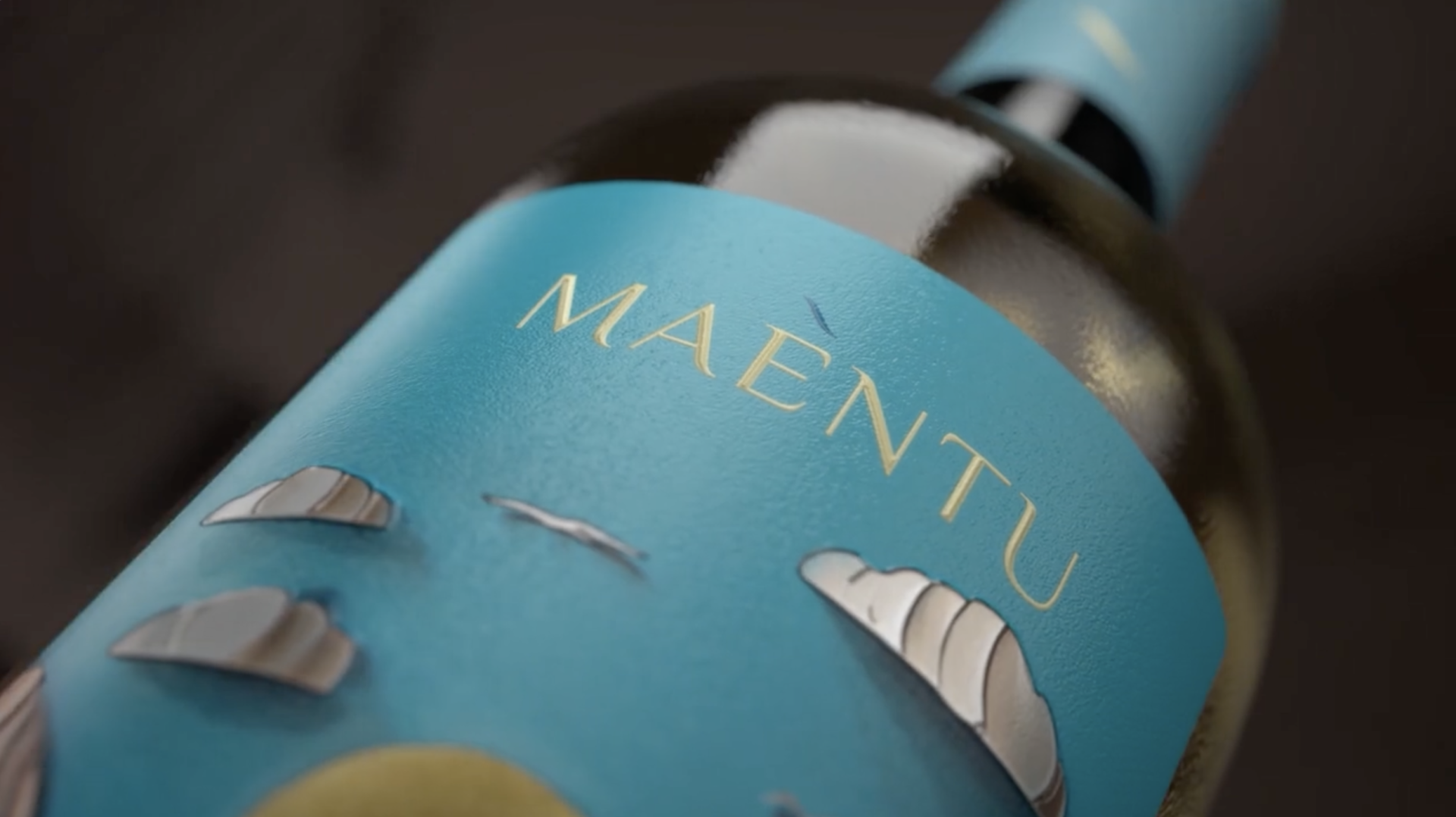
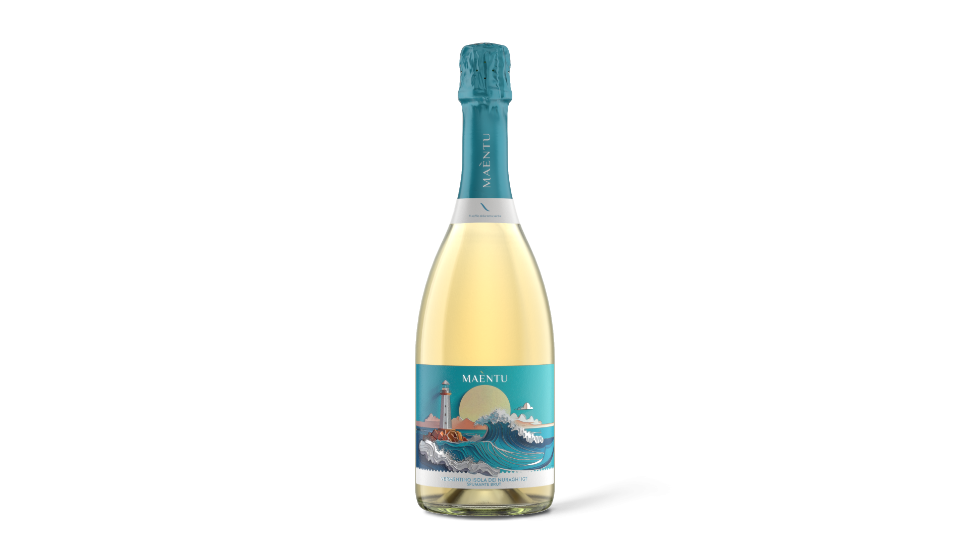
Maèntu is a tribute to the truest soul of Sardinia, a land where nature remains untamed and winemaking is a sacred tradition passed down through generations. It is an ancient voice, a breath that sweeps across hills, vineyards, and sea—the whisper of the Maestrale wind that shapes the land and the vines. Maèntu expresses the deep heartbeat of a wild, authentic island, where time follows the rhythm of nature and humankind.
The inspiration comes from what surrounds us every day: the rugged coastlines, the crystal-clear seas and the wide open spaces framed by hills and mountains. Sardinia is a land of contrasts, suspended between reality and imagination, where natural elements meet a millennial culture. Through Maèntu wines, we wanted to share the story of this land.
The name blends territory and heritage. It originates from Maestrale—the strong wind that blows across every corner of the island—and "entu", meaning “wind” in the Sardinian language.
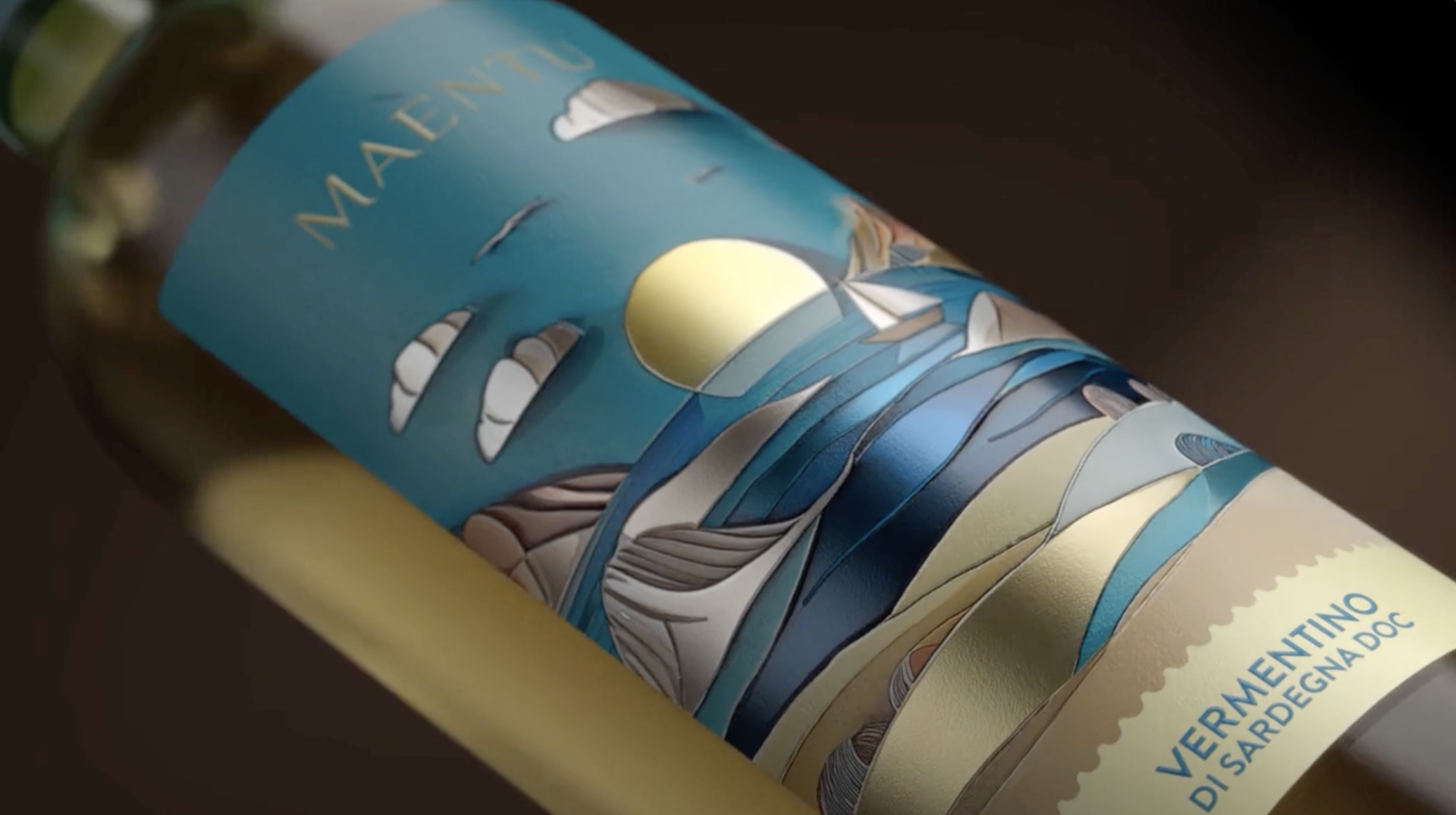
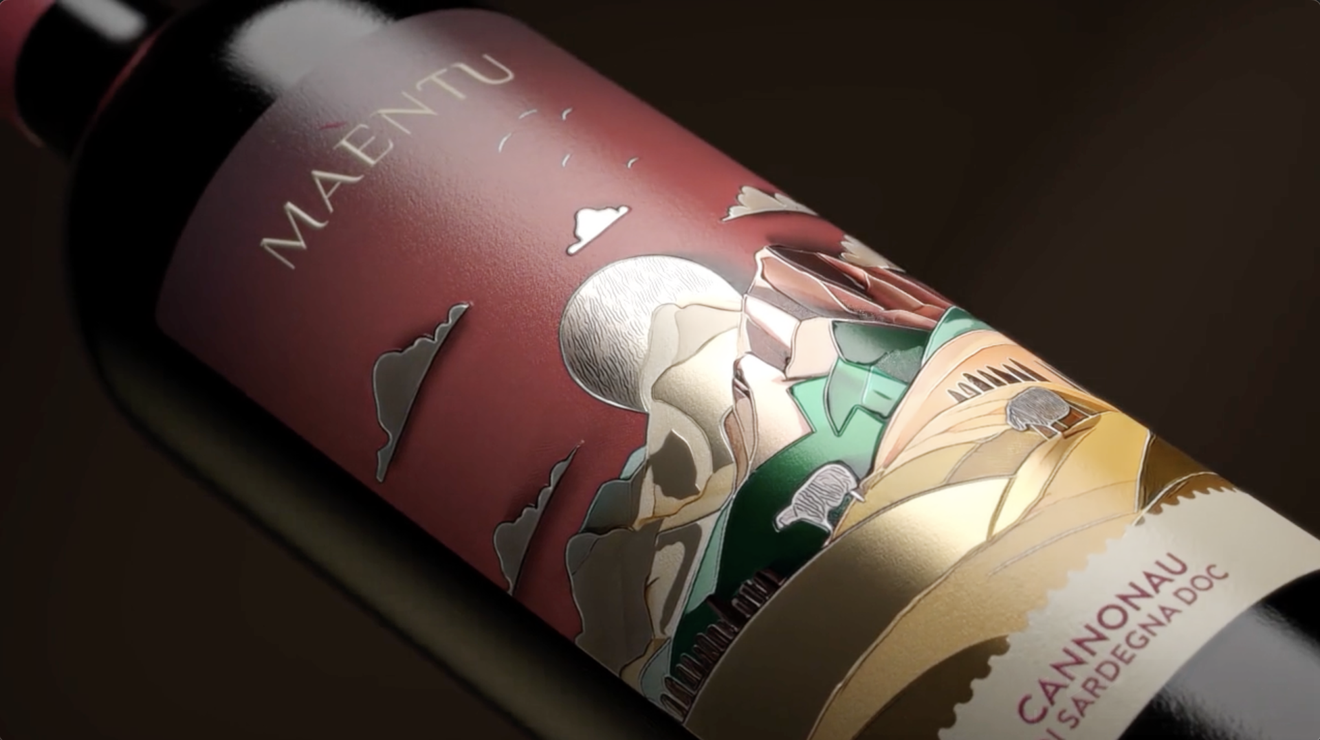
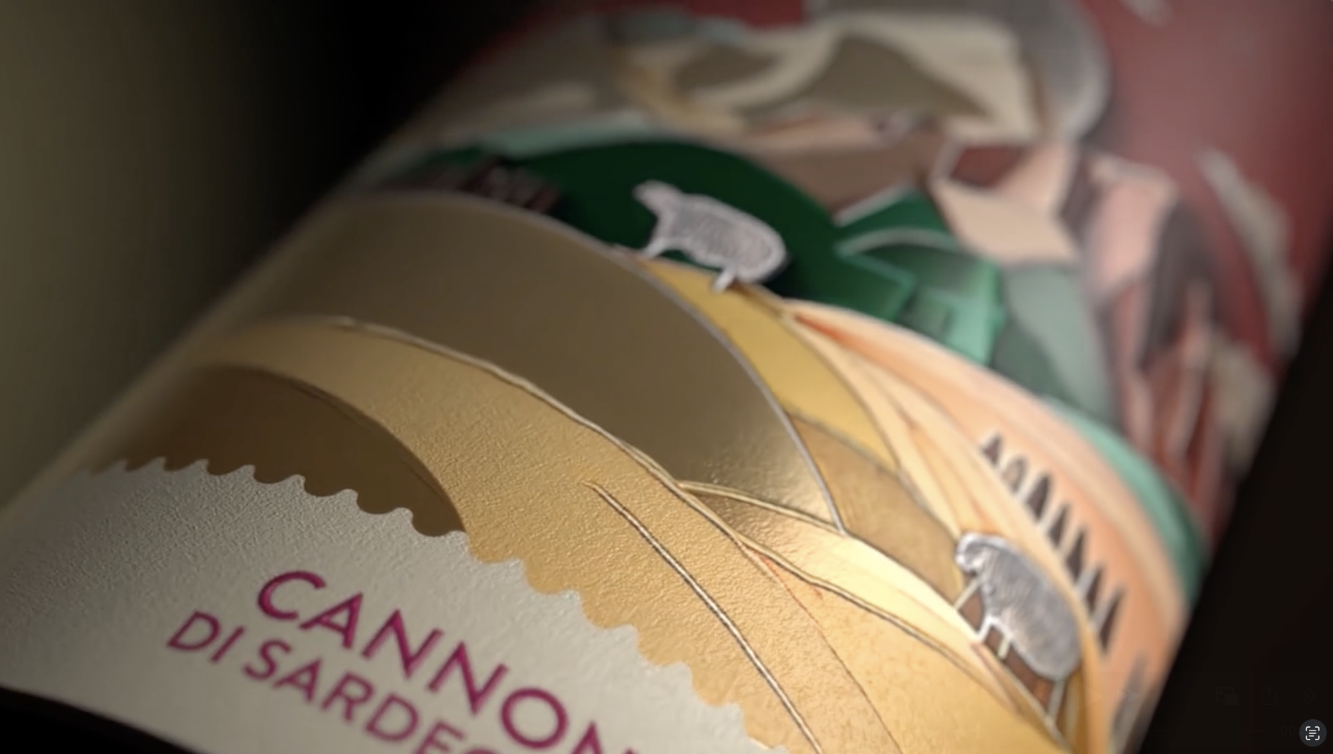
On the labels, we sought to capture the atmosphere of Sardinian landscapes, not by depicting specific places, but by evoking the emotions they inspire. Intense natural colours and stylised shapes reflect the island’s essential elements—earth, sea, and wind.
Our goal was to translate the wind into images and sensations. The Mistral cannot be seen, yet it always leaves its mark. To represent this visually, we chose a contemporary illustrative style: layered, almost three-dimensional, with overlapping planes and bold colour contrasts.
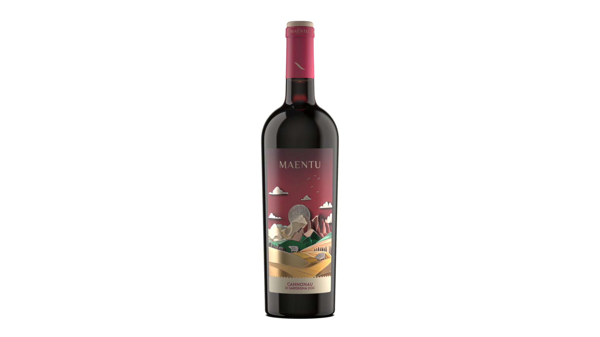
Through these contrasts, we created three engaging labels: one expressing ancient, strong, material Sardinia—Cannonau; one conveying the luminous, fresh, Mediterranean character of the island—Vermentino; and one reflecting its joyful and vibrant soul—the sparkling wine made from Vermentino grapes.
The labels are designed to immerse the viewer in this world and its strong Sardinian identity. We selected UPM Raflatac papers to enhance colours and nuances, using a pearlescent paper that adds light and volume. Special finishes increase the three-dimensional effect, while embossed and Braille details create a tactile experience that invites exploration. Finally, KURZ Lumafin foil enriches select areas with a glass-like brilliance, creating a distinctive play of light.

Credits
Entrant Company
YANGJIANG JIANGCHENG GAWIN INDUSTRIAL CO., LTD
Category
Product Design - Bakeware, Tableware, Drinkware & Cookware
Entrant Company
Perpetuum Designs
Category
Interior Design - Clinic / Hospital Rooms
Entrant Company
DOLLAR JUDGE INC
Category
Product Design - Music, Audio & Sound
Entrant Company
LA NEW INT`L CORP.
Category
Product Design - Smart Technologies