2025 | Professional
Packaging of Laozha Huangjiu
Entrant
Shaoxing Songli Cultural and Creative Co., Ltd
Category
Packaging Design - Wine, Beer & Liquor
Client's Name
Country / Region
China
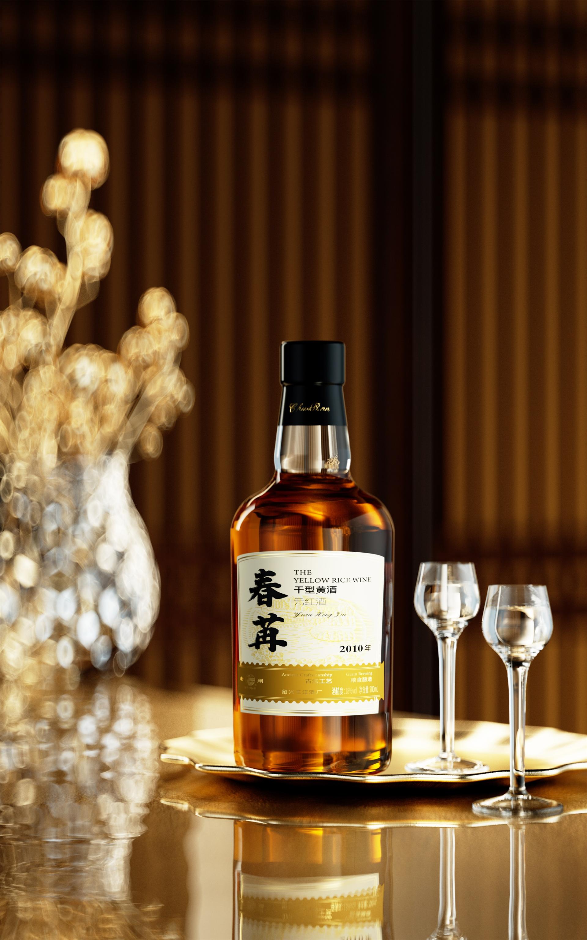
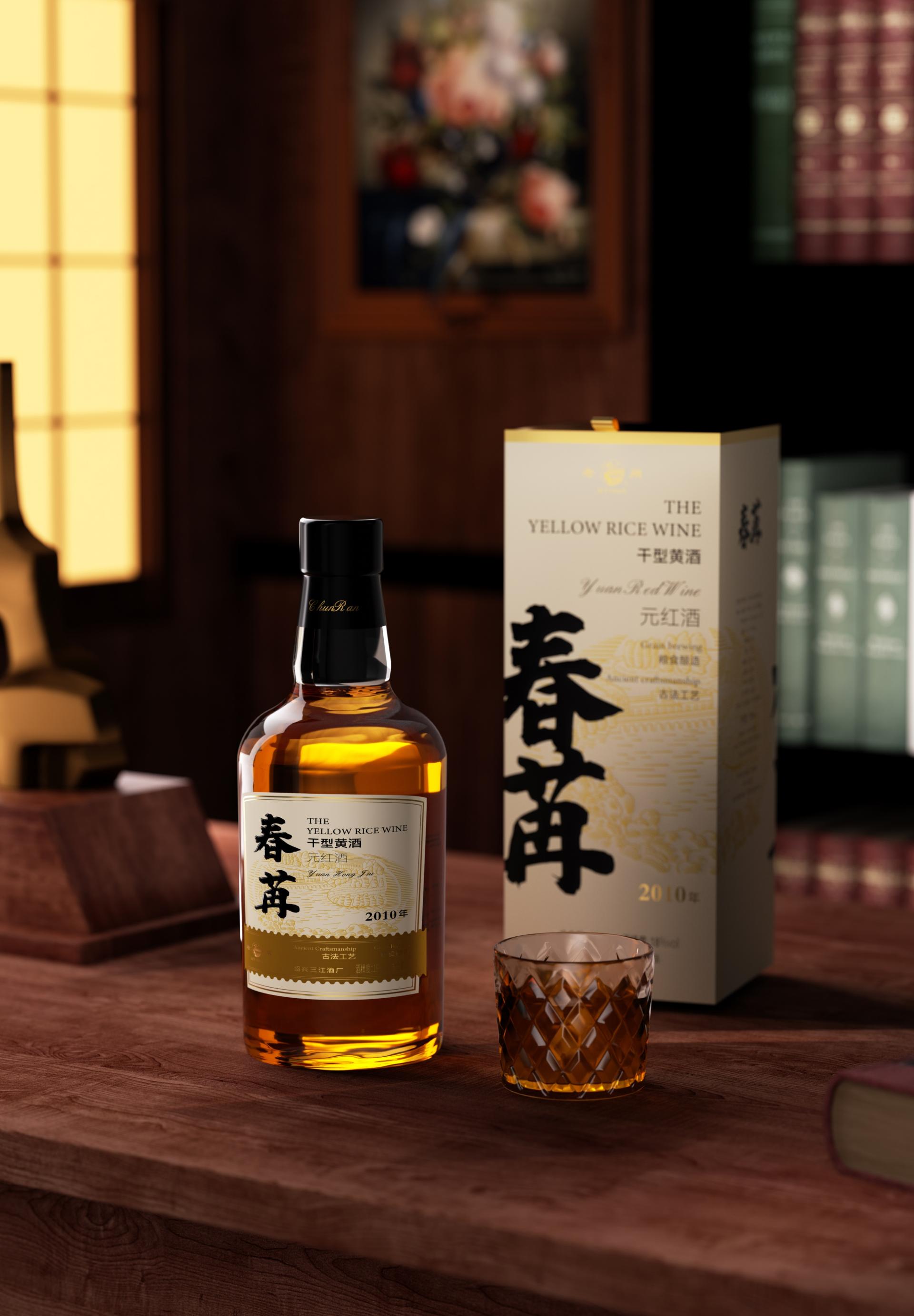
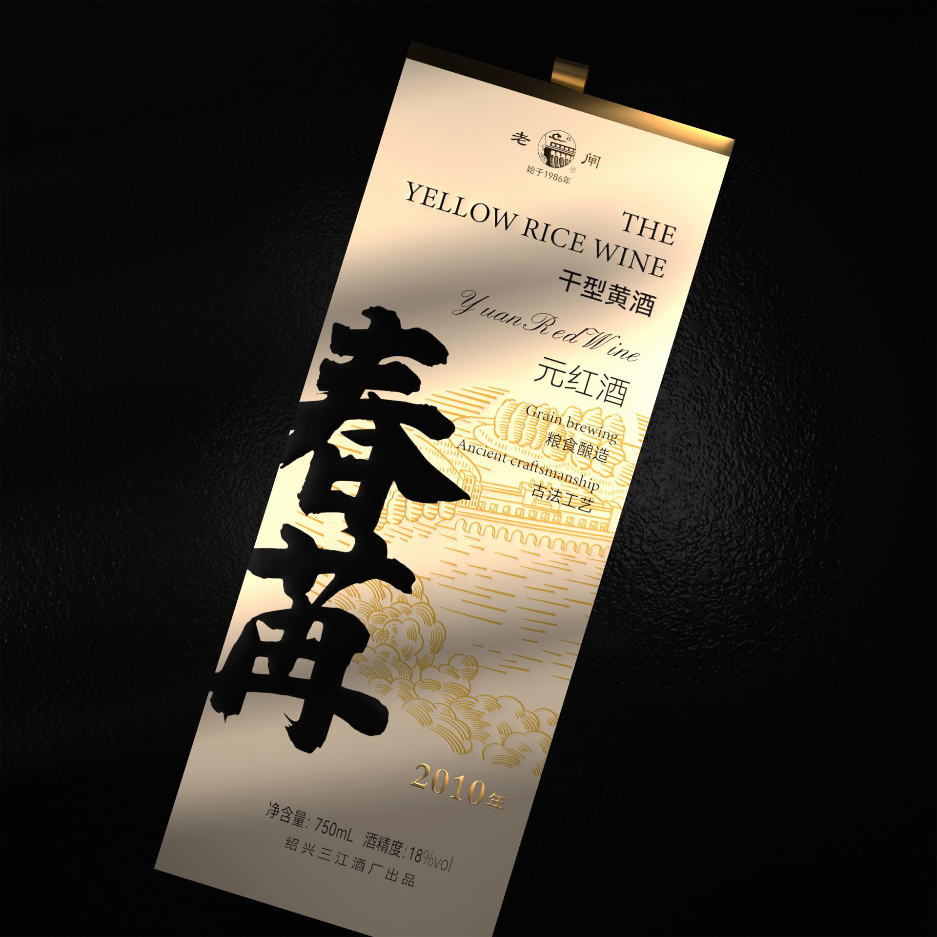
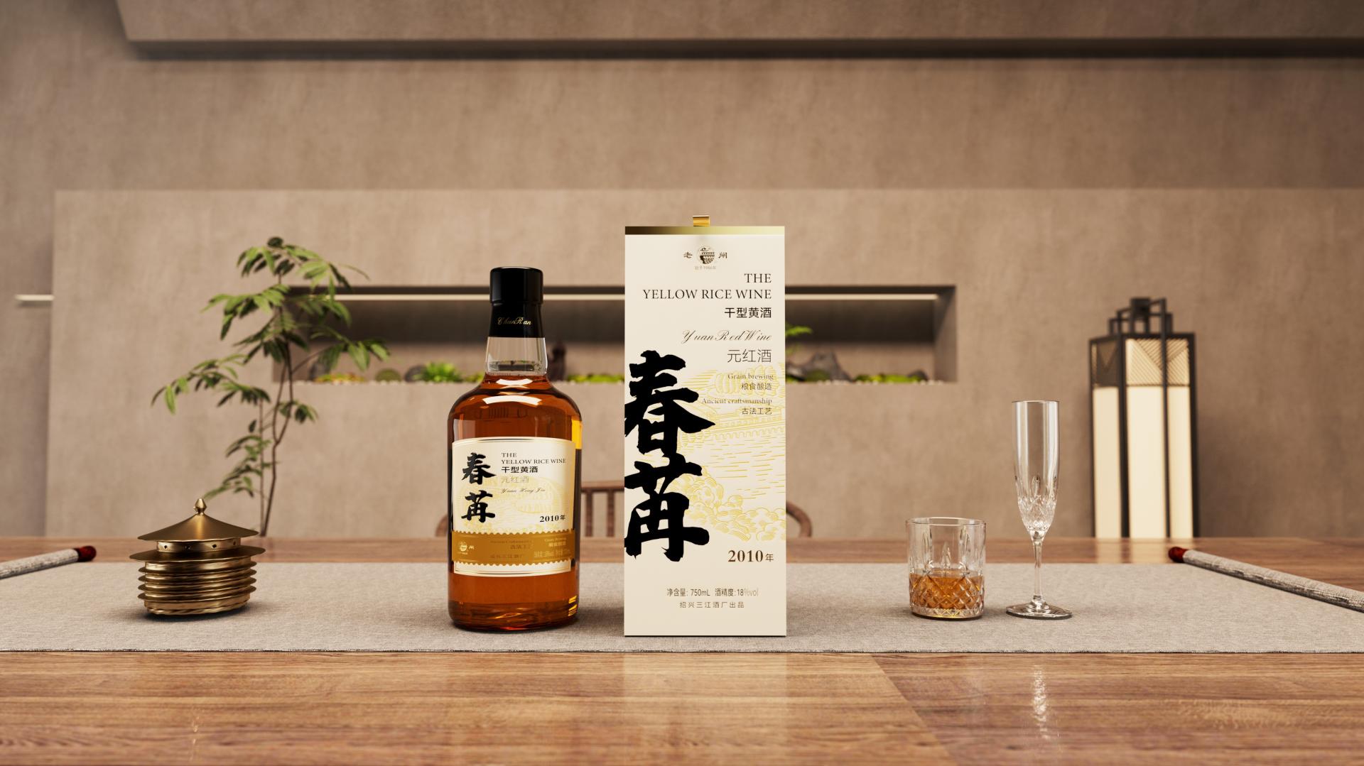
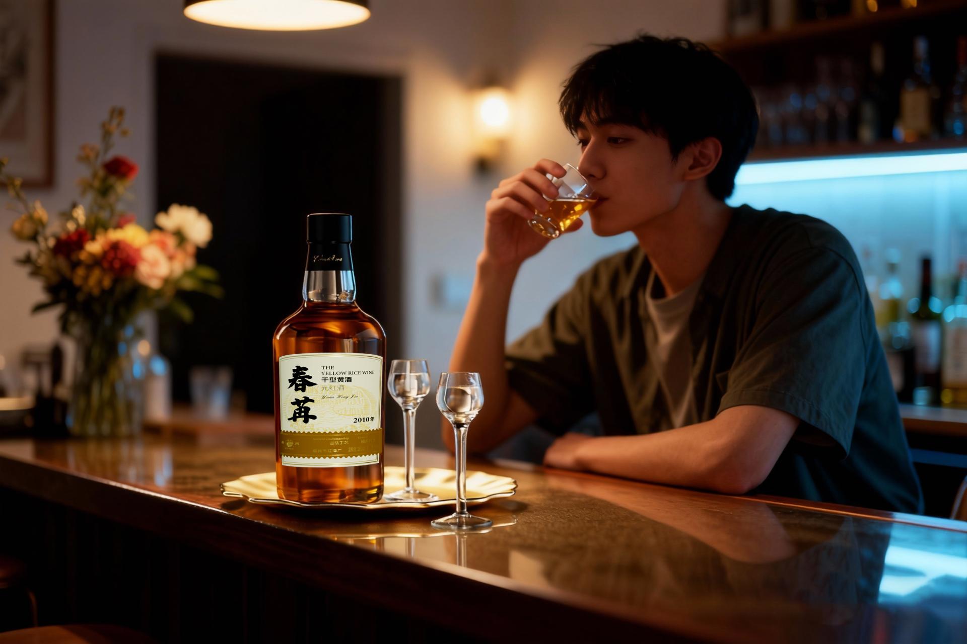
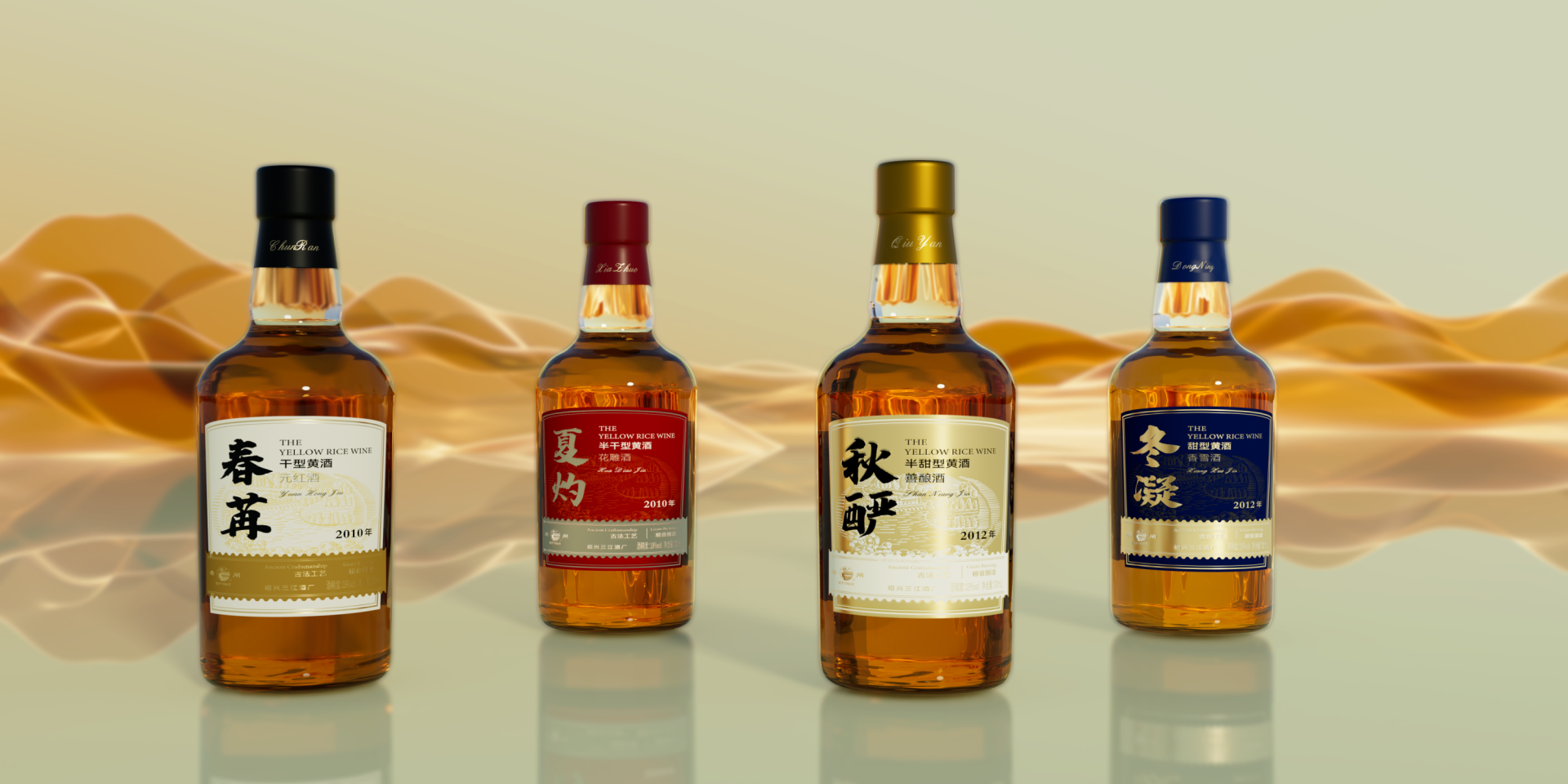
The packaging design project for Laozha Huangjiu aims to infuse this traditional brand, rich with deep historical heritage, with a novel and youthful visual identity to attract a broader young consumer base.
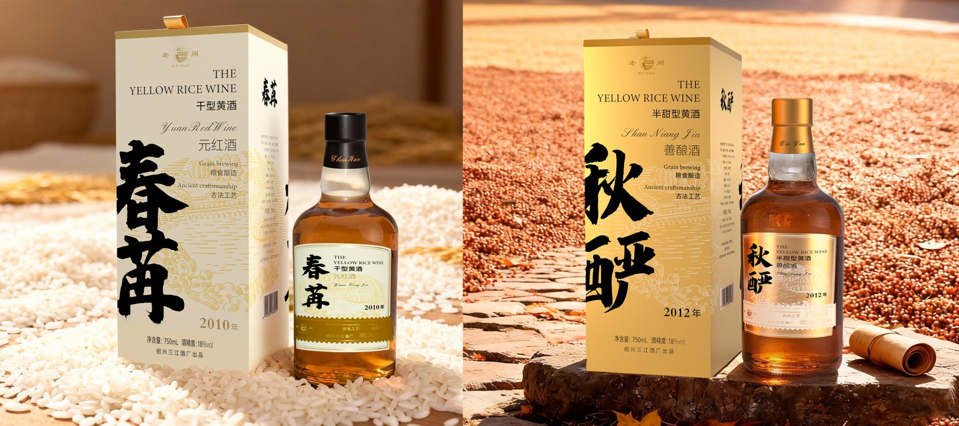
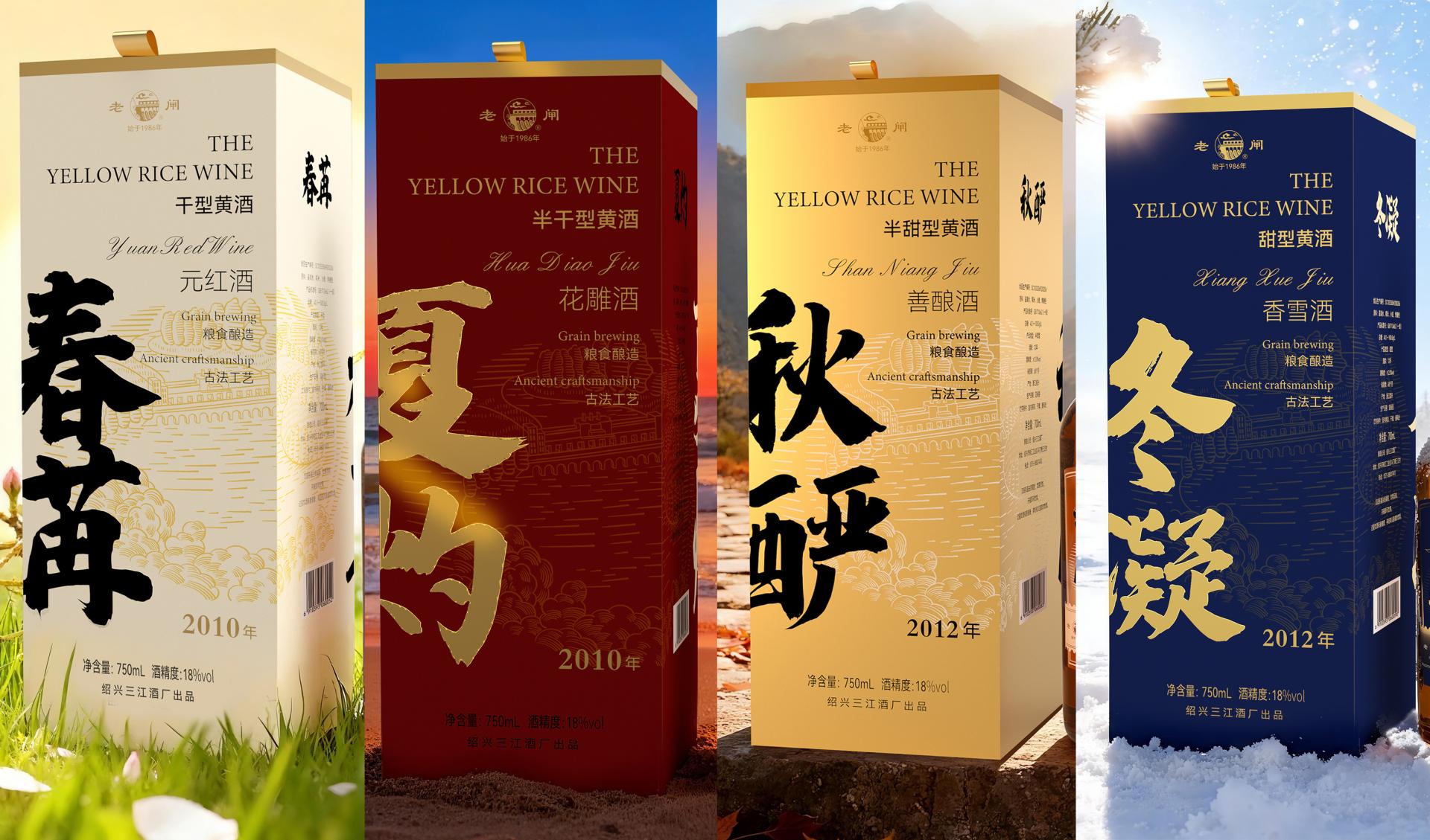
The design team, under a unified design language system, adopted the "four seasons" as the core concept, creating customized packaging visuals for each type: "Spring Bud", "Summer Blaze", "Autumn Richness", and "Winter Solidity".
The primary colors of each box are drawn from the classic imagery of the corresponding season-spring uses off-white to symbolize new life and growth; summer employs cinnabar red to echo heat and vitality; autumn selects amber gold to reflect abundance and tranquility; and winter chooses cobalt blue to convey refinement and restraint. This constructs a comprehensive, emotionally resonant modern visual identity system.
This system also incorporates a clear and unified background visual symbol-the Shaoxing Sanjiang Ancient Lock, embodying Shaoxing's rich regional historical and cultural memory and serving as one of its key symbols. As the brand's representative emblem, the design team reinterpreted the image of the Old Sanjiang Lock using woodblock print and illustration techniques, transforming it into the core visual background of the box. Integrated with the four-season theme, it imbues the product with a "legacy renewed" visual expression, while also serving as the most significant cultural anchor in the packaging design. Amidst the cycle of the four seasons and the transformation of all things, the image of the Old Sanjiang Lock remains a steadfast presence on the packaging, acting as a stable coordinate in the visual sequence. It evokes a sense of "roots" and "origin."
The packaging structure adopts a top-opening box design, utilizing art paper laminated with gray board and eco-friendly new materials. This ensures functionality while reflecting a commitment to sustainable development. The treatment of extending the title from the left side to the side panel enhances brand recognition while maintaining balance with the product information on the right. Key information areas utilize hot stamping techniques to elevate the product's texture.


Credits
Entrant
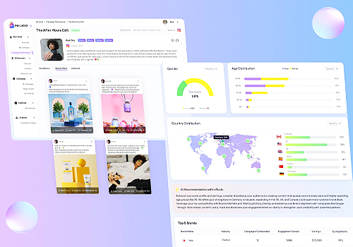
Influcio
Category
Product Design - UX / UI / IxD (NEW)
Entrant
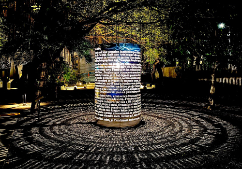
Samuel Production
Category
Lighting Design - Outdoor Lamps / Lighting
Entrant
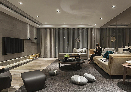
TENART SPACES DESIGN
Category
Interior Design - Residential

Entrant
ShenZhen 1Mii Technologies Limited
Category
Product Design - Audio & Video Devices