2021 | Professional

San Cao Er Mu
Entrant
IF DESIGN WORKSHOP
Category
Packaging Design - Fresh Food
Client's Name
Easy Vitality Marketing Studio
Country / Region
Taiwan
The packaging of San Cao Er Mu honey shows honeybees in search of flowers in the diverse landscape of Taiwan, resulting in honeys of different flavors. This visual design expresses the core value of this product and its brand image – honeys from all corners of the countries with an unparalleled range of flavors and varieties.


Credits
CEO/IF Design Workshop
Chao, Kuo-Sung
Assistant Professor/Chung Yuan Christian University, The Department of Commercial Design
Pai, Nai-Yuan
Assistant Professor/Yuan Ze University, The Department of Information Communication
Huang, Chieh-Ju
More Gold Winners
Interior
2021
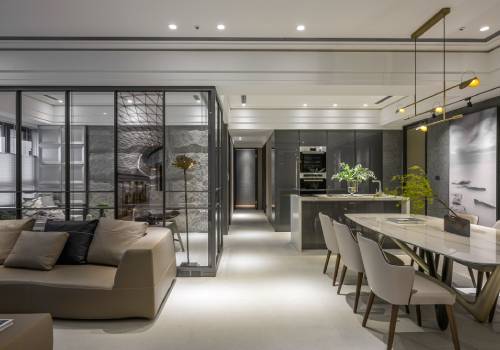
Entrant
Chiyan Interior Design
Category
Interior Design - Residential
Interior
2021
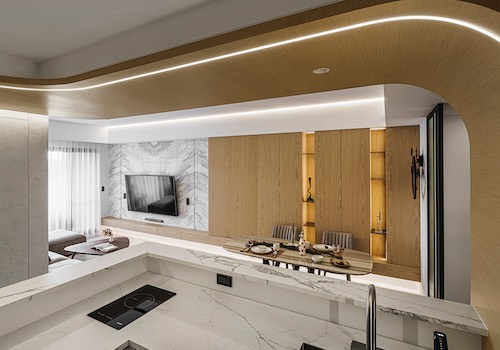
Entrant
YOMA
Category
Interior Design - Living Spaces
Interior
2021
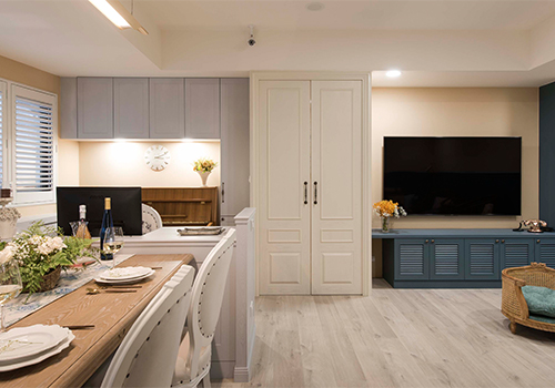
Entrant
AVEN Interior Design
Category
Interior Design - Residential
Interior
2021
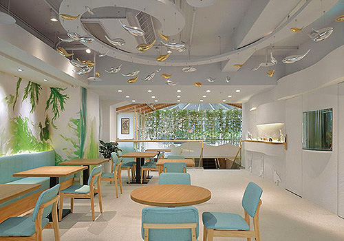
Entrant
FIEFDOM CONFORMITY DESIGN LIMITED COMPANY
Category
Interior Design - Commercial