2021 | Professional

Notter Nuts
Entrant
Achates 360 Pte Ltd
Category
Packaging Design - Snacks, Confectionary & Desserts
Client's Name
Artisan Super Food Pte Ltd
Country / Region
Singapore
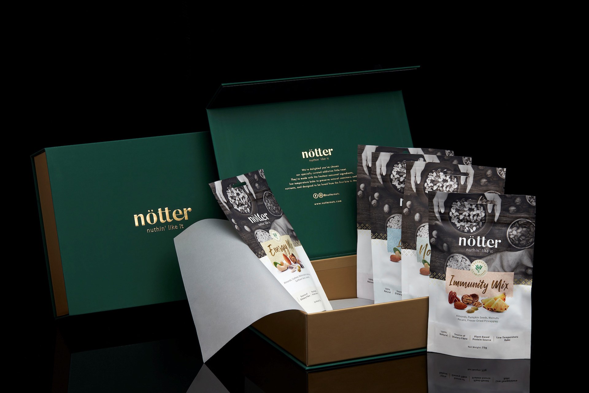
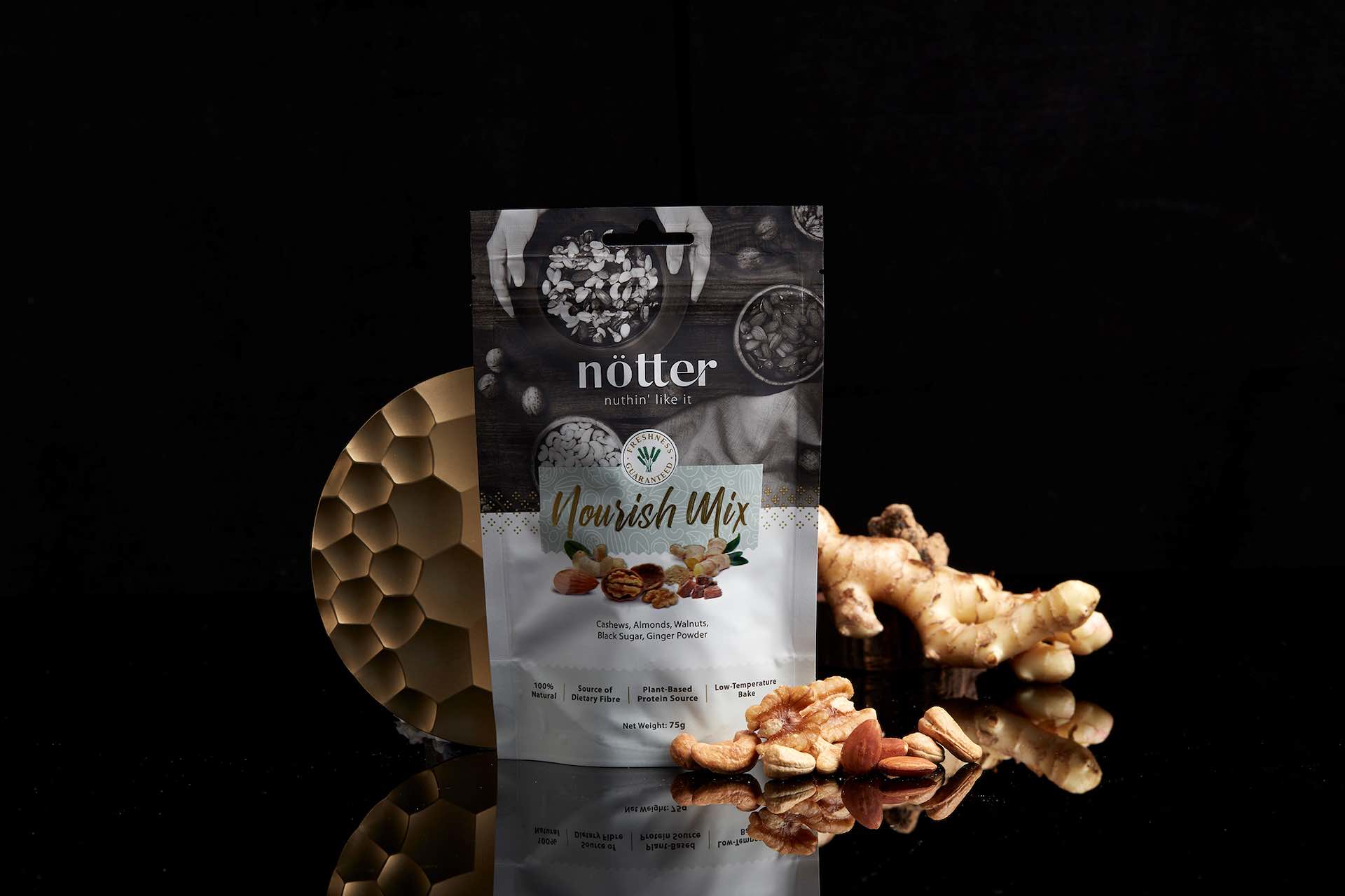
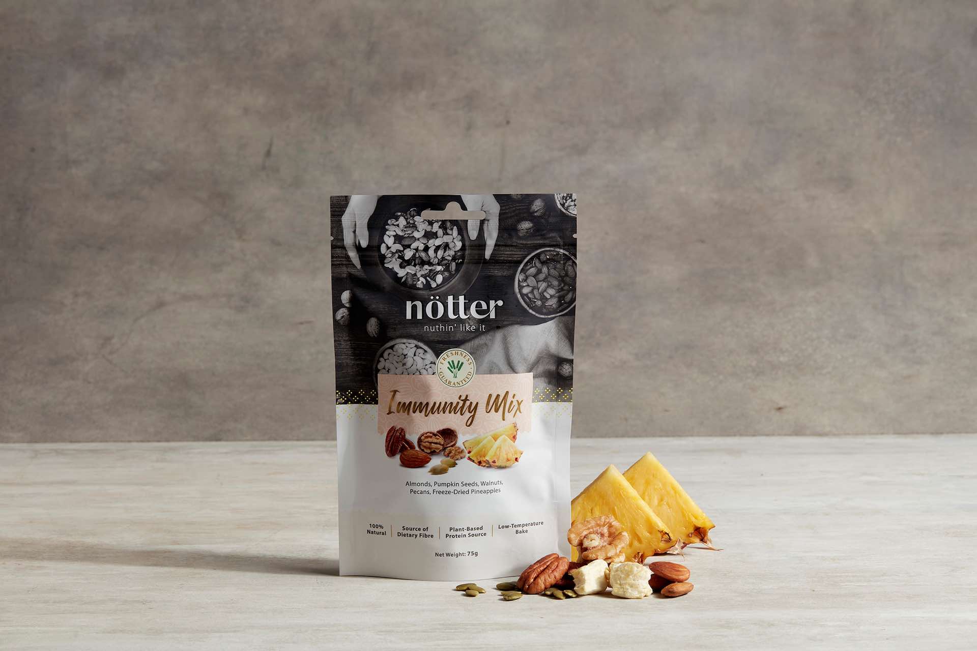
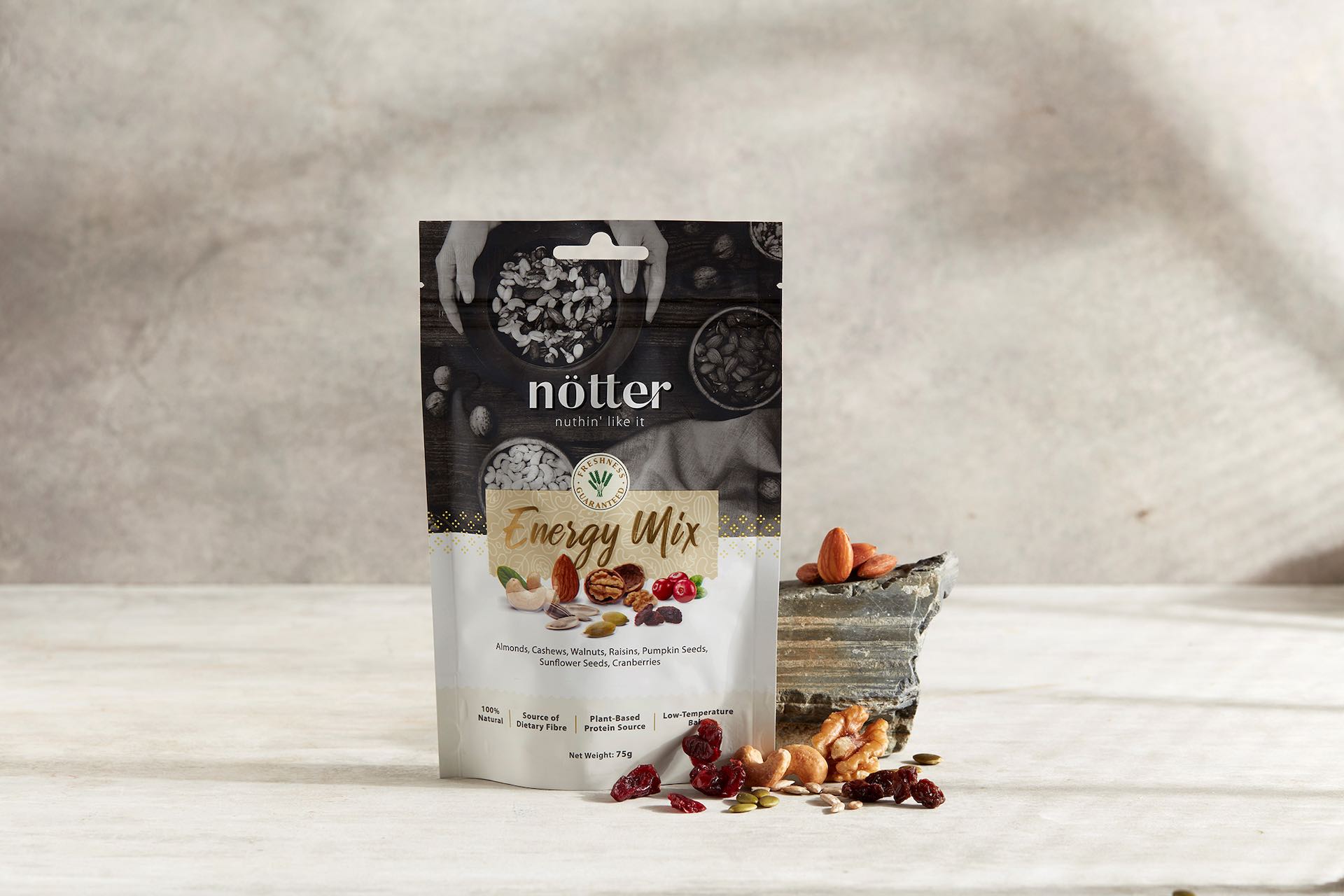
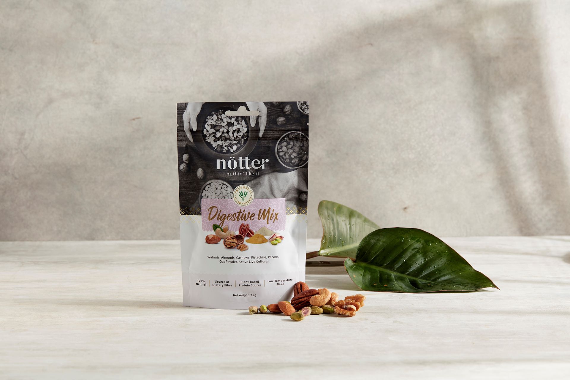
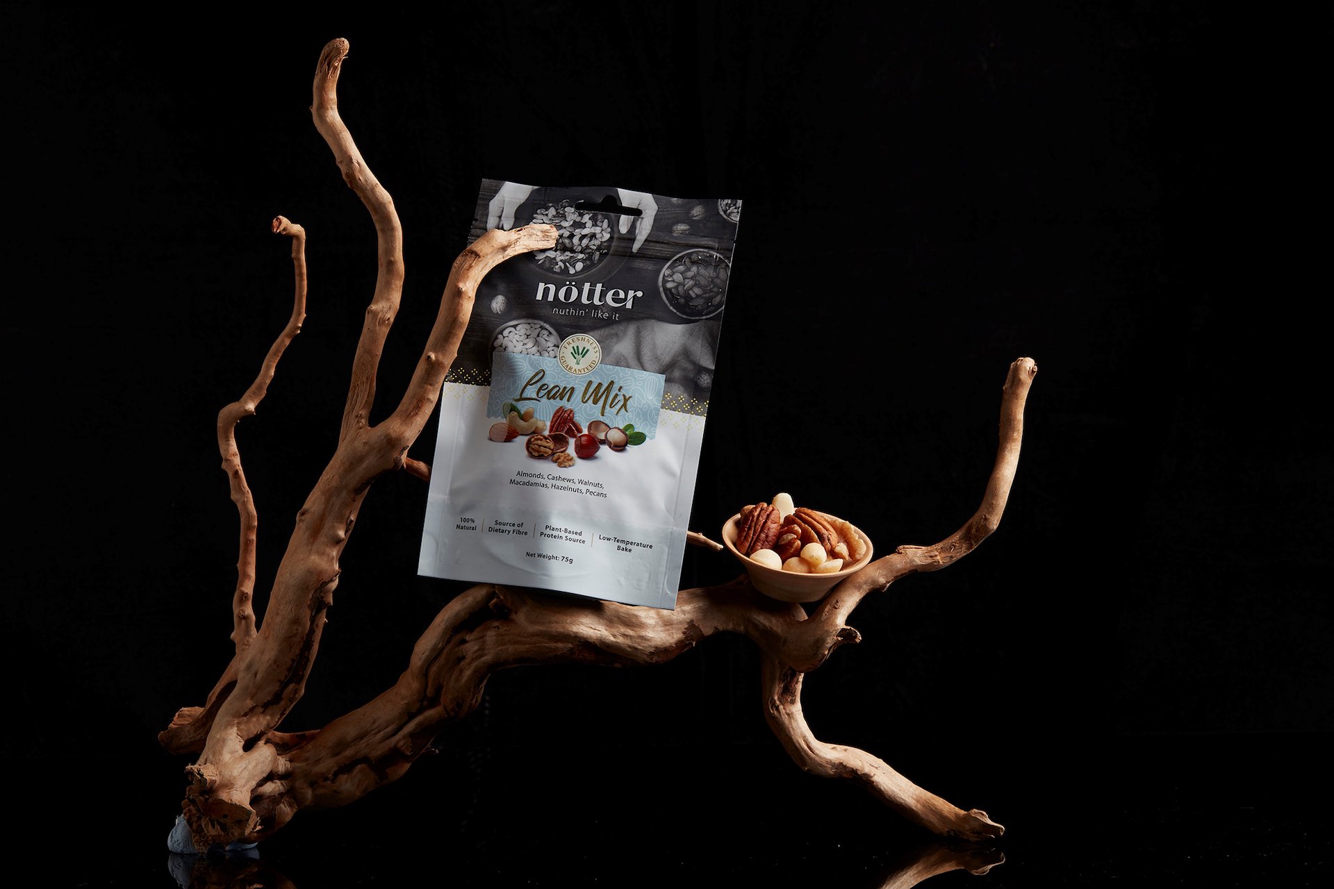
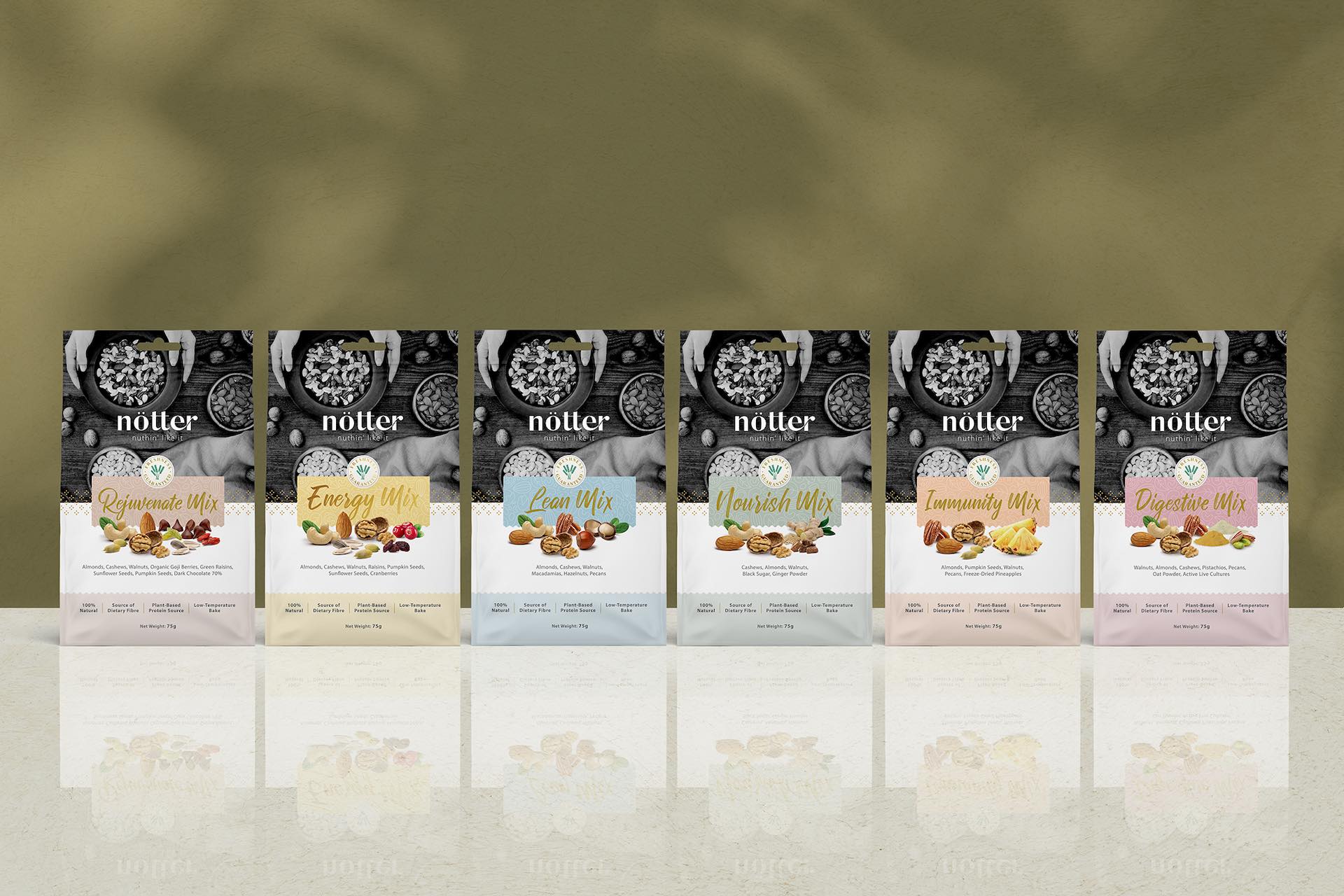
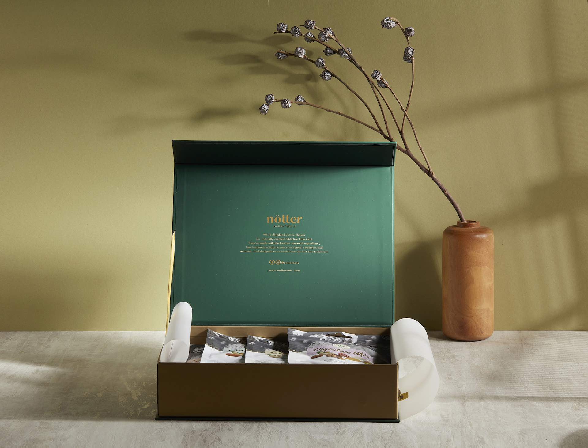
A rebranding effort to refresh Nötter’s image to differentiate and pull away from supermarket brands, Nötter products are freshly picked and of high quality, which needed to be told through the packaging.
We redesigned the logo, adopting typography to make the brand more refined. For a unique feel, we chose a semi-serif – Sunflora for its elegance and unique look to elevate the brand.
Applying the psychology of colours, we put together a new palette of colours to uplift Nötter: gold on deep green for sophistication, coupled with black and white imagery to set the tone for an organic, earthy feel, representative of nature and Nötter’s organic products.
To bring the eye’s focus to the different mixes, they were highlighted with colour photography and the choice of pastel label colours for a calming, modern and clean look.


Credits
Entrant
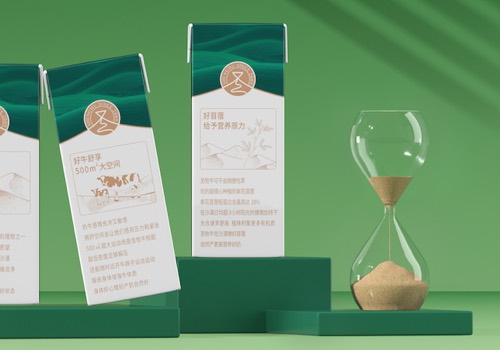
Guangzhou Aidi Advertising Co., Ltd.
Category
Packaging Design - Dairy, Spices, Oils, Sauces & Condiments

Entrant
Cheng Yi Interior Design
Category
Interior Design - Residential

Entrant
a space
Category
Interior Design - Residential

Entrant
Muchen Design
Category
Interior Design - Kitchen