2021 | Professional

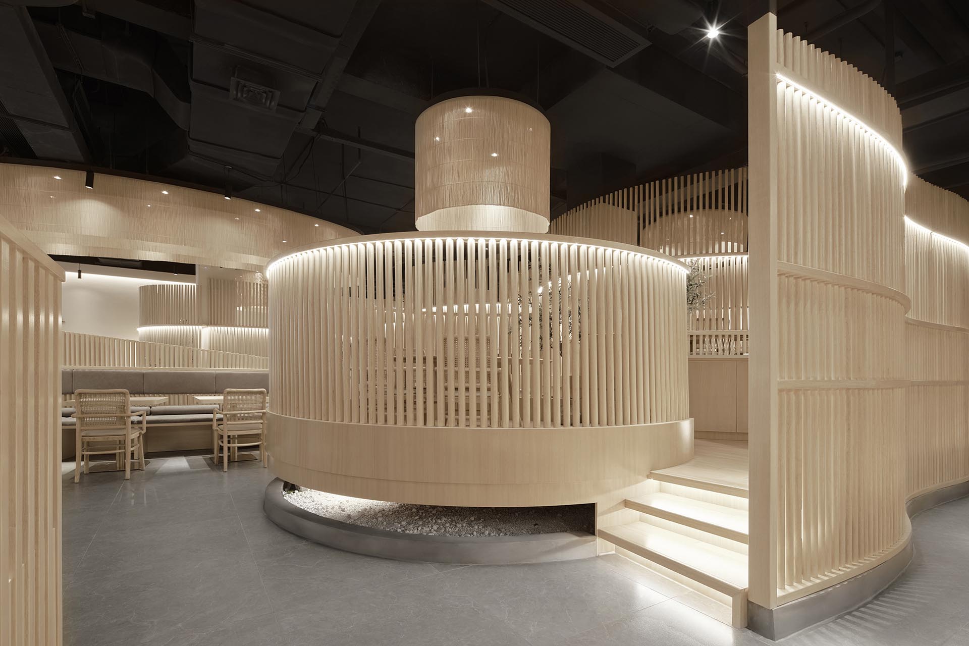
SUSHARE Vegetarian Restaurant —— The Echoes from Bamboo
Entrant Company
HITOMI&CO
Category
Interior Design - Restaurants & Bars
Client's Name
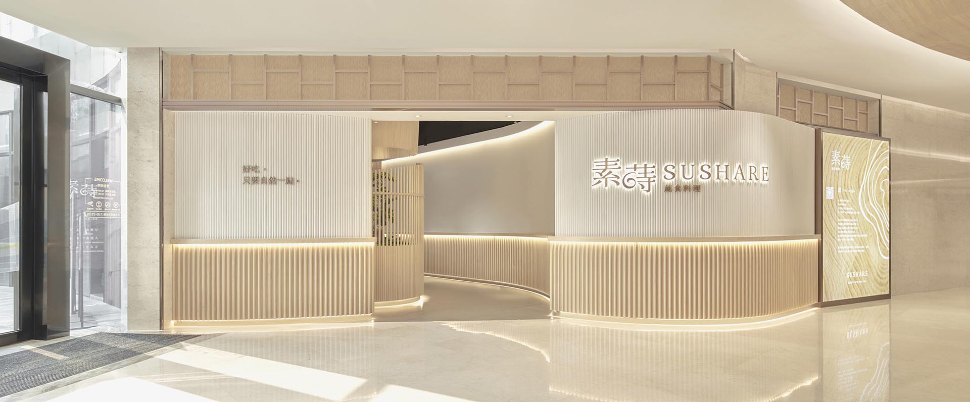
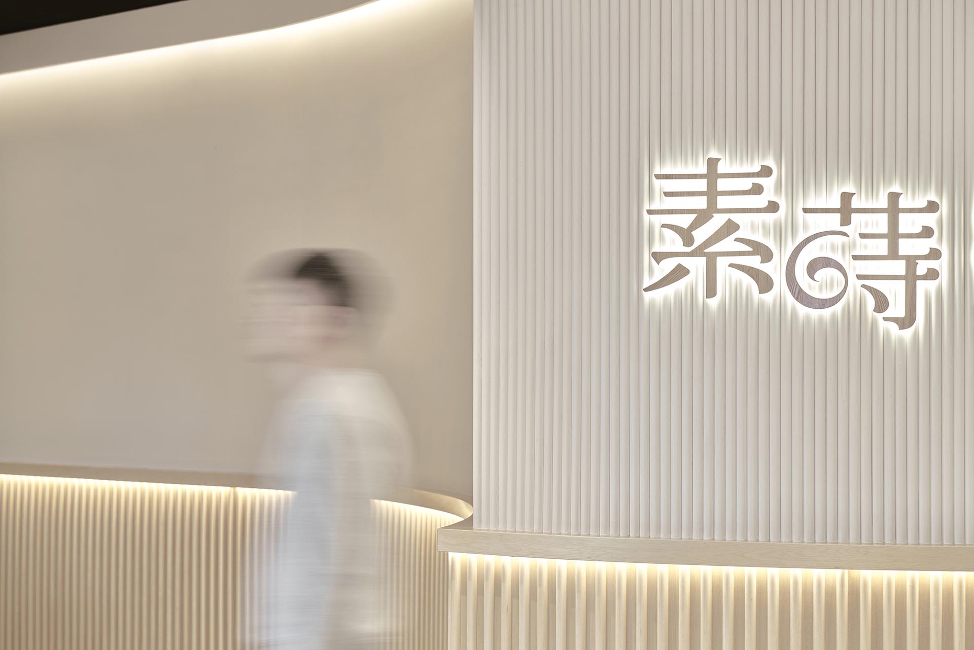
SUSHARE Vegetarian Restaurant
Country / Region
China
The Echoes
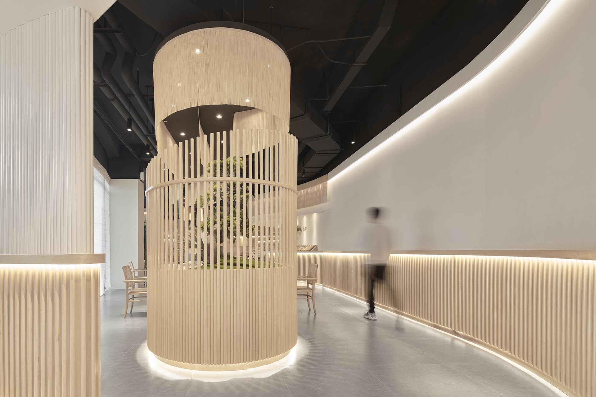
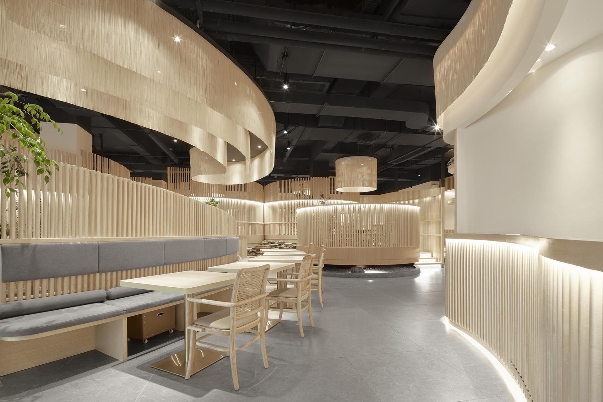
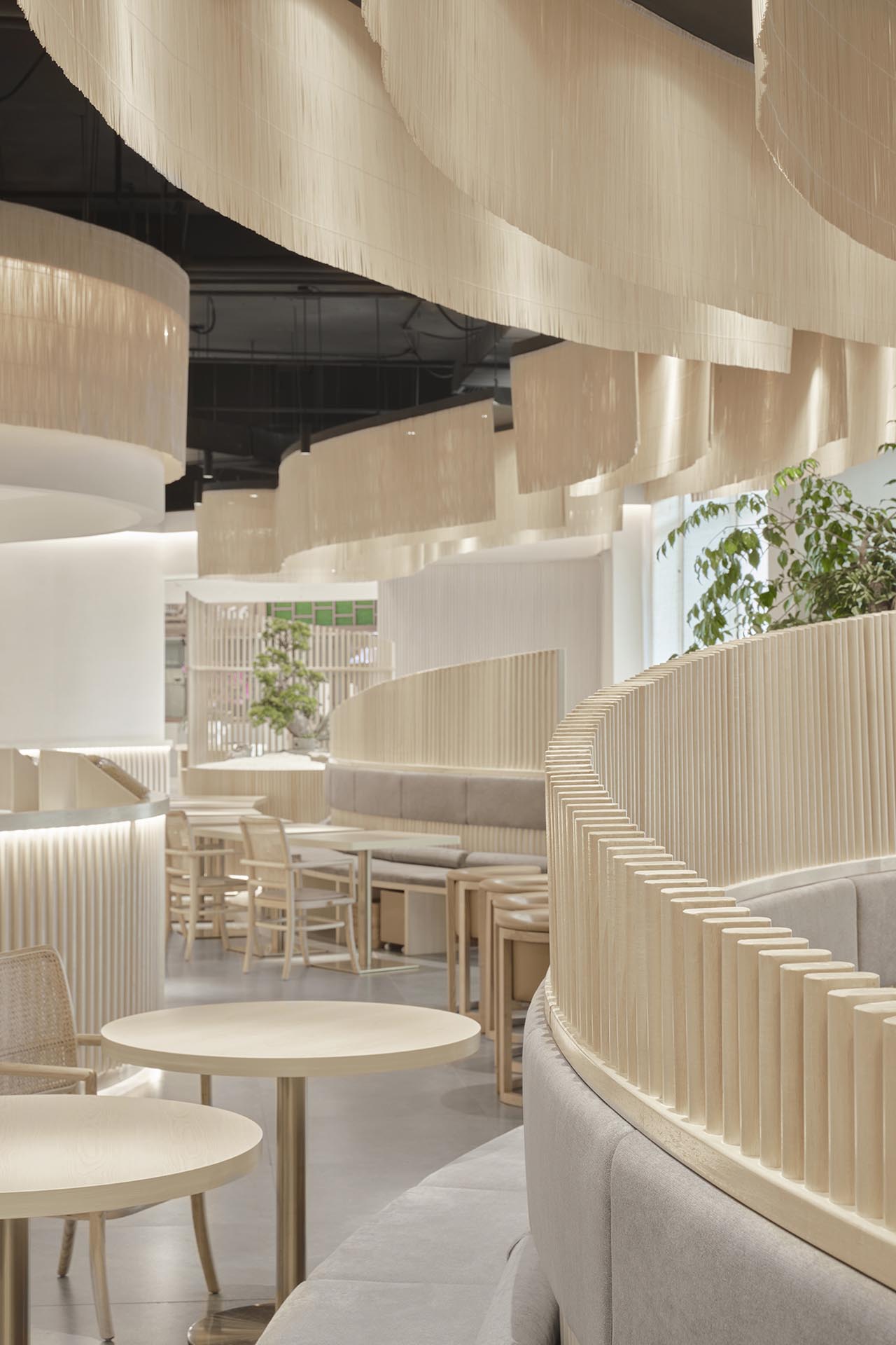
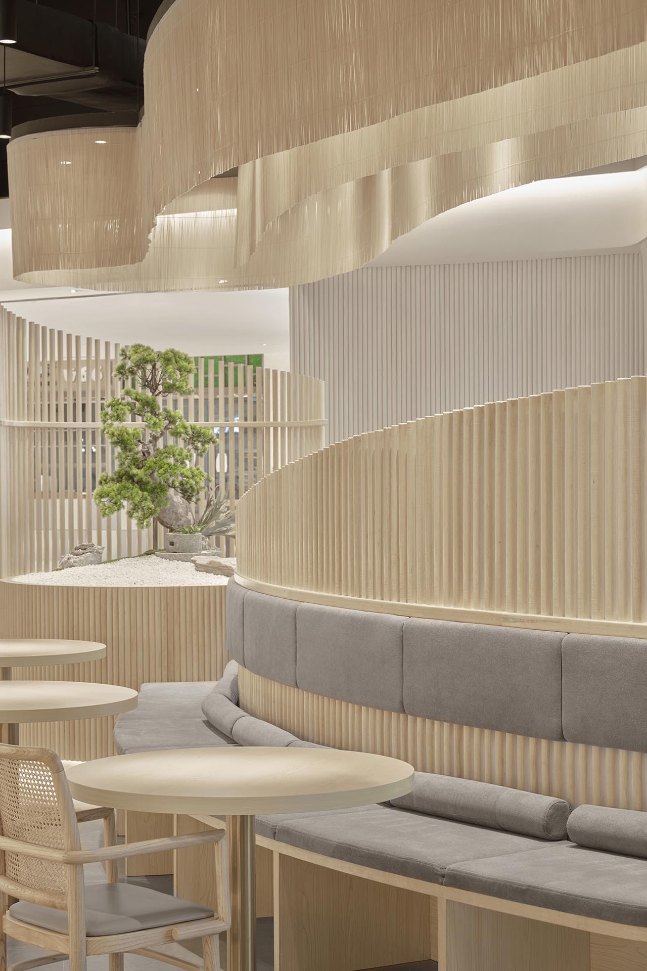
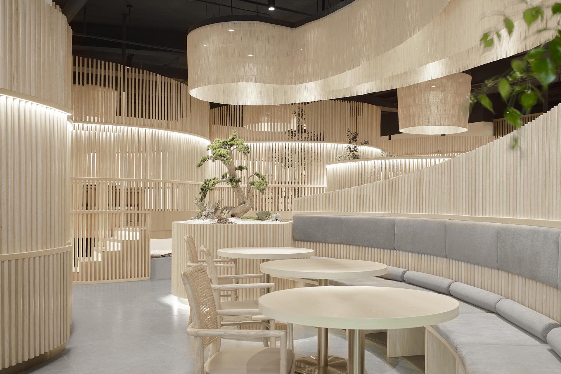
The overall design concept of the SUSHARE brand revolves around the shape of ‘right-handed conch’, extending the curve and meaning of the conch from the brand's logo system (2D) to the space design (3D). According to the functional requirements, the space is divided into four large areas including an open dining area, booths, tatamis, and private dining rooms, and there are also two corresponding working areas, including a kitchen and a bar area. Then the meaning of conch and auspiciousness are integrated into the space through the plane layout according to the brand concept and the inherent pattern of the space.
Simply as Nature
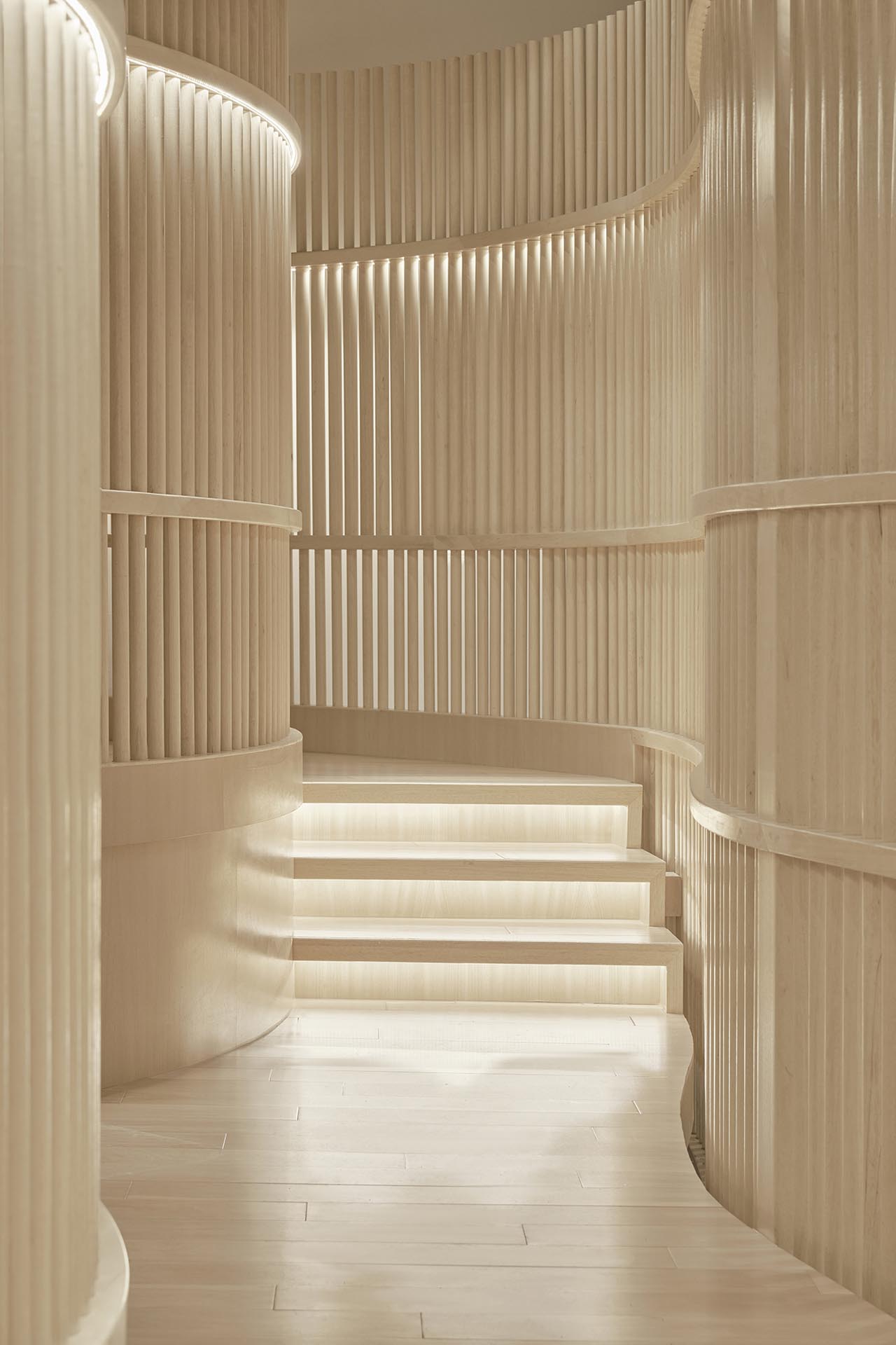
We use natural elements, lines, materials, and flowing lines to divide the space. The flowing lines are also integrated into the S (first letter of the brand name SUSHARE) which represents the original sound of ‘Su’ in Chinese and the meaning of ‘simple' in English. The natural wood elements represent ‘simple’ , ‘elegance’ and ‘vegetarian’ while the flowing lines and the shape of right-handed conch wrap represents gathering and sharing.
Sharing Has No Boundaries
We used natural and transparent wooden grids and rattan materials to set transparent boundaries instead of complete barrier to divide the space for the reason that we believe that sharing has no boundaries. The open dining space is located in the front hall, and the streamlined layout leads to the connecting private dining areas at the end of the space. Like the bamboo forest.
Credits
Entrant Company
J. Lykasova Interior Design Studio
Category
Interior Design - Residential
Entrant Company
SHANGHAI CHICMAX COSMETICS CO. LTD
Category
Packaging Design - Beauty & Personal Care
Entrant Company
fy Design
Category
Interior Design - Residential
Entrant Company
MET Creative Brand
Category
Interior Design - Restaurants & Bars