2022 | Professional

Ferrero 2021 CNY Limited Edition Gift Pack Design
Entrant
ShinyBay Design
Category
Packaging Design - Snacks, Confectionary & Desserts
Client's Name
FERRERO TRADING (SHANGHAI) CO., LTD.
Country / Region
China
Project Challenges
In this project, we encountered a topic that all brands, especially overseas brands, need to consider in their seasonal promotions - how to harmoniously integrate with the Chinese New Year theme, meet consumers' festive demands, achieve sales goals, without sacrifices brand tonality and maintains the unity of consumers' perception of the brand.
So our design need to give solutions for achieving a balance between short-term sales goals and maintaining long-term brand awareness.
Design Ideas & Considerations
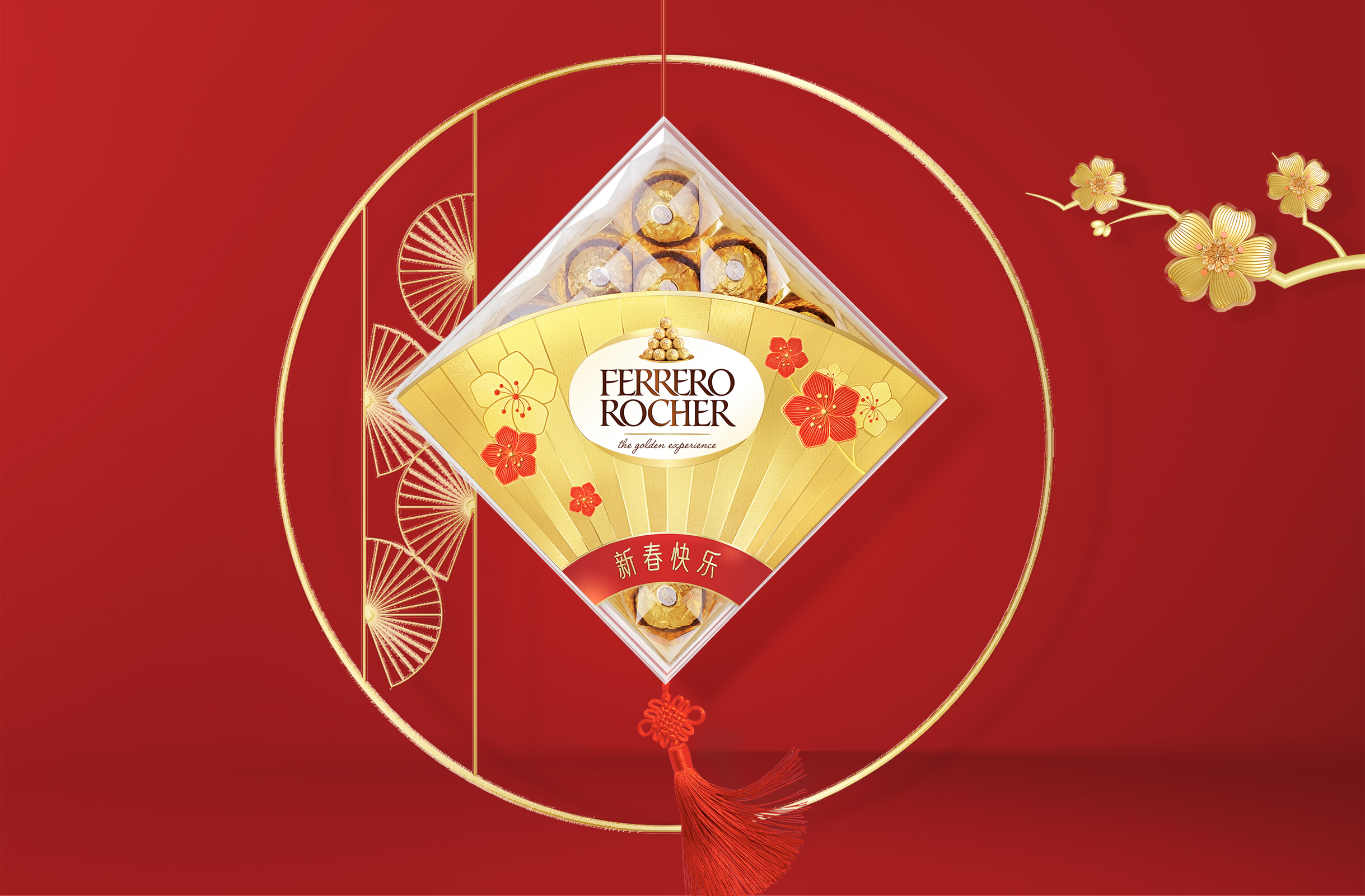
The design takes into account Ferrero's brand image of "exquisiteness, decency and sharing" established over the years, as well as the exposure of the brand's visual assets "golden, Ferrero praline".
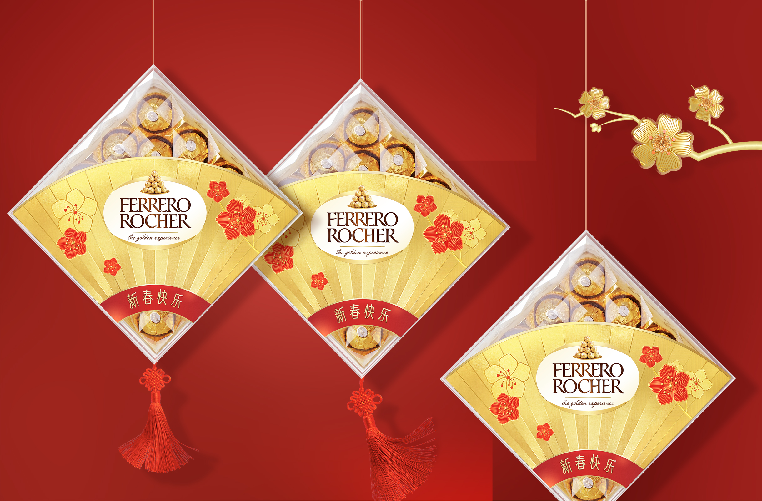
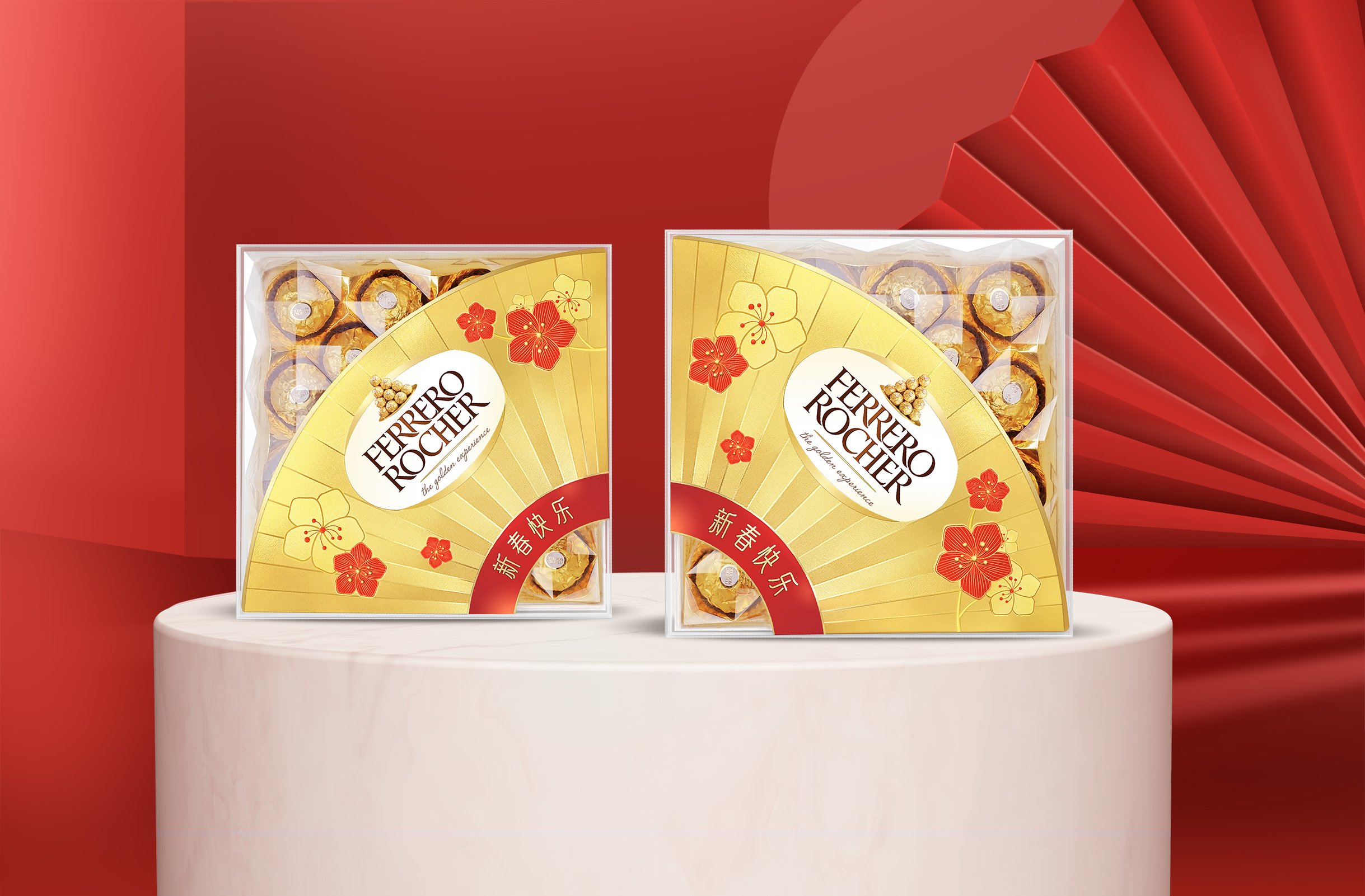
We built a Chinese-style folding fan as a visual structure. The collision of gold and red brings visual impact and shelf expressiveness, while the upper part of the Ferrero Golden Ball praline is naturally exposed, triggering consumers' intuitive association with the use of the brand and festival scenes.
The design hopes to present the atmosphere of Chinese New Year's joy without losing modern elegance.
What kind of elements and techniques to extract to interpret, these thoughts stem from our understanding of local culture: Chinese cultural confidence and traditional oriental aesthetics are increasingly cherished. After extensive comparison of classic Chinese elements, The elements of "Plum and Fan" are extracted, not only because they are the symbol of the Spring Festival, but also the expression of culture, history and aesthetics. And we hope to build a bridge of cultural understanding between brands and consumers through design interpretation.
For the offline shelf and pile head display, a large area of gold and red is used to attract the attention of consumers, and the display method is also suggested to hang the red rope and Chinese knot, which makes the gift box display in the pile head different, and also increases the gift box as added value.
In terms of craftsmanship, we recommend partial bronzing, embossing and reverse varnish craftsmanship, so as to achieve the glittering of the overall picture.
Credits
Entrant
Wilson Yang Design
Category
Interior Design - Exhibits, Pavilions & Exhibitions

Entrant
DAOYUAN Design
Category
Landscape Design - Residential Landscape
Entrant
Goflex Design & Reno
Category
Interior Design - Office
Entrant
Yi Wei Design Ltd.
Category
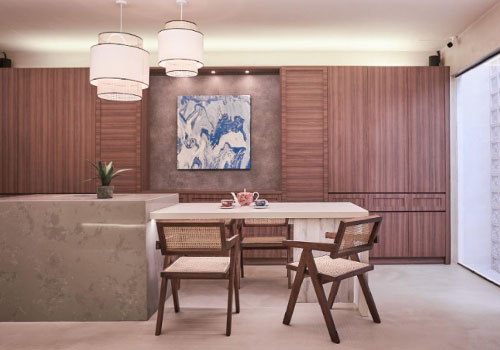
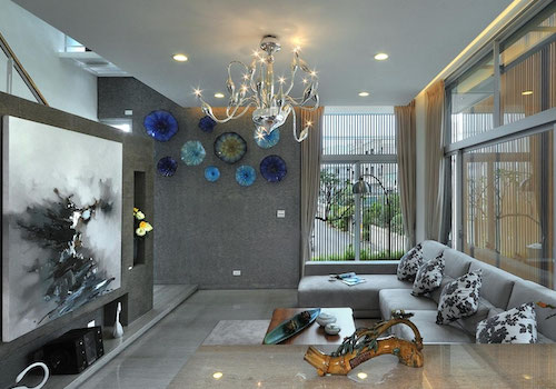
Interior Design - Residential